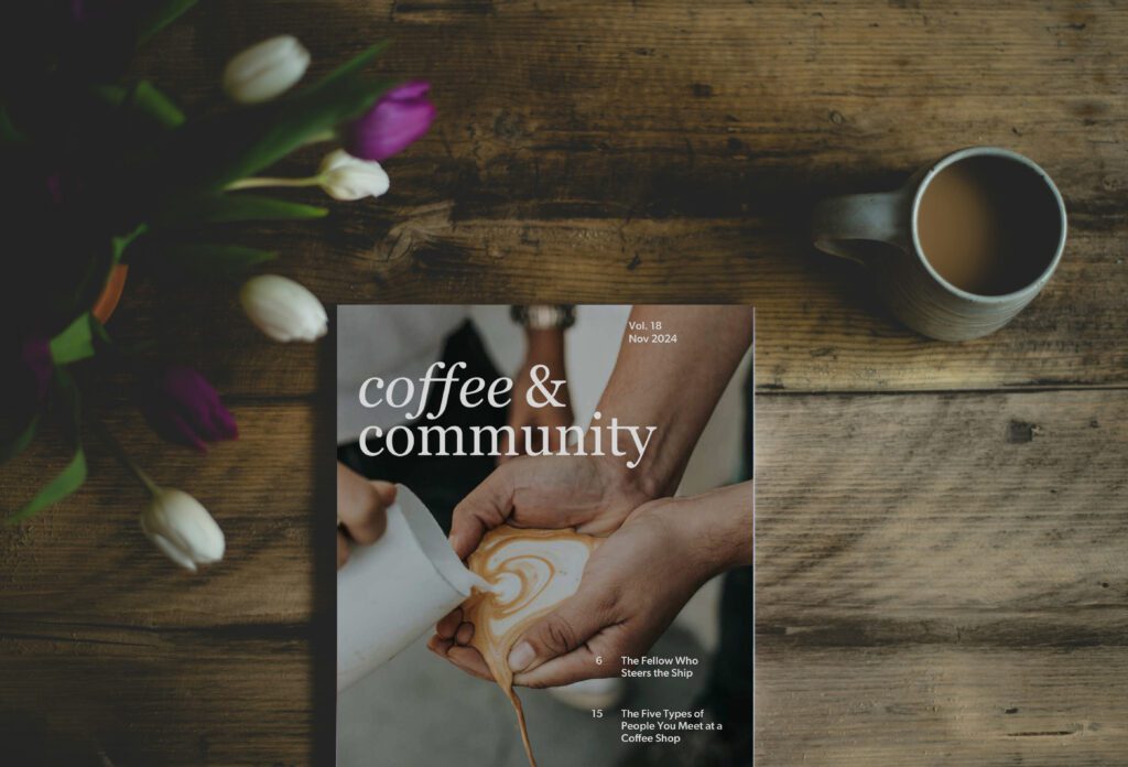
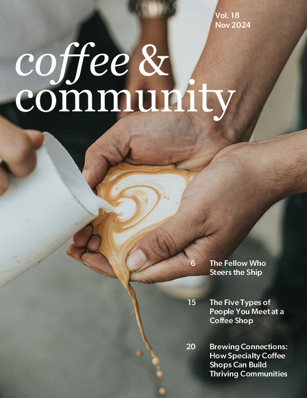
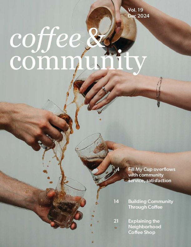
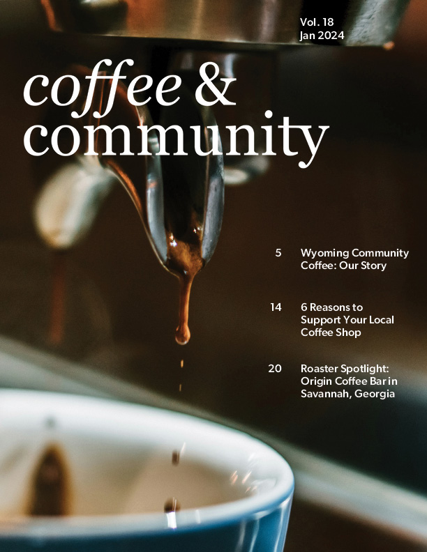
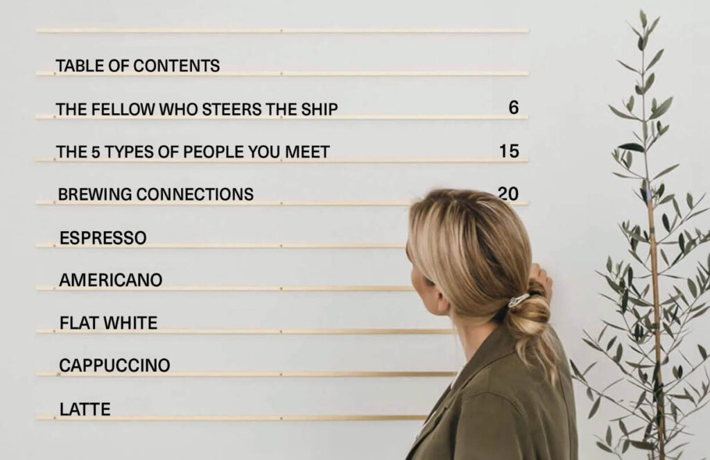
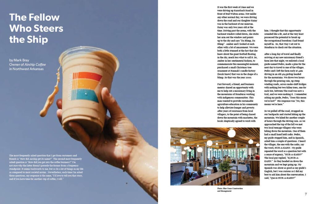
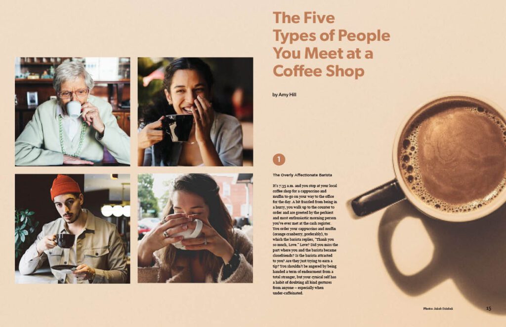
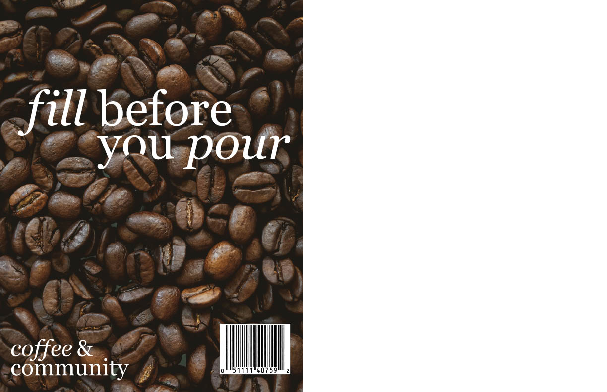
In Typography 2, the assignment was to create and brand a distinctive magazine. Choose a topic of interest and include three iterations of a cover design, three articles relating to the overall topic, a letter from the editor, and table of contents .
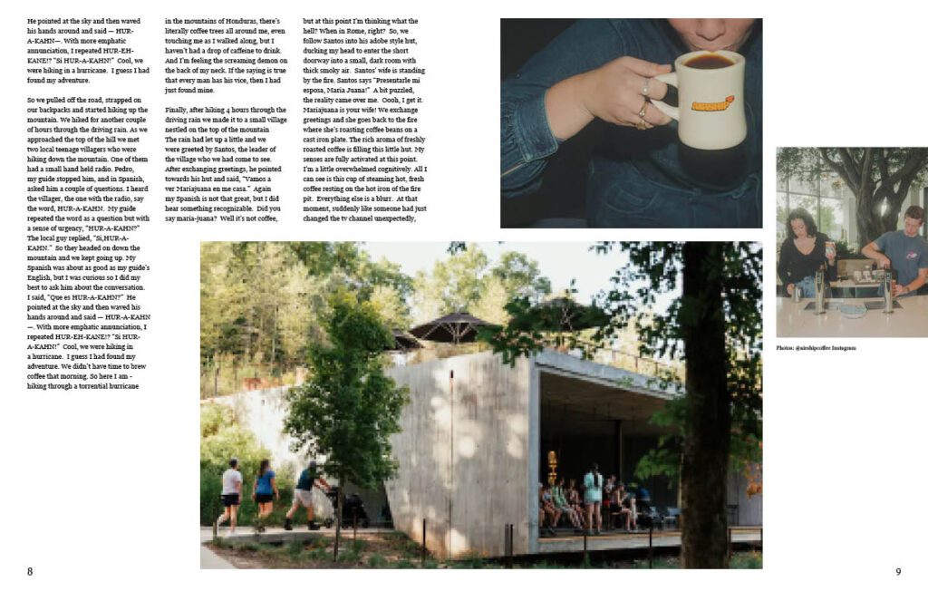
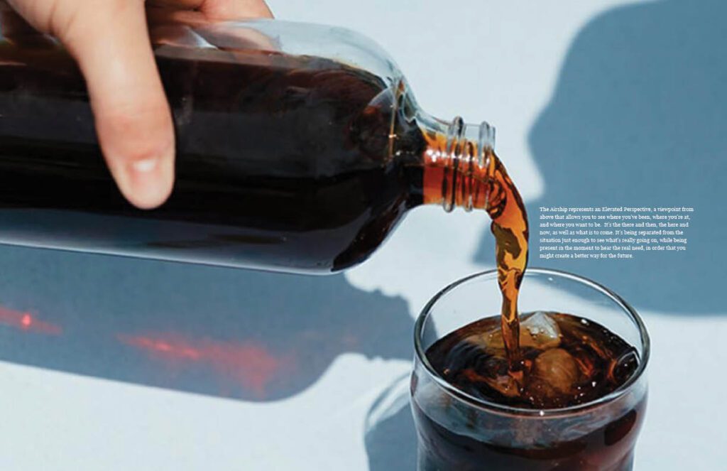
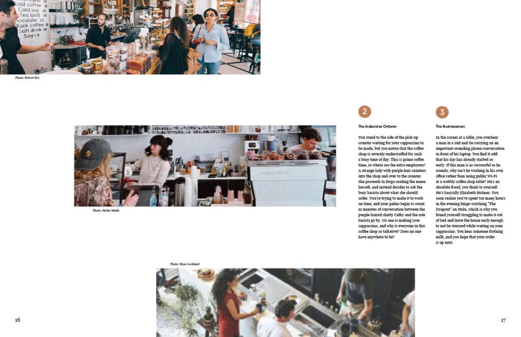
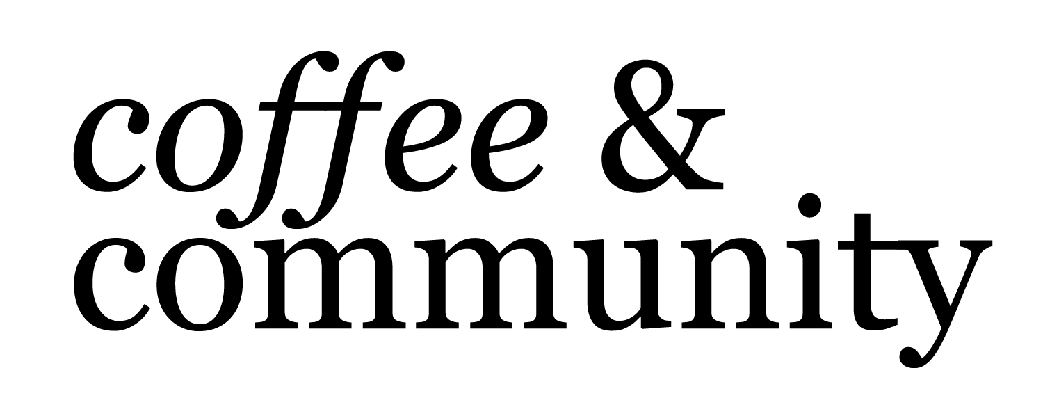
The design process was very tedious and went through multiple revisions. The masthead is where I spent a lot of my time. It went through many different fonts and variations, looking at different weight, italics, and size. Through this project I learned the importance of hierarchy in design layout.
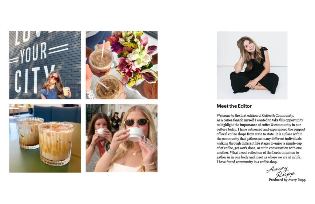
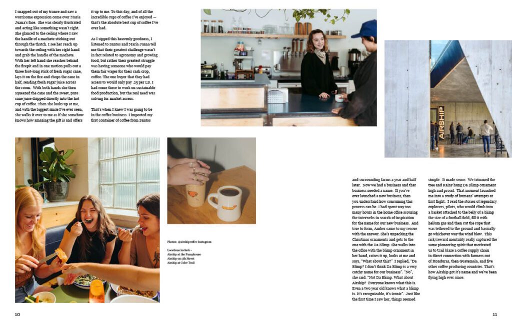
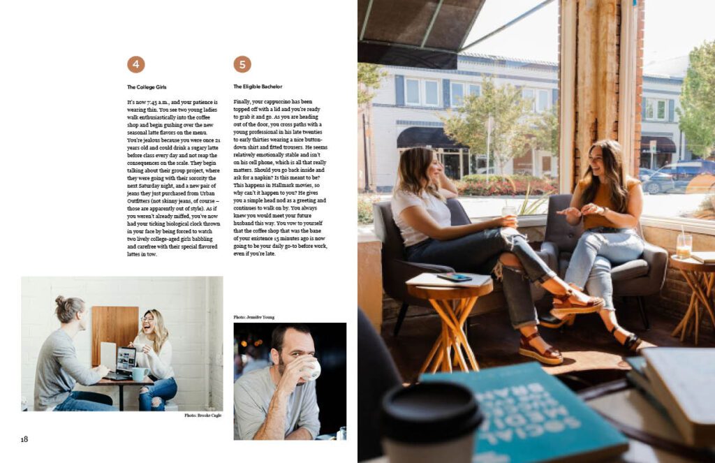
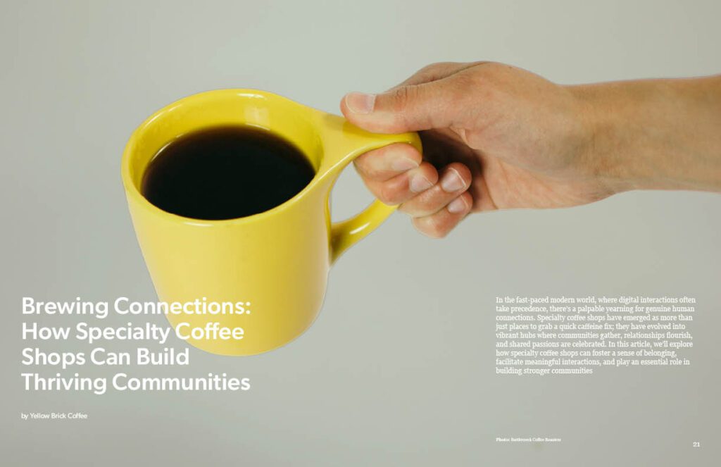
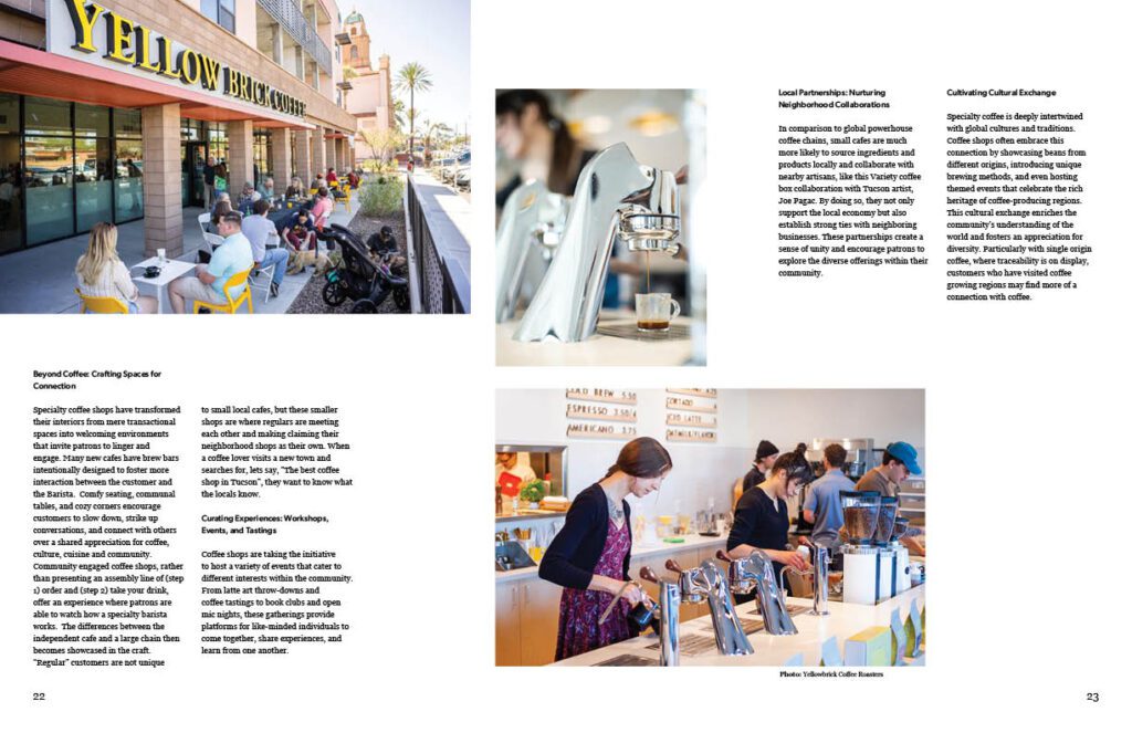
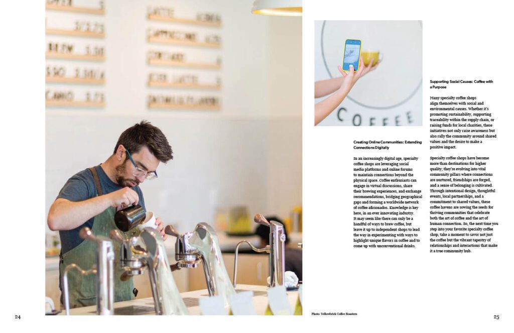
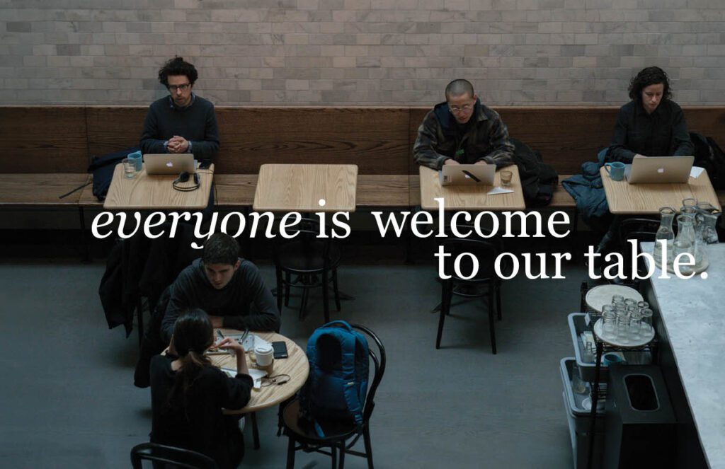
The overall identity of the magazine is to highlight local roasters, owners of coffee shops, and how they play a pivotal role in the community around them. The content of the magazine led to an engaging visual piece.

Leave a Reply