

Spoiler Alert is an app dedicated to managing groceries efficiently, communicating expiration dates of items, and how to best use them within the time frame. Ultimately, leading to less food waste and better organization in the kitchen.
Summary
My Role
This project was prompted to solve an everyday problem you face or witness that an app could help manage. We focused on three individual features within the app that will help with the problem we addressed.
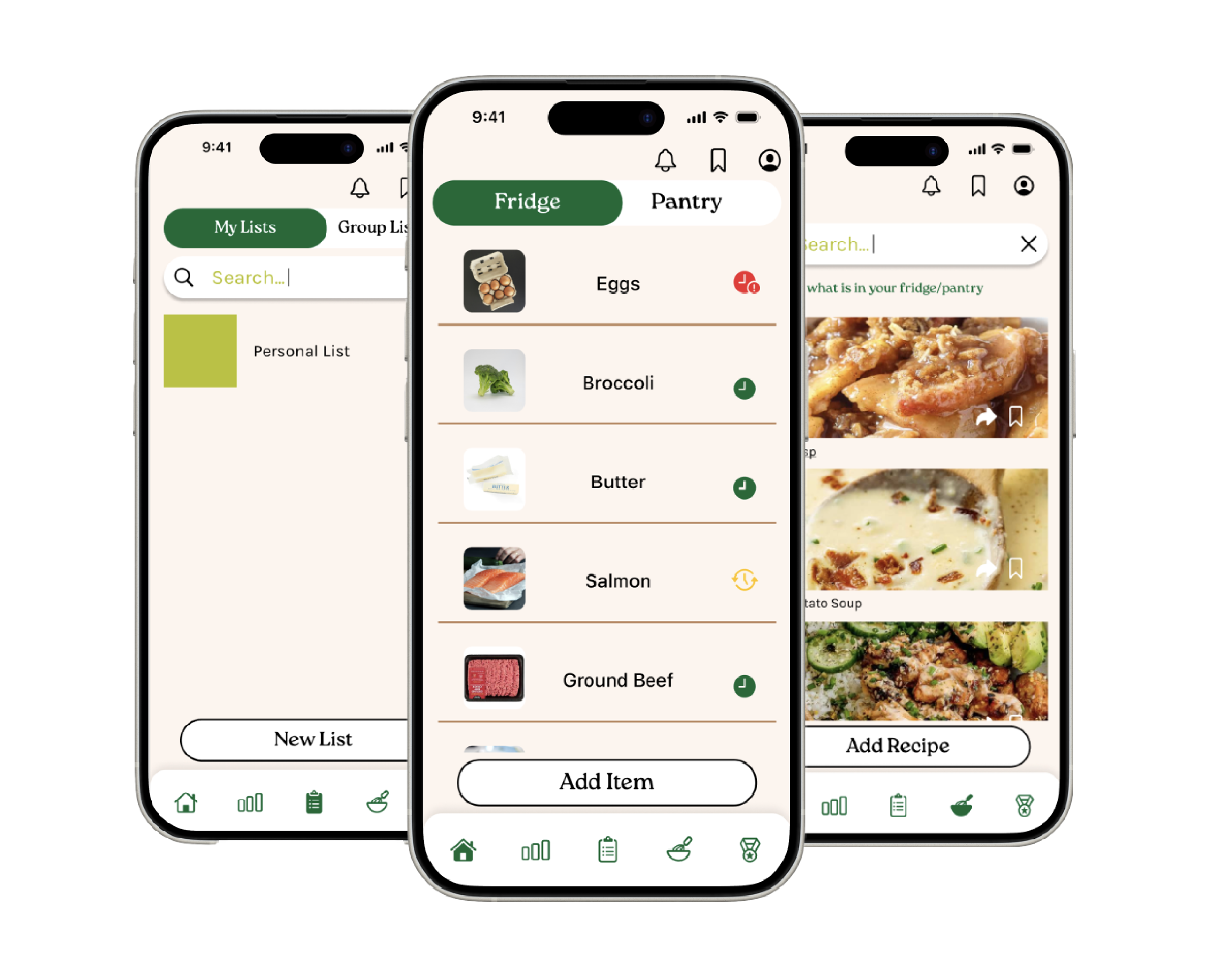
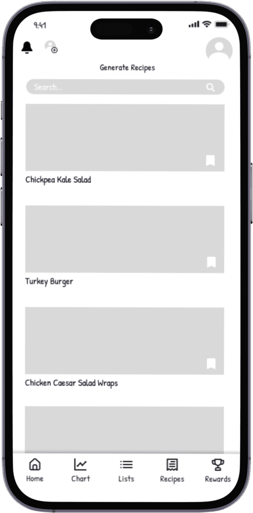
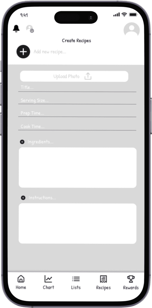
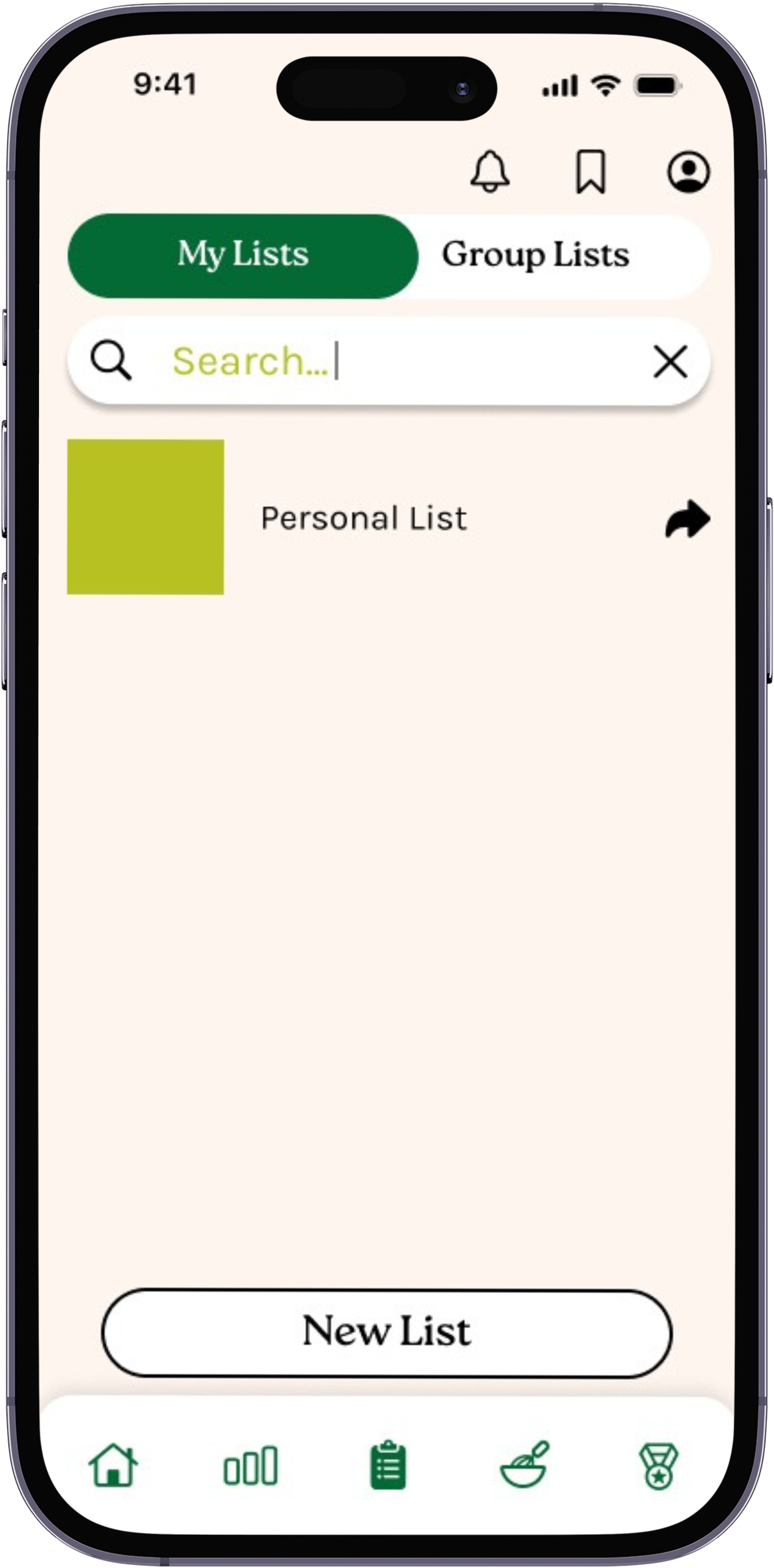
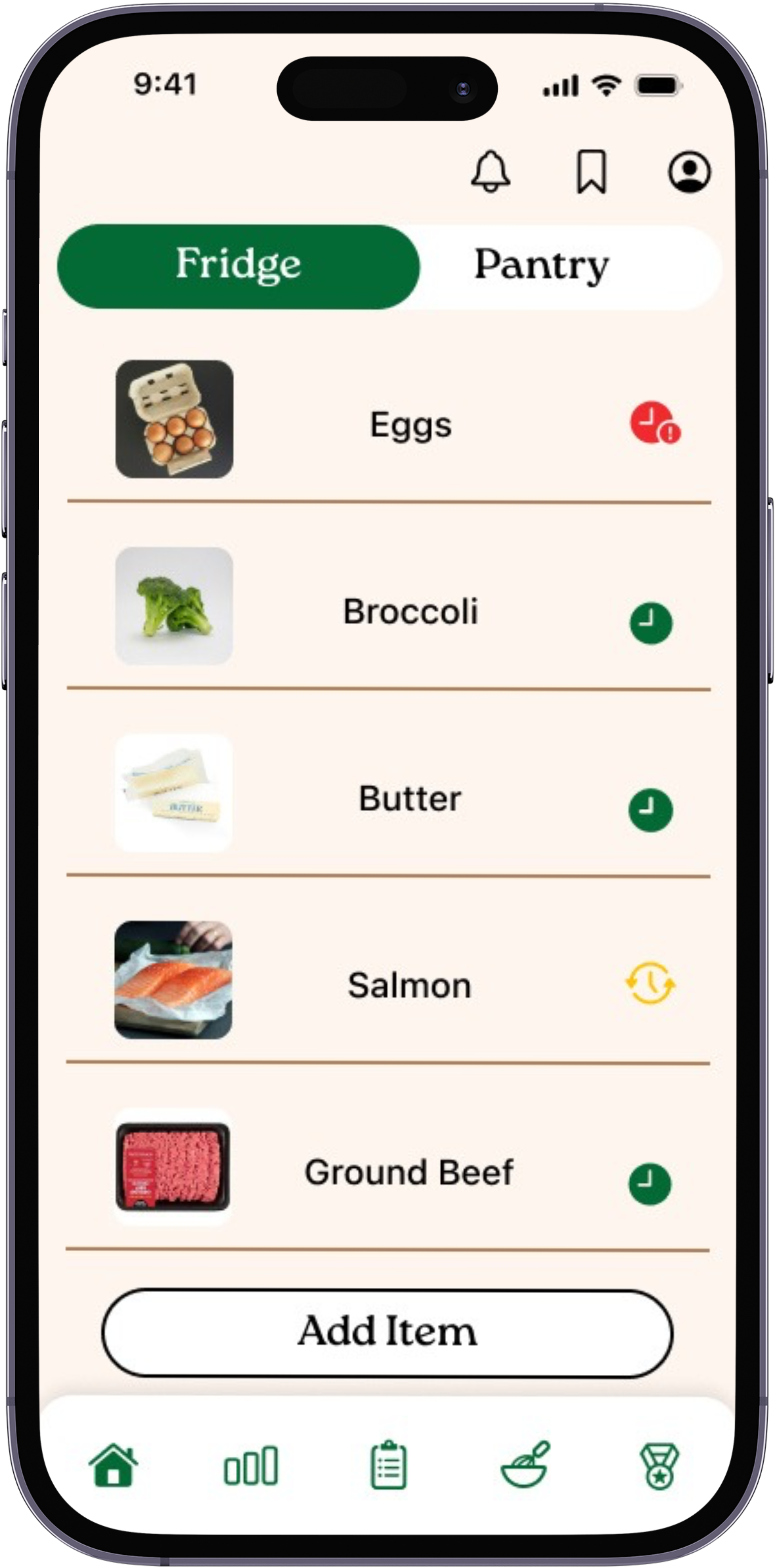
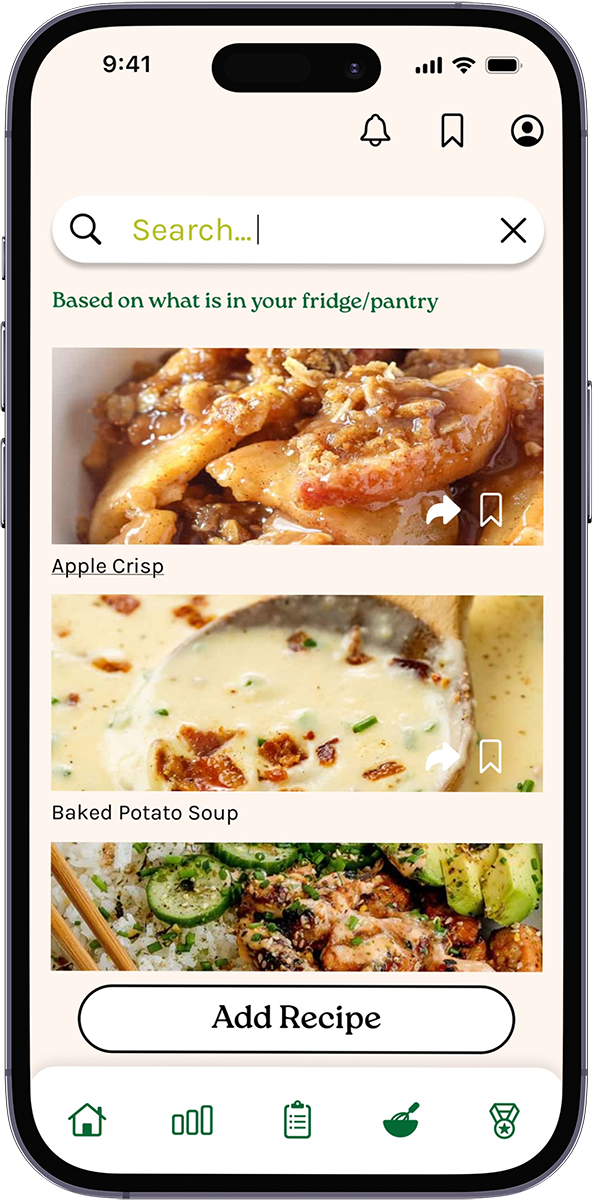
I contributed to all stages of the design process throughout the duration of the project. Overall, I had my hands on the prototyping of the 3 main feature pages including the Pantry/Fridge Inventory, Shopping List, and Generate Recipes. The ideas of each team member were able to come together and enhance the benefits of the app.
Problem Statement
It is so easy to forget when groceries expire and what foods you have in your pantry and fridge to better utilize and be less wasteful when deciding what meals to make. Expired foods not only take up space but build unwanted scents and bacteria that can affect the environment of your other food. No one wants spoiled milk sitting in the fridge. Meal prep and healthy eating living styles are prioritized but sometimes hard to keep up with.
Proposed Solution
We created a mobile app that addresses food waste and disorganized grocery tracking, by enabling users to track expiration dates with ease, share shopping lists among household members, receive proactive notifications for expiring items, search and find recipes that utilize what is currently in your fridge/pantry. Along with these features we included other helpful, efficient tools to enhance kitchen routines and management.
Design Thinking Process
Empathize
Competitive Analysis

Between the three different apps we defined strengths and weaknesses that we would consider in the further design and desire for our final app. One distinct weakness all three had that we wanted to focus heavily on for our app was a fun and engaging visual appeal.
Personal Interviews
Throughout the interview process we gathered some central themes that our interviewees shared and discussed with us to further the design of our app. These themes ultimately guided us to what features we wanted to focus on and build out.
It makes me sad because I know I spent money on it.”
Interviewee 3
“It’s hard to come up with recipes on my own,”
Interviewee 6
“I feel like it’s hard to stick to a budget because food is expensive
Interviewee 2
Empathy Mapping
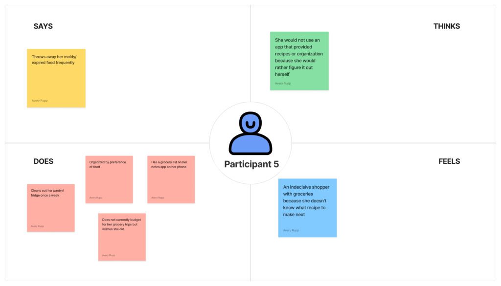
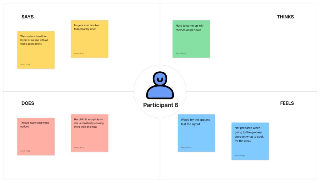
Empathy Mapping is used as a visual tool to better categorize and understand the responses from an interview. By mapping out the participants thoughts, sayings, actions, and feelings a designer can empathize more with the responses and use the information to benefit the rest of the research that follows with the user experience.
Define
Persona
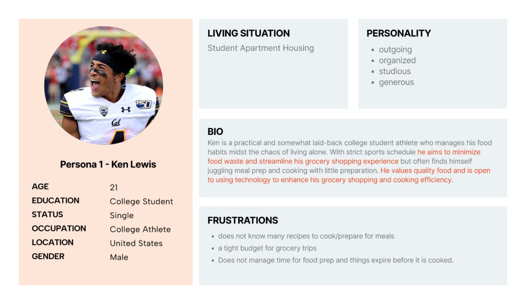
Each of my teammates and I created a persona based on our collective findings in the interviews. The personas help us understand our target audience and potential users of the app and the end-to-end experience.
As a college athlete Ken is frustrated with meal prep and how to grocery shop efficiently, using his food resourcefully amidst his chaotic schedule. Due to his frustrations we focused on this aspect by including real time expiration tracer icons and notifications.
User Journey Map
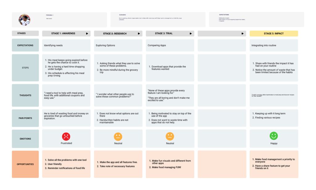
Based on the persona, we each created a User Journey Map that helped us better understand the process that a user may go through in order to find a solution to their everyday problem or frustration.
Ideate
Mood Board

Based off of our competitive analysis and our conducted interviews our mood board brought the visual appeal of the app we had envisioned.
Sketches
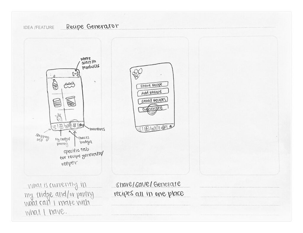
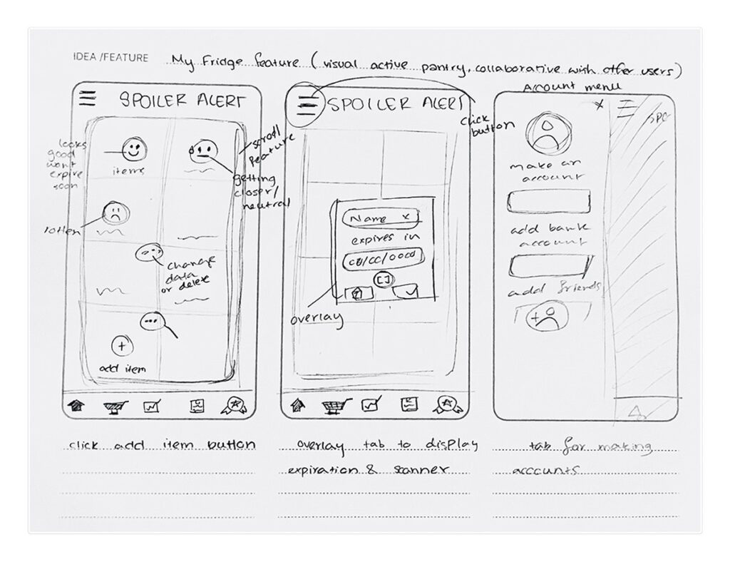
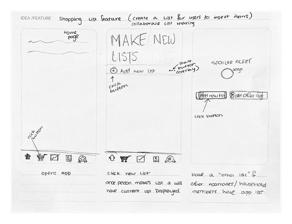
For each possible feature we provided sketches of how they might function in the app and provide visuals of layout and design. These sketches were helpful by helping us as a team communicate each of our ideas and the visual language they could have.
Prototype
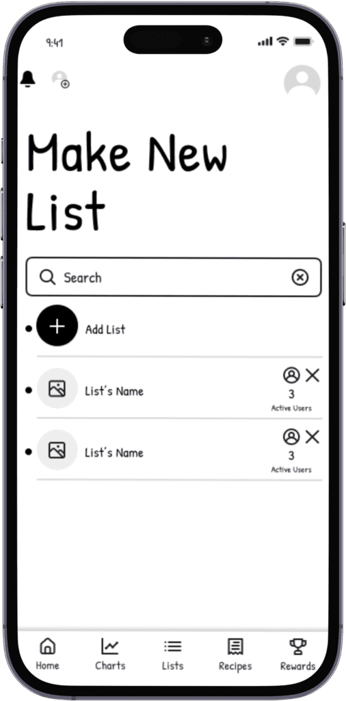
Lo-Fi Wireframes
Wireframing included a simple outline layout of the app to get a visual representation of how we might eventually prototype it. This processes helped develop a consistent visual language, compromise on possible features to include, and collaboration to put all or ideas together.
Cognitive Walkthrough
In the cognitive walkthrough of the wireframes, respondents ultimately agreed that the simple design was straight-forward and easy to understand. Navigating the user through each step of the features. Some of the feedback included more accessible exit strategies out of different pages and change in some of the icons to better represent different features. Allowing our respondents to walk through each page, test the usability flow of the designs helps ensure that the design is easy to navigate and meets user expectations.
Heuristic Evaluation
The Heuristic Evaluation included three peer reviews of our app up to the point we were at. Each individual left comments and suggestions on different issues or left compliments on other functions of the app. These were the following takeaways that my team and I took into consideration going into the final design of the app…
Heuristic 3: User Control & Freedom
– consistency and linking issues
– exit strategy is unclear
Heuristic 4: Consistency & Standards
– buttons need to be consistent
(shape, color, size)
– some icons had different functions
Heuristic 8: Aesthetic & Minimalist design
– quality aesthetic
– simplify wording/communication
Hi-Fi Prototype
Leave a Reply