Brand Identity
Choose a produce that fits in the 5 a day health message to brand a production.
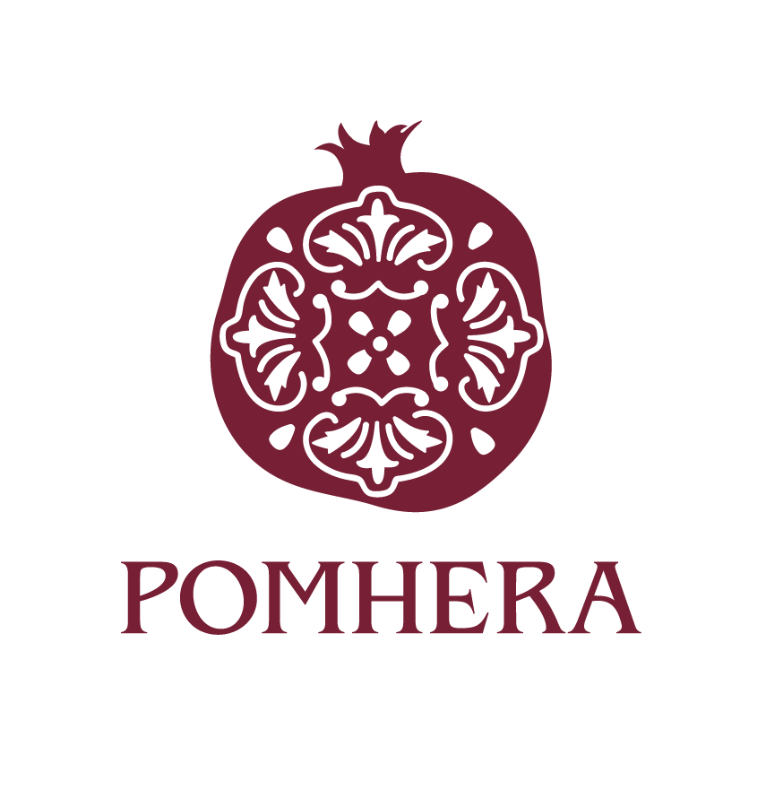
I chose a Pomegranate.
The unique color, shape and form of a Pomegranate offered a lot of creative freedom. After research, brand naming workshops, and multiple composition sketches I landed on the brand name, Pomhera.
Pomhera comes with Greek/Mediterranean roots. The Greek goddess Hera is commonly pictured holding a Pomegranate in her hand as a symbol of fertility and the cyclical nature of life. So with all this considered, the logo icon consists of a simple symbol of a pomegranate with a mediterranean tile inspired pattern inside.
The Pomhera icon went through several variations and iterations. Below are some of the sketches I went through during my design process.
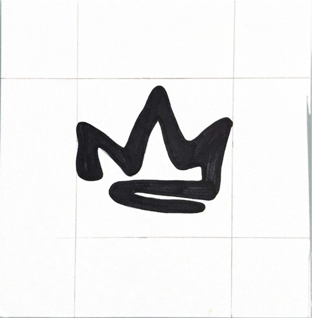
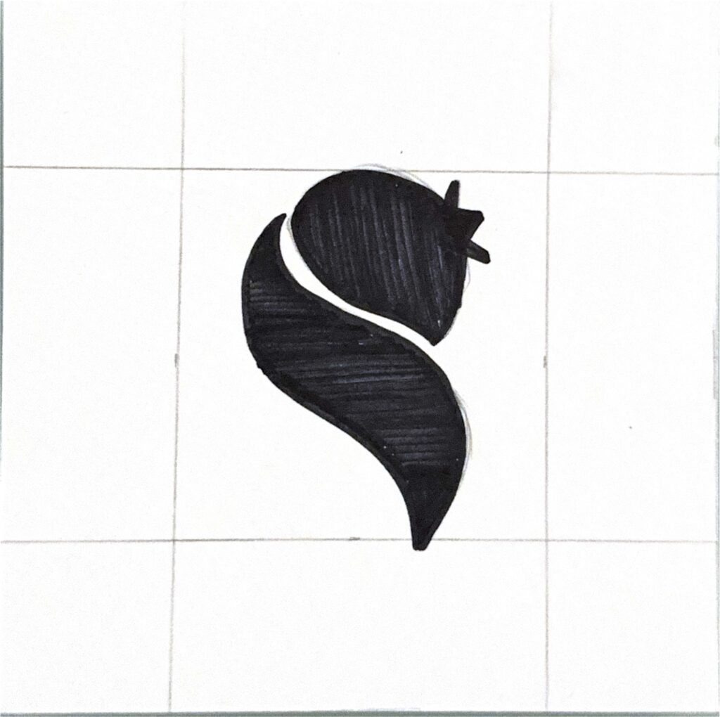

Following the sketch and ideation phase, I moved the icon I chose to Illustrator and began to explore the digital craft of the icon.
Vertical Lockup

Horizontal Lockup
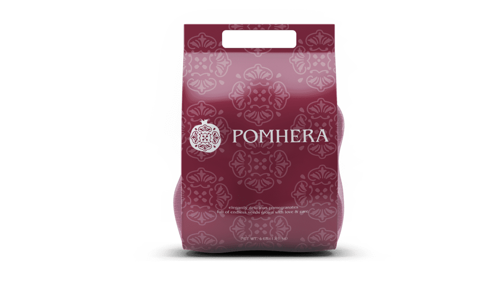
Aside from creating the brand we were tasked to consider product packaging, distribution, promotion.
Below are my mockups for the following


Leave a Reply