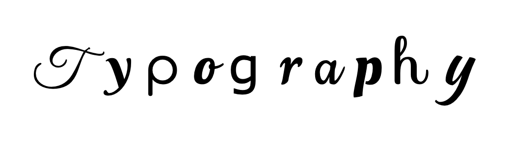
Typography is one of my favorite things about creating graphic designs. Finding that perfect font that you feel conveys your message perfectly and effortlessly is such a rewarding feeling. Typography helps words come more to life when the reader is looking at the advertisement. Understanding how bold and large typography can make a message seem intense and action must be taken while more dainty and script can help make words be more meaningful and heartwarming.
Finding the right typography for your brand can be hard, and that is why it is so wonderful. I suggest taking that time to look at every font that you find interesting and try to find one that you feel represents yourself the best. I went back and forth for days trying to figure out what I felt fit my personal brand perfectly. I wanted the message to be clear as to what my brand was, but I also wanted my personality to shine throughout. It takes time and you have to allow that time to take its course to feel happy with your decision. I highly suggest using Canva to play around with different fonts and finding your right type of style. It is a fun way to get creative with your ideas.

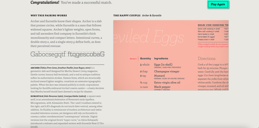
If you choose to use two or more different types of typography, it is important that you use fonts that pair together well. Using two different type of script fonts can be confusing and difficult to find the information that people are looking for. The game Type Connection is a fun way to play around with different fonts and seeing what matches well together if you are having a hard time finding two fonts that you like. Here was my perfect match!
Typography can help make or break an advertisement so always play around with different types and find what you feel fits best with your vibe and brand, then sit on it for a few days and make sure you still love it! Make sure YOU love it before you put it on every part of your brand/company.
Leave a Reply