After I finish this course, I plan to continue to use this blog in order to continue to see my growth over my time here at OU. I have one more year left and I have loved being able to go back to my old blog from freshman year to see how much I have grown in just two years.
I think this blog was a great way for me to speak my mind clearly about my own work and critique myself throughout the course. I do not feel that I will as active as I have been on this blog, but I will definitely come back every now and then for updates or to upload projects I have worked on and am proud of.
This blog helped me throughout the semester and I am glad I was able to stay so active on here, even when life got a little crazy. It was a great learning tool and I highly suggest people being active and actually putting in the work to make your blogs worth reading. It is all a part of the learning process.
I have never been a very good brainstormer in the moment. It always happens during random times of the day like when I am driving or doing the dishes. This will definitely be a blog that I come back to and will have to add to as we go, but that’s the wonderful part about having a blog.
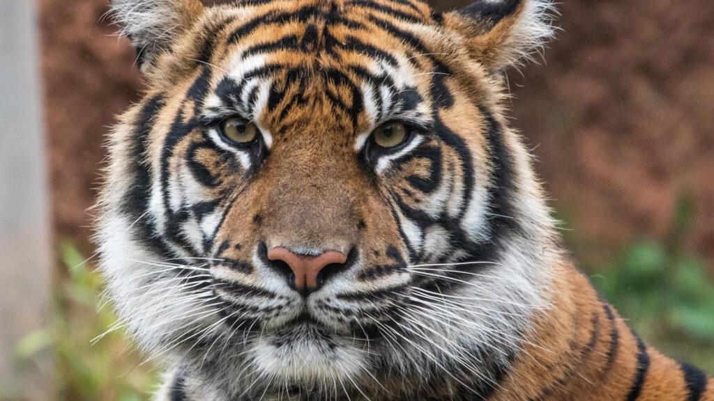
I will be using different types of designing platforms like Canva and InDesign to be brainstorming the different designs in my mind for the Oklahoma City Zoo. I want to focus on the animal aspect of the zoo and what the Oklahoma City Zoo stands for: conservation. I would love to incorporate any type of animal that has come to the OKC Zoo for rehabilitation. I think another great idea would be to have images of the babies that have been born in the Oklahoma City Zoo like the baby giraffes, elephants or the upcoming tiger that is expected during summer of 2022.
Lola, the Sumatran Tiger, will be giving birth sometime this summer
These images will allow for more of a connection with the animals and how these visitors are helping these animals rather than just walking around, staring at them all day. Some people may have heavy feelings about zoos, but it is important to do research to understand how much the Oklahoma City Zoo is helping out our wildlife.
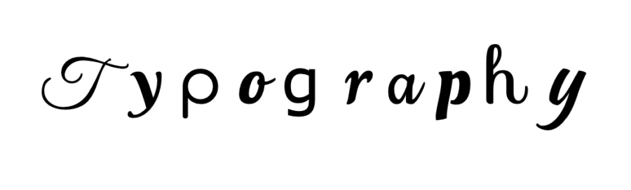
Typography is one of my favorite things about creating graphic designs. Finding that perfect font that you feel conveys your message perfectly and effortlessly is such a rewarding feeling. Typography helps words come more to life when the reader is looking at the advertisement. Understanding how bold and large typography can make a message seem intense and action must be taken while more dainty and script can help make words be more meaningful and heartwarming.
Finding the right typography for your brand can be hard, and that is why it is so wonderful. I suggest taking that time to look at every font that you find interesting and try to find one that you feel represents yourself the best. I went back and forth for days trying to figure out what I felt fit my personal brand perfectly. I wanted the message to be clear as to what my brand was, but I also wanted my personality to shine throughout. It takes time and you have to allow that time to take its course to feel happy with your decision. I highly suggest using Canva to play around with different fonts and finding your right type of style. It is a fun way to get creative with your ideas.
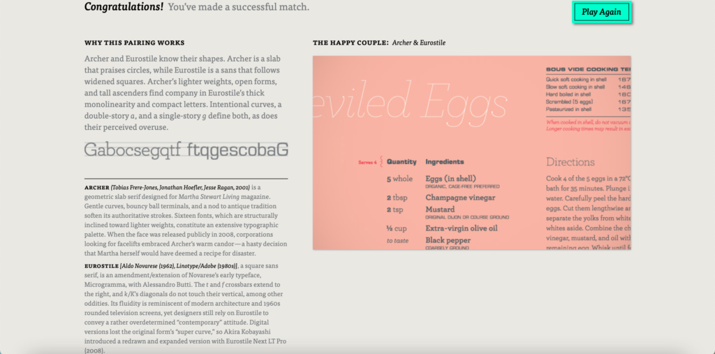
If you choose to use two or more different types of typography, it is important that you use fonts that pair together well. Using two different type of script fonts can be confusing and difficult to find the information that people are looking for. The game Type Connection is a fun way to play around with different fonts and seeing what matches well together if you are having a hard time finding two fonts that you like. Here was my perfect match!
Typography can help make or break an advertisement so always play around with different types and find what you feel fits best with your vibe and brand, then sit on it for a few days and make sure you still love it! Make sure YOU love it before you put it on every part of your brand/company.
During long road trips, what is your favorite thing to do? Personally, I love playing the alphabet game. I think the best way to get all of your letters is by looking at billboards along the road. Do those billboards ever catch your eye for a little longer than most?
Unfortunately, I was not able to go out to take pictures of different billboards around my town as I am sick in bed at the moment, but here are a couple of my favorite billboards that are so pleasing to the eye.
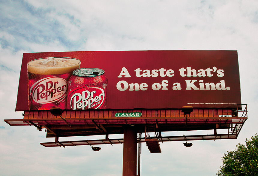
This Dr.Pepper billboard by Lamar is just absolutely stunning. The powerful reds that allow the white lettering to pop is such a pleasing contrast on this ad. I may be a bit biased as Dr.Pepper is my go to drink no matter what time of day, but the balance throughout the billboard is a wonderful example of a near perfect billboard ad. The message can be easily read as people are going down the road quickly trying to get to their destination. The different elements throughout this billboard help unify everything to become one big art piece.
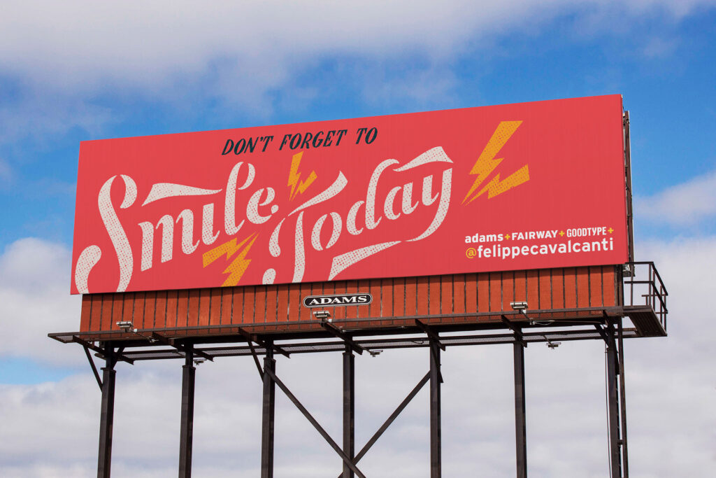
This billboard made by Luis F. Cavalcanti is made from pure kindness and trying to uplift people during dark times. We all know how difficult the last two years have been for everyone and while times are starting to become better, it will be a time that we will never forget. These types of billboards have become more common throughout the United States as people are just wanting to make others feel good. The gorgeous colors that compliment well, while also getting a clear and concise message across are working together in a great way. It can easily be read and the balance of space is used in an effective and efficient way. The rhythm between the lightning strikes throughout the billboard allow for a happy and energetic feeling.
As you will see in almost all of my post, I like to stay positive. I find that things are just as easily understood when you are looking at the positives more than the negatives. I love being able to see all of these different ads and finding my personal favorite parts of them rather than my least favorite.