In the world of public relations, first impressions are everything. The colors, fonts, images, and overall design of marketing materials can either captivate an audience or leave them scrolling/walking right past an advertisement. In this blog post, I will go through different design elements that can either make or break an ad.
Color & Typography
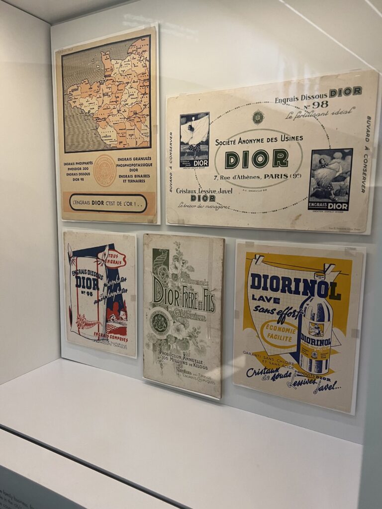
These Dior advertisements are a perfect example of using color and typography as eye-catching design elements. The bottom left and bottom right ads use contrasting colors to highlight the brand name, which will stay in the viewers mind for longer due to the brands use of these design elements. All of the ads use different fonts and different font sizes to make the message more readable and to make the text design appealing to the eye, which is a great use of typography. Overall, I think this brand did a good job at using these design elements to make their ads more interesting, appealing and successful.
Form/Function/Message
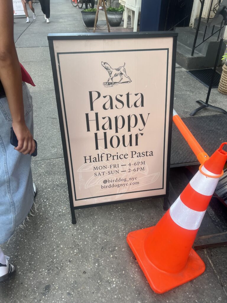
This sign uses a range of design elements to successfully convey their message and perform its intended function. The restaurant used a minimalist design, which I think was appropriate because it matched the vibe of the restaurant. The function of the sign was to get customers to come in for half price pasta. The restaurant used a catchy and fun name to share the message that they were serving half price pasta, they used “Pasta Happy Hour.” Using a catchy phrase is the perfect way to convey your message to viewers and achieve your intended function of the ad. The simple elements of the ad allow the form to look cohesive and appealing. The ad is composed of the same font throughout the whole sign, black and white coloring, and an image of a dog (the restaurant is called birddogs). Although the ad is very minimalistic, the brand still used many different design elements to achieve the restaurants’ goal.
Minimalism & use of space
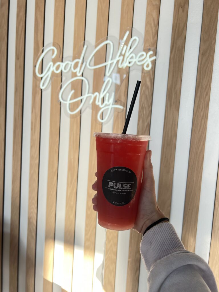
I work at a nutrition shop and I have always thought the company’s logo could benefit from some changes. I think the color combo of black and white is boring to the eye and adding a pop of color would be good to draw more attention to our store. Although I think the logo could use some improvements, I do think the use of space and minimalist style work well on the logo because the store name is big and in the center, which is good for advertising.
Unity
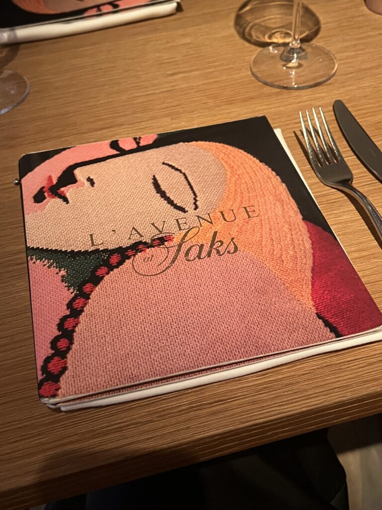
The cover of this restaurant menu is a great example of unity, which is a principle of design. There are many different pieces/shapes that come together to create the image of the woman, but you don’t notice the individual elements until after you appreciate the image as a whole. All of the different shapes and colors are cohesive but also contrasting to one another, which is how it shows unity.
Now that you know more about various design elements, you know how important they are. These seemingly small details hold incredible power in shaping brand perception and driving consumer engagement! You can learn more about different design elements and principles here.