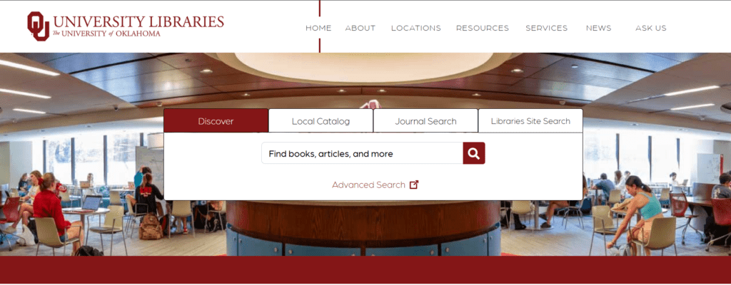
Homepage | OU Libraries This is the homepage. The objective of the homepage is to quickly find resources for students if they need it. The target audience is OU students. I think the design is pretty simple, but only on this page right here. If you were to type something into it, it takes you to a list of relevant things. Sure, there are filters, but I still have trouble finding full access reads sometimes.

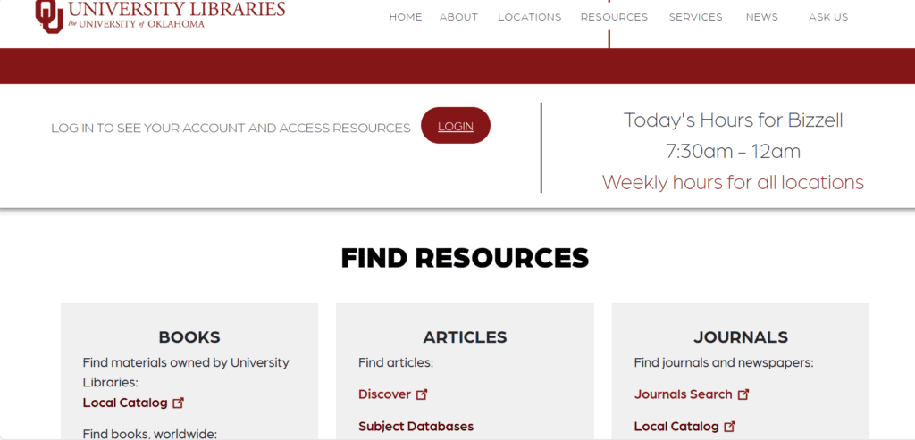
Resources | OU Libraries This is the resources page. It has access to more journals, peer reviews, books and journals. There is also subject database where you can find things by another algorithm that breaks items down into subcategories and classes. I like this layout because of its use of hyperlinks. It’s also practical and hard to miss. I cant find too much wrong with the layout for this particular section.

Locations | OU Libraries This is a directory for a lot of different things. From Labs to weather centers to university archives. Underneath the location/space tabs are a ton of hyperlinks that will point you in the general direction of where you want to be. This one is also simple–it’s just a bunch of hyperlinks. One thing I don’t like about this layout is that it is a lot of information. I think it do with being more compact.

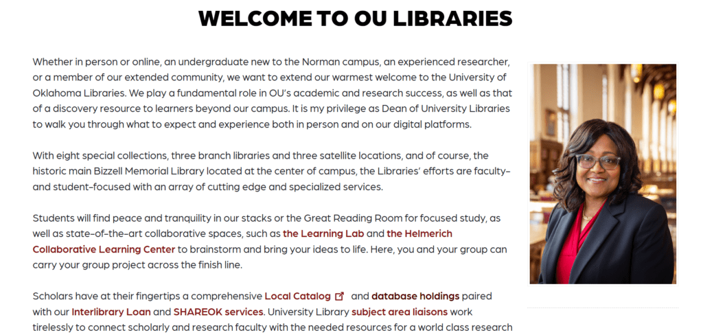
Welcome to OU Libraries | OU Libraries This is the about us page (cut off the top for blog purposes. It’s different in that it includes hyperlinks in the actual body of text. You don’t have to scroll down to the bottom of the page to find what you’re looking for, just click it at your earliest convenience when reading through it. If there is one thing I can say about this section is that it just goes on and on. I think it can be more concise. Maybe some smaller font or compacting the priorities section, meaning instead of writing all of the priorities of the online library out, create a link to the entire section titled: “Our Priorities.”
