Course Blog

Author: Hallie Hunt Page 1 of 2

What is PR Design?

As the semester comes to an end, I am reflecting how much PR Design has helped me grow and learn the ins and outs of designing for print and digital.

In my opinion, PR Design is one of the most important courses to take as a PR major because it prepares you for real-world designing on a professional level. Understanding and actually using Adobe is a project in itself, and this class taught me so much about how to use it effectively for a variety of projects.

A few hacks I learned when creating PR publications were the quick keyboard shortcuts in Adobe Indesign and Photoshop like [Command Z] to undo, [Command C] to copy, and [Command V] to paste. There were many other shortcuts I learned along with these simple ones that were helpful with quick design projects.

One of the most important elements of design is knowing your target audience and being able to identify what will resonate with them the best. I believe knowing your audience helps your design come to life and successfully reach the right people.

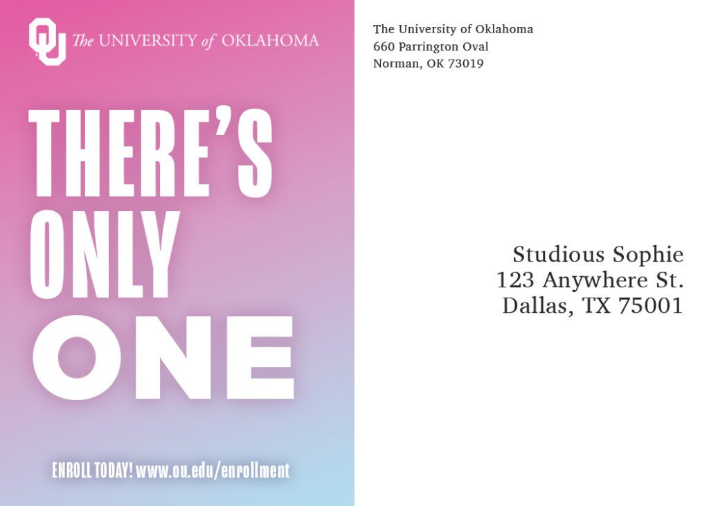
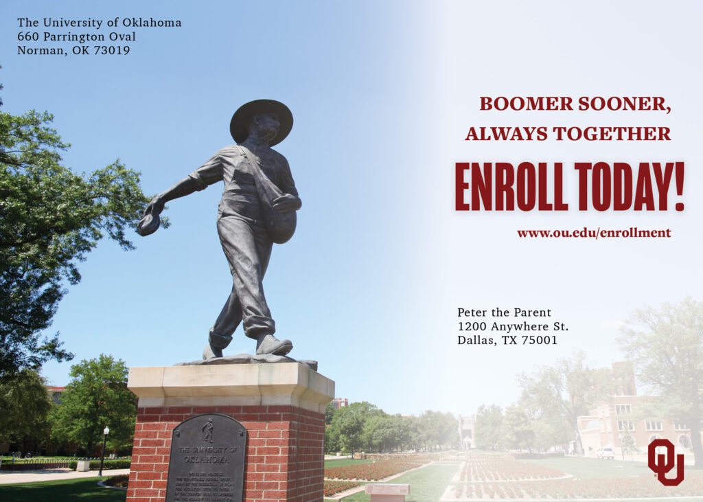
Our final project (and one of my favorites) was creating a Newsletter. In this project we were required to select an organization of interest to us and write a 6 page newsletter about it, with a specific target audience in mind. Using 10 articles from the OU Women’s Gymnastics Newsroom, I created a creative newsletter aimed towards perspective students admitted to OU.

My goal for this newsletter was to effectively show perspective students the legacy OU Women’s Gymnastics is making and inspire them to want to come to OU and attend the meets.

Here is what I came up with:

Digital Design & The Importance of Knowing Your Stakeholders

Designing for digital isn’t just about making things look sharp, it’s about understanding exactly who you’re trying to reach and what they need to see, feel, and do.

Throughout my experience crafting campaigns for OU Admissions and Recruitment in my PR Design class, I learned how important it is to address both the excitement of future students and the questions (and concerns) of their parents.

Stakeholders: More than One Audience

For my social media posts, I focused on engaging prospective female students with vibrant visuals and quick facts about student life.

For parents of perspective students, my email campaigns highlighted academics, safety, and practical info, making it easy to find answers and contact OU Admissions.

Email: Perspective Student’s Parent

On the other hand, for the perspective female student, I created an eye-catching, colorful email that included information about campus community and used the idea “Your future starts here”.

Email: Perspective Student

My presentation template needed to work for both groups, so I combined eye-catching photos with organized, clear information:

Digital Design Template

How My Designs Evolved

Each project started as a pretty basic draft. After getting feedback from my professor and classmates and reviewing what resonated with my audiences, I updated designs to be more visual, easier to skim, and mobile-friendly. The biggest changes always came from real feedback and testing on different devices.

Tips for Digital Design

  • Know your audience: Stakeholder needs to drive your design.
  • Get feedback: It makes your work better every time.
  • Be creative: Think outside the box and make eye-catching designs.
  • Use the right tools: Adobe Photoshop and Canva are the best tool for creating the perfect design.

Overall, effective digital designs are clear, visual, and audience-focused. Keep refinging your work and always design with your stakeholders in mind,

Designing with Purpose: What Photoshop Taught Me About Creativity and Stakeholders

Recently, I had the opportunity to design Direct Mail/Handouts that reflected OU’s brand and aimed to recruit specific stakeholders, such as incoming Freshman and parents.

In this assignment, we used Adobe Photoshop to create the perfect OU Handout. I enjoyed my experience using Photoshop, I think it has so many great features, allowing you to create with endless possibilities.

Our first focus on this assignment was to research our target audience and locate our stakeholders. I had two stakeholders in mind:

  1. A senior in high school, considering OU for college
  2. A concerned parent, wanting to ensure their child is going to a university that has high education, community, and opportunities.

Understanding who I was designing for helped me shape not just the look of the handout, but also the message behind it.

My Handouts

For my first handout, I focused on a high school senior. I included fun colors, different from your typical OU handout, to catch her attention. I wanted to show that OU is anything but boring. I leaned into the university’s beautiful campus to give the student a glimpse of what her future could look like in college.

Side 1:

Side 2:

For my other handout, I considered my second stakeholder, the parent. In this handout I wanted parents to see the community aspect of OU and reminisce on that “game-day feeling” that large universities, like OU, are proud of. The design is clean and professional but still welcoming.

Side 1:

Side 2:

From Draft to Final: Evolving my Designs

My first drafts were just rough ideas, but with feedback from my professor and peers, my layouts, fonts, and overall structure improved. I think the little things are what changed the most. For example, slightly editing my shadows/lighting on text made a huge difference. Photoshop made those edits edits quick and easy, helping me refine my design until it clicked.

Quick Photoshop Tips

  • Plan first. Know your audience and message.
  • Name your layers. It saves time.
  • Try new things. Don’t be afraid to play.
  • Get feedback. It makes a huge difference.
  • Be confident. Designing is all about believing in yourself.

Photoshop helped me create with intention, adjust with purpose, and communicate ideas clearly. Once you get the hang of it, it’s a total game-changer.

Understanding and Targeting Stakeholders in OU Recruitment

OU Image

When it comes to recruiting students for the University of Oklahoma, understanding who we are trying to reach is key to developing an effective communication strategy. While the broad category of “prospective students” is an obvious target, we must dig deeper to define specific stakeholders and their unique characteristics. For this project, we have identified two primary stakeholders:

1. High-achieving Prospective Students (Ages 17-18)

These students have qualifying ACT/SAT scores, are high academic performers, and are considering multiple universities. Many are National Merit Scholars or have access to competitive scholarship opportunities. They actively seek institutions with strong academic programs, campus involvement opportunities, and financial support.

Example of a primary stakeholder for OU Recruitment Services

2. Parents of perspective students (Ages 40-55)

Parents play a crucial role in their child’s college decision-making process. They are focused on affordability, academic reputation, career outcomes, and campus safety. They are likely to engage with recruitment materials through university websites, financial aid pages, and campus visit events.

Example of a secondary stakeholder for OU Recruitment Services

Why Targeted Stakeholders Matter

Recruitment marketing is not a one-size -fits-all approach. Each stakeholder group has different motivations, concerns, and information needs. By defining targeted audiences, OU can craft messages that resonate more effectively and drive meaningful engagement. For Example

  • For High-achieving prospective students, messaging should highlight academic prestige, scholarships, and student life. Social media campaigns, digital tours and student success stories can showcase opportunities available at OU.
  • For parents, communication should focus on financial aid options, career development programs, and campus safety. Providing clear and concise resources on tuition assistance and graduate success rates can reassure them of OU’s value.

Shaping the Message for Stakeholders

Each stakeholder requires tailored messaging to guide them through the recruitment journey. An effective message for prospective students might be “Join a university that values your academic excellence. With competitive scholarships and world-class faculty, OU is the perfect place to launch your future.”

On the other hand, a message for parents could be, “Your child’s success starts at OU. With strong academic program, career support, and financial aid opportunities, we ensure their future is bright.”

By narrowing our focus and addressing stakeholders with relevant, targeted messaging, OU Recruitment Services can build stronger relationships with prospective students and their families, ultimately leading to higher enrollment rates and a more engaged campus community.

A Guide to Designing a Professional Stationary Package

If you’re new to design, creating a business stationary package might feel overwhelming, but don’t worry! With a few simple guidelines, you can make your designs look professional and polished.

1. Keep it Clean

Avoid clutter and stick to a simple, well-balanced layout that still accurately represents your personal brand and aesthetic.

2. Use Brand Colors

Choose 2-3 consistent colors that match your brand.

3. Pick Easy-to-Read Fonts

Limit yourself to two fonts and ensure they’re clear and professional.

4. Design with Purpose

Whether it’s your business card, letterhead, or envelope, each piece of stationary serves a different role, so design accordingly

Business Cards

These introduce you and your brand, so keep them simple but memorable. Include your name, job title, contact information, and a logo with a clean layout.

Here is an example of the business card I created in my PR Design class.

Envelopes

First impressions matter! Keep the return address readable and place the logo subtly so it doesn’t overpower the design.

Letterheads

Used for official documents, letterheads should look professional. The logo and contact details should be neatly placed at the top, leaving plenty of space for the actual content.

As I work on design projects, I have learned that less is more. Focus on simplicity, alignment, and readability and your designs will look polished and professional!

My Logo Analysis

In PR Design at Gaylord College I have the opportunity to create a logo that represents my personal brand. This is the logo I designed:

My Mission

As a Public Relations student at the University of Oklahoma, my mission is to create compelling digital media campaigns using strategic communication, creative storytelling, and data-driven insights. Through my experience in PR, digital marketing and media relations, I aim to help brands build meaningful connections with their audiences while maintaining a strong, authentic presence across platforms.

My Competitive Landscape

In the evolving filed of public relations and digital marketing, competition comes from other aspiring PR professionals, digital strategists, and content creators. What sets me apart is my extensive experience working with clients and a deep understanding of how to create lasting relationships. Through my experience in Lindsey + Asp and as a retail associate at a local boutique, I am confident in my ability to create results-driven campaigns catered to clients needs.

My Attitudes and Core Values

I bring a positive attitude, a keen eye for detail, and an energetic, hard-working mindset to every project, ensuring that my work is both strategic and impactful. My core values include authenticity, innovation, collaboration and strategic thinking. By staying committed to these values, I strive to become a dynamic, forward-thinking PR professional who drives meaningful brand engagement and communication success.

What Makes a Powerful PR Campaign?

Throughout my classes in Gaylord, I have learned the power of effective campaigns and how to strategically create them to be appealing to their target audience. In PR Design at Gaylord College we were assigned a Typesetting assignment created on Adobe InDesign to gain experience in crafting successful PR publications.

Publication Image

Two powerful programs that can be used to make effective PR campaigns are Adobe InDesign and Canva.

1. Adobe InDesign

Adobe InDesign is a desktop publishing application that allows users to create and publish content for print or digital media. This program highlights the importance of detail and kerning to ensure the media project is appealing and eye-catching. Through our typesetting assignment I learned how to include the essentials in a print or digital publication such as the headlines, subheads, photo cutline, nameplate, etc.

2. Canva

On the other hand, Canva offers free online access to graphic design tools, allowing users to create visual content for a variety of purposes. A feature I appreciate is the free online templates that provide examples of designs that you can recreate to fit your designing goals. For example, Canva provides a newsletter mock up that you can edit to make it your own by filling in the textboxes and designs to cater to your target audience.

Both of these programs make successful PR publications and PR practitioners should learn about these programs because they offer user-friendly interface and free online tutorials to get started. They also ensure that your design is sleek and visually appealing to create successful and engaging publications.

So What Makes a Good Design?

A good design incorporates clarity, consistency, visual hierarchy, and engaging elements. When fonts are easy to read and eye-catching, the reader is hooked and eager to learn more. Kerning and leading ensures that the spacing of letters and lines is consistent and visually satisfying. When important words are bolded or highlighted, the reader can see what information is the most important. Finally, images and pull quotes are engaging and keep the reader’s attention, making the publication a good and intriguing design.

Reflection

Reflecting on our recent assignment, I enjoyed the freedom to design the page how we wanted to, while also following guidelines that pulled the entire digital newsletter together. I also enjoyed seeing the project come together cohesively at the end and being proud of my work.

InDesign’s layout can sometimes be confusing, so it took me some time at first to get the hang of it. Paying attention to detail and following instructions is incredibly important in projects like this and I am excited to create more throughout this semester!

Typography: Why is It So Important?

Typography is more than just selecting a font–it’s the art and technique of arranging type to make written language legible, readable, and visually appealing. It plays a crucial role in design, influencing how messages are perceived and understood. Whether it’s a brand name, a digital sign, or a logo, typography shapes user experience in ways that often go unnoticed.

Typography Photo

Fun Typography Games to Sharpen Your Skills

Typography isn’t just a theoretical concept-it’s also a skill that can be honed through practice. Luckily, there are interactive and fun ways to improve your understanding of fonts and spacing. Two fun and engaging typography games include Type War and Kern Type.

1. Type War

Type War is a simple yet addictive game that challenges your ability to identify fonts. The game presents a letter in a specific typeface, and your task is to determine which font it belongs to. I found this game quite challenging at first, but once I developed an eye for font characteristics I understood it better. Over time, this game can create valuable skills for any designer or typographer so they can memorize fonts and use them more effectively.

Type War Photo

2. Kern Type

Kerning is the adjustment of space between individual letters, which can make or break the readability of text. In Kern Type, your mission is to adjust the spacing of letters in a word to create a balanced and aesthetically pleasing arrangement. Once you submit your adjustments, the game compares your result with that of a professional typographer and gives you a score.

At first, I thought this game would be simple, but I quickly learned that it takes lots of practice and memorization to space the letters correctly. I didn’t realize the effect kerning can have on the impact and aesthetic of words.

Kern Type

Final Thoughts

Typography is a powerful tool in design, influencing how people interact with content and brands. Through fun and educational games like Type War and Kern Type, I can sharpen my typography skills and develop a more refined eye for typefaces and spacing.

Want to test your typography knowledge? Try these games and see how well you can distinguish typefaces and perfect kerning!

Type War Kern Type

Why Kappa Kappa Gamma?

Joining Greek Life has always been a dream of mine and as soon as I decided to go to the University of Oklahoma I signed up for Rush, not knowing how much it was going to impact me and introduce me to lifelong friends.

BID DAY

Bid day was in the Fall of 2022 right before classes started at OU. It was a stressful day but also relaxing, knowing that rush was over and now it all came down to the bid card that would be delivered to my dorm. When we got the knock on our door that the bids had arrived, my roommates and I ripped our cards open and all of them said “Kappa Kappa Gamma”!

We ran to the Kappa lawn that was crowded with current Kappa members, parents, fraternity boys and more. I ran to Kappas arms that had rushed me throughout the week, happy with my decision to go Kappa and knowing that this was going to be the best four years.

Living in the House

Living in the Kappa house has been such a cool experience. I have grown deeper connections and relationships with the girls in my pledge class. Something I love so much about the girls in Kappa is that everyone is very genuine and inviting. I have one roommate that I share a room with and it has been so fun experiencing living in the same room as someone. We share clothes, get ready together, and our friendship has grown stronger from it. I will miss living in the house but am excited for the next two years to come as a member of Kappa in college.

Kappa House

Date Parties

Kappa date parties feel like a holiday. The entire day is planned out for them and they can start as early as 3p.m to begin getting ready and taking pictures. Then every member and their dates check-in and take a bus to a venue that the chapter has rented out for us that usually has to do with the theme of the party. Kappa Date parties have been so much fun so far and have been a great way to get to know girls in my sorority better.

There are many other reasons as to why I chose to go Kappa but these are just a few of my favorite reasons. Kappa truly brings you to your best friends, whether you knew them before going to college or they were thousands of miles away. I am so glad I joined Kappa and I cannot wait for more memories to come!

JMC 1013 Takeaway

I have learned many things this semester in Intro to Media and am leaving this class feeling very educated and prepared to advance to the next Gaylord class required for my major.

Due to the readings assigned in our class, I am familiar with various media laws that I was not aware of before. In this blog I am going to explain my understanding of the two tests of press freedom.

Gaylord

According to our assigned readings and our slides in class, lectured by Professor Lalli, the two tests are:

  1. “The ability to go unpunished after venting severe criticism of those holding political power” (TopHat)
  2. “Can government officials check over what you have written and deny you the right to publish it?” (TopHat)

These two tests are extremely important and are vital steps that go into publishing media. I am glad I understand this concept now and am thankful to have learned many new things in this class.

Page 1 of 2

Powered by WordPress & Theme by Anders Norén