As we progress to a digital society, the importance of stationery and staples such as letterheads, business cards and envelopes still (and will for the foreseeable future) exist. For my client, I decided to challenge myself and use Vogue as my canvas. While the brand is known for extravagant magazine covers that use maximalist guidelines, the actual brand employs a minimalist aesthetic for their website, and other channels of communication.
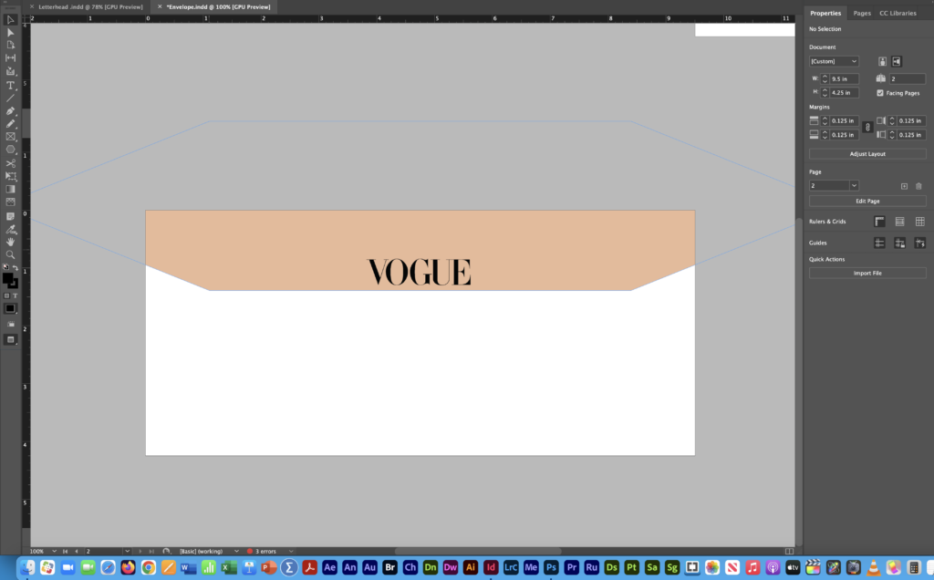
For my stationery package, I wanted to use a trifecta for color: black, white and an unexpected color. For my unexpected color, I wanted something that brings balance to my stationery and also makes sense for the brand. The third color selection for me was Vogue and Pantone’s color of the year, Pantone 13-1020. In all of my stationery minus the envelope, I decided to use the peach fuzz shade as an accent color to take away from the stark black and white color palette Vogue normally employs.
Font selection was another area for my brand that was almost untouchable. Vogue has used Didot the font for the brand’s lifespan, and it’s how many people recognize the brand. When creating my business card, I used a sans-serif font on the back to include all my contact information so people would want to look at it and read it. For my letterhead, I used Times New Roman font in the body of the message. For whom the letter was addressed to, I used a bold serif font to make it one of the first things a reader sees.
Balance was another huge aspect for my brand. While they take a maximalist approach for their magazine, everything is still balanced. For my business card, I used a thin line of Pantone 13-1020 underneath a huge VOGUE logo to add some contrast but balance to the card. I used the same approach for my letterhead and I liked how it turned out.
I didn’t use any images other than the logos for Vogue and the social media I wanted to include, which elevated the presence of the brand in my opinion. I think clean lines and minimal colors from black and white worked in my brand’s favor that gave me a product that I was happy with.
Being challenged to bring a new aspect of color and design to such an established brand helped me appreciate aspects of design that I never took into consideration before my stationery package. Using theories and practices of balance, color and harmony helped me create a product for my brand that I’d be comfortable with using as a professional.
My stationery package is below and goes in the order of: letterhead, business card (front and back) and envelope (front and back).