Typography can be defined as the arrangement of printed data. This often focuses on the arrangement of numerals and letters on a page. As a public relations practitioner, it is vital to understand the ins and outs of typography to create visually stunning designs. Typography can make or break a design, and we must learn how to utilize it. Below I’ve linked some informational games to help strengthen your typography skills.
Embracing the Negative: Kern Type
One of the most interesting typography games is Kern Type, a game where you arrange the letters on the page to evenly distribute negative space between letters. Both visually pleasing and challenging, this game encourages users to dive into their creative side and imagine perfectly spaced designs.
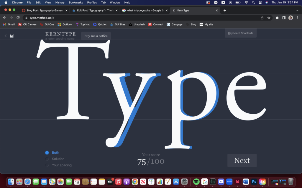
Kern Type is definitely a useful tool to utilize when learning about equally distributing negative space, but there are some more great resources to sharpen up on your typography skills.
Combating Differences in Type War
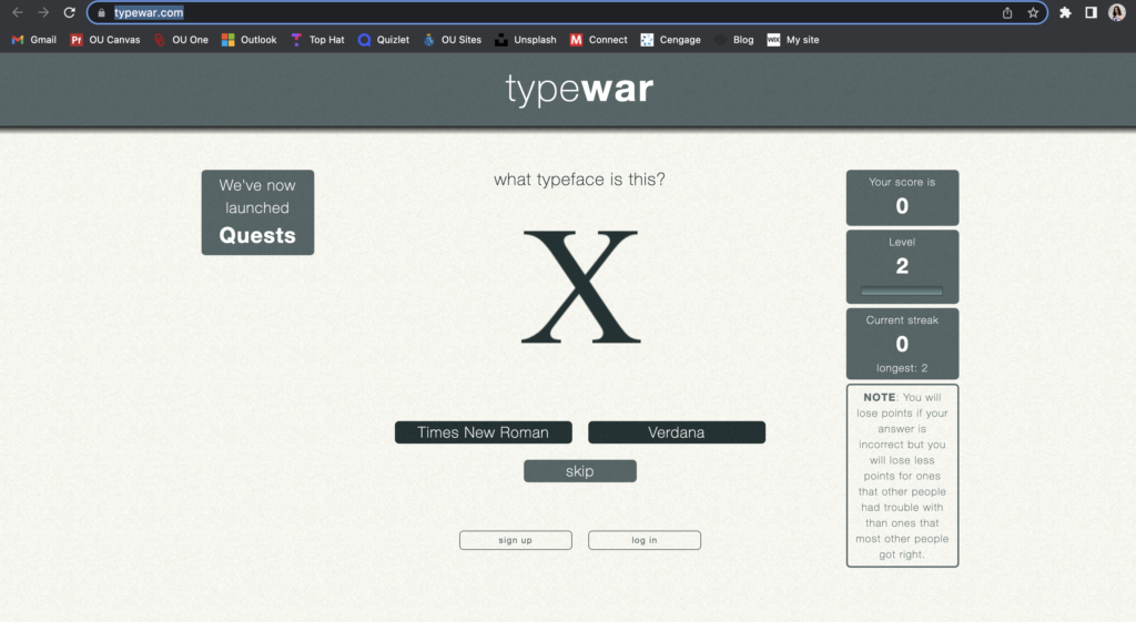
One of the more challenging games for those hoping to improve their knowledge of typography is Type War, where users are shown a singular letter with two different choices of what the font may be. The users then must decide which font corresponds to the letter in front of them. This game is tricky because most of the fonts have similar characteristics, so just as you feel like you are picking up a streak, you must start over again.
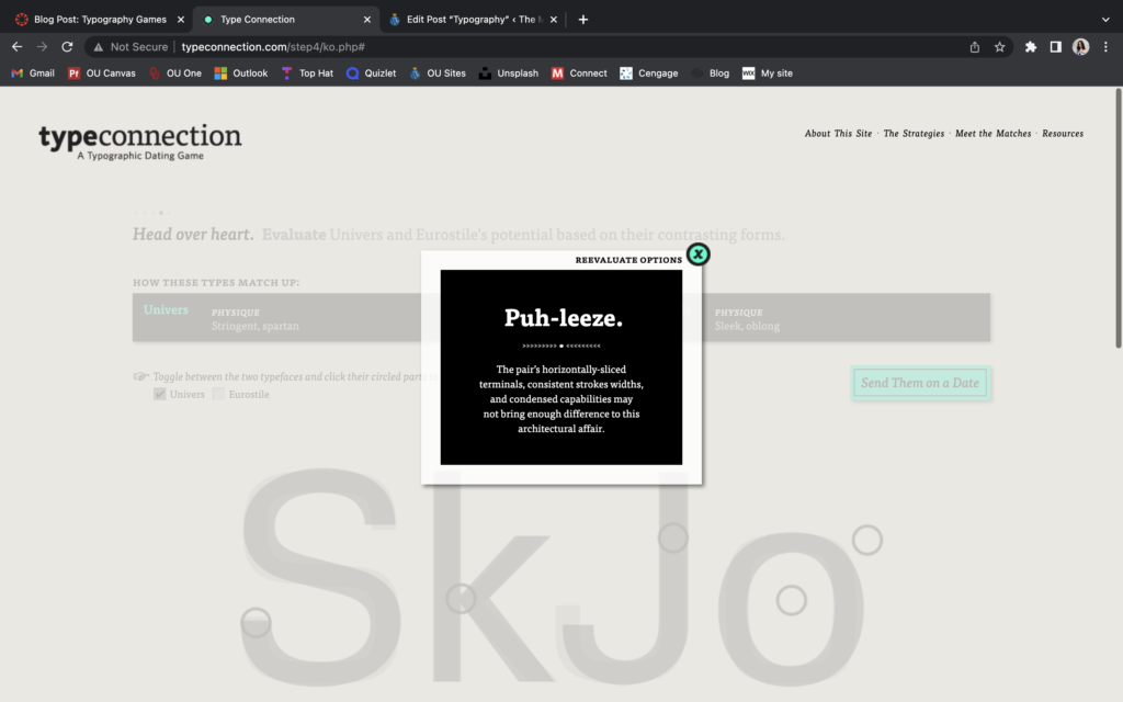
A Match Made in Heaven: Type Connection
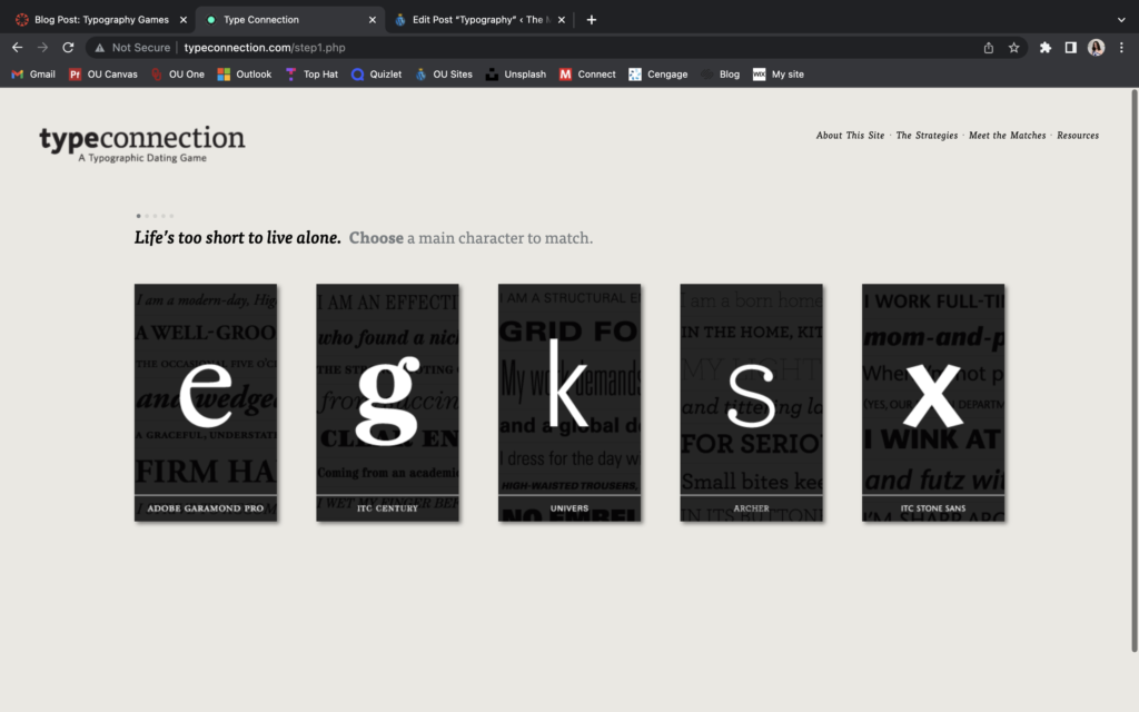
If you are looking for a less challenging game that helps to distinguish the “compatibility” between two fonts, look no further than Type Connection, the newest (and silliest) dating game in the world of typography! This game allows users to choose two different fonts to set up on a date between the respective fonts’ personal bios. After pairing these two fonts together, the website tells the user if they’ve made a successful match or not. These matches are deemed successful only if there is not too much similarity between the fonts the user chose. Type Connection is a super fun, fast, and interesting way to learn about the similarities and differences found between differing fonts!
Shooting the Serif
Last but not least, users can choose to play a fun game called Shoot the Serif. This game is compatible with iPhone and iPad products, so some users may be unable to use this game. In this game, users are prompted to shoot the “serif” fonts out of the puzzles they are given of many different fonts. The game is fast-paced and helps users recognize the difference between “serif” and “non-serif” fonts in a quick environment.
Why Typography?
Typography is one of the most important design tools a public relations practitioner can use in their designs. Playing with the scale of the fonts can help your designs be more dynamic and reference the element of surprise. Additionally, using the same font in typography can add to a design’s sense of consistency, which often provides comfort and understanding to audiences.
It can be difficult to learn the ins and outs of typography, but these typography games can help users feel more comfortable experimenting with typography in their designs. Remember – don’t be afraid to try new things! Save all of your work, and make brave choices in your designs. The worst thing that can happen is that you don’t like the outcome, but you can always go back and try again.
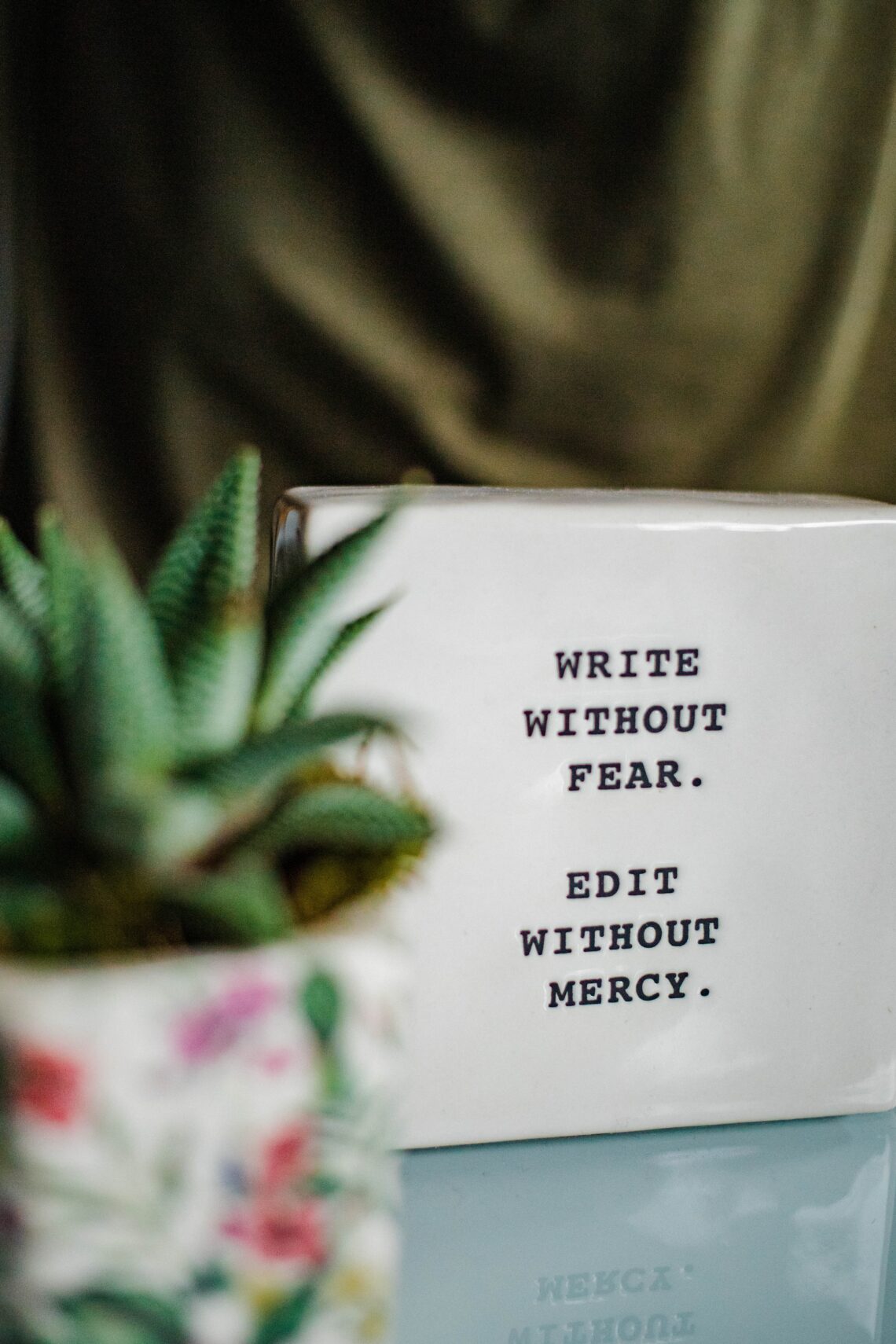
Remember, don’t be afraid to have fun with fonts!


Comments by Lindsay Moynihan