
Direct Mail
Direct mail is an important marketing tool for many organizations around the world. Here, companies can mass-produce handouts to send to the homes of individuals in a designated area, and residents are forced to at least look at the handout rather than just hitting the “trash” function on a piece of digital communication.

Because direct mail is more likely to be skimmed through by the consumer, graphic designers and PR practitioners must create eye-catching designs for the handouts they send to the public. One of the most beneficial programs for creating interesting designs is Adobe Photoshop.
Using Photoshop
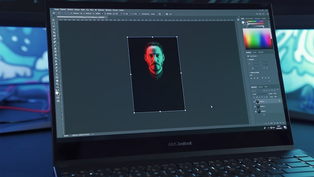
While Photoshop can seem daunting, the best practice to learn the program is simply to practice and play around in the workspace. Simply creating a test document and learning what each of the tools can do to the content on the page is a great way to get started in using Photoshop.
Tips and Tricks
One of the most valuable tips to understand how to use Photoshop is accessing learning tools. Some of the most valuable information can be found using a quick Internet search, and this course on LinkedIn Learning is a valuable tool in getting a grasp on Photoshop and its use.
Another great trick to understand for Photoshop is to be patient. Sometimes components will not seamlessly come together on the page in short amounts of time. Instead, we must understand that it is more likely that we will have to set aside longer periods of time to try new things and tweak each individual component in Photoshop.
Why Photoshop?
Photoshop is beneficial because it can add depth and creativity to designs. Additionally, it allows PR practitioners to edit and make changes to photographed content.
Photoshop offers a wide variety of tools to allow designers to edit multiple types of media. Rather than solely focusing on print media and direct mail, designers can edit photographs, social media posts, and infographics, among many other things.
Handouts and Stakeholders
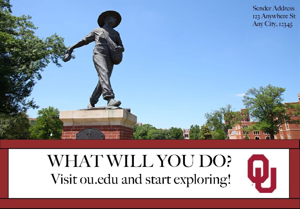
For OU Recruitment Services, we were tasked with making two direct mail handouts to send to our selected stakeholders. The stakeholders that I chose were parents of prospective students at OU and prospective students for OU. To market to these two audiences, I offered my first handout to appeal to the stakeholder of the parent. This handout included images of OU’s campus and the link to OU’s website, offering parents and students to explore what they have the potential to accomplish at OU.

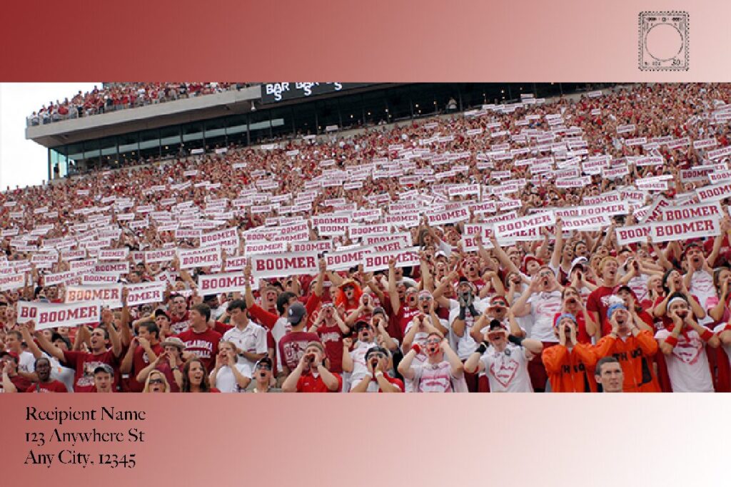
My second handout was marketed to prospective students at OU. To accomplish this, I utilized photos of the OU Community at sporting events and a fun gradient as the background that represented OU colors. Additionally, I used the phrase “Find Your Sooner Home Here” to give students a look into their lives on campus.

The Design Process
Designing handouts in Photoshop requires a lot of patience and understanding how to use layering in designs. Stakeholders are essential in creating handouts because it is important to know your target market rather than simply sending out messages to a wide, broad audience that isn’t necessarily specific.
While drafting, it is important to understand which stakeholder you wish to market to. This will influence the use of components on the page – for example, using vibrant colors and gradients may appeal more to a younger audience rather than an audience of parents.
My design evolved as I continued to draft the phrasing I wanted to use on the handouts. To appeal more to my stakeholder of prospective students, I used the phrase “Find Your Sooner Home Here” to help them envision their potential role at OU. I added the gradient to add to the whimsical nature of the sporting events shown in the pictures, and I believe the simplicity on the back allows the prospective students’ imaginations to run wild as they picture their future at OU.
For my first design, I started with the image of the OU campus, but moved to add the OU logo and the lines separating the information on the bottom from the image on the top. I believe this allowed for a more sophisticated, information-based design.
Words of Advice
Remember, while Photoshop can seem overwhelming at first, it is important to be patient with yourself when trying new things. Don’t forget to make choices, and save your work as you go! If you end up not liking something, you can always hit the “undo” button.
Working in Photoshop involves a lot of trial and error. Try not to be discouraged if your design doesn’t necessarily mesh together on the first try – it is rare that we get the result we want right away!
Remember, as Thomas Edison once said, “The most certain way to succeed is to try one more time” (via Northern Lakes Community Mental Health Authority).


Comments by Lindsay Moynihan