There are many components that help add a sense of originality to design in public relations. These features give public relations practitioners the freedom to fully express themselves and design strategically with their target audiences in mind. These components can be found everywhere, and I often find myself staring at different logos and advertisements, analyzing the components of each.
The Use of Color in the “Naughty Santa”
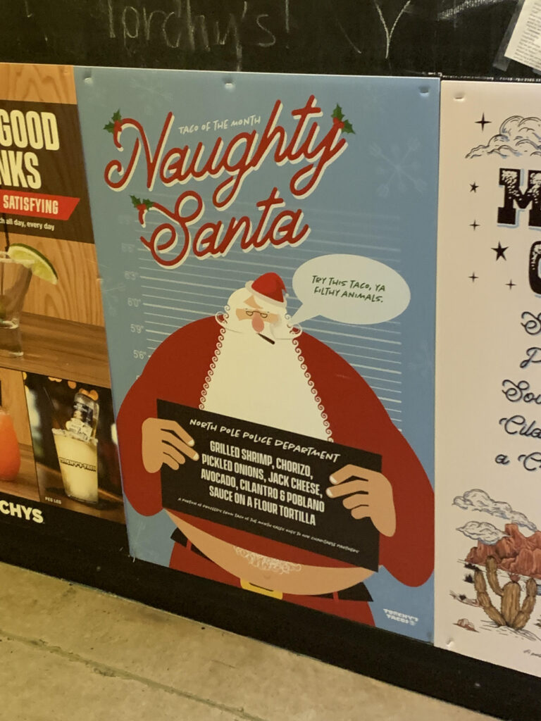
This advertisement that I found at a local restaurant showcased quite a few design components that I found to be clever. The use of color in the poster helps to portray a playful tone, showing a funny parody of Santa. The light blue background helps to establish this playful tone and serves as a foil for Santa’s red coat. This brings more attention to Santa, who is standing in what appears to be a prison setting. The white lines behind Santa help to reference this point, and the spacing between the lines helps to add to the cleanliness of the overall design. The lines are evenly spaced on the page, adding a form of symmetry that adds a sense of comfort to the target audience. The words “Naughty Santa” are written in a red, white and green font, portraying the holiday season. Lastly, the sign being drawn in black allows for the white font to stand out on the page.
Color in design is important because it can differentiate the content on the page, bringing a sense of contrast into the graphic. Contrast is important because it creates interest in the different elements of the page, drawing the viewer’s eye. The color changes on the page allow for the element of surprise to be showcased, which provides excitement in viewers.
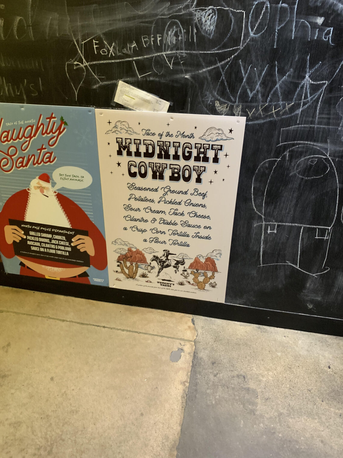
Proportion in the “Midnight Cowboy”

In the graphic for the Midnight Cowboy, the creator utilized proportions to create a sense of seamless symmetry throughout the graphic. In this specific advertisement, the page is divided by imaginary hanglines to keep the title and the “Taco of the Month” evenly above the ingredients below. Additionally, the designer likely used symmetrical margins to set the visual art away from the margins of the page, arranging the components of the graphic around an imagined vertical line of symmetry. This symmetry provides an excellent sense of consistency that leaves audiences feeling comforted and motivated to try the Midnight Cowboy. Additionally, this symmetry helps portray a more formal tone which contrasts heavily with the graphic of the Naughty Santa shown above.
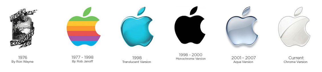
The Simplicity of Apple
The Apple logo is an excellent example of minimalism in public relations design because it makes use of the negative space around it and isn’t embellished in an overuse of color or illustration. This negative space does not take away from the design of the logo and the audience can see that the negative space only serves to further illustrate the design of the apple. This minimalistic design makes an impact on audiences and many individuals can recall the Apple brand simply from its minimalist logo. The Apple logo has changed over time, as seen in an excellent graphic from The Logo Creative. In the past, Apple has experimented with different colors and shadows, but the minimalistic shape of the logo has continuously been preserved.
Dominance in Cuisine
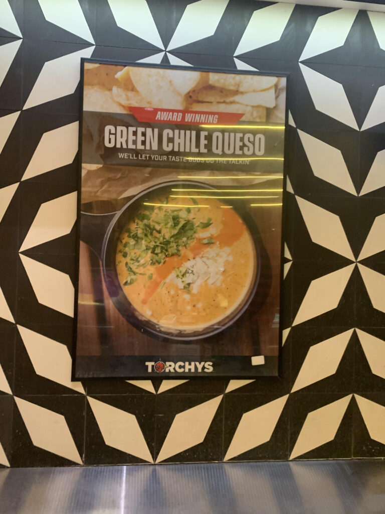
What is the first thing that you see in the advertisement above? In this image, the graphic designer makes great use of dominance to show that the queso is the most important element on the page. The scale of the queso is so much larger than the other elements on the advertisement because the designer hopes to persuade the customers at the register to add the green chile queso to their order. This advertisement is placed conveniently at the counter where customers place their orders and cashiers are trained to upsell, offering queso to every customer. Because the queso is so dominant in the advertisement, customers are more likely to begin to crave it. Additionally, the phrase “award winning” above the queso gives the company a sense of credibility and customers are more likely to try it.
While the queso is the most dominant component of the page, it does not take away from the other elements on the advertisement. The company logo is still prevalent on the bottom of the advertisement, and it is not difficult to make out the words at the top of the photo. The only element that seems to get lost in translation are the chips found at the very top of the photo. I believe that this can be attributed to both the queso being so much larger in scale and to the words taking up the majority of the upper half of the advertisement. Nevertheless, the designer’s decision to enlarge the scale of the queso in relation to the other elements on the page effectively leads the audiences’ eyes straight to the product that is being advertised.
Typography in Spectacle: Barnum’s “Jumbo”
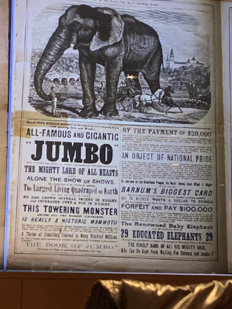
In the image above, P.T. Barnum uses typography to advertise the different attractions in his show. The word “Jumbo” is the biggest on the page and is in a bold font, referencing that the elephant in the circus is the main attraction. The capitalization of the phrase “the show of all shows” allows Barnum to highlight how unique his presentation is. On the page, the fonts change to showcase the different attractions that Barnum features, referencing how unique each act is.
The use of typography is important in public relations because playing with the scale and typeface can bring attention to the most important words on the page. Additionally, the different fonts can portray different moods that are associated with the words present in the graphic.


1 Pingback