When it comes to graphic design or web design, I tend to like something that has a lot of typography and a clean brand kit. For example, I absolutely love the way that Vox.com looks because of its very refined brand kit.
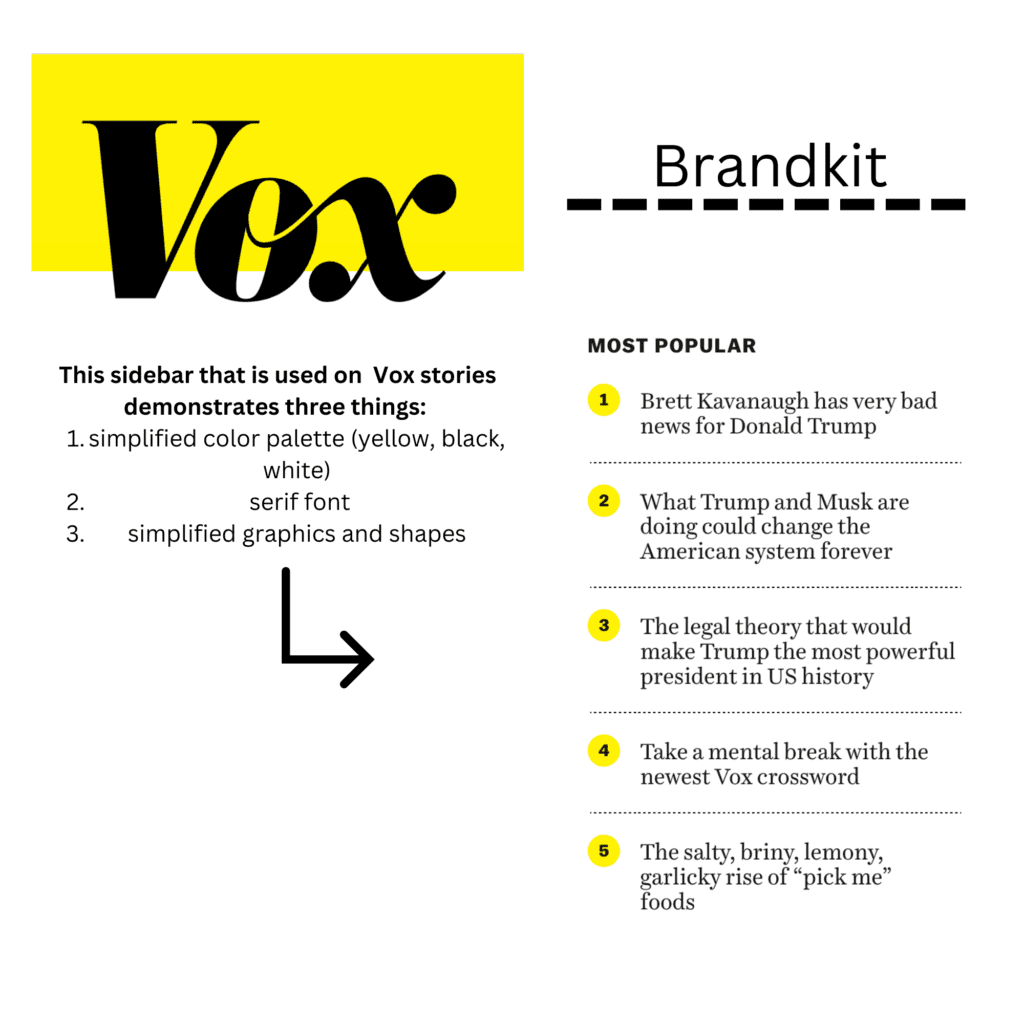
Vox uses a simplified color palette, interesting typography and lots of negative space which is extremely visually appealing. I think that it is also helpful for accessibility because this website looks good in both normal and dark modes. Additionally, the blocks of the website are easy to navigate and follows basic rules of spacing and the laws of association.
Vox is an example of a really great website, but unfortunately one of my new favorite local businesses has a horrible website. Waste Knot Needlepoint here in Arlington is run by the sweetest older woman but the website could use some help. The website has some unique elements- it’s designed to look like a needlepoint canvas- but it needs to refine its color palette and fonts in order to take a competitive step.