Font Personality
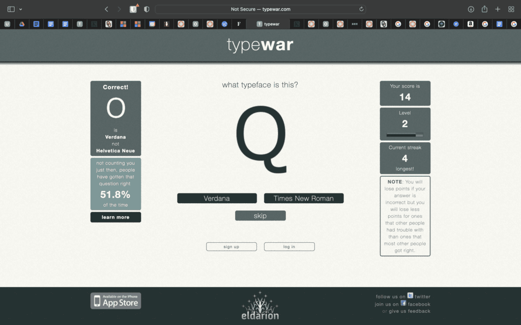
Font plays an important role in getting a personality across within a design. Times New Roman gives a professional look while Verdana is more simple and personal. A great way to be introduced to fonts is through TypeWar. This game helps the user explore specific fonts and the faces of letters. Specific typography can help immensely in getting the tone of a project across. If an organization is making an informational brochure for a fun event, the typeface of the brochure is an essential element. Bright colors and fun graphics would not always make sense with a more serious, stern font. That being said, a simple font is often a good course of action to balance a design. If you have an informational and professional presentation, it is a good idea to oppose a serif with a sans serif font.
Font Spacing and Serif
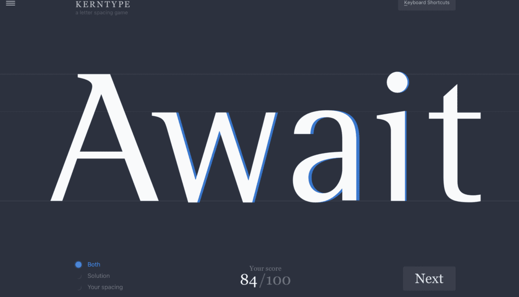
Put simply, a serif font includes a small stroke at the ends of each letter. Sans-serif fonts exclude these small lines, making them ideal for quick reading. The spacing included in between each letter is also an important element in design. The larger a font is, the larger the space between letters will be. Kerntype lets users explore the spacing between letters in a word. After a few rounds of playing this game, it became easier for me to picture the appropriate look of a word. The natural placement of each letter became more apparent as the game went on.
While fonts may sometimes be seen as a trivial choice for a design, I highly encourage PR professionals to consider the tone and purpose of their design in order to choose a font. While content is the most important piece, it is crucial to use typography to extract meaningful information. Some words can be bolded or underlined to convey importance.
Leave a Reply