A Focus on Placement and Color
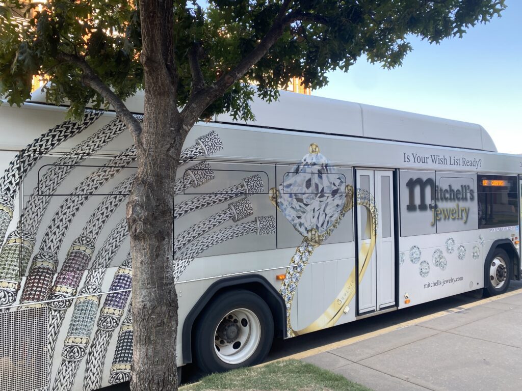
This advertisement uses shape in a large way. The circle of the engagement ring draws the eye first while “Mitchell’s Jewelry” answers the question of where the jewelry is from. The phrase “Is Your Wish List Ready?” could be better implemented. Its current placement makes it seem like more of an afterthought and unimportant. The words lead the reader to be more curious about the context of a “wish list” and helps them consider their jewelry needs. As a design rule, the viewer is interested in an image that leads to a question. The bracelets on the left side of the bus add a bit of color to the design, but the main color that pops is the gold of the ring in the middle. It was a good idea to put an engagement ring as the main focus of the advertisement. The look of an engagement ring is known to most people so it adds a sense of familiarity for the viewer.
Knowing what to Emphasize
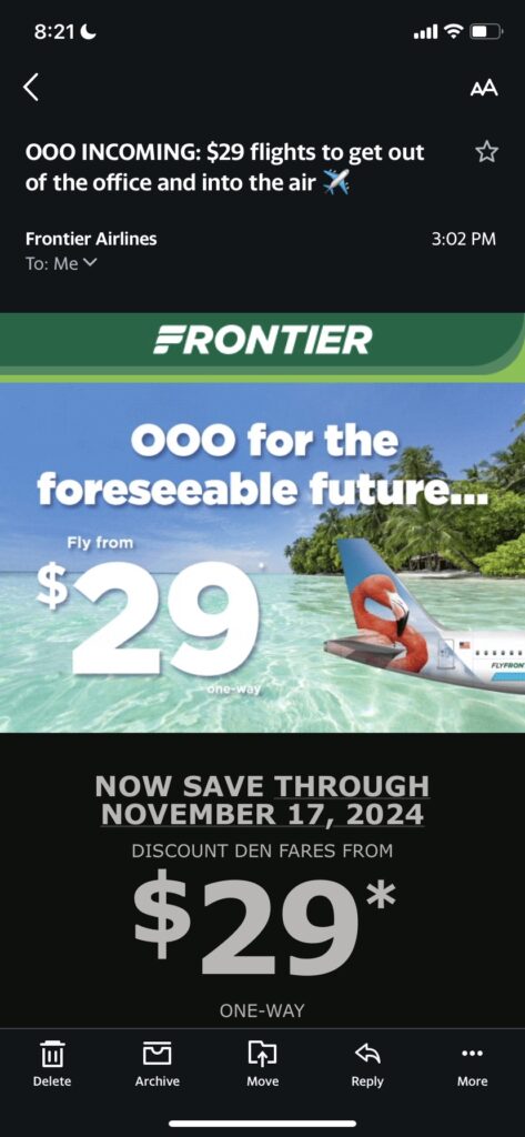
Frontier Airlines prides itself on its low prices, so it makes sense that that would be the main focus of their advertisement. The use of scale within the image provides an interesting perspective. While a plane would not be in the position it appears to be in this picture, it gives the illusion of arriving right to a tropical destination. The price of $29 is repeated and made larger than other text numerous times within this advertisement. The larger size of the price helps emphasize the value of Frontier that customers are most looking for. Their prices are what give them an advantage over competitors, so it is important that they stress that most, even more than destinations. The picture itself shows that the destination can be tropical which is the most important part of the appeal for such a low price. The term “foreseeable future” gives a sense of urgency to the deal. With “$29” being written so largely, the viewer does not look into the small print of “one way” right away. It is especially hard to read on the water which is the main focus of the email.
Leave a Reply