When people think about design, they usually picture colors, logos, or maybe the overall layout of a page. What often gets overlooked is one of the most important tools in visual communication: typography. Typography is not just about picking a nice font. It is about shaping the way a message is experienced and making words more powerful through design choices.
What Typography Really Means
Typography is the practice of arranging letters and text so that it is clear, attractive, and easy to read. Designers pay attention to font style, letter spacing, text size, and even how much space sits between lines of text. These decisions change how someone feels when they look at a page. Good typography works almost like magic. You might not notice it at first, but you feel the effect. Bad typography, on the other hand, stands out quickly. For example, imagine an important business letter written in Comic Sans. It just feels wrong.
Playing the Typography Game
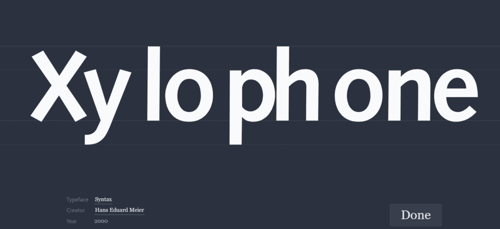
To see how much of a difference typography makes, I tried out the Kern Type game. The game challenged me to adjust the spacing between letters until the word looks balanced. This spacing is called kerning. At first, I thought it would be simple, but it was more challenging than I expected. Sometimes the letters looked evenly spaced, but the word still felt off until I adjusted it. The game showed me that typography is not just science, it is also about training your eye to see harmony and rhythm in the shapes of letters.
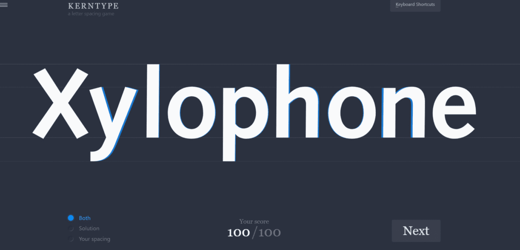
Inserted screenshot of my best round of the game.
Why Typography Shapes Design
Typography sets the tone before the words are even read. Think about how a wedding invitation looks compared to a news article. One feels elegant and celebratory while the other feels serious and professional. That difference is not just about the words on the page but the way they are presented. Typography also makes content easier to read. Headings, spacing, and font choices help guide the reader through the design so they know where to focus.
Typography is everywhere in daily life, from websites to billboards to books. Once you start noticing it, you realize it plays a huge role in how we connect with information. Playing the kerning game reminded me that even the smallest changes in type can completely change the way a message feels. Typography is not just decoration, it is storytelling through design.