Design is everywhere from the ads on the subway to the cereal boxes in your kitchen. On my recent Design Blitz, I set out to capture how design principles shape our experiences, guide attention, and communicate messages. I focused on four key concepts: color, typography, minimalism and use of space, and metaphors and symbols, and discovered how small details can make a big difference.
Color
Color is one of the first things we notice, and it can completely change how we perceive a message. I decided to use a bright red sale sign at a local store that immediately drew my attention and created a sense of urgency as an example.

In contrast, a poster with clashing colors can sometimes feel chaotic and hard to read, making it easy to ignore. Color, defined as the hues used in design to influence perception and emotion, can evoke feelings, highlight important information, and direct the viewer’s focus. Effective color choices make a design memorable, while poor choices create confusion and reduce impact.
Typography
Typography communicates personality and tone. I decided to use a restaurant menu using a clean sans serif font that felt modern, clear, and easy to read. Sometimes using decorative script font that looks elegant can actually be difficult to decipher quickly. Sometimes it is important to remember that less is more. Typography, the style and arrangement of text, can either guide the reader’s eye and reinforce brand identity or frustrate and confuse the audience. Choosing the right font is as important as the words themselves because it affects readability and perception.
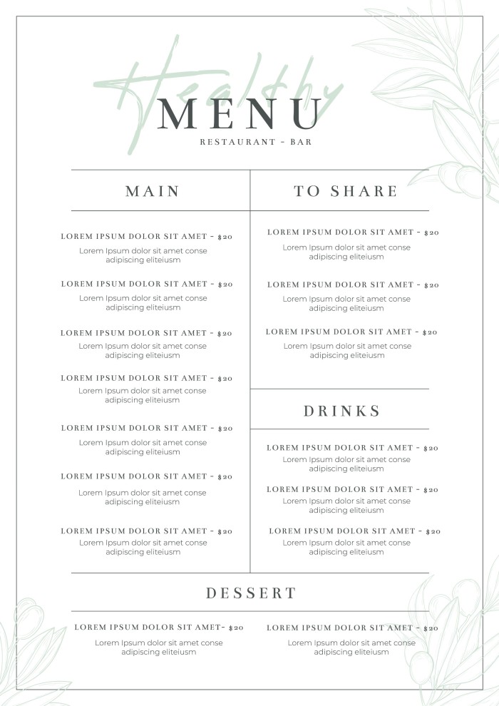
Minimalism and Use of Space
I came across a flyer that a design website posted of exactly what not to do when creating advertisements. There is a flyer that crammed too much text and imagery into a small space, making it nearly impossible to know where to look first. The lack of white space made the design feel chaotic and overwhelming, and the important information got lost among all the clutter. This example shows why minimalism is so important in design and again how sometimes less is more. Minimalism emphasizes simplicity and clarity by using only what is necessary, allowing viewers to focus on the most important elements without distraction. When designers ignore this principle, the audience can become confused or frustrated, and the overall message is weakened. Proper use of space guides the eye naturally, creates balance, and makes the design easier to understand and more visually appealing. Without minimalism, even a flyer with good content can fail because the message is buried under unnecessary clutter

Metaphors and Symbols
Metaphors and symbols are powerful tools for quick communication. For example, a recycling symbol on a storefront, can instantly communicate sustainability without any words. Another example I saw used a poorly designed icon that left me puzzled about its meaning. Metaphors and symbols use imagery to represent ideas beyond the literal, and when used effectively, they strengthen understanding and engagement. Misused or unclear symbols, however, create confusion and weaken a design’s impact.
This Design Blitz reminded me that every element from color to typography affects how we perceive and interact with a brand. Even poorly designed objects teach valuable lessons about clarity, focus, and audience impact. Paying attention to these design principles helps me better understand effective communication and apply these lessons in PR design.