As PR professionals, we understand that every detail communicates something about a brand. Collateral material like business cards, letterheads, and envelopes are more than just paper. They are strategic tools that reflect professionalism, build trust, and create lasting impressions. In this blog post, I’ll share best practices for design and layout that I applied to my own collateral project, while highlighting why balance, harmony, and consistency matter.
Balance Creates Stability
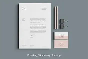
A strong design relies on balance. Whether symmetrical or asymmetrical, balance ensures that no one element overpowers the others. For my business card design, I positioned my name, title, and contact information so that the layout feels stable and easy to read. This balance helps the card feel both professional and approachable.
Harmony Builds Brand Recognition
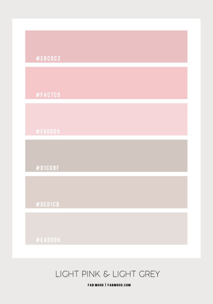
Harmony comes from repeating brand elements across all materials. By keeping my color scheme of pink, grey, and black consistent across my business card, letterhead, and envelope, I created a cohesive identity. This uniformity ensures that no matter what piece a client interacts with, the brand is instantly recognizable.
White Space Enhances Readability
It can be tempting to fill every corner with design elements, but effective collateral makes good use of white space. White space gives breathing room and draws attention to what matters most. For example, my letterhead design leaves plenty of space for the actual content of the letter, while still featuring the brand identity at the top.
Functionality First
Great design is also practical. Business cards should be easy to store and read quickly. Letterheads must provide ample space for correspondence, and envelopes must align with postal standards while still carrying brand personality. My designs emphasize usability while maintaining style.
My Collateral Project
Here are my finished pieces:
Each design uses balance, harmony, and consistency to reinforce the message: “Guiding brands through crisis.”
Final Takeaway
Collateral materials are often the first impression of a brand. By designing them with balance, harmony, and readability in mind, organizations can project professionalism and credibility at every touchpoint. Thoughtful design elevates brand identity and ensures that even the smallest details communicate the right message.