Creating a newsletter from start to finish has been one of the most rewarding projects this semester. It’s not just about putting words and images together; it’s about telling a story that your audience actually wants to read. As a PR professional in training, I’ve learned that newsletters are one of the most powerful tools for maintaining strong relationships with an audience. Whether it’s an internal company update or a community newsletter, the design, tone, and visuals all work together to create something meaningful.
Choosing the Right Photos
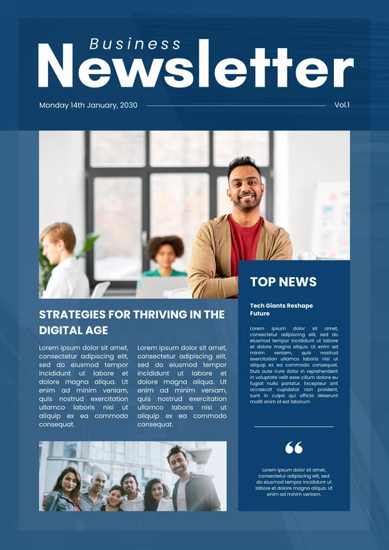
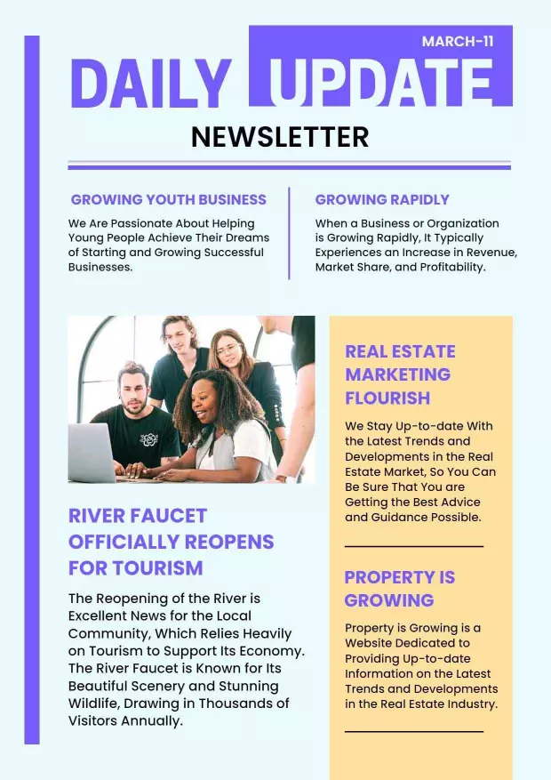
The visuals in a newsletter are just as important as the articles themselves. Photos set the tone and help readers emotionally connect to the content. When I was designing my newsletter, I focused on choosing images that didn’t just look nice but also enhanced the story. For example, if the article focused on community service, I used candid shots of people actually volunteering instead of posed stock photos. It made the newsletter feel more authentic and relatable.
High-quality images also create visual balance, which is a big part of good design. A clean, well-cropped image with good lighting can make even a simple layout look professional. To keep readers engaged, I made sure every photo supported the message rather than distracting from it. A good tip is to use websites like Unsplash or Pexels for free, high-resolution images that fit your tone and audience.
Writing for Your Audience: Know Who You’re Talking To
Every successful newsletter starts with knowing your audience. Before I began writing, I asked myself: Who will be reading this, and what do they care about? Writing for your audience means understanding their interests, goals, and even their reading habits. For a younger audience, I kept the tone conversational and direct. For a professional audience, I leaned toward a more polished, informative voice.
I also made sure that every article had a clear purpose, whether to inform, inspire, or engage. Including calls to action like “Read more,” “Join us,” or “Share your thoughts” helps invite interaction and keep readers connected.
Layout and Design
At the beginning of the semester, we learned about layout principles like harmony, balance, and visual agreement. These came in handy when I started putting everything together. I used consistent fonts, color schemes, and spacing to create flow. The goal was to make the newsletter easy to read while keeping it visually appealing. White space was my friend; it helped break up text and kept the layout from feeling cluttered.
Using design platforms like Canva made this process simple and fun. I used its grid system to align images and text neatly and added subtle accent colors to create visual unity. A clean design with thoughtful spacing and consistent elements builds trust and keeps readers scrolling.
Final Thoughts
Designing a newsletter isn’t just a design exercise, it’s storytelling through visuals and words. The process taught me that every detail, from font choice to photo placement, affects how your audience connects with your message. When done right, a newsletter doesn’t just share information, it strengthens your brand, builds community, and inspires engagement.