Simple ways to improve your typography skills.
Typography is an intricate and precise aspect of designing within the public relations profession, or any profession for that matter.
Maintaining the right balance of creativity while at a high level of readability is key to proper and effective typography in design.
The font you want.
The most important trait of typography expert like me, is the essence of picking the right font for the right job. The simple rule is this: Use common sense when picking what font to use.
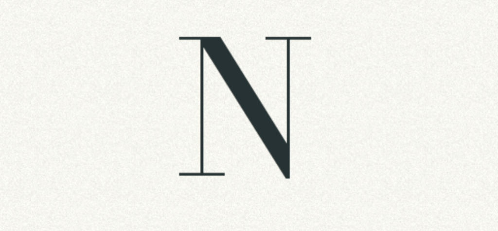
Look at a font like Didot. The thin lines compliment the thick, resulting in a striking contrast. Just as apparent are the sharp, 90 degree serifs supporting each letter. Fonts like this belong on the cover of a fashion magazine and advertisement or as an elegant business’ logo.

One of the most common fonts, however, Helvetica Neue, can tell something different about a brand, company or written work as it radiates simplicity. In some contexts, like a computer centric blog or an indie film, the font can seem right for the digital setting. But seeing this font on a professional article or advertisement may make the writer/designer seem lazy and might show lack of creativity.
The typography game typewar is an easy and simple game teaching you to recognize differences between common fonts like the ones shown above.
The right fit.
When designing for any written deliverable, increasing visual clarity for every letter typed can be easy for those conscious of effective typography.
Not thinking like a typographer and leaving words as they are written is easy. For an impressive logo, it might be worth rethinking not just what font you use, but how each letter is spaced in relation to each other.
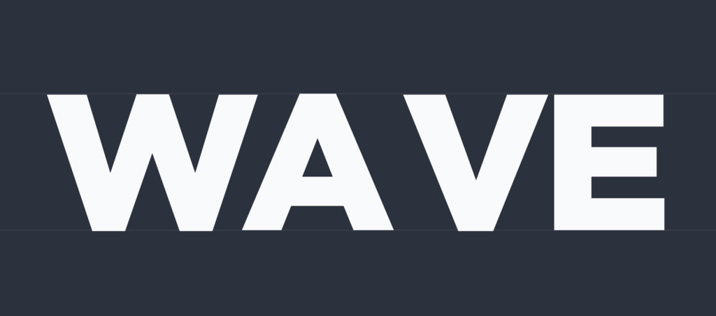
Look at the word “wave.” It seems odd doesn’t it? It probably looks like this while its typed but noticing that and being able to fix it can mean the difference between looking lazy, and looking like an expert.
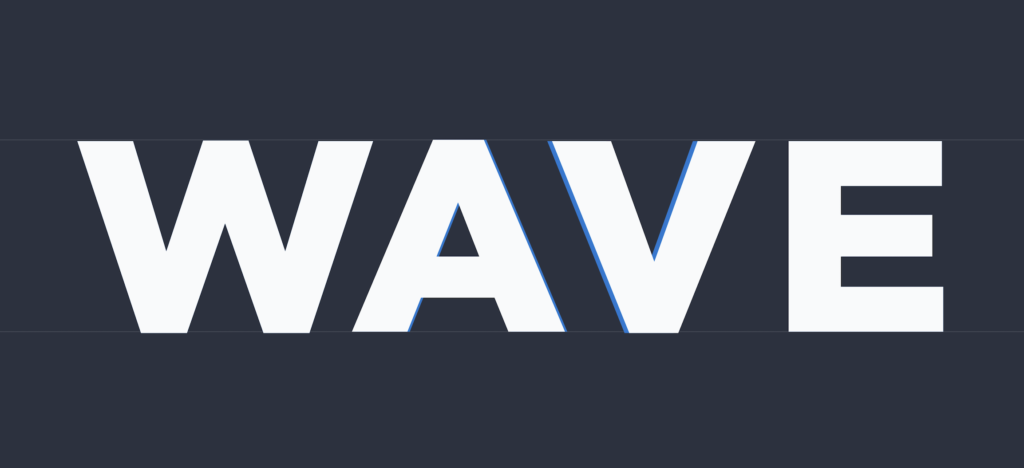
That’s better. Keeping design quirks like this in mind is the name of the game for maintaining quality typography. Designing with letters and words is not always as easy as “type and go,” and paying attention to how words look in any written deliverable can improve those typography abilities in many ways.
The game Kerntype is a great way to learn how important letter spacing can be, and allows me to pay more attention to this aspect that usually gets glossed over by beginners.
These perspectives and games have allowed for an improved sense of creativity and clarity in my typography and design, and I hope it shows in your future projects.