

So far, developing material for organizational use has been simultaneously simple and exhausting. I tried to make my materials as simple as I can make it for me, just to maintain consistency among them.
Business Card
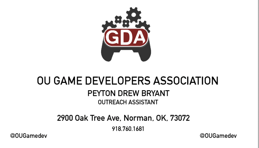
The hardest of the bunch to design was easily the business card. I always kept the notion that the best business cards are simplistic yet striking in design. At first, I felt that since this was a design class I should focus on the latter. I’ve since altered my judgment on the matter and think that, while a good idea in some cases, a flashy card is just that, flashy.
Just looking at these stock business cards on Adobe Stock, it’s apparent that simplicity is in.
Envelope
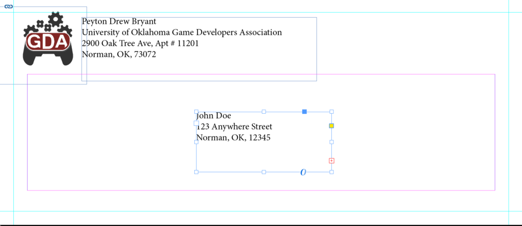
The next was far too easy.
I know what an envelope looks like. You know what an envelope looks like. We all know what envelopes look like.
To be consistent between this, the business card and the letterhead is important. These items need to harmonize in a way that isn’t overbearing and keeping things traditional never fails.
Even so, there’s still room to be creative and set yourself apart from other envelopes.
Letterhead

Though mine is quite simple, I feel as if the letterhead is the underdog of these three pieces of material. It’s the thing people are going to be looking at and reading the most. To think that people are going to sit and examine your envelope or business card for more than 5 seconds is absurd. For something people read and engage with, it’s essential for this to be clear.
There are plenty of templates out there, but for me I think keeping it simple was key.