
For me, getting a Brochure right meant two things, clear copy and clear visuals.
Brochures are really familiar for me, as they probably are for tons of other people. They’re simple to navigate and can contain a lot of information given the compact format. It can be used to sell, advertise, inform and so much more. With the Brochure I created for Norman First American Methodist Church I wanted to inform and convince donors to give to the organization.
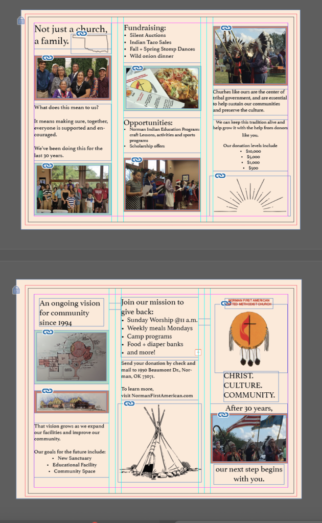
The Design
I used a tan color for the paper of the brochure, with red and green borders around each photo. I used various illustrations including a teepee, which relates to one of the various events the church holds, an outline of Oklahoma, and a sunrise to symbolize a new era for the church.
The photos I used are taken straight from the website, and provide a diverse look at the people of the church as well as what they do.
The Copy
For the copy, I took all the information from the provided google doc, and rewrote everything into simple copy. From there, I picked all the elements that might put into words what the church envisions for its future. I wanted to make it coherent as one opens the brochure as well.
From the front, opening to an introduction of the people that make the face of the organization, next to the plans for expansion including illustrations.
Continuing to open reveals the ways the church currently gets funds and the opportunities it provides, next to the levels of donation the audience will hopefully consider.
On the back is another call to action, allowing readers to find upcoming ways to get involved and where to donate and a link to the website.
Overall I thought designing this brochure helped a lot with my skill of laying out a format for copy and images, and want to experiment more with what I can do on indesign.