Month: August 2023

I’m Designer-InDesign & Photoshop

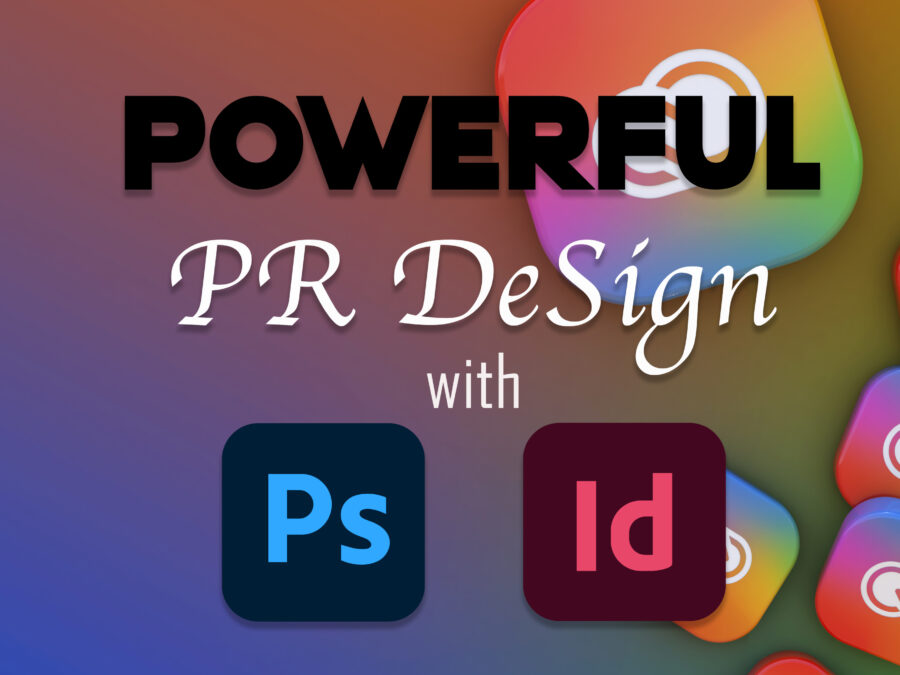
As a media industry professional, I’m presented with tasks that heavily involve Adobe Suite. From Audition for radio production to Photoshop and InDesign for print and publication purposes. Occasionally, I’ll visit Illustrator for any vector artwork. It makes for quick work manipulating vectored art. The Adobe Suite offers nothing but complete creative control over art or projects from a multitude of mediums. I have always likened the different programs to building blocks for another program within the Suite. One program creates a building block that you can use in another. While the Suite and Creative Cloud give unparalleled access to tools that designers seek, two of the practical and robust programs for PR Design are Photoshop and InDesign.

Photoshop (handy dandy)

For instance, you can create a beautiful logo in Illustrator from the ground up. Then, use the logo in a flyer or on pictures. It is possible with Photoshop. This program offers creative control over most elements, including fonts, picture adjustments, and removing subjects from photos. Photoshop isn’t Lightroom, but it has some of the same attributes. For those who edit photos and like the ability to manipulate those images, Photoshop is in your best interest. Resizing images is an easy chore inside Photoshop. I recently had time to adjust and clean up photos of my great-great-grandfather William Joseph Cizek. My father is currently tracing our roots and came across this photo. Photoshop allowed me to remove some of the blemishes in the original photograph taken in 1926.

Before

Original 1926

After

Photoshop fixes-cropped, removed noise and anomalies. The spot healer tool is genius.

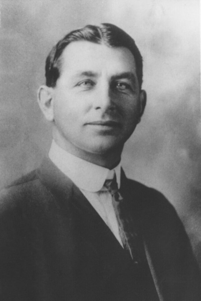
Photoshop has an arsenal of tools at the user’s disposal. Correcting photos to use within PS so they are usable within InDesign is the logical step to creating quality. Say I am creating a design for a family reunion. Of course, I could use the original photo as it scanned. Photoshop is unique in its ability to remove the background of an image and replace it with something else with the content-aware feature—a remarkable feature in PS.

InDesign

The interfaces appear identical, but they are not the same design programs. First, there are no layers within ID. I found myself looking for the eyeball next to a layer that was never there. My lack of use in InDesign constrains my abilities and proficiency with the program. However, I have found that creating publication pieces like flyers and brochures will be much easier than making them in PS. I tried creating a brochure from scratch in Photoshop, and it did not go well.

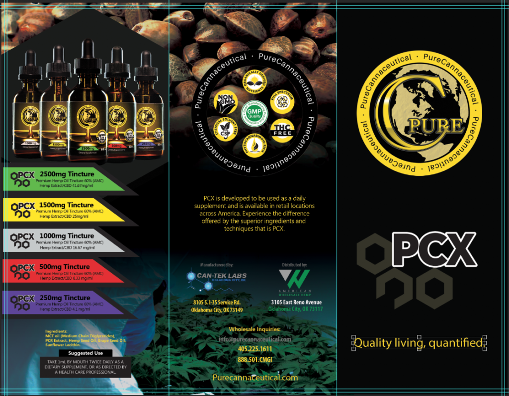
While it looks the part of a brochure, it took me days to create it because of the text and inability to keep it consistent. It would have been an easier putt if I would have started in InDesign first.

InDesign allowed me to create a better-structured flyer with containers to insert text and pictures. Simple.


Both programs are best discovered by jumping right in. They answer with solutions to many of a designer’s needs. Many video resources are available online, and answers are in the forums as part of Adobe’s Web Community. Chances are, someone else has had the same issue as you, and they figured out a solution.

Some online places often give many tips to help sharpen your skills within these programs. Here are 32 Indesign Tutorials to help you improve your overall abilities. If you are looking to hone your Photoshop abilities here are a bunch of tutorials, 600, for you.

Knowing when to use what program is necessary in becoming a professional designer.

Utilizing one program for another will also become routine.

However, nothing overrules a well designed piece that encompasses proportion, color, typography, and all the other characteristics that define quality.

Defiled for Educational Purposes only

The spaces of newspapers are named and consistent. These allocated spaces are essential for the publication as they give the paper structure and the viewer the information they want. Most newspapers and newsletters utilize these specific areas to deliver various content. Here are some examples illustrated within the August 2023 ‘Football Preview Guide’ edition of the OU Daily.

Delicately Designed For Your Viewing Comfort

Design elements are present even in places you would hardly look to find them. Just walking back to the parking garage after classes and going about my daily life, I found a few examples of the elements that are some the following design characteristics.

  • Color
  • Typography
  • Metaphors/symbols
  • Minimalism & use of space
  • Form/function/message
  • Balance
  • Rhythm
  • Proportion
  • Dominance
  • Unity

The design blitz is on! Every day these design elements are present in our life’s. Having the notion and ability to incorporate the elements are where the true art and concepts of design collaborate. From the most intended to a surprising coincidence the aforementioned characteristics of design are what we find visually appealing.

Color

Without the green foliage, the northeast rear brick wall of the Bizzell Library would be just a dull brick wall, a corner that would melt into the other red brick building (Evans Hall) behind it. While it may be Mother Nature offering her design, someone had to decide to let it display her beauty. The deliberate nature of allowing the beauty of the greenery informs us that an element of design is at work.

Proportion

I found that the mums on the South Oval are well on their way to the usual spectacular explosion of Crimson and Cream seen at its height around homecoming. Above, the image demonstrates a level of proportion and draws your attention to the dominant image in the lower left corner. The single plant is the reason for the shot but with the abundance of plants, in rows, its understandable to incorporate them into the shot.

The mural is visible on the north side of Koda CrossFit at 1210 McGee Drive.

Rhythym

An example of color, symmetry and rhythm is Rick Sinnett’s “Butterfly Mandala” in Norman. The balance and colors are eye-popping. Those characteristics give the piece a powerful element of visual structure.

The colors are deep and bright, drawing attention to the drab cinder wall.

The symmetry develops from the Mandala’s center into the butterflies comprising the outer circle. Sinnett says the design represents life’s beauty (Uncovering Oklahoma, www.uncoveringoklahoma.com). Rhythm flows from the center with corresponding geometric shapes that repeat. Although, the repetition is the focal point. The piece relies strongly on its repetitive patterns, creating balance and a feeling of undulation.

Mid-Continent & Philtower buildings.

Balance & Unity

I recently walked downtown Tulsa and saw a group gathering on a corner. Five to six people with cameras were taking a picture of the above. Naturally, I followed suit and took out my camera. They were looking at two buildings between two buildings. Really. It is a remarkable image. Upon a Google search of the area and its art deco roots, the Mid-Continent building with the patinaed roof is to the right. The building to the left, with the spire is the Philtower Building. The balance of the split between the two buildings (or one, depending on your view) so you can view two beautiful vintage-styled buildings is spectacular. The two buildings on the far right and far left act to support the design image of the photo completely.

Got Minimalism?

The minimalist approach is used in many aspects of design. From logos to complete campaigns. Got Milk? That campaign relied on reminding viewers of the color of milk, white. The simple tag line and concept fed many copycats. Got books?, Got booze?, etc..

Pringle’s pizza flavored potato crisps may be ‘Bursting with Flavor’, however, it is the logo that adopts a minimalist design. The circle with two eyes and a mustache is a just a white circle without the eyes and mustache. Without the words ‘Pringles’ the company utilizes black and white with the noticeable feature the mustache. The circular logo takes advantage of the unique packaging the chips comes in. It works because of the simplicity.

Typography

I saw this logo at the bottom of this old Coke machine at a restaurant I was eating at. I thought to myself, how simple of a name. If you own a vending company, why not Vendo? The typeface conveys fun and vintage. The Ascender on the ‘V’ and the kerning between it and the rest of the name is noticeable. The cursive connection of the letters is aesthetically appealling and reminiscent of the logos of that period. At one time, when this was brand new, this logo stood out on that red paint.

Conclusion

Design elements are arrows in the artists quiver. These are the concepts that are beholden to those in the profession. Not only help guide the designer but they are elements that appeal to human senses guiding the viewers to the intended message.


Sources

Spielman, D. (2017, March 6). Rick Sinnett “Butterfly Mandala.” Uncovering Oklahoma. https://www.uncoveringoklahoma.com/2017/03/rick-sinnett-butterfly-mandala/

The Rug’s Typography

Don’t mind if I do.

Utilizing the subject and the space allowed while incorporating it visually through the text describes typography. Artists tap into emotion through a myriad of techniques using text and typefaces. Evoking an emotion or action using a different typeface or font is also a typography characteristic. Perhaps the company has a logo sans text but has a company name that the artist must include?

I always admired this brilliant use of the logo as the ‘O’ in vapor.

A former employer used such a technique. The artist’s name is Michael. He created this genius use of a logo within the name of a former employer. This slight adjustment added visual value to the brand at no cost to the company.

Being able to visualize the subject with title or heading together demonstrates the artists grasp of typography. An image could be written in a foreign language making only readable to those that spoke the language, however, if an image is presented with the text anyone can discern what the message is trying to convey.

Definitely not an image promoting the Loch Ness Monster.

Alternatively, perhaps we can observe an example of typography with the text itself. The typeface selection can immediately create a sense of familiarity with the viewer. In this example, the idea of the military comes to mind just from the typeface.

Knowing the little nuances of typeface will help deliver a message via typography. Using typewar can really test your knowledge of the nuances. I had a pretty good streak going!

Typography as stated in the Linkedin video series, we scan for a familiar image. We immediately know what is being conveyed when typography is manipulated.

Kerning is important to the brand. If out of place it throws off the whole design. I finally got he hang of it.

Give Kern Type a try and see how well you do.

Professional Portrait

  Who am I?

My name is Tony. I am a husband and father of two children. As mentioned in my blog post from October of last year. Our children are growing fast, and we are working hard to teach them all the things they are going to need for their future.

I am a PR/senior at The University of Oklahoma with only a couple of semesters left. I work full time at WWLS and ALICE FM. Recently, WWLS celebrated it’s twenty-fifth anniversary at Remington Park in Oklahoma City. I work with a former professional baseball player and some accomplished journalists.

Pictured are some of the guys I work with weekdays from 4p-7p on The Sports Animal (Al Eschbach, Jim Traber, Me, Berry Tramel and Dean Blevins).
I’ve been with the company for about 20 of those 25.

What are my PR qualifications?

I have broadcasted in the Oklahoma City radio market for twenty-three years. My PR qualifications are scant however, around 2016 I started a boutique agency with a former co-worker. We named it Red Plains Media. The agency created audio and video content while managing the advertising buys for radio and TV. We were radio guys that were trying to find a fit and make money doing it. We had no formal training. We just had the gear and great ambition to go create great content. One of our first, successful clients was a CBD manufacturer that needed a partner to manage the flow of information and content. We created brochures and video sales collateral for their sales team. Once again, we had no idea what we were doing but we jumped in and tried. Luckily, they enjoyed our work for a few years.

This was an ad I shot and created for one of the many products the client manufactured.

What do I enjoy about PR?

  I have always admired the PR professional and their ability to create or manage the spin of situations. I have found that the untrained have developed an idea of what the PR professional really does and usually their assumptions are off a bit. I want to study Public Relations because of the ability to craft and maintain an image for a client while simultaneously generating revenue. It sounds like a canned response but when the client is successful, in turn, so are you.

Why am I studying PR and what motivates me regarding PR?

Ultimately the bottom line is at stake for everyone in a capitalistic environment. Revenue and the ability to nudge the direction of the company sales are what motivate my desire to know more about Public Relations. The PR professional isn’t exactly a salesperson but a voice of image, message and design.

What on-campus activities or community organizations do I volunteer with?

  The schedule I keep professionally and at home inhibits my ability to participate in on campus activities. I would genuinely enjoy participating, however, most of the meetings happen during my work hours. I am not a regular or active member in the community outside of talking on the radio for hours on the radio each weekday. If I had the option, I would participate in more extracurricular activities here at the university.

Powered by WordPress & Theme by Anders Norén