Utilizing the subject and the space allowed while incorporating it visually through the text describes typography. Artists tap into emotion through a myriad of techniques using text and typefaces. Evoking an emotion or action using a different typeface or font is also a typography characteristic. Perhaps the company has a logo sans text but has a company name that the artist must include?
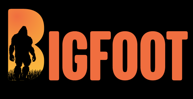
A former employer used such a technique. The artist’s name is Michael. He created this genius use of a logo within the name of a former employer. This slight adjustment added visual value to the brand at no cost to the company.
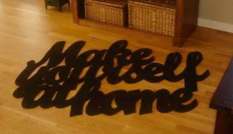
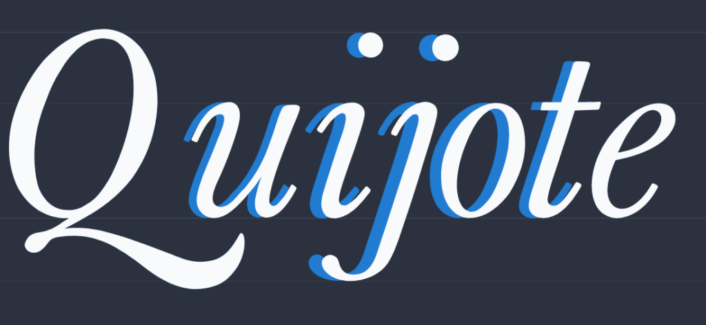
Being able to visualize the subject with title or heading together demonstrates the artists grasp of typography. An image could be written in a foreign language making only readable to those that spoke the language, however, if an image is presented with the text anyone can discern what the message is trying to convey.
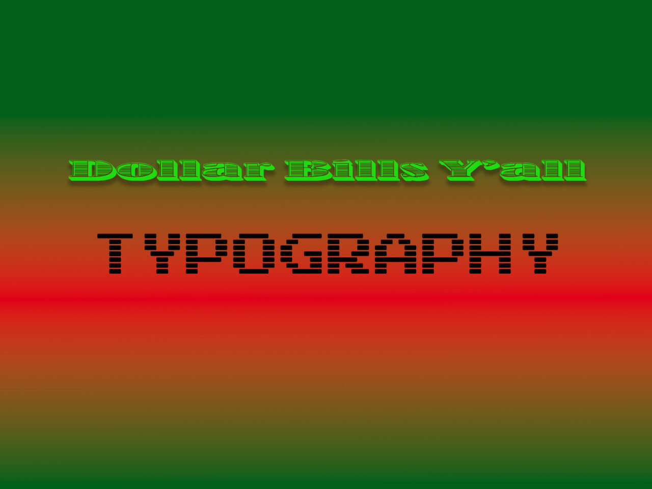
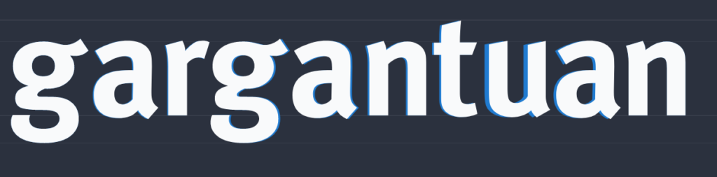
Alternatively, perhaps we can observe an example of typography with the text itself. The typeface selection can immediately create a sense of familiarity with the viewer. In this example, the idea of the military comes to mind just from the typeface.

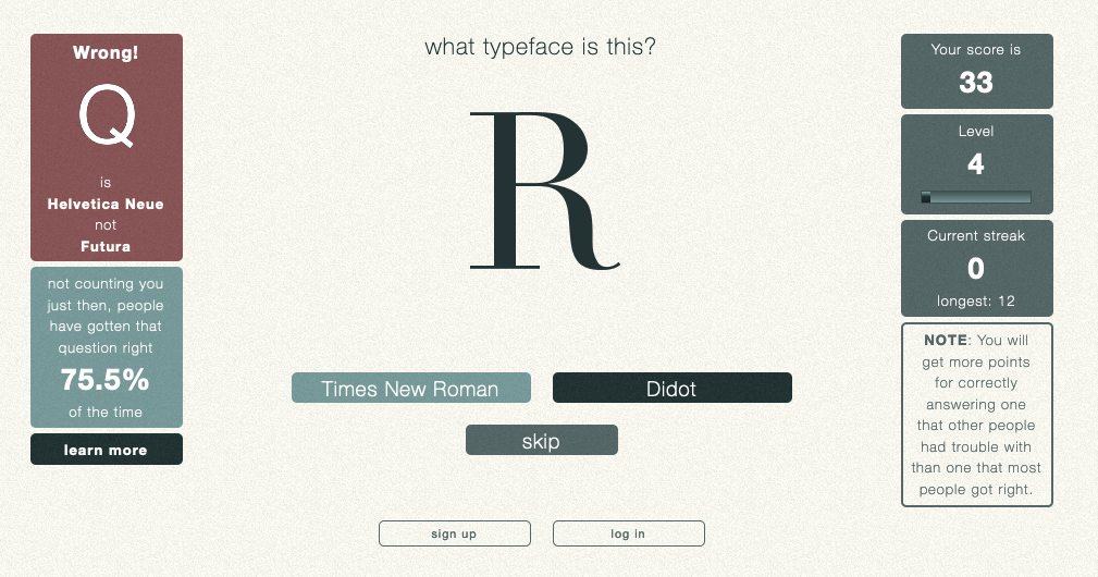
Knowing the little nuances of typeface will help deliver a message via typography. Using typewar can really test your knowledge of the nuances. I had a pretty good streak going!
Typography as stated in the Linkedin video series, we scan for a familiar image. We immediately know what is being conveyed when typography is manipulated.
Kerning is important to the brand. If out of place it throws off the whole design. I finally got he hang of it.
Give Kern Type a try and see how well you do.