
Design elements are present even in places you would hardly look to find them. Just walking back to the parking garage after classes and going about my daily life, I found a few examples of the elements that are some the following design characteristics.
- Color
- Typography
- Metaphors/symbols
- Minimalism & use of space
- Form/function/message
- Balance
- Rhythm
- Proportion
- Dominance
- Unity
The design blitz is on! Every day these design elements are present in our life’s. Having the notion and ability to incorporate the elements are where the true art and concepts of design collaborate. From the most intended to a surprising coincidence the aforementioned characteristics of design are what we find visually appealing.
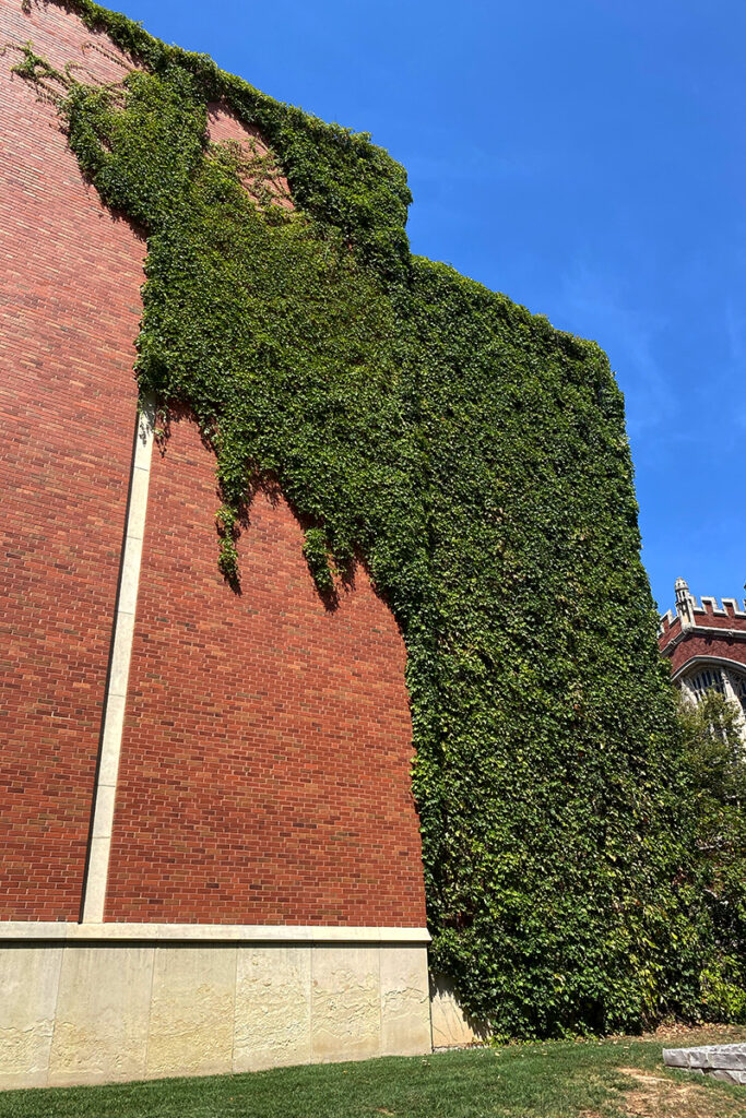
Color
Without the green foliage, the northeast rear brick wall of the Bizzell Library would be just a dull brick wall, a corner that would melt into the other red brick building (Evans Hall) behind it. While it may be Mother Nature offering her design, someone had to decide to let it display her beauty. The deliberate nature of allowing the beauty of the greenery informs us that an element of design is at work.

Proportion
I found that the mums on the South Oval are well on their way to the usual spectacular explosion of Crimson and Cream seen at its height around homecoming. Above, the image demonstrates a level of proportion and draws your attention to the dominant image in the lower left corner. The single plant is the reason for the shot but with the abundance of plants, in rows, its understandable to incorporate them into the shot.
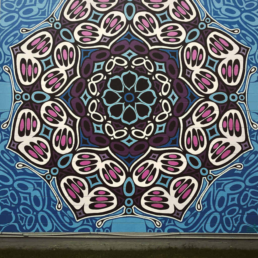
Rhythym
An example of color, symmetry and rhythm is Rick Sinnett’s “Butterfly Mandala” in Norman. The balance and colors are eye-popping. Those characteristics give the piece a powerful element of visual structure.
The colors are deep and bright, drawing attention to the drab cinder wall.
The symmetry develops from the Mandala’s center into the butterflies comprising the outer circle. Sinnett says the design represents life’s beauty (Uncovering Oklahoma, www.uncoveringoklahoma.com). Rhythm flows from the center with corresponding geometric shapes that repeat. Although, the repetition is the focal point. The piece relies strongly on its repetitive patterns, creating balance and a feeling of undulation.
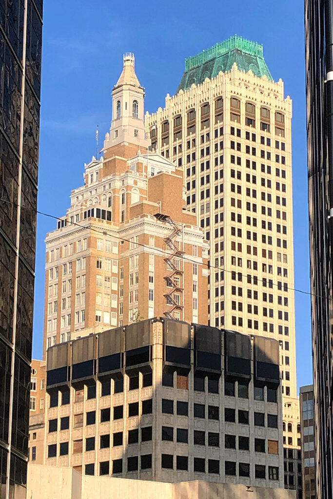
Balance & Unity
I recently walked downtown Tulsa and saw a group gathering on a corner. Five to six people with cameras were taking a picture of the above. Naturally, I followed suit and took out my camera. They were looking at two buildings between two buildings. Really. It is a remarkable image. Upon a Google search of the area and its art deco roots, the Mid-Continent building with the patinaed roof is to the right. The building to the left, with the spire is the Philtower Building. The balance of the split between the two buildings (or one, depending on your view) so you can view two beautiful vintage-styled buildings is spectacular. The two buildings on the far right and far left act to support the design image of the photo completely.
Got Minimalism?
The minimalist approach is used in many aspects of design. From logos to complete campaigns. Got Milk? That campaign relied on reminding viewers of the color of milk, white. The simple tag line and concept fed many copycats. Got books?, Got booze?, etc..
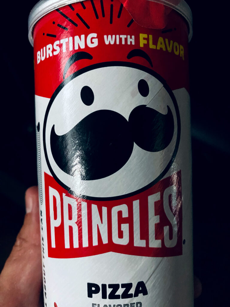
Pringle’s pizza flavored potato crisps may be ‘Bursting with Flavor’, however, it is the logo that adopts a minimalist design. The circle with two eyes and a mustache is a just a white circle without the eyes and mustache. Without the words ‘Pringles’ the company utilizes black and white with the noticeable feature the mustache. The circular logo takes advantage of the unique packaging the chips comes in. It works because of the simplicity.
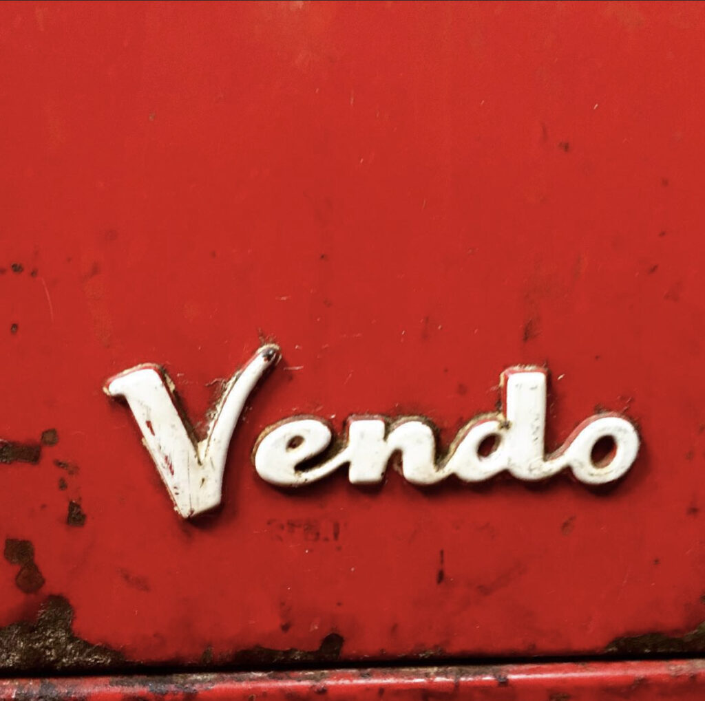
Typography
I saw this logo at the bottom of this old Coke machine at a restaurant I was eating at. I thought to myself, how simple of a name. If you own a vending company, why not Vendo? The typeface conveys fun and vintage. The Ascender on the ‘V’ and the kerning between it and the rest of the name is noticeable. The cursive connection of the letters is aesthetically appealling and reminiscent of the logos of that period. At one time, when this was brand new, this logo stood out on that red paint.
Conclusion
Design elements are arrows in the artists quiver. These are the concepts that are beholden to those in the profession. Not only help guide the designer but they are elements that appeal to human senses guiding the viewers to the intended message.
Sources
Spielman, D. (2017, March 6). Rick Sinnett “Butterfly Mandala.” Uncovering Oklahoma. https://www.uncoveringoklahoma.com/2017/03/rick-sinnett-butterfly-mandala/