Defining a stakeholder when creating a campaign is not only smart, it’s imperative. It’s like driving across the country without GPS or a map. Who are you intending to reach? It seems to me that it would take longer to process and create any visuals without a roadmap. Recognizing your public and stakeholders is a critical task. According to Larder, Understanding your stakeholder, or the stakeholder of your client stops assumptions perceived by publics and allows the targeted communication of the organization to stay on track (Larder, 2018).
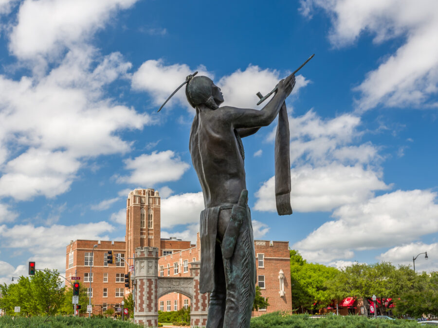
I’m assigned to create a mailer for a stakeholder, two actually, related to the University of Oklahoma’s Admission and Recruitment office and their outreach to prospective native students looking for a college that would fit their lifestyle and values.
Stakeholder 1
18-22 years old,
Native American (male or female)
test scores allow for admission to OU
Undecided on what institution to attend after high school
Eligible regardless of involvement in ceremonials or dances
Stakeholder 2
29-34 years old
Native American male or female (often a same tribe as student)
Parent
Tribal community member
How to Target
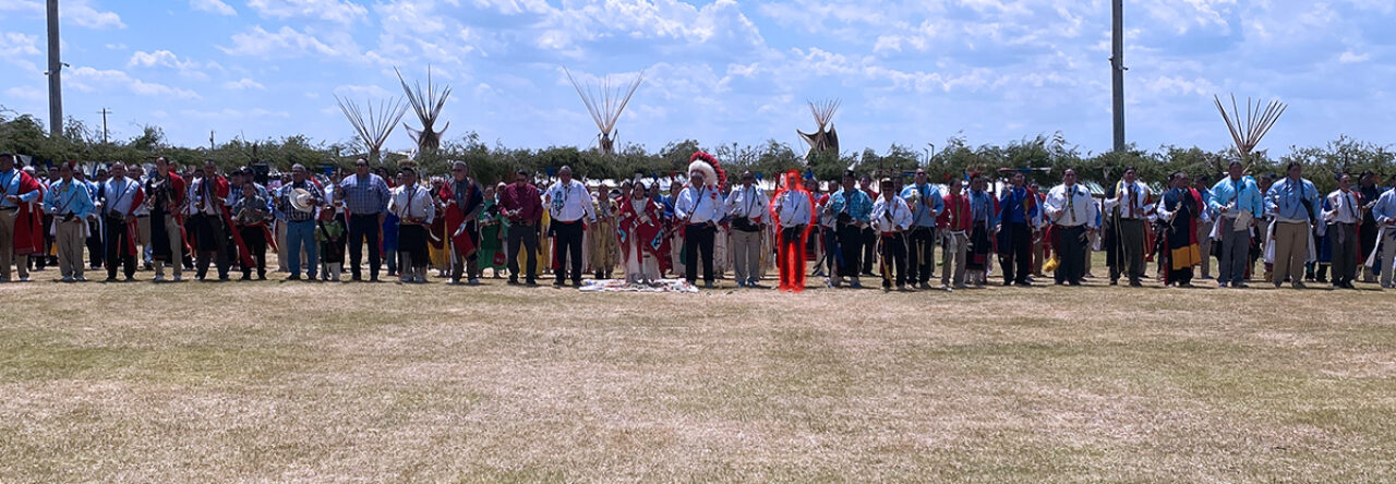
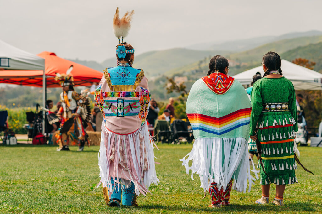
These two age groups and stakeholders are both Native American. As a native, I’m aware Native Americans fondness for color and vibrancy. Incorporating color and subtle glimpses of regalia might intrigue these stakeholders. At least it would signify to me that natives are recognized. There is a fine line between demonstrating and exploiting. Careful.
While design elements are one thing and share mutual interest. Age and responsibility are where the two stakeholders separate in interests and how they might respond to situations or stimulus.
Using images of youth and college life would help foster an idea of acceptance and inclusion. Offering an image of a school that recognizes its native student body.
Sources
Larder, M. (2018, May 6). The importance of stakeholders in PR . linkedin. https://www.linkedin.com/pulse/importance-stakeholders-pr-maddison-larder
Next to the brand itself, the content on which its branded can be a companies most valuable asset. Branded collateral is often the first thing a potential client or customer might see. Perhaps its branded letterhead sent in a branded envelope processed through snail-mail? Or, the most likely scenarios, you are meeting a customer and they request a card to contact you for business? Do you have one?
Businesses and the executives that represent them must have a brand they can include on company stationary. That includes letterhead, envelopes and business cards. Branding these items first enables a strong footing moving forward in becoming a well-known brand that people can gravitate toward and recognize. The consistency of the brand across all of your elements is known as known as the brand touchpoints and is discussed here in depth.
Operating a DJ company for decades, until recently I needed a business card completely designed by me. My company’s name is The 572 DJs LLC. (I keep telling myself the 572 area code will catch on like the 405 did). I created the logo within Illustrator and used InDesign to create a business card, letterhead and envelope for The 572 DJs.
This is the company’s current logo
Business Card
Utilizing negative space and proportion I enlarged the logo and positioned it to one side of the card. Using the white space as negative space because of the nature of the logo. A lot going on there.
Letterhead
The logo reveals enough of the company and what we do, I felt it was necessary to leave the white open. I also created an alternate with a text border, of sorts. I feel either could work, what do you think?
Envelope
The envelope presents a challenge. Staying within the Post Offices recommended guidelines. Parts of the envelope aren’t allowed to be covered or marked. It is where the designer and Post Master resistance meets. I never paid much attention to envelopes with a large logo offset to the upper left corner. There isn’t much room to mess with here. Post Grid offers guidance on these issues, check this page out for those.
Check out our Brand-O!
Branding can really become the preoccupation of any company. Almost obsessive but what else do you have other than your brand? You can brand just about anything!
However, you must maintain brand consistency. It is as crucial as the brand itself. Consumers and the public rely on what they know and how they will spend their hard earned dollar.
When a customer picks up your product because of its look or appearance, a designer somewhere beams with pride, but the researcher sips wine on a beach. The researchers job involves more than being a talented artist, its only a small bit of their job.
Knowing what appeals to your customer base or clientele is essential to the 4Ps (Product, price, promotion and place). If the design is essential, then the research into that design is crucial. Creating a well thought out communication strategy involves managing design elements actively.
Colo®
Relaying color is a part of visual language. It involuntarily coerces the human eye into perceiving an idea or emotion. Humans are weird creatures.
For shoppers and retailers, it is apparent that the color red is everywhere during the Christmas holiday. In the early 1900s, according to Fabrik Brands, Coca-Cola ingrained the color red into the minds of Americans with their version of Santa Claus.
Research into the relevant colors is vital to a brand, especially when targeting a specific demographic.
What works for men might not work for women.
What color appeals to children over adults?
Do warmer tones appeal to specific demographic during a particular season?
Are certain tones more expressive than others?
What tone creates revenue?
These are all valid questions to consider when creating a communications strategy and essential enough to incorporate into the brand’s design. In reality, revenue is what it is all about. It’s the ultimate measuring stick for most employers and clients. In most cases, choosing color is a commitment to the bottom line. So choose wisely.
Imagery
What images are being used are also an important element of design and its communication strategy. Take for instance these images of a stick figure in different actions. Without the heart illustration we’re left with a stick figure(s) doing uninteresting actions. You could place any image in the heart’s place and it could convey a completely different message.
the heart imagery conveys love
the heart imagery conveys care
the heart imagery conveys compassion
There’s a reason Southwest Airlines chooses to use a heart in its logo. Amongst an airport of varying airlines for customers to choose from, Southwest uses the’ heart’ imagery to sway customers to fly with them. The heart helps convey “Heart & Hospitality”.
Space & Composition
Space is at a premium in any design. The area of the paper, screen or banner limits you. Good strategic planners utilize space to create the size and the enormity of the message, which can take the message to heights that far supersede the size of the medium—saving a few dollars in printing costs.
When a design scales back to a basic shape (familiar) without text, we see a minimalist design with a powerful message. Here are some others mentioned by Jami Oetting at Hubspot that are clever. Call it coincidence or fate. Some would call it brilliant.
Logo
Here is the logo I created for my DJ company. I felt that the circular nature of the logo represented a turntable platter. This is the design I have worked with for a few years now. I had stickers printed of them and the printer really hated the ‘saw blades’ around the sticker. The bubble look conveyed fun. However, there are many elements to choose from to incorporate into other visuals for the brand (letterhead, stationary, etc.).
Below, I started with a circle and worked my way into what you see above.
Sources
Color & Consumer Behavior Infographic. Insights In Marketing. (n.d.). https://insightsinmarketing.com/how-does-color-affect-consumer-behavior/
Hodgson, S. (2023, February 13). The history of Christmas colors and what they mean. Fabrik Brands. https://fabrikbrands.com/the-history-of-christmas-colors-and-what-they-mean/
Oetting, J. (2016, January 6). 24 Minimalist Print Ads to Inspire Your Creativity. Hubspot. September 9, 2023, https://blog.hubspot.com/agency/minimalist-print-ads
Pure heart: The evolution of the southwest corporate logo. Southwest 50 Years. One Heart. (n.d.). https://southwest50.com/our-stories/pure-heart-the-evolution-of-the-southwest-corporate-logo/