Month: October 2023

A Big, Genius Newsletter from Apple..Kind of

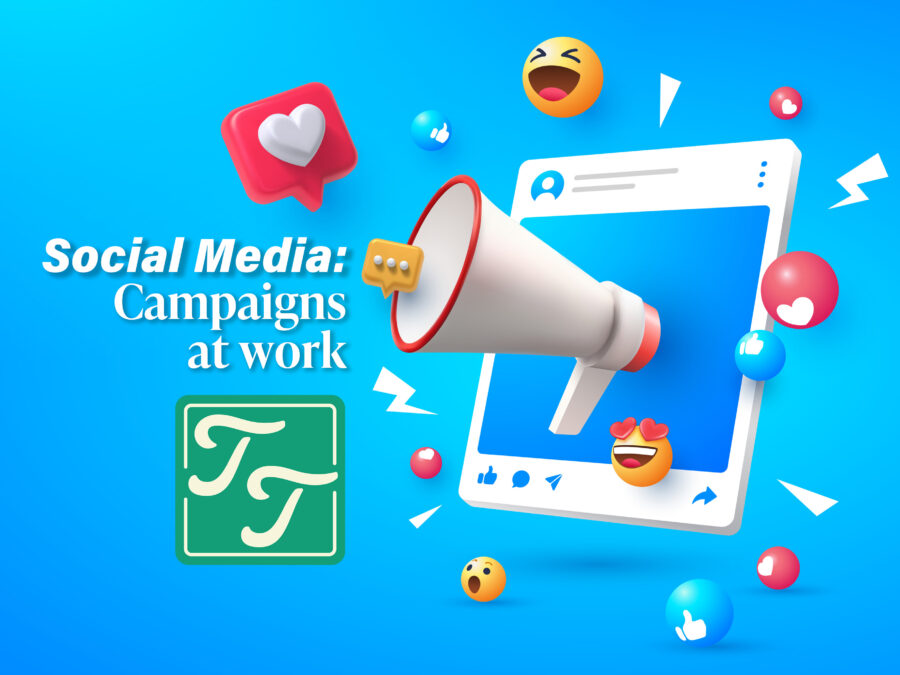
I have the occasional newsletter in my inbox. Some I read and others not. The subject matter is essential, and design is just as important. I now have a newfound respect for those who created them after attempting two of them myself, and they are not easy doings. Everything has a place, and paying mind to these will help you make the perfect newsletter for your organization or business. The elements complement the stories, namely the photos. I can write about the new Apple Watch, but when I write about the Apple Watch, I can see an image of Snoopy on the watch in the article. It’s like harmony to music. The relationship is complete. The pictures bring life to the stories and give some context. I would much rather see the new features on the new iMac in a picture than read about it and no picture. Newsletters bring these elements together so the reader feels connected to the story.


My first attempt

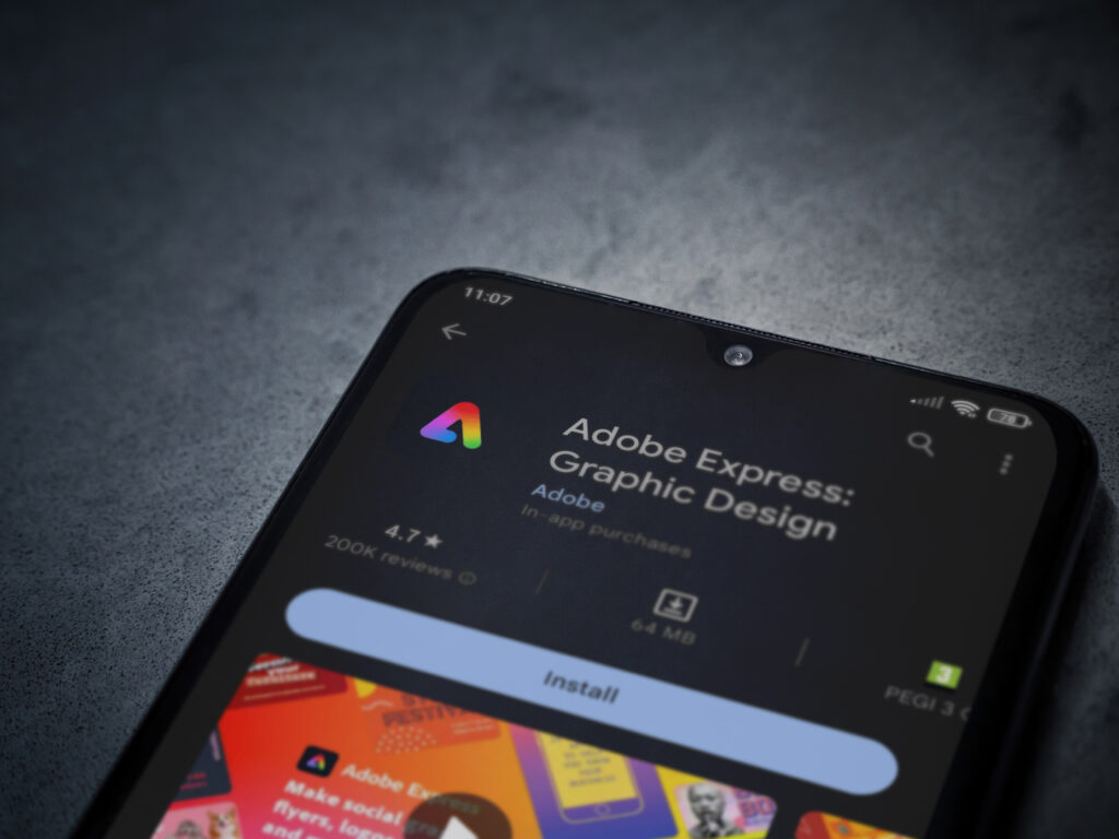
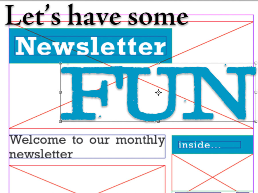
This is an example of a newsletter I created in Media Writing and Storytelling for my current employer, Cumulus Media. I designed it in Adobe Express. If I had known what I know now, I would have started this creation in Indesign. Its not pretty. I would change so much.

What was different here from the next example, is the writing is mine. Having willing co-workers ready to lend a hand helped. If I knew what I didn’t when I made this, it would appear better. I now understand the idea of Indesign and the ‘containers in which you can place pictures and text. It’s a convenient feature. Here’s an Adobe tutorial about its functions. Pretty powerful and easy tool to use.

The Tedium will get you

Although challenging, they are fun to design and create. The biggest challenge I found while making this faux newsletter for Apple was the amount of space and work area you have to work with. When there is so much information, it is a challenge to figure out what stories to include, where to place them, what is essential and what can fall to the cutting room floor. The space and fitting everything in is the difficulty. Planning and sketching out your design helped give me an idea of where things might have a place.
Creating these newsletters demanded attention to detail and constant nudging. Keeping the errors off the page proved difficult also, but the ability of InDesign to realize there are errors is miraculous.
The elements required presented a challenge. Fitting all the elements necessary needed great attention, and I’m not sure I got them all in.
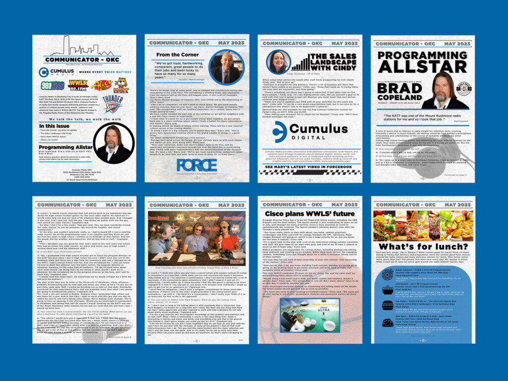
Here is the Genius Newsletter from Apple, kind of.

The Genius Newsletter

(*entirely fictional, except for the stories)

I think the spacing should be managed a little better, but overall the design works.

I found spacing and area posed a good challenge, I’m close but it still could be adjusted on page 2.

Including all the text and information of the story was difficult with this page, the story was so detailed and well written that I didn’t want to lose any of the story or pictures. The final version shows I had to move some things on page 3.

Maintaining Apple’s clean look challenged my use of negative space. The Apple brand thrives from the use of negative space but with lengthy stories and so much information to pass along to the reader, space is the issue on page 4.


The Apple Newsroom is packed full of news from the company. This is something I learned with this project. I realized that most large companies have a newsroom, where stories are propagated and distributed. Apple even allows you to download the original picture file. I still am amazed at that. With no photo credits or cut lines included though.

Knowing your personas and some design elements, you can try creating your new letters. It seems like a mammoth task, but with some planning, like sketching, you can do this. And you’ll end up with a design you’re proud of.

Bringing a Social Media Campaign to Life

Launching your social media campaign is not as complicated or overwhelming as it may seem if the design is compelling and coherent. A simplistic design uses minimal text and imagery to convey the message in an easily digestible manner for users. Creating a consistent and concise message with a call to action is vital. The call to action spurs the user to visit a website, sign up for a trial, sign up for a newsletter, or spend money with your business or company.
Beginning with a goal is where the process starts. What goal is your social media campaign attempting to achieve? Is it selling more products? More email subscriptions? The list is endless. Here are eleven helpful trends in 2023 to keep in mind as you set out to create a successful social media campaign and here are a few of my own suggestions.


Social Media=Powerful PR Tool

The remarkable aspect of social media is that it’s mostly free, creating a powerful PR tool for the PR practitioner that is valuable to use. Most platforms monetize their ads but are far cheaper than legacy media streams. For the PR practitioner, social media also encompasses measurement and numbers to sift through. The analytics offered with social media only adds to the value of social media. These platforms are trendy and where your key demographics, regardless of age and status, most likely spend a majority of their time.

The numbers don’t lie, most with a smart phone and connection are involved in some sort of online activity. This is where your audience is most likely.

Source: datareportal

Important Design Elements to keep in mind

Brand and design elements are essential to remember as you craft your message and campaign. Social media users are bombarded with ads and campaigns all day. It is necessary to keep your campaign consistent across all platforms. Consistency will help keep the message for the end user memorable. While appearing memorable, having a call to action is almost as crucial in creating your campaign. Without a call to action, your campaign is useless. What is the goal of the campaign? It may be time to revisit your goal for the social media campaign if you are experiencing a difficult time in the design portion of the project.
Keeping the dimensions of each platform should also be considered in your design. You can create fantastic designs, keeping dimensions and work surfaces in mind.

Facebook Post Image (1600X630 pixels)
Facebook Header Image (820X312 pixels)
Instagram Post Image (1800X1800 pixels)
X Header Image (1500X1500 pixels)

The design elements are consistent throughout this campaign I created for my photobooth business. Also, there is a call to action. *DM for Info. I feel I can better answer questions talking directly to the client through phone or email at that point.

Remember, you don’t have to fit the whole message onto the design. That can be saved for the text of the post.

*For Example*

Go to the572djs.com and secure your date now! Dates are filling for the holidays. Book your event now and save.


Brand Voice & Culture

It’s important to remember the voice of your organization or client. Writing your message in a language that suits the voice of your campaign will help relate the message more believably. Remember that the message needs to resonate with your audience and prompt them to take action.


Adobe Express

I use Adobe Express as a tool for social media. It is very similar to Canva. It is tailor-made for brands. I can also incorporate all of my other Adobe assets to projects using Adobe Express. You can get as specific as you can in Canva. Sizes for social media posts are accessible using templates. Adobe has paid particular attention to AI and incorporates it into several paid softwares. Here is a fantastic tutorial and link on scoring Adobe Express and adding it to your arrows in the design quiver.

Lod, Israel – July 16,2023: Adobe Express – Graphic Design app play store page on smartphone on a dark marble stone background. Top view flat lay with copy space. By wavemovies

Function over form…

..or quantity over quality. Depending on the context of the situation, we usually hear these statements in reverse. In my case, its dysfunction over form. Sometimes my glaring inability to maneuver within Photoshop (proficiently) is baffling. As I grappled with a recent Photoshop project working, my lack of ability to grasp a concept frustrated me to the point of wanting to never work in Photoshop again. Its an overreaction, I know, and it probably won’t happen because my love-hate relationship with the software. Its clear to me that InDesign might work for my brain processes better. Photoshop is pretty cool though, and its just too intriguing to walk away from.

By napat

Outside of the technology gap, The recent project focused on stakeholders and how the personas affect the design. This post will explain the importance of how the stakeholders role, views, goals, pain points and behaviors dictate what to include in your project. Combining these aspects for Photoshop users can also present challenges as you are working within the medium.

Admissions & Recruitment – American Indian Mailers

Persona 1 – Native Graduate.

Front

Persona 2 – Native Higher Education liaison.

Front


Stakeholders & their importance

Stakeholders are those that have an interest in a topic, subject or situation. In this case, the relationship between the official representing the higher education offices for tribes across the country and the student to the University are the stakeholders here. If the University of Oklahoma and The office of Admissions and Recruitment were to work specifically with the American Indian offices in a mailer campaign in an outreach effort to communicate with both student and an educational official from the tribes. Knowing who you are designing for, is imperative to the creative process. Knowing which elements to include or what language to use is a symptom of good planning and creating the persona for each of the stakeholders.

Knowing

Role: Who are you creating for and what role do they play in the organization or business.

Views: Their views are what you can directly appeal to. How do they view themselves and the community.

Goals: What are the goals of their campaign or organization. What they trying to achieve?

Pain Points: What are the issues or barriers that they may encounter or currently are experiencing.

Behaviors: What are their behaviors and how do they approach their goals?

In the case of the mailers I created for this assignment, knowing the aforementioned key points for stakeholder 1 helped define these specifics in how stakeholder 2 interacts with them, revealing an angle in how to effectively communicate the message. The students needs dictate the interactions. Ultimately, its about the student needs.

By Anna

Suggestions

However, my suggestion is working with the latest version. I have two machines I work with. An iMac at home and use a newer MacBook Pro for my traveling machine. The new features within the software are evident when working between two different generations of technology. The Object Selection Tool is amazing and worked well when approaching two mailers I created for OU’s recruiting and admissions office and the masking effect you see. I really enjoy PS. It does however, make me crazy. I found this guys blog to be helpful in establishing a better approach a session. The post included some helpful tricks that I am going to continue to use.

The biggest advice for anyone wanting to improve is to just dive in. YouTube videos are always helpful but not knowing what to even call a particular process or technique its rather difficult to relay what you are looking for. Its another one of those cliches: practice makes perfect.

Powered by WordPress & Theme by Anders Norén