I have the occasional newsletter in my inbox. Some I read and others not. The subject matter is essential, and design is just as important. I now have a newfound respect for those who created them after attempting two of them myself, and they are not easy doings. Everything has a place, and paying mind to these will help you make the perfect newsletter for your organization or business. The elements complement the stories, namely the photos. I can write about the new Apple Watch, but when I write about the Apple Watch, I can see an image of Snoopy on the watch in the article. It’s like harmony to music. The relationship is complete. The pictures bring life to the stories and give some context. I would much rather see the new features on the new iMac in a picture than read about it and no picture. Newsletters bring these elements together so the reader feels connected to the story.
My first attempt
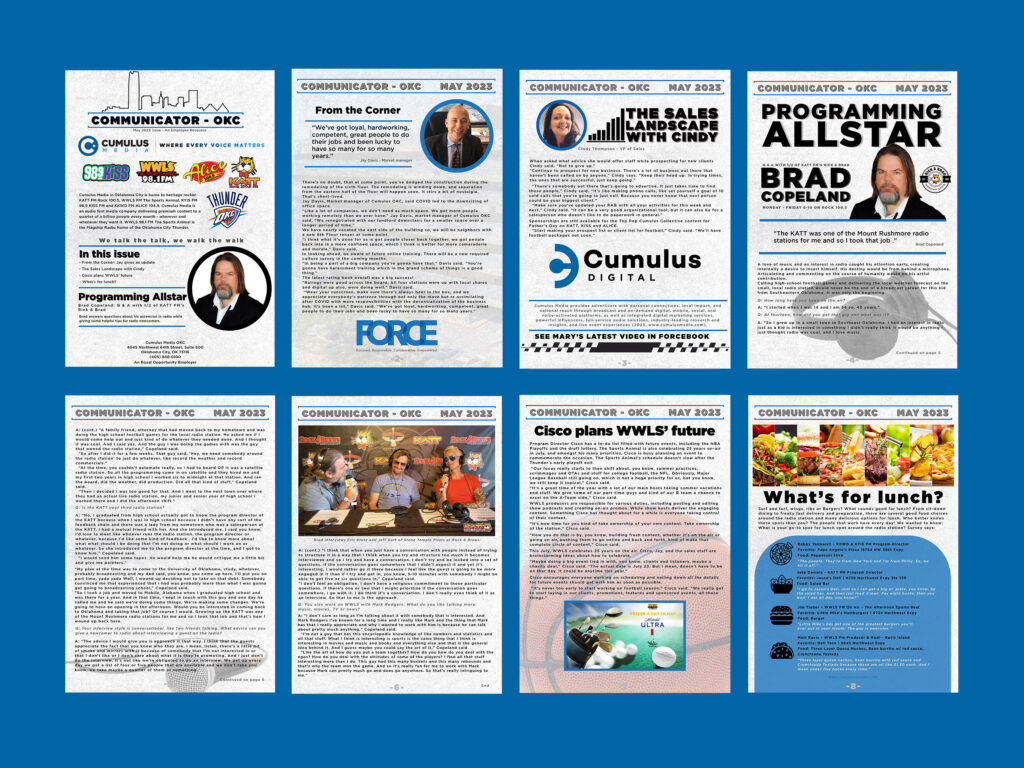
This is an example of a newsletter I created in Media Writing and Storytelling for my current employer, Cumulus Media. I designed it in Adobe Express. If I had known what I know now, I would have started this creation in Indesign. Its not pretty. I would change so much.
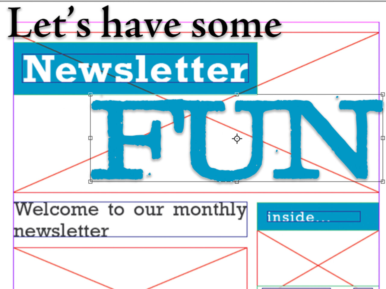
What was different here from the next example, is the writing is mine. Having willing co-workers ready to lend a hand helped. If I knew what I didn’t when I made this, it would appear better. I now understand the idea of Indesign and the ‘containers in which you can place pictures and text. It’s a convenient feature. Here’s an Adobe tutorial about its functions. Pretty powerful and easy tool to use.
The Tedium will get you
Although challenging, they are fun to design and create. The biggest challenge I found while making this faux newsletter for Apple was the amount of space and work area you have to work with. When there is so much information, it is a challenge to figure out what stories to include, where to place them, what is essential and what can fall to the cutting room floor. The space and fitting everything in is the difficulty. Planning and sketching out your design helped give me an idea of where things might have a place.
Creating these newsletters demanded attention to detail and constant nudging. Keeping the errors off the page proved difficult also, but the ability of InDesign to realize there are errors is miraculous.
The elements required presented a challenge. Fitting all the elements necessary needed great attention, and I’m not sure I got them all in.
Here is the Genius Newsletter from Apple, kind of.
The Genius Newsletter
(*entirely fictional, except for the stories)
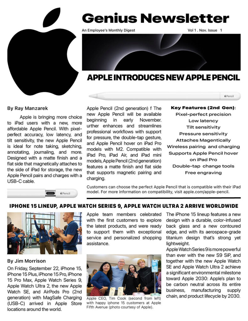
I think the spacing should be managed a little better, but overall the design works.
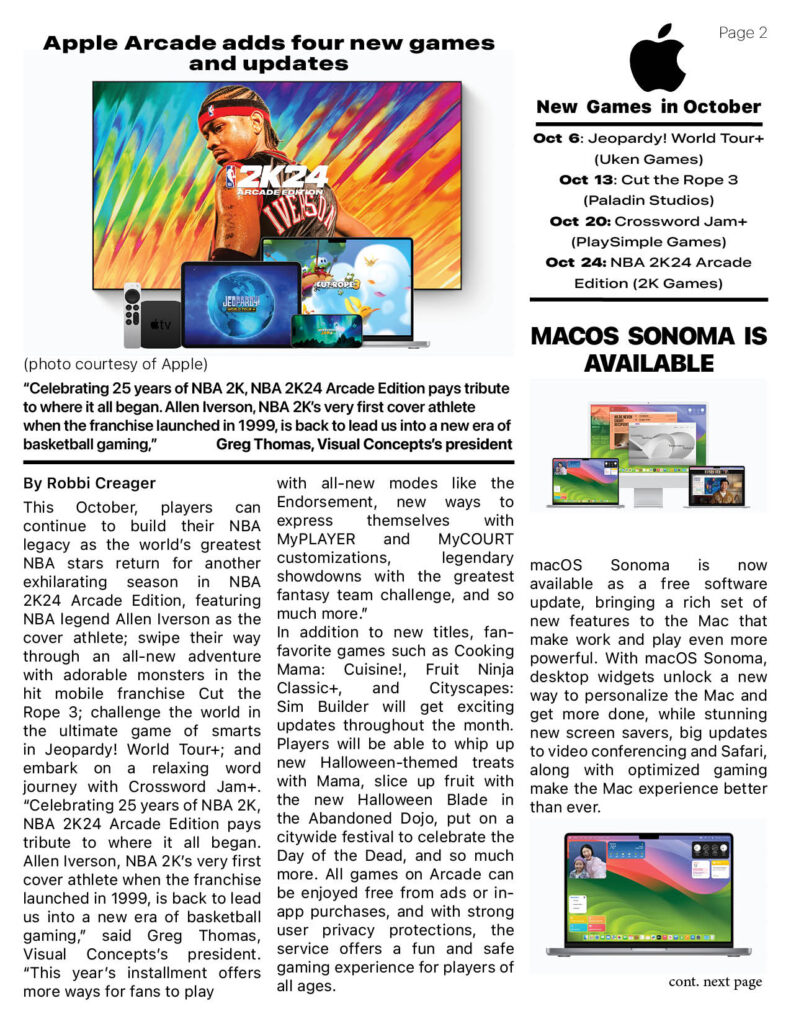
I found spacing and area posed a good challenge, I’m close but it still could be adjusted on page 2.
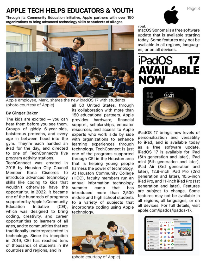
Including all the text and information of the story was difficult with this page, the story was so detailed and well written that I didn’t want to lose any of the story or pictures. The final version shows I had to move some things on page 3.
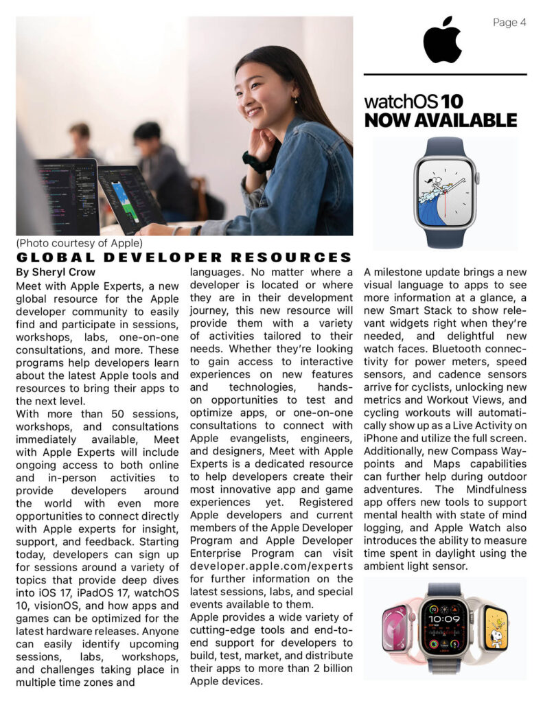
Maintaining Apple’s clean look challenged my use of negative space. The Apple brand thrives from the use of negative space but with lengthy stories and so much information to pass along to the reader, space is the issue on page 4.
The Apple Newsroom is packed full of news from the company. This is something I learned with this project. I realized that most large companies have a newsroom, where stories are propagated and distributed. Apple even allows you to download the original picture file. I still am amazed at that. With no photo credits or cut lines included though.
Knowing your personas and some design elements, you can try creating your new letters. It seems like a mammoth task, but with some planning, like sketching, you can do this. And you’ll end up with a design you’re proud of.
Leave a Reply