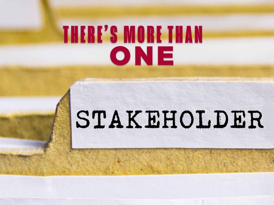

Designing a brochure for an organization is essential to building credible deliverables. The brochure passes on information at a trade show or event for a specific purpose. Developing the brochure is a process that relies on obtaining correct and up-to-date information and obtaining messaging that is pertinent and current from stakeholders. The design is only 50% of the effort when working with brochures.
Puzzling Efforts

Aggregating the data and most important information to include on the brochure is the most difficult task when creating your brochure. Having a clear messaging and an overall design concept also prove important.
It can seem overwhelming when tasked with the brochure. What information do I need to include? The space is limited to two 8.5 X 11 sides, divided into six smaller panels. Does the design encompass the entire room, or do you compartmentalize each panel with its information? The information may dictate the position of images, or a logo may fit in a spot better than others.
My Example – Hand Sketch
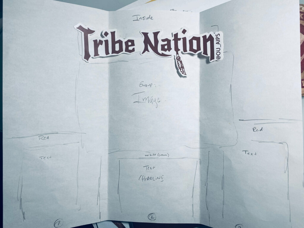
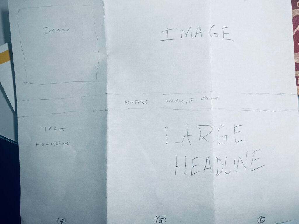
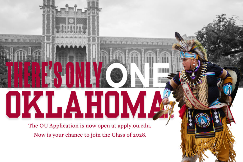
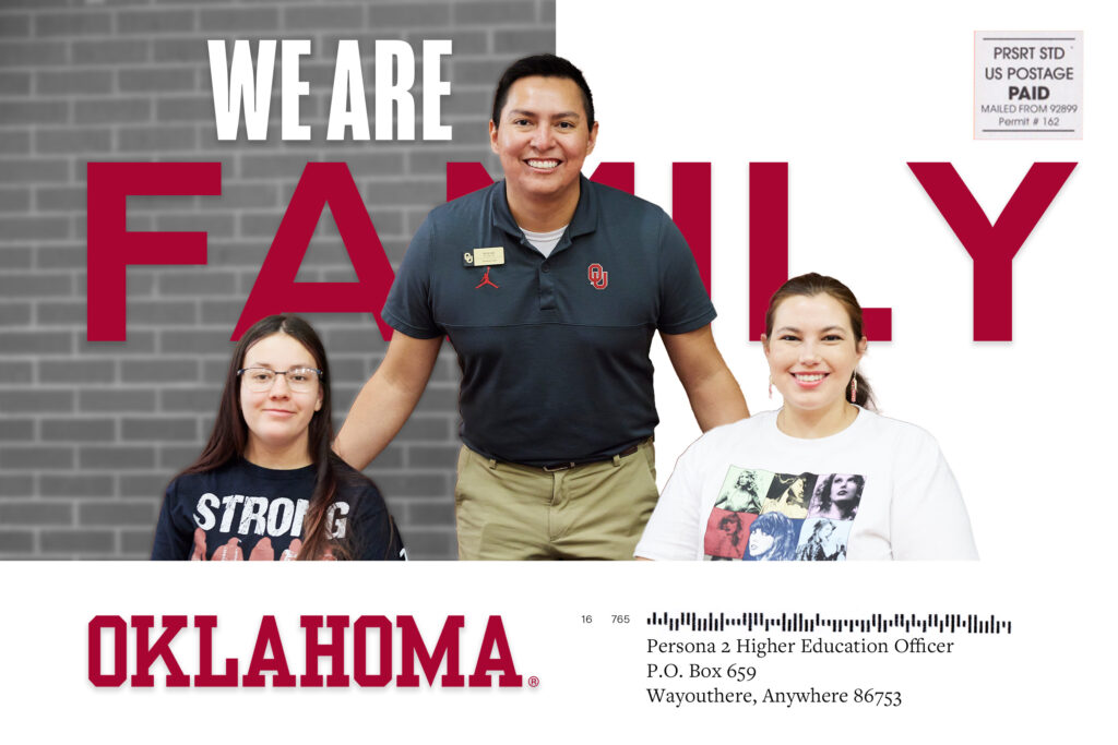
In this blog installment, I created a brochure for the Native American departments at The University Of Oklahoma. My initial hand-drawn sketch illustrates how fluid the process is with many changes happening until the end. The collective is known as ‘Tribe Nation.’ It is a great way to envelope the native community within the student body. I wanted to demonstrate the inclusiveness of the native body here at the school. This brochure would be within a media kit or handed to a prospective native student. It could function as collateral for a school information day, etc.
For this design I wanted to reflect on the earlier mentions of space and color.
Using InDesign
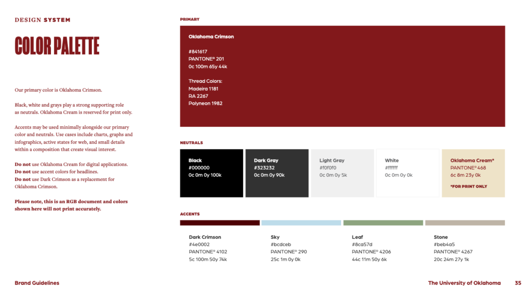
It has become my new go-to software for text and images projects. InDesign and its container feel allowed me to create this brochure for Admission and Recruitment. While it could use minor tweaks and nudges, the overall design features images on black and white backgrounds, keeping the traditional Oklahoma Crimson. The University of Oklahoma, in an effort to protect their brand from misuse, issues brand guidelines (found HERE) for anyone working with their colors, logo, and fonts. It helped stay within the requirements set forth by the University.
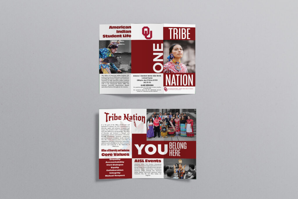
Design Mock
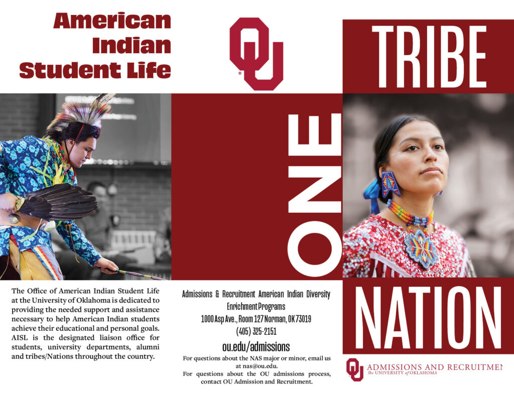
Outside
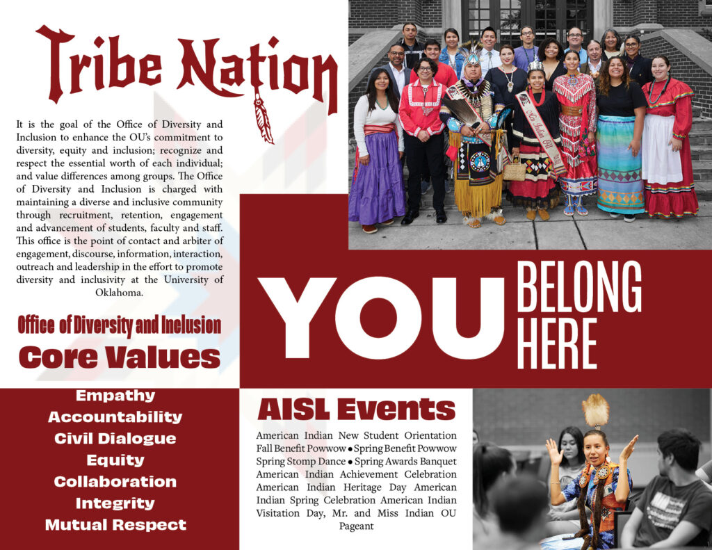
Inside
Note
While creating the brochure, watching your bleed and borders setup is essential. The folded crease is also critical to note. Creative Pro offers a calculator when accounting for the folds. Some even offer free templates if you want to go that route. However, remember that someone else could have the template, too. Create your own. It will encourage self-pride and spawn creativity.
Writing for your Audience

When anything goes to the printer, knowing who you are writing for is crucial. Not only is it essential but vital. Once the brochure prints, you can’t take it back. We aren’t printing money. The costs can get out of control when a design goes to print.