Tag: PR

What is PR Design?


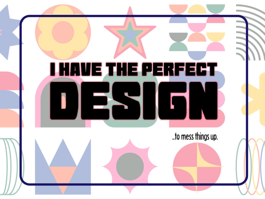
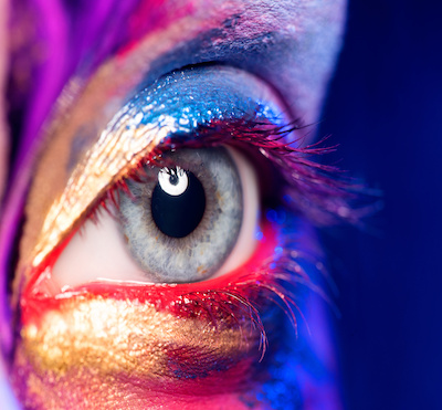
What is it we perceive as visually pleasing? How do those elements form to create a message that creates an action? It’s really open to interpretation.
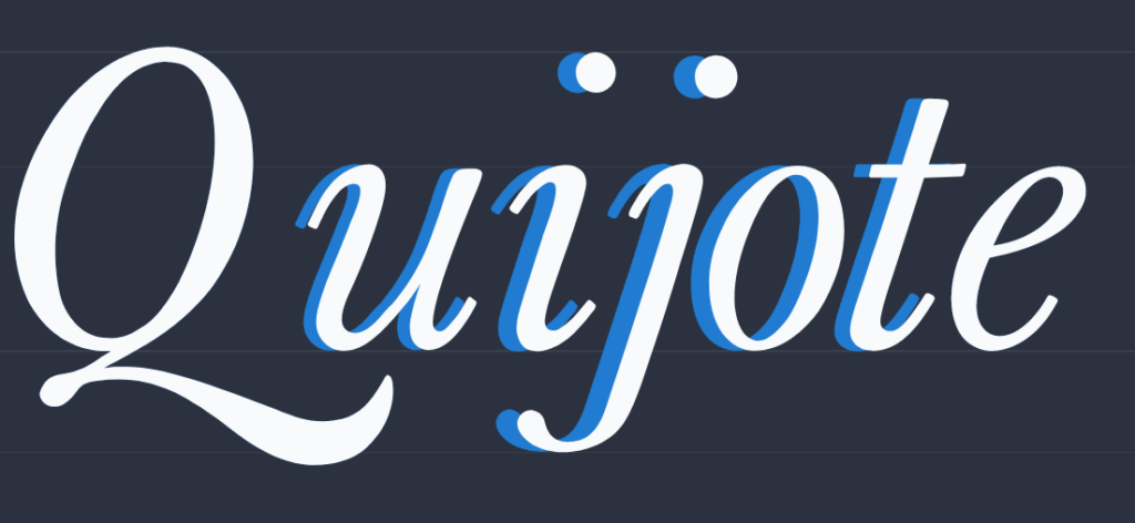
Closeup image of woman eye with creative makeup painted different colors
Dragon_Fly

While design and art are subjective, incorporating a semblance of structure and continuity is essential to recognize. Basic design elements will help a design flow and make translating a message more accessible. That’s ultimately the solution—a visually appealing image with a strong message encouraging action.
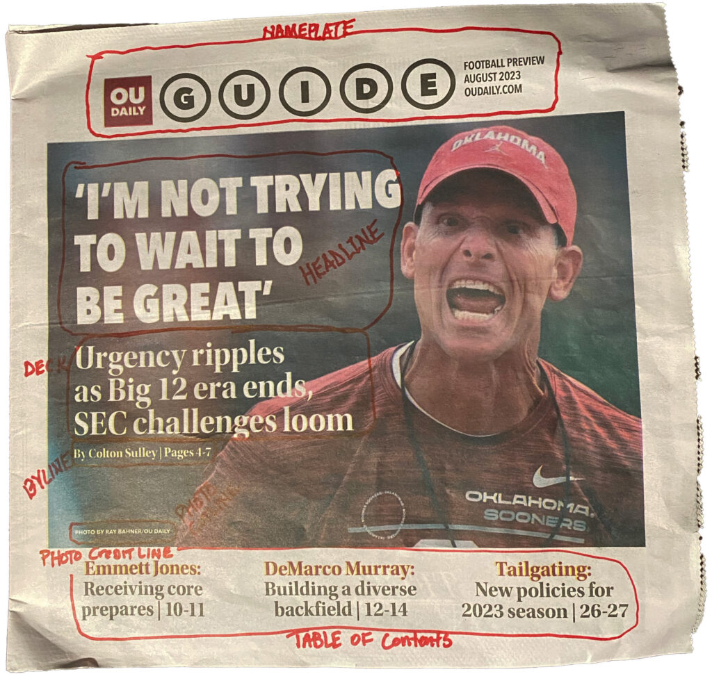
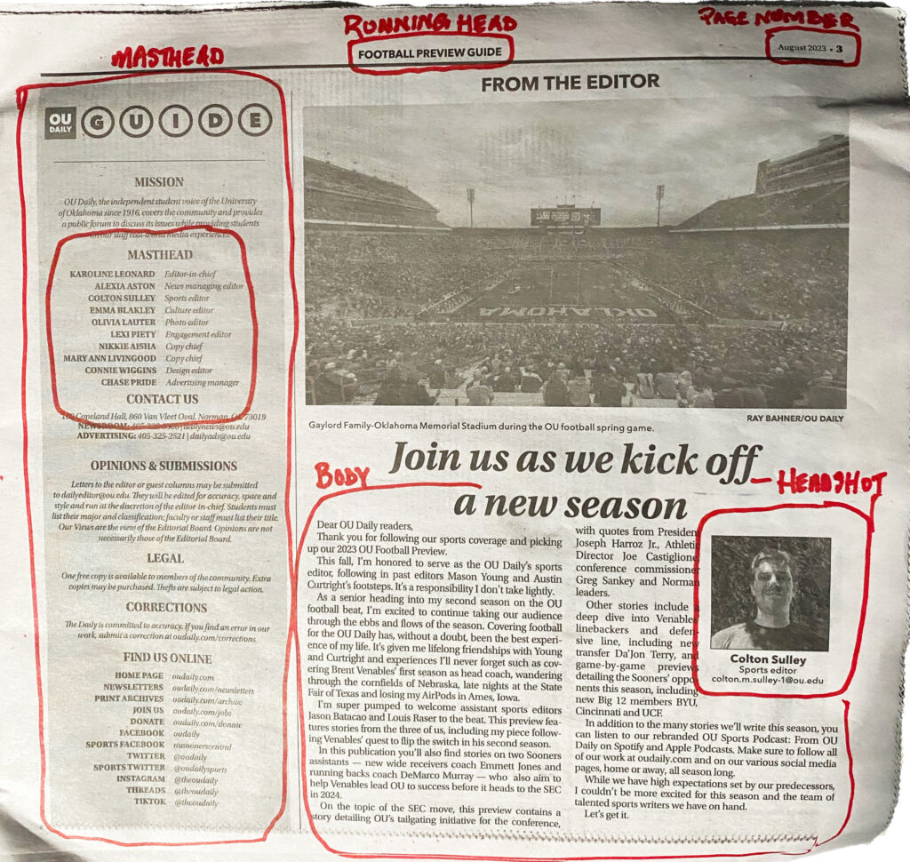
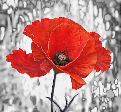
Design Elements


Design is everywhere. From the design of the bricks of a building to the look of a mailer, you might have received in the mail today. The design attracts or entices you to read it. They are the proverbial building blocks of a well-thought-out design. Generations of designers have established standards of design. Guidelines that help guide the messenger to receive the message appropriately. The designer’s job is to harness specific elements for a comfortable and manageable design to streamline the process. Once a designer knows color, typography, symbols, use of space, form-function-message, balance, rhythm, proportion, dominance and unity, the results can be formidable. These elements intertwine with the message to create the campaign.
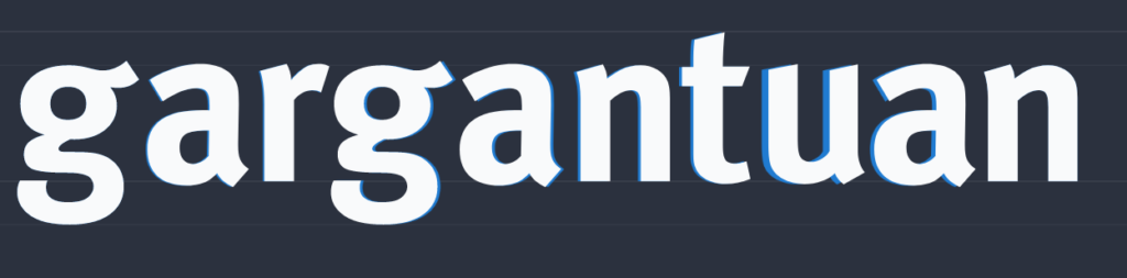
Collection of designer oil paintings. Decoration for the interior. Modern abstract art on canvas. Painting set. Red poppy.
By Erenai

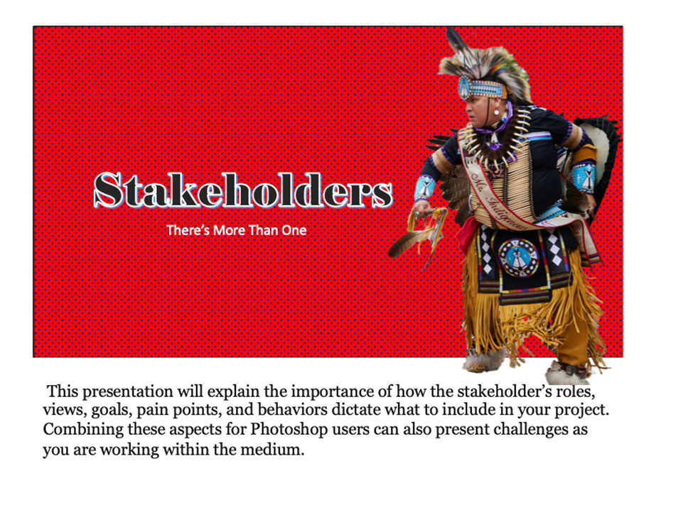
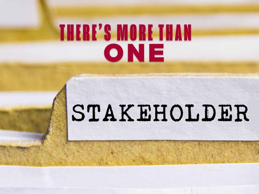
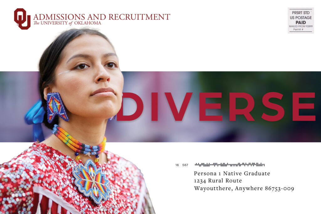
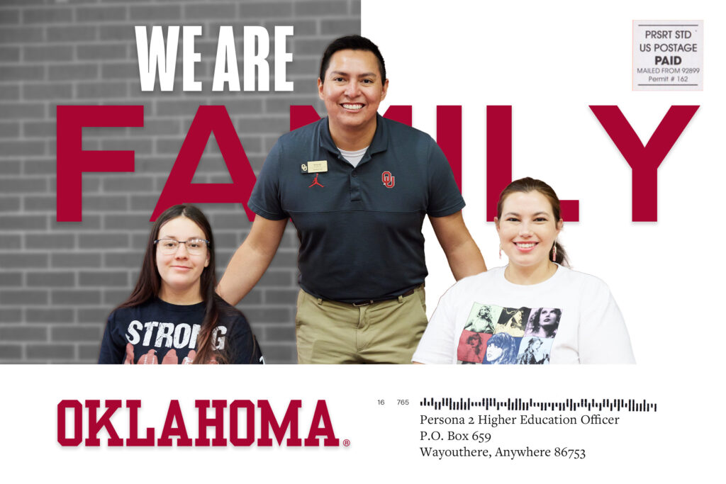
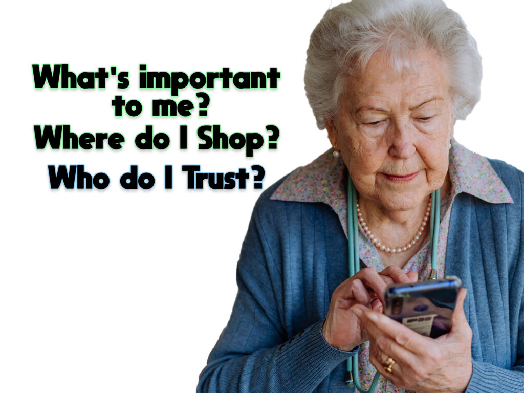
Stakeholders & Personas

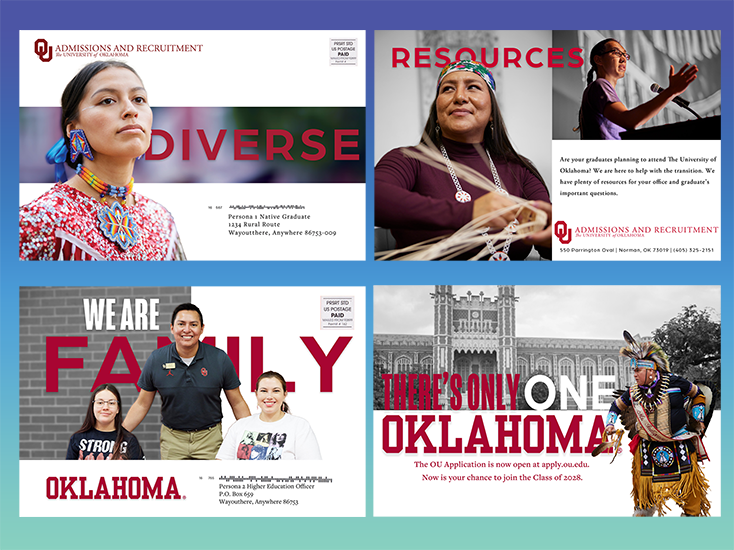
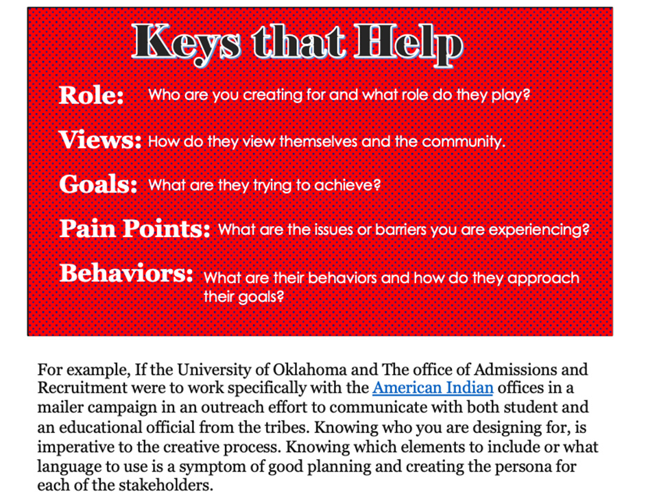
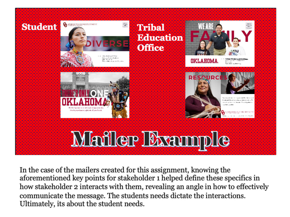
As a PR design professional, marrying your stakeholders and personas to create your campaign is your bread and butter. When you create your design, consider what makes them tick, their interests, likes and dislikes. Ultimately, you are creating for an audience, and the design is as important as the message. Capturing attention will help alleviate your hard work ending up in the trash can with all the others.

Keeping in tradition with PR as a whole, compared with advertising, where there is an exchange of money, PR is a part of earned media. Design is no different. It operates in a free environment to capture an emotion and affect influence. According to Professor Sherry Kast, PR Design and Writing at The University of Oklahoma, “PR Publications provide a free, controlled media designed for publics who share characteristics and interests.”


PR Publications provide a free, controlled media designed for publics who share characteristics and interests

Professor Sherry Kast PR Design & Writing
The University of Oklahoma

Mediums, platforms and consistency

Mediums

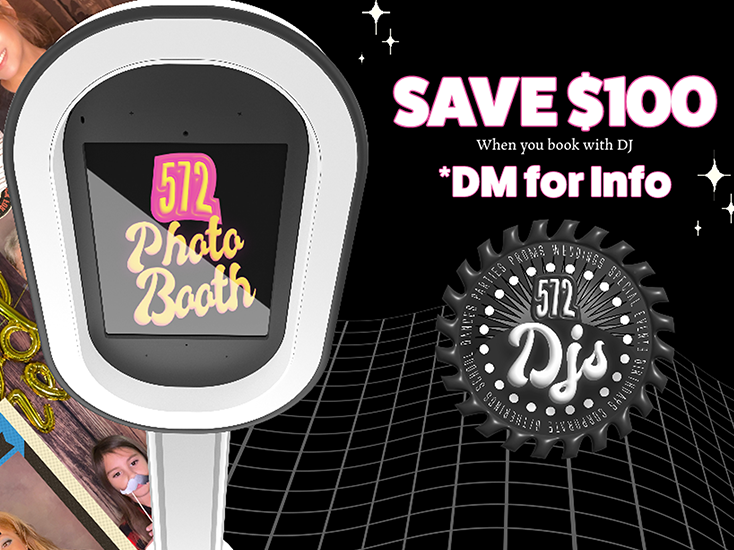
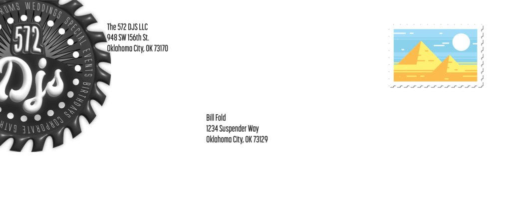
There are a multitude of mediums for PR design, such as folded brochures, mailers, e-newsletters, social media campaigns, branded materials, and so on. You’ll want to choose a medium or a combination for your campaign. One isn’t better than the other, but it’s important to choose yours according to the stakeholders and where they are finding their information. The formula for a successful campaign relies on many factors. Planning, acknowledging, and recording those factors is wise and prudent.
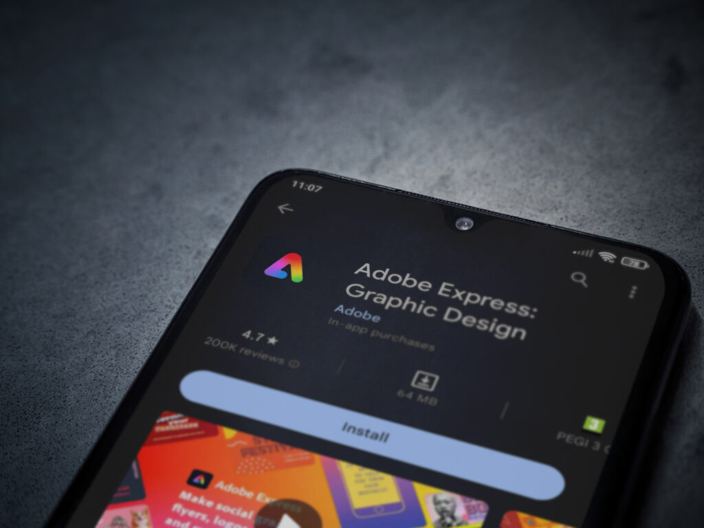
Platforms

The importance of the platforms on which these deliverables spawn cannot be understated. The Adobe Suite and Canva are potent platforms for designers. I found that there are many ways to accomplish tasks on these platforms. It’s a preference when performing the processes of the functions.
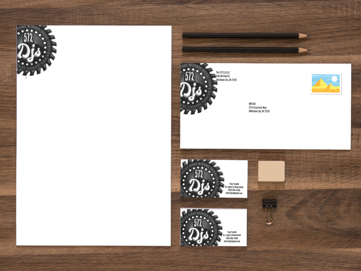
Consistency

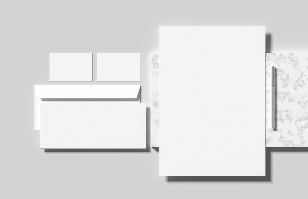
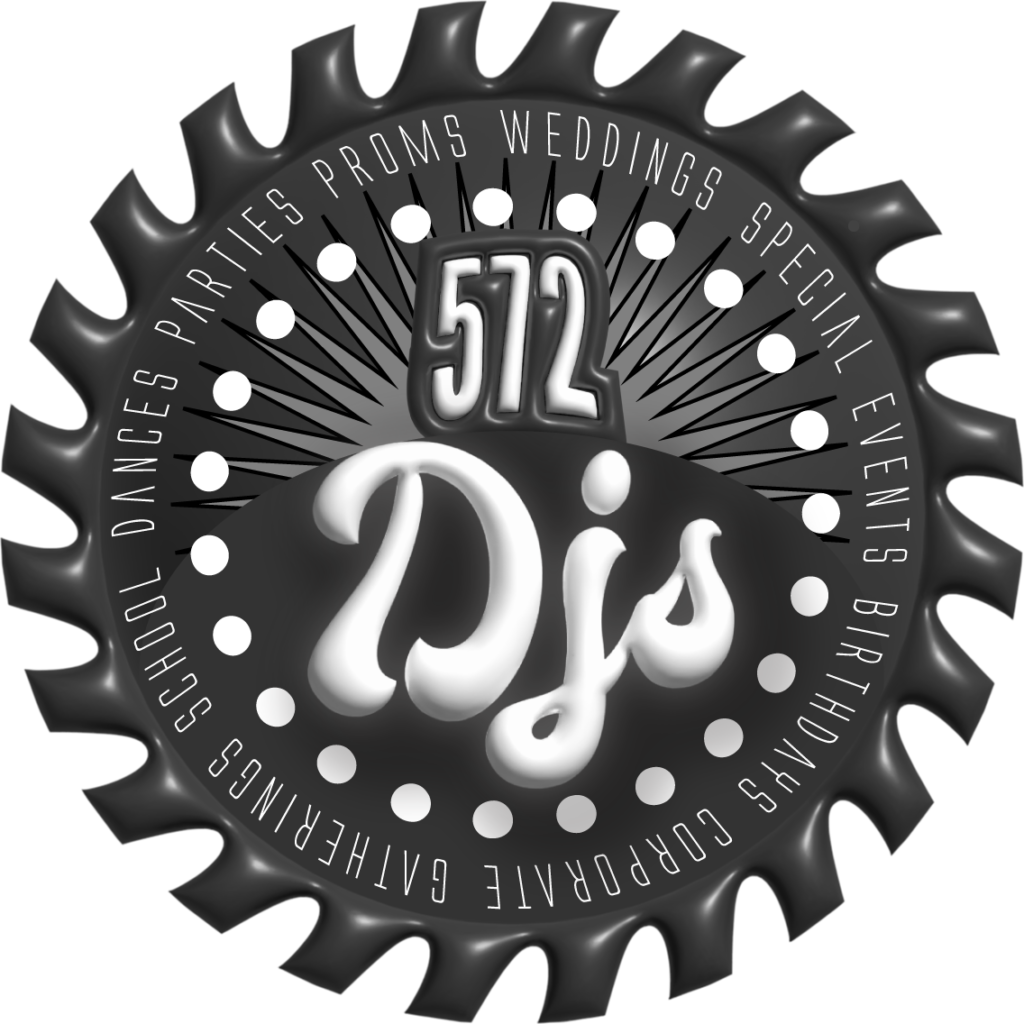
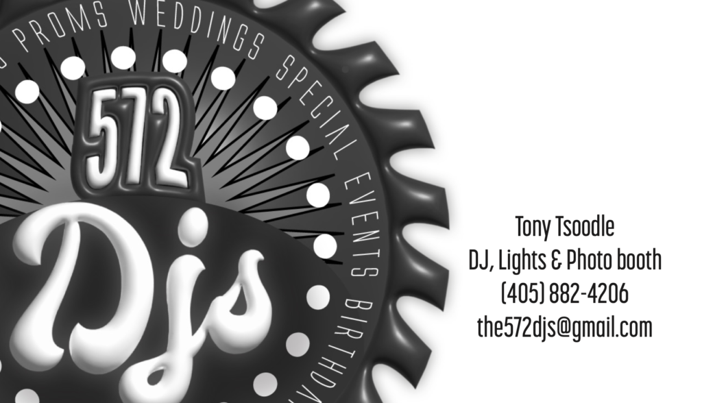
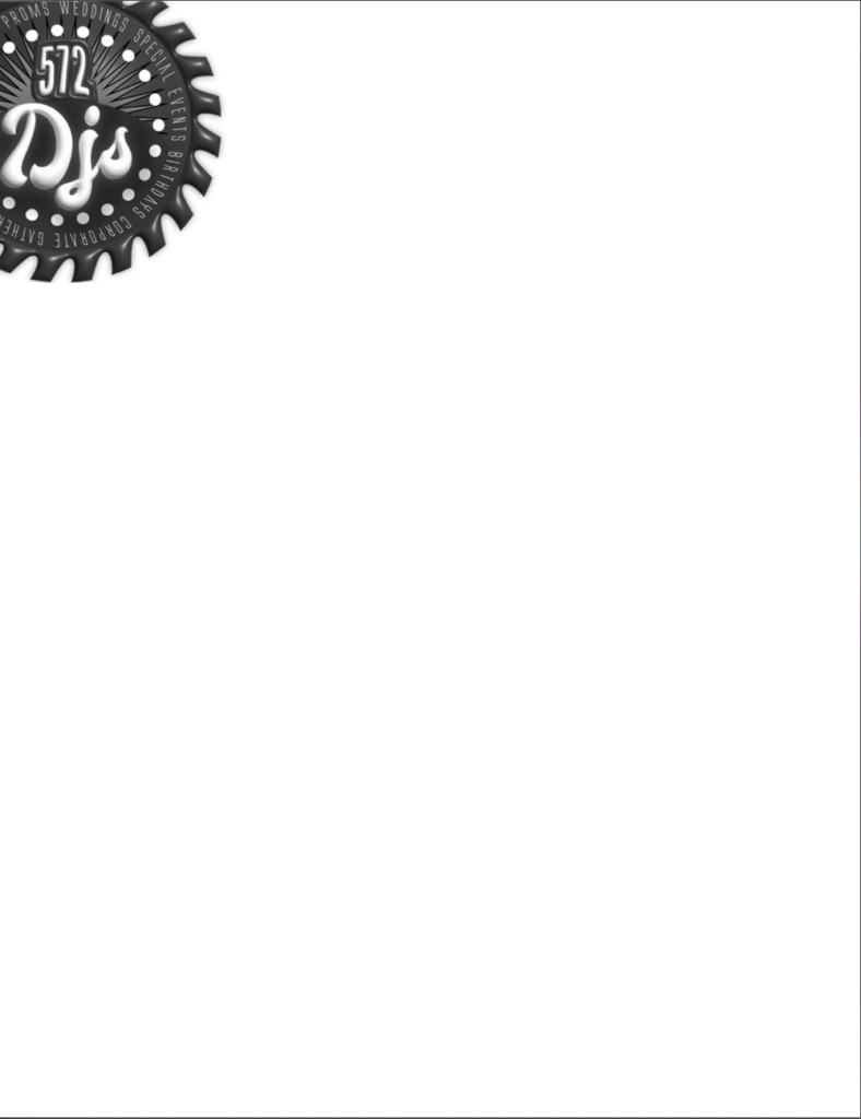
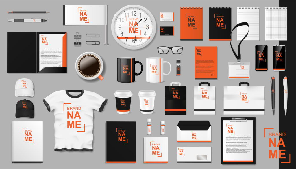
Staying consistent with a brand throughout the design process creates a lasting impact. It is in reasonable design taste to always stay consistent with the brand and is worth protecting it at all costs.


Conclusion

Pr design takes the ideas and basics of public relations and combines them with graphic design. It takes a more scientific approach than a free-form artist, though. I could describe it as tactful artistry. When done well, it prompts the receiver to react or spend money. I think there is no surprise that money is the general basis of why we are creating designs worthy of a campaign. Most designs are persuasive ways to encourage spending dollars. However, it’s important to remember that consistent public relations design encourages earned media and influence.


A short get to know ya, in your email inbox.


A concise and compelling e-newsletter campaign will help further your contact with your clients or customers. Unlike the traditional hard copy newsletter sent through the mail, the e-newsletter allows readers to follow links to a further website or blog. Developing a specific message that resonates and prompts readers to follow those links is imperative. Creating the e-newsletter doesn’t take an extraordinary amount of time but is a great way to automate the contact with a client list. Constant Contact and Mailchimp are two user-friendly e-marketing solutions for the e-newsletter created for Zed Farm Media, including four previous blog entries. This is a bonus blog, lucky for you right?

Presenting ideas in a Digital Production

An e-newsletter and PowerPoint presentation are similar in the regards. They both replaced a form of legacy media. No longer are designers strictly relegated to traditional print deliverables but have access to an array of features within a digital production.


e-newsletter

I’ve used MailChimp and its great features. However, for the Zed Farm Media e-newsletter, I used Constant Contact. I have never used the service and wanted to see if it was similar to MailChimp. It offers a free trial period with plans from $12-$80/month. Like Mailchimp, Constant Contact lets you see if your e-newsletter was opened and read. I always thought that it was a great way to target your audience. Both services offer a way to measure your campaigns—a minor feature offering significant upside to the marketer or PR professional.

Teachable moments in PowerPoint

Sometimes, designers must hand off a presentation to another colleague. Perhaps the designer is absent from the presentation, and another colleague must deliver the presentation without the designer. Whatever the case, Microsoft PowerPoint is another helpful arrow in a designer’s quiver. Its another option to create a digital publication. The robust platform incorporates video and other effects exclusive to PowerPoint. One of those features contains notes on the slides created within PowerPoint. Those notes are only visible to the presenter—a handy feature. Taking

Bangkok, Thailand – August 22, 2019 : Microsoft PowerPoint, a presentation program developed by Microsoft, on computer screen.
By wachiwit

Presentation example

For this example, using the mailer and brochure blogs, I created this short, concise PowerPoint presentation with notes included. Notice that most of the text is in the notes, not the slide itself. Remember as you start to pay careful attention not to overload the viewers of the presentation with too much text on the slides.

Fortunate for the 21st-century designer, digital publications have added an advantage because of their control over designs and campaigns. Designers need to present ideas that are interactive and achieve the desired goal.


Designer Spotlight (this dude)

In Microsoft PowerPoint, designers can take full advantage of the notes features for presenters. So handy. I will pass along a great PowerPoint master. Jacob is doing some fantastic things with PowerPoint—Jedi-like tricks to take your designs to the next level. While the videos move quickly, he briefly explains how the trick works. His content is usable content, for sure.


Conclusion

Requiring a printing press or company to print your collateral costs money, and there is no guarantee the piece you create and send out will ever cross the eyes of your intended target. With digital publications, the chances of a glance rewarding your hard work or a reader taking action are more achievable than ever.

Bringing a Social Media Campaign to Life

Launching your social media campaign is not as complicated or overwhelming as it may seem if the design is compelling and coherent. A simplistic design uses minimal text and imagery to convey the message in an easily digestible manner for users. Creating a consistent and concise message with a call to action is vital. The call to action spurs the user to visit a website, sign up for a trial, sign up for a newsletter, or spend money with your business or company.
Beginning with a goal is where the process starts. What goal is your social media campaign attempting to achieve? Is it selling more products? More email subscriptions? The list is endless. Here are eleven helpful trends in 2023 to keep in mind as you set out to create a successful social media campaign and here are a few of my own suggestions.


Social Media=Powerful PR Tool

The remarkable aspect of social media is that it’s mostly free, creating a powerful PR tool for the PR practitioner that is valuable to use. Most platforms monetize their ads but are far cheaper than legacy media streams. For the PR practitioner, social media also encompasses measurement and numbers to sift through. The analytics offered with social media only adds to the value of social media. These platforms are trendy and where your key demographics, regardless of age and status, most likely spend a majority of their time.

The numbers don’t lie, most with a smart phone and connection are involved in some sort of online activity. This is where your audience is most likely.

Source: datareportal

Important Design Elements to keep in mind

Brand and design elements are essential to remember as you craft your message and campaign. Social media users are bombarded with ads and campaigns all day. It is necessary to keep your campaign consistent across all platforms. Consistency will help keep the message for the end user memorable. While appearing memorable, having a call to action is almost as crucial in creating your campaign. Without a call to action, your campaign is useless. What is the goal of the campaign? It may be time to revisit your goal for the social media campaign if you are experiencing a difficult time in the design portion of the project.
Keeping the dimensions of each platform should also be considered in your design. You can create fantastic designs, keeping dimensions and work surfaces in mind.

Facebook Post Image (1600X630 pixels)
Facebook Header Image (820X312 pixels)
Instagram Post Image (1800X1800 pixels)
X Header Image (1500X1500 pixels)

The design elements are consistent throughout this campaign I created for my photobooth business. Also, there is a call to action. *DM for Info. I feel I can better answer questions talking directly to the client through phone or email at that point.

Remember, you don’t have to fit the whole message onto the design. That can be saved for the text of the post.

*For Example*

Go to the572djs.com and secure your date now! Dates are filling for the holidays. Book your event now and save.


Brand Voice & Culture

It’s important to remember the voice of your organization or client. Writing your message in a language that suits the voice of your campaign will help relate the message more believably. Remember that the message needs to resonate with your audience and prompt them to take action.


Adobe Express

I use Adobe Express as a tool for social media. It is very similar to Canva. It is tailor-made for brands. I can also incorporate all of my other Adobe assets to projects using Adobe Express. You can get as specific as you can in Canva. Sizes for social media posts are accessible using templates. Adobe has paid particular attention to AI and incorporates it into several paid softwares. Here is a fantastic tutorial and link on scoring Adobe Express and adding it to your arrows in the design quiver.

Lod, Israel – July 16,2023: Adobe Express – Graphic Design app play store page on smartphone on a dark marble stone background. Top view flat lay with copy space. By wavemovies

Function over form…

..or quantity over quality. Depending on the context of the situation, we usually hear these statements in reverse. In my case, its dysfunction over form. Sometimes my glaring inability to maneuver within Photoshop (proficiently) is baffling. As I grappled with a recent Photoshop project working, my lack of ability to grasp a concept frustrated me to the point of wanting to never work in Photoshop again. Its an overreaction, I know, and it probably won’t happen because my love-hate relationship with the software. Its clear to me that InDesign might work for my brain processes better. Photoshop is pretty cool though, and its just too intriguing to walk away from.

By napat

Outside of the technology gap, The recent project focused on stakeholders and how the personas affect the design. This post will explain the importance of how the stakeholders role, views, goals, pain points and behaviors dictate what to include in your project. Combining these aspects for Photoshop users can also present challenges as you are working within the medium.

Admissions & Recruitment – American Indian Mailers

Persona 1 – Native Graduate.

Front

Persona 2 – Native Higher Education liaison.

Front


Stakeholders & their importance

Stakeholders are those that have an interest in a topic, subject or situation. In this case, the relationship between the official representing the higher education offices for tribes across the country and the student to the University are the stakeholders here. If the University of Oklahoma and The office of Admissions and Recruitment were to work specifically with the American Indian offices in a mailer campaign in an outreach effort to communicate with both student and an educational official from the tribes. Knowing who you are designing for, is imperative to the creative process. Knowing which elements to include or what language to use is a symptom of good planning and creating the persona for each of the stakeholders.

Knowing

Role: Who are you creating for and what role do they play in the organization or business.

Views: Their views are what you can directly appeal to. How do they view themselves and the community.

Goals: What are the goals of their campaign or organization. What they trying to achieve?

Pain Points: What are the issues or barriers that they may encounter or currently are experiencing.

Behaviors: What are their behaviors and how do they approach their goals?

In the case of the mailers I created for this assignment, knowing the aforementioned key points for stakeholder 1 helped define these specifics in how stakeholder 2 interacts with them, revealing an angle in how to effectively communicate the message. The students needs dictate the interactions. Ultimately, its about the student needs.

By Anna

Suggestions

However, my suggestion is working with the latest version. I have two machines I work with. An iMac at home and use a newer MacBook Pro for my traveling machine. The new features within the software are evident when working between two different generations of technology. The Object Selection Tool is amazing and worked well when approaching two mailers I created for OU’s recruiting and admissions office and the masking effect you see. I really enjoy PS. It does however, make me crazy. I found this guys blog to be helpful in establishing a better approach a session. The post included some helpful tricks that I am going to continue to use.

The biggest advice for anyone wanting to improve is to just dive in. YouTube videos are always helpful but not knowing what to even call a particular process or technique its rather difficult to relay what you are looking for. Its another one of those cliches: practice makes perfect.

Serving the Underserved

Defining a stakeholder when creating a campaign is not only smart, it’s imperative. It’s like driving across the country without GPS or a map. Who are you intending to reach? It seems to me that it would take longer to process and create any visuals without a roadmap. Recognizing your public and stakeholders is a critical task. According to Larder, Understanding your stakeholder, or the stakeholder of your client stops assumptions perceived by publics and allows the targeted communication of the organization to stay on track (Larder, 2018).


“invisibility is in essence the modern form of racism used against Native Americans. It is this invisibility that leads to a college access and completion crisis among Native American students.”

The American Indian College Fund

I’m assigned to create a mailer for a stakeholder, two actually, related to the University of Oklahoma’s Admission and Recruitment office and their outreach to prospective native students looking for a college that would fit their lifestyle and values.

Stakeholder 1

  • 18-22 years old,
  • Native American (male or female)
  • test scores allow for admission to OU
  • Undecided on what institution to attend after high school
  • Eligible regardless of involvement in ceremonials or dances
Chumash Day Pow Wow and Inter-tribal Gathering. The Malibu Bluffs Park is celebrating 23 years of hosting the Annual Chumash Day Powwow. By Hanna Tor

Stakeholder 2

  • 29-34 years old
  • Native American male or female (often a same tribe as student)
  • Parent
  • Tribal community member

How to Target

These two age groups and stakeholders are both Native American. As a native, I’m aware Native Americans fondness for color and vibrancy. Incorporating color and subtle glimpses of regalia might intrigue these stakeholders. At least it would signify to me that natives are recognized. There is a fine line between demonstrating and exploiting. Careful.

native american
By Joy Fera

While design elements are one thing and share mutual interest. Age and responsibility are where the two stakeholders separate in interests and how they might respond to situations or stimulus.

Using images of youth and college life would help foster an idea of acceptance and inclusion. Offering an image of a school that recognizes its native student body.

Sources

Larder, M. (2018, May 6). The importance of stakeholders in PR . linkedin. https://www.linkedin.com/pulse/importance-stakeholders-pr-maddison-larder

We Don’t talk about Brand-O

Next to the brand itself, the content on which its branded can be a companies most valuable asset. Branded collateral is often the first thing a potential client or customer might see. Perhaps its branded letterhead sent in a branded envelope processed through snail-mail? Or, the most likely scenarios, you are meeting a customer and they request a card to contact you for business? Do you have one?

Businesses and the executives that represent them must have a brand they can include on company stationary. That includes letterhead, envelopes and business cards. Branding these items first enables a strong footing moving forward in becoming a well-known brand that people can gravitate toward and recognize. The consistency of the brand across all of your elements is known as known as the brand touchpoints and is discussed here in depth.

Corporate identity stationery mock up isolated on modern style background. Mock up for branding identity. 3D illustration
By Salih

Operating a DJ company for decades, until recently I needed a business card completely designed by me. My company’s name is The 572 DJs LLC. (I keep telling myself the 572 area code will catch on like the 405 did). I created the logo within Illustrator and used InDesign to create a business card, letterhead and envelope for The 572 DJs.

This is the company’s current logo


Business Card

Utilizing negative space and proportion I enlarged the logo and positioned it to one side of the card. Using the white space as negative space because of the nature of the logo. A lot going on there.


Letterhead

The logo reveals enough of the company and what we do, I felt it was necessary to leave the white open. I also created an alternate with a text border, of sorts. I feel either could work, what do you think?


Envelope

The envelope presents a challenge. Staying within the Post Offices recommended guidelines. Parts of the envelope aren’t allowed to be covered or marked. It is where the designer and Post Master resistance meets. I never paid much attention to envelopes with a large logo offset to the upper left corner. There isn’t much room to mess with here. Post Grid offers guidance on these issues, check this page out for those.


Check out our Brand-O!

Branding can really become the preoccupation of any company. Almost obsessive but what else do you have other than your brand? You can brand just about anything!

Corporate Branding identity template design. Modern Realistic colorful Business Stationery mockup. Stationery and uniform, paper pack, Coffee, package for your brand. Vector illustration
By sergey985

However, you must maintain brand consistency. It is as crucial as the brand itself. Consumers and the public rely on what they know and how they will spend their hard earned dollar.

Defiled for Educational Purposes only

The spaces of newspapers are named and consistent. These allocated spaces are essential for the publication as they give the paper structure and the viewer the information they want. Most newspapers and newsletters utilize these specific areas to deliver various content. Here are some examples illustrated within the August 2023 ‘Football Preview Guide’ edition of the OU Daily.

Delicately Designed For Your Viewing Comfort

Design elements are present even in places you would hardly look to find them. Just walking back to the parking garage after classes and going about my daily life, I found a few examples of the elements that are some the following design characteristics.

  • Color
  • Typography
  • Metaphors/symbols
  • Minimalism & use of space
  • Form/function/message
  • Balance
  • Rhythm
  • Proportion
  • Dominance
  • Unity

The design blitz is on! Every day these design elements are present in our life’s. Having the notion and ability to incorporate the elements are where the true art and concepts of design collaborate. From the most intended to a surprising coincidence the aforementioned characteristics of design are what we find visually appealing.

Color

Without the green foliage, the northeast rear brick wall of the Bizzell Library would be just a dull brick wall, a corner that would melt into the other red brick building (Evans Hall) behind it. While it may be Mother Nature offering her design, someone had to decide to let it display her beauty. The deliberate nature of allowing the beauty of the greenery informs us that an element of design is at work.

Proportion

I found that the mums on the South Oval are well on their way to the usual spectacular explosion of Crimson and Cream seen at its height around homecoming. Above, the image demonstrates a level of proportion and draws your attention to the dominant image in the lower left corner. The single plant is the reason for the shot but with the abundance of plants, in rows, its understandable to incorporate them into the shot.

The mural is visible on the north side of Koda CrossFit at 1210 McGee Drive.

Rhythym

An example of color, symmetry and rhythm is Rick Sinnett’s “Butterfly Mandala” in Norman. The balance and colors are eye-popping. Those characteristics give the piece a powerful element of visual structure.

The colors are deep and bright, drawing attention to the drab cinder wall.

The symmetry develops from the Mandala’s center into the butterflies comprising the outer circle. Sinnett says the design represents life’s beauty (Uncovering Oklahoma, www.uncoveringoklahoma.com). Rhythm flows from the center with corresponding geometric shapes that repeat. Although, the repetition is the focal point. The piece relies strongly on its repetitive patterns, creating balance and a feeling of undulation.

Mid-Continent & Philtower buildings.

Balance & Unity

I recently walked downtown Tulsa and saw a group gathering on a corner. Five to six people with cameras were taking a picture of the above. Naturally, I followed suit and took out my camera. They were looking at two buildings between two buildings. Really. It is a remarkable image. Upon a Google search of the area and its art deco roots, the Mid-Continent building with the patinaed roof is to the right. The building to the left, with the spire is the Philtower Building. The balance of the split between the two buildings (or one, depending on your view) so you can view two beautiful vintage-styled buildings is spectacular. The two buildings on the far right and far left act to support the design image of the photo completely.

Got Minimalism?

The minimalist approach is used in many aspects of design. From logos to complete campaigns. Got Milk? That campaign relied on reminding viewers of the color of milk, white. The simple tag line and concept fed many copycats. Got books?, Got booze?, etc..

Pringle’s pizza flavored potato crisps may be ‘Bursting with Flavor’, however, it is the logo that adopts a minimalist design. The circle with two eyes and a mustache is a just a white circle without the eyes and mustache. Without the words ‘Pringles’ the company utilizes black and white with the noticeable feature the mustache. The circular logo takes advantage of the unique packaging the chips comes in. It works because of the simplicity.

Typography

I saw this logo at the bottom of this old Coke machine at a restaurant I was eating at. I thought to myself, how simple of a name. If you own a vending company, why not Vendo? The typeface conveys fun and vintage. The Ascender on the ‘V’ and the kerning between it and the rest of the name is noticeable. The cursive connection of the letters is aesthetically appealling and reminiscent of the logos of that period. At one time, when this was brand new, this logo stood out on that red paint.

Conclusion

Design elements are arrows in the artists quiver. These are the concepts that are beholden to those in the profession. Not only help guide the designer but they are elements that appeal to human senses guiding the viewers to the intended message.


Sources

Spielman, D. (2017, March 6). Rick Sinnett “Butterfly Mandala.” Uncovering Oklahoma. https://www.uncoveringoklahoma.com/2017/03/rick-sinnett-butterfly-mandala/

The Rug’s Typography

Don’t mind if I do.

Utilizing the subject and the space allowed while incorporating it visually through the text describes typography. Artists tap into emotion through a myriad of techniques using text and typefaces. Evoking an emotion or action using a different typeface or font is also a typography characteristic. Perhaps the company has a logo sans text but has a company name that the artist must include?

I always admired this brilliant use of the logo as the ‘O’ in vapor.

A former employer used such a technique. The artist’s name is Michael. He created this genius use of a logo within the name of a former employer. This slight adjustment added visual value to the brand at no cost to the company.

Being able to visualize the subject with title or heading together demonstrates the artists grasp of typography. An image could be written in a foreign language making only readable to those that spoke the language, however, if an image is presented with the text anyone can discern what the message is trying to convey.

Definitely not an image promoting the Loch Ness Monster.

Alternatively, perhaps we can observe an example of typography with the text itself. The typeface selection can immediately create a sense of familiarity with the viewer. In this example, the idea of the military comes to mind just from the typeface.

Knowing the little nuances of typeface will help deliver a message via typography. Using typewar can really test your knowledge of the nuances. I had a pretty good streak going!

Typography as stated in the Linkedin video series, we scan for a familiar image. We immediately know what is being conveyed when typography is manipulated.

Kerning is important to the brand. If out of place it throws off the whole design. I finally got he hang of it.

Give Kern Type a try and see how well you do.

Professional Portrait

  Who am I?

My name is Tony. I am a husband and father of two children. As mentioned in my blog post from October of last year. Our children are growing fast, and we are working hard to teach them all the things they are going to need for their future.

I am a PR/senior at The University of Oklahoma with only a couple of semesters left. I work full time at WWLS and ALICE FM. Recently, WWLS celebrated it’s twenty-fifth anniversary at Remington Park in Oklahoma City. I work with a former professional baseball player and some accomplished journalists.

Pictured are some of the guys I work with weekdays from 4p-7p on The Sports Animal (Al Eschbach, Jim Traber, Me, Berry Tramel and Dean Blevins).
I’ve been with the company for about 20 of those 25.

What are my PR qualifications?

I have broadcasted in the Oklahoma City radio market for twenty-three years. My PR qualifications are scant however, around 2016 I started a boutique agency with a former co-worker. We named it Red Plains Media. The agency created audio and video content while managing the advertising buys for radio and TV. We were radio guys that were trying to find a fit and make money doing it. We had no formal training. We just had the gear and great ambition to go create great content. One of our first, successful clients was a CBD manufacturer that needed a partner to manage the flow of information and content. We created brochures and video sales collateral for their sales team. Once again, we had no idea what we were doing but we jumped in and tried. Luckily, they enjoyed our work for a few years.

This was an ad I shot and created for one of the many products the client manufactured.

What do I enjoy about PR?

  I have always admired the PR professional and their ability to create or manage the spin of situations. I have found that the untrained have developed an idea of what the PR professional really does and usually their assumptions are off a bit. I want to study Public Relations because of the ability to craft and maintain an image for a client while simultaneously generating revenue. It sounds like a canned response but when the client is successful, in turn, so are you.

Why am I studying PR and what motivates me regarding PR?

Ultimately the bottom line is at stake for everyone in a capitalistic environment. Revenue and the ability to nudge the direction of the company sales are what motivate my desire to know more about Public Relations. The PR professional isn’t exactly a salesperson but a voice of image, message and design.

What on-campus activities or community organizations do I volunteer with?

  The schedule I keep professionally and at home inhibits my ability to participate in on campus activities. I would genuinely enjoy participating, however, most of the meetings happen during my work hours. I am not a regular or active member in the community outside of talking on the radio for hours on the radio each weekday. If I had the option, I would participate in more extracurricular activities here at the university.

Powered by WordPress & Theme by Anders Norén