
Deciding what color your brand should be isn’t as simple as taking a “What Color Are You?” Buzzfeed quiz. Crafting a personal brand requires strategy, intentionality and, yes, research.
For me, that research has shaped my visual communication strategy that I call “Rich Creativity.” It’s an aesthetic that captures both my high-class professionalism and my bold, innovative creativity. Together, they create an identity and message that feels refined yet original.
Brand Stalking 101
Every strong brand begins with research, and mine was no exception. I started by studying brands that embody the same balance I wanted to strike. Lady Gaga’s Haus brand gave me inspiration for how creativity can feel bold, avant-garde and unapologetic. Skims showed me how sleek minimalism can communicate luxury and confidence without being loud. And then there’s Emma Chamberlain’s coffee brand, casual, approachable yet clever, proving that relatability and creativity can be just as powerful as refinement.
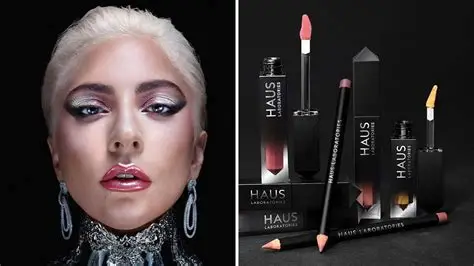
Image from Hollywood Reporter
Looking at these brands side by side, I realized my personal brand didn’t need to mimic any one of them but instead take cues from all three. The daring originality of Haus, the sleek sophistication of Skims and the approachable authenticity of Emma Chamberlain all informed my “Rich Creativity” aesthetic. It’s where professional polish meets personality.
What Does “Rich Creativity” Look Like?
“Rich Creativity” isn’t just a catchy phrase, it’s a visual and strategic identity. At its core, it’s the balance between luxury and originality, professionalism and personality.
In practice, this aesthetic comes to life in three main ways:
- Color Palette: Deep navy blues paired with creamy neutrals. Navy communicates sophistication and authority, while cream softens the intensity, adding warmth and approachability. Together, they feel high-end without being cold.
- Typography: Bold typefaces that command attention. These fonts communicate confidence and clarity, the kind of presence that makes someone pause and take notice.
- Imagery & Visual Style: Since creativity is key in my brand, Imagery will be used heavier than typeface. Every image reinforces the idea that professionalism can be creative, and creativity can be professional. The imagery will be unique and risk-taking, but never sloppy.

Image from Pinterest
“Rich Creativity” isn’t about over-the-top flash, it’s about intentional choices that communicate who I am, what I value and how I want to be remembered.
How Research Powers a Strong Communications Strategy
Research isn’t just an optional first step, it’s the foundation of any effective communications strategy. Without it, messages risk missing their mark, visuals can feel random and campaigns might fail to resonate with the audience. With it, every choice, from words to colors to delivery, becomes intentional and strategic.
Here’s how research shapes a communications strategy:
- Understanding Your Audience: Research tells you who you’re talking to, what they care about and how they prefer to receive information. Knowing your audience’s behaviors and preferences ensures your strategy is relevant and engaging.
- Informing Visual and Verbal Identity: Whether it’s choosing colors, typefaces or imagery, research ensures your visual language communicates the right message. For example, deep navy and cream aren’t just aesthetically pleasing, they convey professionalism, trust and approachability. Likewise, tone of voice, phrasing and messaging style all come from studying what resonates with your audience.
- Identifying Opportunities and Gaps: Research uncovers areas where your brand can stand out. It helps you understand what competitors are doing, what audiences are responding to and where your unique voice can make the most impact.
In short, research turns a communications strategy from guesswork into a deliberate, measurable and impactful plan. It ensures every element, whether a campaign, social media post or business card, is aligned with both audience expectations and your brand identity.
One Comment