Month: August 2023

Two Apps You Must Have in Your PR Toolkit!

Design can be a very daunting topic, especially for artistically challenged people like most of us. However, with programs like Adobe Indesign and Photoshop, you’ll never have to wonder if your design must rely on your sketching skills!

Adobe Photoshop

Adobe Indesign


Adobe Indesign: A brief overview

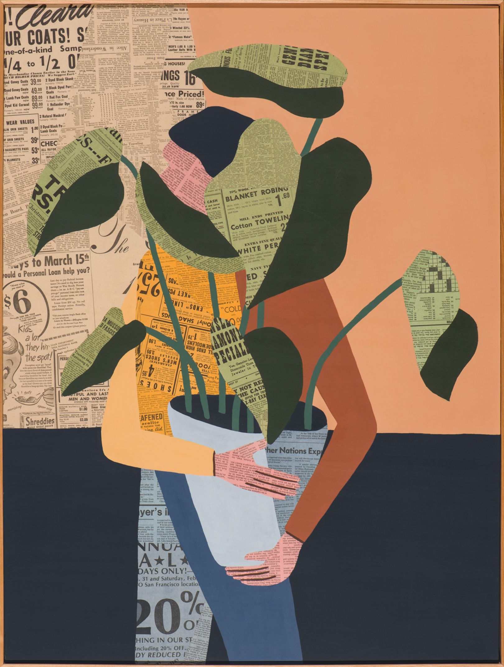
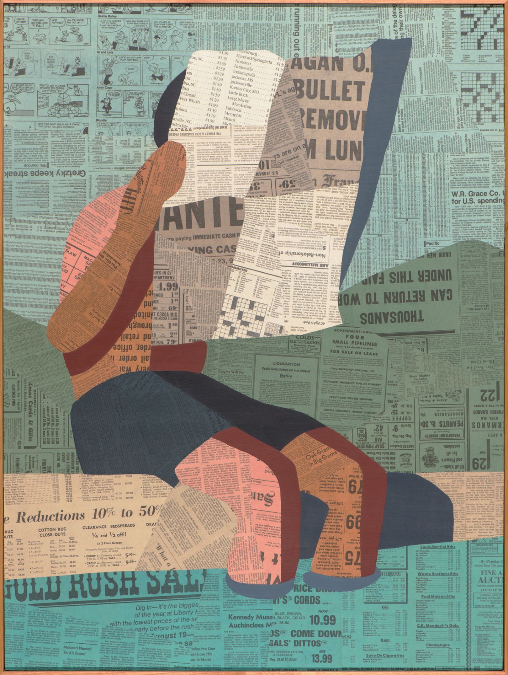
Adobe Indesign allows users to create documents across various platforms. Its primary focus is on page layout and, of course, design! I can create several documents with InDesign to fit my clients’ needs. Just to name a few, Indesign allows its users to make brochures, magazines, flyers, and many more. Another great feature I love with InDesign is the ability to size the document to my needs. When you open Indesign, there are a few different options on how you want your page to be set.

This option allows us to choose the best document option based on where we plan to utilize the project. This is a fantastic feature for me because I go between work from my iPad to my laptop, and they have different screen dimensions. I think this feature with Indesign is very adapted to our world, where work is not solely performed on a desktop anymore, and most organizations are cross-platform!

Along with the amazing page setup options, Indesign offers many design tools that can be unnerving initially. However, after the brief learning curve, I felt like any idea I had for my designs was feasible.

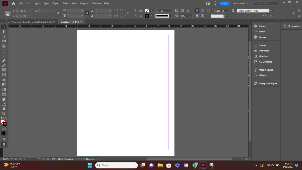
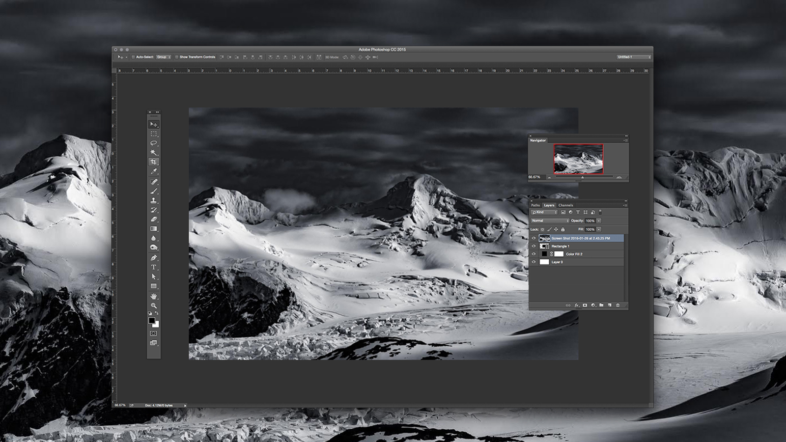
Here is just a brief look at how InDesign functions. That toolbar on the left has many options and could be overwhelming, but Adobe can provide significant resources to its users to aid in any technical difficulties! Once I learned the app’s mechanics, I now utilize almost every tool along the toolbar.

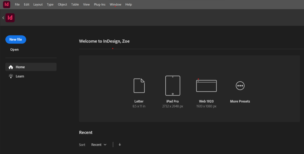
Needing help with Indesign? No problem.

Indesign through the application offers tutorials under the label “Learn.” Although most software provides this, I haven’t seen an application that promotes the idea of learning consistently with their program. I think that having the “learn” tab be a prominent feature of the home screen helps me, as a customer and user, feel that I have support and that it is normal not to be an Indesign pro on the first day! This is a unique aspect of any design software because it can quickly feel lost with all of the settings.

Becoming familiar with Adobe Photoshop

PHOTO PROVIDED BY JONTORRES.COM

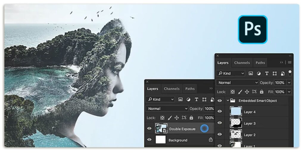
While Adobe has shined with Indesign, they offer another application that is just as valuable to PR, if not more. Think of PR campaigns, how polished everything looks, how there aren’t any shadows, and how the photos’ lack of business allows brands to focus on their messages. You can thank Photoshop for that! Photoshop allows users to eliminate any distractions in pictures, clean up edits, and ensure our designs and photographs align with the vision imagined for our campaigns and organizations.

Adobe Photoshop offers many settings and tools, such as cut, blur, a spot selection tool, and much more. Combined with a photograph or design, these tools are a way to clean up an image or transform it into something very powerful in displaying a desired message.

“Graphic design can be an integral part of public relations, from designing websites to social media graphics. Chances are Adobe Creative Cloud has an app to help you create content.”

Jenna LaBorde, “Utilzing Adobe Creative Cloud”

What makes Adobe Photoshop and Indesign unique?

As we briefly touched on before, Adobe generally offers excellent user support. They acknowledge that these programs can be challenging to learn by providing step-by-step tutorials for almost everything. Both applications have a “learn” option, where users can have an interactive experience when asking questions about the Adobe applications.

Another critical aspect is the community of Adobe users. Throughout my time using these applications, I have found a TON of information through YouTube videos, Linked In learning, Reddit, and other resources. This sense of community and helping each other perfect our skills is another thing that truly sets Indesign and Photoshop apart from other applications.

We’ve got the tools; now, how do we use them?

A great application is just the beginning of becoming a great designer. Designing takes planning and lots and lots of trial and error. Design is not a situation where you can get the best design your first go around. For a great design, the designer must utilize elements such as proportion, coloring, and dominance. Combining knowledge of design and programs is essential to using design in PR and ensuring your design is the best for your organization!

Good luck using these tools to create your designs and graphics. Check out my other posts for tips on perfecting them with typography and other design elements!

Keep Your Eye Out for Design!

Elements of Design we can see out and about!

Typography

Typography (as referenced in my last post) studies letters and words to make them visually appealing to the reader’s eye. So with that, obviously, that is a HUGE part of design. We want our readers to be captivated by our messaging or to understand the tone of our message. That starts with the first glance, which emphasizes ensuring the font fits the style we are trying to achieve!

While doing my morning journaling, I noticed that my journal had a captivating aspect for a few different reasons.

First, the typography for this journal just hits the message on the head. The font feels very academic and whimsical. This font allows me to correlate that I can write freely throughout this journal because of the literary feel. I also enjoyed how the bottom “subheading” is in all caps, drawing attention to the area even though the text is smaller.

Lines

Secondly, the use of lines in this photo was also exciting. The line between the dark blue journal in contrast to the light blue journal behind. The vinyl cover follows the same angles as the journal when they are apart while having its design covered with lines. Then, lastly, seeing the roundness of the glass with a straight line from the straw draws attention back to the journals. Lines allow my eyes to follow the angles, almost guiding the eyes to every individual element of this photo.


Dominance

The element of dominance in design can allow our eyes as viewers to see an intended message very quickly. In this bathroom at a furniture store in Norman, it was amazing to see how, despite a busy background, the “LOVE” stands out due to its simplicity and asserts dominance over the floral design. Utilizing distinction is an easy way to grab attention quickly, and I love how this design was put together.


Proportion

Though not the most artsy photo, this picture taken on the University of Oklahoma’s campus captures the idea of proportion so well. I took this photo and got closer to the ground to make the clock tower seem even more significant than the man. The willow trees standing taller than him give us an idea of how big the clock tower is and allow us to fully understand the different sizes of things in the world.


Balance

This photo may seem very busy at first, but as my eyes follow the elements of the picture I notice that every area has its unique feature and is balanced to the other. For example, the bottom is significantly busier than the top. Therefore, we can notice the bright white ceilings to balance this photo. Secondly, something is happening in every aspect of this photo—the ceilings with lights and the “STASH” sign. The bottom has an assortment of pots and pants. The right and left sides match each other perfectly while allowing room at the top to create balance within the photo. This photo also leans into another design aspect, which is UNITY.

Unity

Each element of this photo feels that it complements another. The bright white walls, mixed with the lush green plants. Specks of muted browns for the furniture that mesh well with the natural colors of the plants. Every aspect of this photo seems to link together well to create an aesthetic scene for me!


Color & Rythm

Within this image, there is a sense of color that is very repetitive and rhythmic. Rythme with color is very important, depending on which message you’d like to portray. When I came home and saw my two cats, I first noticed how not one color felt that loud or aggressive. Every color felt intentional and peaceful. The repetitive nature of the colors felt very calming. For example, my orange cat’s hair matches the color of some of the lighter bricks and is almost similar to my gray cat’s eyes. The gray cat’s coat is the same as the curtain color in the back, longing for a repetitive aspect to the color palette. This is highly appealing to the eyes because everything in this photo has a place and a complementary element with the same color. The receptive nature amplifies the message that these two pairs of cats are partners and one of the other’s better half.


Symbols & Minamlism

When I came to Gaylord for the first day of the semester bright and early at 7 a.m., I noticed the minimalism of this message. The bright JMC, compared to the dull, minimalistic background, seemed like a metaphor to me. Something similar to how JMC courses outshine and seem so much more intense next to other classes. However, this metaphor wasn’t implied in any way. It is interesting how minimalism, compared to the bold JMC logo, can allow viewers like myself to ponder a deeper meaning behind the image!

Combining these elements

Having these elements be what you base your ideas on is a great way to ensure that your design aligns with the messaging you want for your target audience. Knowing how aspects that may seem small, like lines and rhyme, can entirely change the messaging!

Make sure to keep your eye out for design to gather inspiration in your daily lives, too!

What’s your Type? Choosing the Right Font for Your Next Design.

Typography is a make or break in the way we design, communicate, and share our ideas with others.

© Patrick Nelson

What is typography, and how do you incorporate it into design?

Typography is the way in which we arrange letters and words to create an aesthetic and legible copy. Typography is the basis of design because there are many ways that the font we chose pushes a certain story or can be associated with certain things. So, how are ways we can break down typography to understand how it can completely change the ways of the story we want to portray?

Fonts and their Impact on Image

Typography is the way you want your reader to view your message. The choice of font can change the entirety of your messaging. A font that might be considered “loud or aggressive” should be chosen for a specific audience. On the other hand, fonts are seen as dainty or quiet and could be utilized in a calmer, more serene environment! Typography is one of the shakers and movers in design and public relations because the appearance of your messaging can be as harmful and helpful as the words you say!

Differentiating between different styles of fonts

Besides just basically studying a list of fonts and brushing up on your memorization skills, there are a couple of options to use while studying typography.

My favorite way to study typography was to play Type War. This game focused on choosing between options of font when displaying a letter. The two options might be “is this Verenda or Times New Roman?” and you choose between the two options. With enough repetition, I felt an actual difference in my ability to differentiate fonts. Some of them look very similar, so this one can be tricky!

Another great game I played was KernType. Now, while I liked this game… this one felt a lot more difficult for my learning style. With KernType, you adjust the space between letters to match the font they give you. The layout of this game was really interesting, and I got to learn a new term in the world of typography: Kern. Kern is the spacing of letters like so:

Photo: Adobe Creative Cloud, Discovering Kerning.
Ways choosing the wrong font can ruin the legitimacy of your brand
Photo: Metaweb / CC-BY

Having errors like these in logo designs can tarnish the hard work you have done for your brand and leave that idea in your audience’s head instead of your intended message. Several instances have been far worse than this, where it has been a scandal instead of just being a funny moment.

To see more typography fails that can inspire you before “choosing your type,” click here!

So… before you choose a font, make sure it is the best way to convey appropriate messages to your audiences!

Professional Portrait

Sticky post

Hi there! I am Zoe Taylor.

I am a public relations professional that believes in a heavy emphasis on learning, growing, and adapting as a professional.

I utilize the skills I gained at the University of Texas and the University of Oklahoma to create a public relations toolkit focusing on creativity, collaboration, and strengthening bonds between organizations and their audiences.

Why I Enjoy Practicing Public Relations

Public relations opened up a world that combined my two favorite things: helping others and using my words to do so. I love the idea that creativity is combined with a strategy to help clients connect with their audience in a way they haven’t been able to before. Not everyone is as skilled in communication, and that is where PR practitioners step in. We want to help our clients build those strong relationships and help them succeed as an organization!

I started studying public relations because of my intimal overall interest in communications and the urge to help others around me. I started off college as a political science major, wanting to make a change in our world. Soon I realized that being a political science major wasn’t going to allow me the face-to-face time with the public that I appreciate. Shortly after my first semester of college, I became interested in journalism. I loved connecting with people but wanted to be a little bit more geared toward creative design and big-picture ideas. I then landed on public relations and fell in love. I took my first public relations course at the University of Texas and never looked back. It was amazing to take the elements from both political science and journalism.


My Motivation regarding PR

Public relations is one of those fields that is ever-changing. In just a few days, something can drop in the media that completely reimagine what you had laid out for the week. It is the fact that no matter how long you’ve been in practice, you learn something new every day as there is an ever-changing environment around you. It is exciting to feel that even after you graduate with your degree, that you will be a student every day.


getting involved in extracurriculars

Student organizations such as the University of Oklahoma’s PRSSA chapter are incredibly helpful. Finding a community within the university adds another layer to campus life and creates incredible relationships among your peers. I plan to join the PRSSA this semester, as I was a member at the University of Texas and thoroughly enjoyed it.

In my community, I love to participate in volunteering for festivals. Helping set up and seeing events behind the scenes in an area I am very interested in. Helping your community feel supported when they express creativity is a great way to connect. One of my favorite festivals I have helped volunteer for is the Art. Music. Power. (AMP) Festival! This festival focused on creative works from women artists in my community!

Powered by WordPress & Theme by Anders Norén