Month: November 2023

Reflecting on My Time With Digital Designs

Utilizing digital designs is a new way for communicators and organizations to reach their audiences. With digital designing, there is a lot of fluidity in the process, as you see how the design integrates along different platforms like mobile, desktop, and tablets.

What is Digital Design?

Digital design is exactly how it sounds, designs that are adapted for usage in the digital realm. These can be seen as social media graphics and posts, headers, email newsletters, digital flyers, and much more.

Typically most things that are traditionally printed: can be transformed into a digital component. However, this process requires trial and error as many layouts need to fit a certain screen size.

Why I Prefer Going Digital

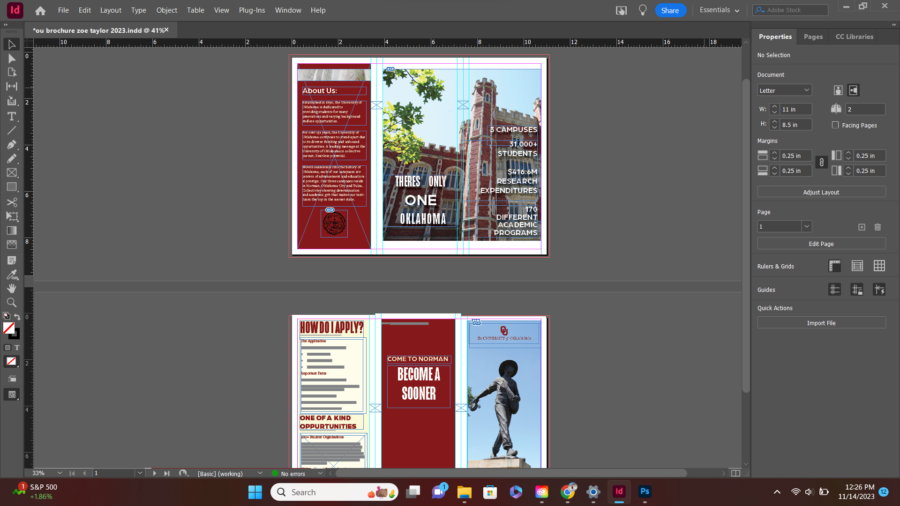
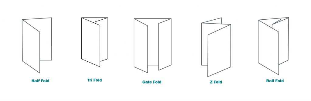
Using digital designs opened a new world for me. With printing, several factors come into play: bleed and slug, color printing accurately, scale, etc. For example in a brochure, you have to calculate the fold to have it align correctly when you print. However, in digital designs, you can see how a design will look on a screen as you work.

However, if you are still very interested in printing your designs, check out some of my blog posts on the different tips and tricks for printed designs.


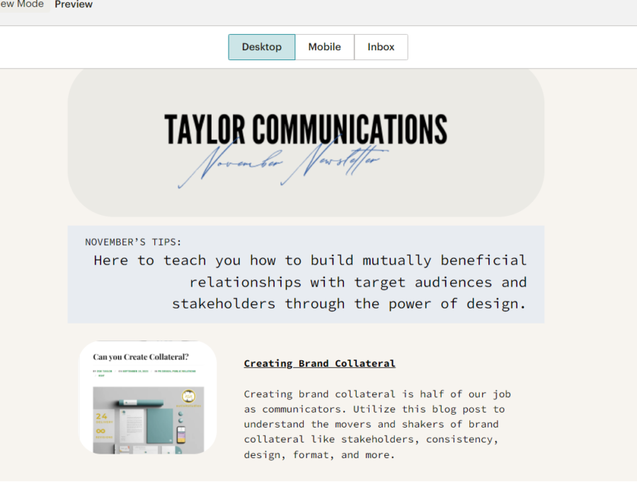
My Creative Process: Taylor Communications

For my new brand, Taylor Communications I constructed a e-newsletter promoting some of my helpful articles on design tips. I gauged my newsletter to an audience who is already interested in Taylor Communications, but may not be engaged. My goal is to have this audience interact with my website and become more invested in Taylor Communications as a brand.

Choosing a Platform

For my email newsletter, I chose to utilize the infamous MailChimp. I have never used MailChimp and was impressed by the user-friendly layout. They offered a variety of design layouts and I drew my inspiration from there. I applied a template and customized it.

The Design of Taylor Communications: November Newsletter

I created a Canva header titled “November Newsletter” with the font of my logo pasted across the top.

Under my header, I put a brief introductory statement before jumping into the body content of the newsletter,

“Here to teach you how to build mutually beneficial relationships with target audiences and stakeholders through the power of design.”

I chose to do this so that people knew what they were about to get into before reading further!

After scrolling, viewers can see I have thumbnailed four of the most helpful articles that I wanted to spotlight. These thumbnails have a hyperlink linking to the original blog, and the title is hyperlinked as well for optimal usage by viewers. The blogs I chose to highlight are:
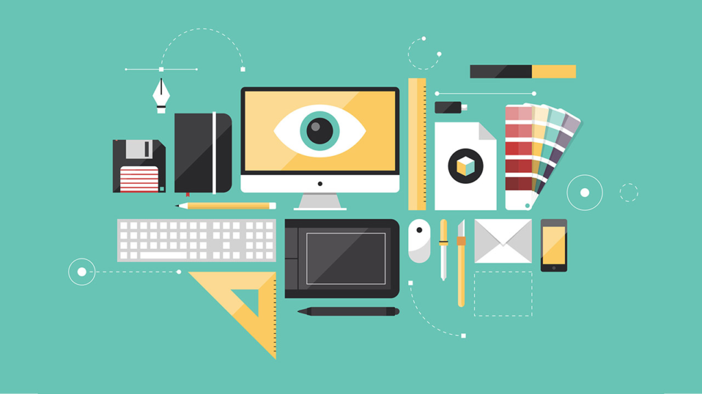
Elements of the E-Newsletter

I utilized several design elements for my newsletter. The first one is space. I think having too busy of an email can almost look like a spam email. It is essential to keep things clean and concise. I also used thumbnails to preview my blog posts.

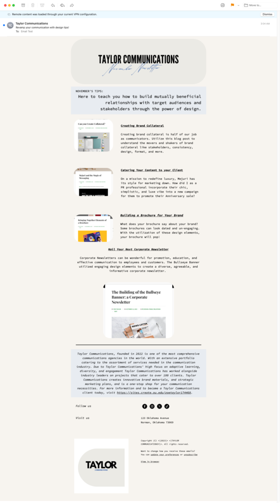
I added a boilerplate for my PR agency at the bottom, and highlighted it in a blue color to tie back to my header and logo!

Final Thoughts

Overall I enjoyed the process of creating an e-newsletter. I feel the digital design space allows for more adaptive thinking, and was able to be very flexible in the ideas I had for my design. I loved the platform MailChimp as it streamlines the process entirely.

Bringing Together Elements of a Brochure

Brochures- a key staple in promotion and public relations. We see brochures everywhere, even if you don’t notice them. They come in our mail, at gas stations, travel centers, schools, the doctor’s office, and so many more places.

With brochures, we are able to provide information alongside eye-capturing graphics and images. These portable pieces of information allow for convenience to viewers and can be great at being a reminder of your organization as brochures are seen so frequently.

What is a Brochure’s Purpose?

A brochure once again is a great way to catch the eye of viewers. It is able to translate essential information while piquing interest with images, statistics, and quick facts about your organization.

The folding mechanism of a brochure is especially helpful because it adds to the portability factor, and allows the fold to break up information to keep the viewer engaged.

Ways Organizations May Utilize Brochures

We see brochures utilized often for event promotion, travel, and for promotion of institutions like universities. However, there are several different sectors of business that can and would benefit from the utilization of brochures. Some of these types of brochures that would be helpful for all businesses are:

  • Company Brochures
  • Product Promotion Brochures
  • Informational Brochures
  • Response Brochure
  • Direct Mail Brochures
  • Enquiry Response Brochures
  • Leave Behind Brochures
  • Point Of Sale Brochures

The Different Types of Brochure Layout/Folds

  • Tri-fold
  • Half-fold
  • Roll-Fold

My Brochure Design Process

Utilzing Adobe Indesign was my first step. I set up my page meticously and utilized a fold calculator, like this one from Eagle Printing! This helped me ensure that when I go to print my deisng lines up accurately and ensures the highest quality of work.

Deciding the Objective of My Brochure

Each promotional asset you create should have some type of call to action. My call to action in this brochure was to apply to the University of Oklahoma. I wanted to focus on action words and the promotion of the University.

Utilizing Branding Assets

The University of Oklahoma has a whole section on its website that states key messaging, logos, colors, and fonts. Using these sections on organizations’ websites is incredibly helpful as it helps line up your new project with previous projects and the brand’s messaging.

Picking the Correct Images and Layout

As discussed in previous blog posts like my Newsletter post, it is important to create a harmonious and balanced product. I did this by balancing images with solid colors to allow for a “Z” Layout. Notice on the top page that there is a design element in the top left, then the top right, then across the page to the bottom left. This keeps the reader’s eyes flowing through the page and being interested in every aspect of the brochure.

I chose to utilize several design elements such as open space, drop shadows, and font size to keep the brochure looking crisp and professional.


My Final Tip

Utilizing inspiration from other brochures, and visiting the organization’s website to view its current branding elements is always a great idea. When I first started, the idea of a brochure seemed daunting. However, after reviewing inspiration and just trying out several different design elements I felt confident with my work.

Just keep trying! The more designs you try, the easier it will be to select the correct one next time!


Helpful Resources:

Powered by WordPress & Theme by Anders Norén