Utilizing digital designs is a new way for communicators and organizations to reach their audiences. With digital designing, there is a lot of fluidity in the process, as you see how the design integrates along different platforms like mobile, desktop, and tablets.
What is Digital Design?
Digital design is exactly how it sounds, designs that are adapted for usage in the digital realm. These can be seen as social media graphics and posts, headers, email newsletters, digital flyers, and much more.
Typically most things that are traditionally printed: can be transformed into a digital component. However, this process requires trial and error as many layouts need to fit a certain screen size.
Why I Prefer Going Digital
Using digital designs opened a new world for me. With printing, several factors come into play: bleed and slug, color printing accurately, scale, etc. For example in a brochure, you have to calculate the fold to have it align correctly when you print. However, in digital designs, you can see how a design will look on a screen as you work.
However, if you are still very interested in printing your designs, check out some of my blog posts on the different tips and tricks for printed designs.
My Creative Process: Taylor Communications
For my new brand, Taylor Communications I constructed a e-newsletter promoting some of my helpful articles on design tips. I gauged my newsletter to an audience who is already interested in Taylor Communications, but may not be engaged. My goal is to have this audience interact with my website and become more invested in Taylor Communications as a brand.
Choosing a Platform
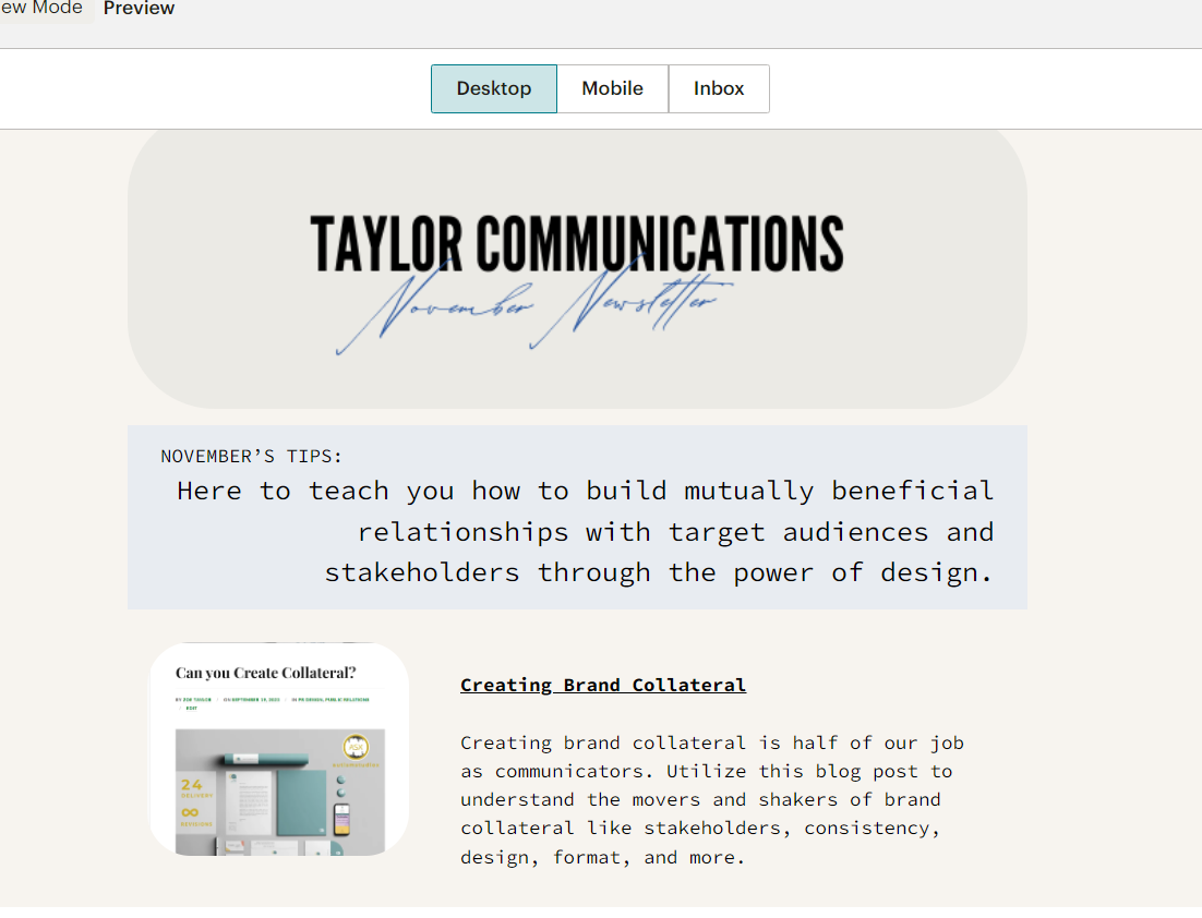
For my email newsletter, I chose to utilize the infamous MailChimp. I have never used MailChimp and was impressed by the user-friendly layout. They offered a variety of design layouts and I drew my inspiration from there. I applied a template and customized it.
The Design of Taylor Communications: November Newsletter
I created a Canva header titled “November Newsletter” with the font of my logo pasted across the top.
Under my header, I put a brief introductory statement before jumping into the body content of the newsletter,
“Here to teach you how to build mutually beneficial relationships with target audiences and stakeholders through the power of design.”
I chose to do this so that people knew what they were about to get into before reading further!
After scrolling, viewers can see I have thumbnailed four of the most helpful articles that I wanted to spotlight. These thumbnails have a hyperlink linking to the original blog, and the title is hyperlinked as well for optimal usage by viewers. The blogs I chose to highlight are:
- Creating Brand Collateral
- Catering your Content to your Client
- Building a Brochure for your Brand
- Nail your next Corporate Newsletter
Elements of the E-Newsletter
I utilized several design elements for my newsletter. The first one is space. I think having too busy of an email can almost look like a spam email. It is essential to keep things clean and concise. I also used thumbnails to preview my blog posts.
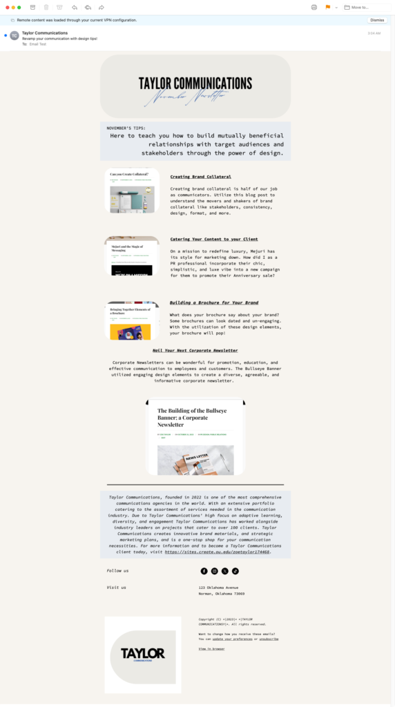
I added a boilerplate for my PR agency at the bottom, and highlighted it in a blue color to tie back to my header and logo!
Final Thoughts

Overall I enjoyed the process of creating an e-newsletter. I feel the digital design space allows for more adaptive thinking, and was able to be very flexible in the ideas I had for my design. I loved the platform MailChimp as it streamlines the process entirely.

