Author: Zoe Taylor Page 1 of 2

Top Social Media Trends for Holiday Decor 2023

It’s that time of year when the goal is to make your home a cozy winter wonderland! Between garland, wreaths, and trees there are so many ways to decorate your space this year.

Social media is a major factor in how trends begin. In this post, many of these trends have gained buzz on platforms like TikTok and Instagram. It makes sense considering there were “4.76 billion social media users around the world January 2023”1

So we did all the work for you and scoured trends among social media platforms to bring you the top three ways to decorate your home this winter season!


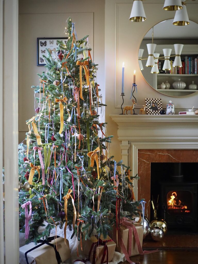
Bow, Bows, and More Bows

As featured on several blogs like Melanie Lissack Interiors, bows are huge this year. Velvet bows are a wonderful way to spice up any garland or Christmas tree. Going viral on social media, bows are even seen to be wrapped around cabinets and chairs! Adding a bow to your space spruces up any Christmas decorations and brings a sense of elegance to your home.

Photo from MelanieLissackInteriors.com
Bring in the Nostalgia

We all want Christmas to feel like it did when we were kids. It seemed all so much more magical. Well according to SouthernLiving, the classics are back. This 2023 season expect to see a vintage take on Christmas, bringing in all the nostalgia. Elements you might see are primary colors, felt stockings, nutcrackers and anything else you may have seen in your home growing up! The focus here is on perfecting that cozy vibe.

Photo from sanctuaryhomedecor.com

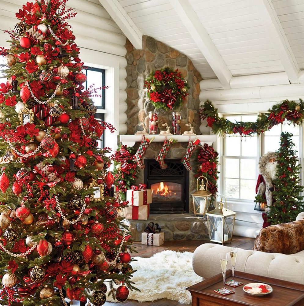
This trend may just have us jumping on the bandwagon,2 joining everyone else in soaking up all of the childhood memories.

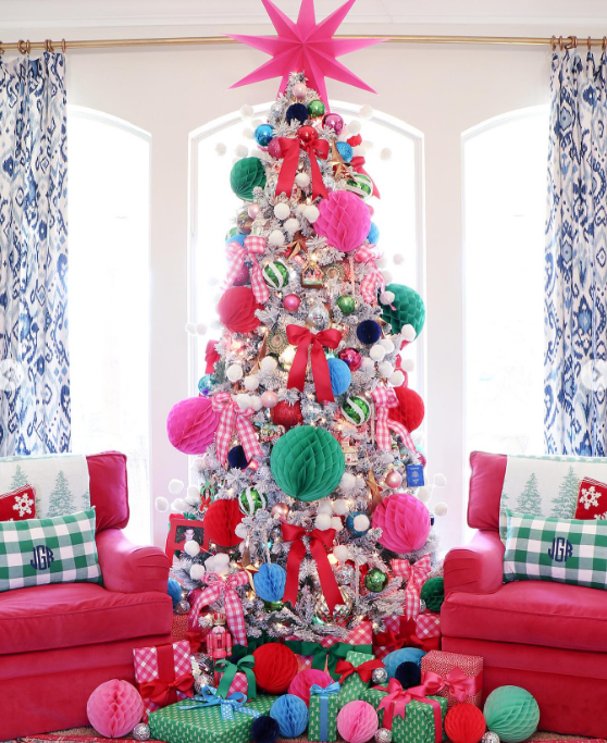
Opting for Non-Traditional Color Schemes

Many posts on Instagram have featured bright and colorful holiday decorations this year. As we know social media influencers, bloggers and YouTubers have built loyal communities, allowing for trends to grow among varying groups. These posts have created a shockwave, changing the way interior designers are bringing the festivities into their homes.

With elements of bright pink tinsel, ornaments, and bows you are guaranteed to get compliments on this eclectic decor.

This trend allows you to align your holiday decor to your current color palette in your space, or bring in new pops of color. Our personal favorite take on this trend is brightly colored Christmas trees!

Post by @JennifersDimplesandTangles on Instagram

Make sure to blend these trends into something that works for you and makes your space feel beautiful. That way you can use these decor styles for years to come!


  1. Aggozinno & Ward. “PR Principles: Current. Proven. Practical.” June 2020. Edify. ↩︎
  2. Aggozionno & Ward. “PR Principles: Current. Proven. Practical.” June 2020. Edify. ↩︎

The Expansive World of PR Design

The Importance and Utilization of PR Design

PR Design is a wonderful way to engage your audience visually and draw attention to your brand. Combining public relations with creative elements allows for the integration of brand messaging formatted for a new digital world. Considering many social matter platforms are visually based, or picture-sharing apps, it is important to format our messaging for these platforms.

Ways I Learned More about PR Design

PLATFORMS

Throughout my time as a PR Design student, I felt it was crucial to introduce PR design to anyone by starting with platforms first. I first started with Adobe Indesign, which took a lot of trial and error.

From margins, columns and the selection tool; all of it felt like a big confusing mess at first. You must take it slow and stay calm! I recommend watching tutorials and using the Adobe Learn feature.

Indesign is great for the majority of PR design projects and allows you to customize as much as you need. By the end of every project I used InDesign on, I felt like I started to like it more and more.

Adobe Photoshop is similar to Indesign as they both were difficult at first. Photoshop is more catered towards trying to retouch and edit specific photos, not specifically for layout.

Canva was a great beginner-friendly platform that I feel like is optimal for social media, and quick projects like headers, and logos.

DESIGN ELEMENTS

There are a few key rules that I picked up as I created my designs.

1.) Golden Rule of Three

According to Interaction-design.org, the rule can be followed “You place a simple grid overlay (divided equally into thirds, both horizontally and vertically) on the space to be used for the design.”

2.) Keep it Consistent!

According to BlackIllustrations.com, “When your brand is consistent in its design approach, users will recognize and remember it more easily. Consistency also helps to create a sense of trust with your audience.”

3.) Choose a Layout that Keeps Reader’s Eyes Engaged

For this rule, I chose several different types of layouts from a wonderful resource to show you! My favorite layout was the Z layout, as I felt it drew the reader’s eyes the most efficiently!

Example of a Z-Layout
AUDIENCES

As discussed in my previous blog posts, Mejuri and the Magic of Marketing & Staking in Your Stakeholders, we touched on how crucial it is to cater your design to your target audience.

We know as designers that what may appeal to Gen-Z may not appeal to the baby boomer generation based on culture, exposure, and technology usage.

There have been many instances where brands have not aligned their spokesperson, or designs to their brand’s audience and have received major backlash. Keeping in mind your audience allows for a better two-way communication channel, and makes your audience feel seen!

For example, if you start watching the Great British Baking Show and they have a collaboration with a Monster Truck brand, you’d be confused and feel like there wasn’t much thought to that choice.

Recap

All in all, combining all of these elements has made my process of designing much more organized, and efficient. I think that learning different elements of design is crucial to ensuring your design achieves the goals you want. Combining design with PR requires research and background information to connect your designs with your audiences, and make sure your messaging fits those audiences.

Remember! It is super important to continue to practice and experience new platforms, layouts, and elements of design before you get a finished product. Make sure to make your design process fun, and you’ll see a better product in the end.

Reflecting on My Time With Digital Designs

Utilizing digital designs is a new way for communicators and organizations to reach their audiences. With digital designing, there is a lot of fluidity in the process, as you see how the design integrates along different platforms like mobile, desktop, and tablets.

What is Digital Design?

Digital design is exactly how it sounds, designs that are adapted for usage in the digital realm. These can be seen as social media graphics and posts, headers, email newsletters, digital flyers, and much more.

Typically most things that are traditionally printed: can be transformed into a digital component. However, this process requires trial and error as many layouts need to fit a certain screen size.

Why I Prefer Going Digital

Using digital designs opened a new world for me. With printing, several factors come into play: bleed and slug, color printing accurately, scale, etc. For example in a brochure, you have to calculate the fold to have it align correctly when you print. However, in digital designs, you can see how a design will look on a screen as you work.

However, if you are still very interested in printing your designs, check out some of my blog posts on the different tips and tricks for printed designs.


My Creative Process: Taylor Communications

For my new brand, Taylor Communications I constructed a e-newsletter promoting some of my helpful articles on design tips. I gauged my newsletter to an audience who is already interested in Taylor Communications, but may not be engaged. My goal is to have this audience interact with my website and become more invested in Taylor Communications as a brand.

Choosing a Platform

For my email newsletter, I chose to utilize the infamous MailChimp. I have never used MailChimp and was impressed by the user-friendly layout. They offered a variety of design layouts and I drew my inspiration from there. I applied a template and customized it.

The Design of Taylor Communications: November Newsletter

I created a Canva header titled “November Newsletter” with the font of my logo pasted across the top.

Under my header, I put a brief introductory statement before jumping into the body content of the newsletter,

“Here to teach you how to build mutually beneficial relationships with target audiences and stakeholders through the power of design.”

I chose to do this so that people knew what they were about to get into before reading further!

After scrolling, viewers can see I have thumbnailed four of the most helpful articles that I wanted to spotlight. These thumbnails have a hyperlink linking to the original blog, and the title is hyperlinked as well for optimal usage by viewers. The blogs I chose to highlight are:

Elements of the E-Newsletter

I utilized several design elements for my newsletter. The first one is space. I think having too busy of an email can almost look like a spam email. It is essential to keep things clean and concise. I also used thumbnails to preview my blog posts.

I added a boilerplate for my PR agency at the bottom, and highlighted it in a blue color to tie back to my header and logo!

Final Thoughts

Overall I enjoyed the process of creating an e-newsletter. I feel the digital design space allows for more adaptive thinking, and was able to be very flexible in the ideas I had for my design. I loved the platform MailChimp as it streamlines the process entirely.

Bringing Together Elements of a Brochure

Brochures- a key staple in promotion and public relations. We see brochures everywhere, even if you don’t notice them. They come in our mail, at gas stations, travel centers, schools, the doctor’s office, and so many more places.

With brochures, we are able to provide information alongside eye-capturing graphics and images. These portable pieces of information allow for convenience to viewers and can be great at being a reminder of your organization as brochures are seen so frequently.

What is a Brochure’s Purpose?

A brochure once again is a great way to catch the eye of viewers. It is able to translate essential information while piquing interest with images, statistics, and quick facts about your organization.

The folding mechanism of a brochure is especially helpful because it adds to the portability factor, and allows the fold to break up information to keep the viewer engaged.

Ways Organizations May Utilize Brochures

We see brochures utilized often for event promotion, travel, and for promotion of institutions like universities. However, there are several different sectors of business that can and would benefit from the utilization of brochures. Some of these types of brochures that would be helpful for all businesses are:

  • Company Brochures
  • Product Promotion Brochures
  • Informational Brochures
  • Response Brochure
  • Direct Mail Brochures
  • Enquiry Response Brochures
  • Leave Behind Brochures
  • Point Of Sale Brochures

The Different Types of Brochure Layout/Folds

  • Tri-fold
  • Half-fold
  • Roll-Fold

My Brochure Design Process

Utilzing Adobe Indesign was my first step. I set up my page meticously and utilized a fold calculator, like this one from Eagle Printing! This helped me ensure that when I go to print my deisng lines up accurately and ensures the highest quality of work.

Deciding the Objective of My Brochure

Each promotional asset you create should have some type of call to action. My call to action in this brochure was to apply to the University of Oklahoma. I wanted to focus on action words and the promotion of the University.

Utilizing Branding Assets

The University of Oklahoma has a whole section on its website that states key messaging, logos, colors, and fonts. Using these sections on organizations’ websites is incredibly helpful as it helps line up your new project with previous projects and the brand’s messaging.

Picking the Correct Images and Layout

As discussed in previous blog posts like my Newsletter post, it is important to create a harmonious and balanced product. I did this by balancing images with solid colors to allow for a “Z” Layout. Notice on the top page that there is a design element in the top left, then the top right, then across the page to the bottom left. This keeps the reader’s eyes flowing through the page and being interested in every aspect of the brochure.

I chose to utilize several design elements such as open space, drop shadows, and font size to keep the brochure looking crisp and professional.


My Final Tip

Utilizing inspiration from other brochures, and visiting the organization’s website to view its current branding elements is always a great idea. When I first started, the idea of a brochure seemed daunting. However, after reviewing inspiration and just trying out several different design elements I felt confident with my work.

Just keep trying! The more designs you try, the easier it will be to select the correct one next time!


Helpful Resources:

The Building of the Bullseye Banner; a Corporate Newsletter

Newsletters are a great way to reach stakeholders and internal audiences. Newsletters showcase events, news, promotions, and tidbits about the organization all throughout. Newsletters are valuable because they allow you to communicate directly with your stakeholders and add promotional aspects.

How Newsletters are an Important Tool in PR

Newsletters like I said prior are a fantastic way to connect with stakeholders while utilizing promotional aspects. Having all information and media assets in one place allows for efficient communication.

There are so many different types of newsletters that can work for you and your organization. Some of the various types are:

  • promotional newsletter
  • reporting newsletter
  • company newsletter
  • consumer newsletter
  • blog
  • curated newsletter
  • practical newsletter

A great example of newsletters is the ones that come in our mailboxes from an organization we interact with often, typically around holidays or big times for said organization.


How to Factor in Your Audiences

Choosing the appropriate newsletter is based on who your audience needs to be. For example, if we want to spread internal news throughout a company, we will utilize a company newsletter and distribute it among employees.

If we want to reach our customers to engage with our company or organization we may send out a promotional newsletter.

For stakeholders already involved with an organization, it is a goal to keep them informed and entertained by our organization, “You want your customers to feel part of your family. A newsletter can help existing customers feel respected and stay in the loop, while also bringing in new prospects,” said GreenFish Marketing. Therefore utilizing a consumer newsletter would be ideal to stay in contact with these target audiences.


Key Elements of a Successful Newsletter

Finding the right elements to incorporate into your newsletter is another important part for maximum effect.

Great platforms like Canva produce templates to help you find inspiration, I believe that InDesign has much more customizability than Canva and can provide a much cleaner layout.

One thing that I’ve learned over the course of my time practicing PR is that consistency is key to building rapport and reputation among your organization and audiences. Use familiar fonts associated with the brand, and factoring these all throughout your newsletter.

Next, it is important to find pictures and graphic elements that are associated with the brand.

For my newsletter, my client was the company: Target. Target’s main elements are bullseye logos, their mascot the dog; Bullseye, and the color palette of red and cream. I incorporated these elements all throughout my newsletter to stay authentic to the brand’s image.

My Corporate Newsletter for Target:

Another prominent element is that the layout of the newsletter has to be appealing to the reader’s eye. It is important to:

keep them engaged!

Engaging layouts are ones that have the copy or text, broken up throughout with pictures, design, and structure. We want to limit long, “boring”, stretches of copy that could make the reader lose interest.

The same goes for the color, images, and patterns. We want these factors to be harmonious and allow the reader to find the publication visually attractive.

Give the reader a reason to keep reading! Wether this be with interesting layouts, designs, quotes or colors.


Newsletter Layouts for Inspo!

Studying Social Media

Throughout my professional and academic career, I recognized how critical social media is in public relations. From news to entertainment, social media is a massive part of our lives now. PR professionals must use this tool to connect with audiences and promote our organization!


Having Social Media as a Tool in your PR Kit

You can use social media as a tool rather than just a platform in several ways. Many social media platforms have built-in analytic monitoring services, allowing organizations to track their engagement and impressions. This can be helpful to gauge how specific promotions and campaigns are working with your audience.

Social media also offers a two-way communication channel with your stakeholders and target audiences. Allowing for post feedback lets your audience feel connected to the brand or organization, keeping that relationship.

Creativity is a big part of social media that traditional news, press releases, and other forms of media do not offer. With social media, there are creative ways to connect to your audience. You can do this via polls, comments, taking on social media trends, and commenting on influencers’ posts.

Creating a Social Media Campaign for Mejuri

To polish my social media skills, I created a social media campaign for the brand I have worked with for the past couple of weeks, Mejuri. ( Check out my previous posts on Mejuri brand collateral for context!) For this campaign, I relied on consistency and adjusting the post to the platform. For example, this campaign was centered around the Mejuri anniversary sale and was an Instagram and Facebook post exclusive as that’s where our major audiences are.

Mejuri Anniversary Campaign: Instagram Post
Anniversary Sale: Facebook Post
Utilizing consistency in the Mejuri logo allows for brand recognition. Repeated promotion of “Shop our anniversary sale.”

I wanted to utilize these posts to be the main element of promotion. I followed through with Mejuris’ editorial picture feel and blended this into the anniversary campaign. Using high-contrast images and them becoming the catching eye point of the posts.

Facebook Cover
Twitter Header

I wanted a consistent header/cover for the Facebook and Twitter headers that would stay on these platforms for multiple campaigns and seasons. One element of Mejrui is their catchphrase, “fine jewelry for being your damn self.” I utilized light gray, cream and dark exposure images that match Mejuri’s clean and crisp tone.


When Creating Social Media Content, Keep in Mind…

Brand voice, culture and tone are key to staying connected with your pre-established audiences.

For Mejuri, aligning with their classy, editorial, and clean vibe was important. They have consistently used product images focusing on the “people” aspect. It is important to keep these elements. That way there is greater brand recognition, so it feels genuine to the audience.


Platforms for Social Media Campaigns

Platforms like Canva are user-friendly, free and expansive. Canva has several elements that you can add to your posts. Canva also offers templates that can provide a jumping-off point for your creations. Templates are great when you need to see examples and ideas to generate your own creativity and ideas.

There is also a new feature that can help in idea generation. Canva has an AI helper called “Magic Tool,” which allows you to input ideas and design elements.

Canva is a great accessible platform for social media creation and is easier than its predecessors, InDesign and Photoshop.

Canva offers many tutorials, and you can even utilize the AI helper to guide you through your designs.


Here are several more articles and resources on how social media can be one of the best tools in your PR Toolkit.

Shopping the Features on Adobe Photoshop

Designing Direct-Mail with Photoshop

My client, the University of Oklahoma Recruitment and Admission Offices, needs to reach several target audiences. A classic way to reach out to stakeholders is through direct mail-ins. My first step in designing these mail-ins was brushing up on my Photoshop skills.

My Experience with Photoshop

Photoshop had a learning curve for me. I found the platform pretty difficult to use at first compared to Adobe Indesign. Especially in terms of creating a design and layout, I had to watch many YouTube tutorials explaining the basics to help me get started. A great one I watched explained the platform in under 20 minutes.

After reviewing these tutorials, I learned the basics and shortcuts to improve my Photoshop experience.

One piece of advice I have is do not give up! I closed my laptop several times in frustration, but after practice and understanding that “Ctrl + Z” made anything go back, I was flying!

The Importance of Knowing Your Audience and Stakeholders

For this assignment, I really needed to research my stakeholders and make our mail-in stick out more than other competing colleges. As noted in my last post, I am working with two main stakeholders: transfer students and Promising high school seniors.

As we discussed before, it was important for my promising high school senior stakeholder to focus on the unique education the University of Oklahoma offers. I wanted to advertise this on the mail-in and focus on academia.

I chose to go with an angle that would resonate well with parents as well, considering this high-school senior still lives with her parent.

Paige Turner: High School Senior with above-average grades.

The back of the mail-in:

The front of the mail-in:

Justin Case: Contemplating Transfer Student

For the transfer student, this stakeholder wants a sense of community and networking in his new university. As privy to my research, it is important for transfer students to feel interconnected with their new university and feel that the benefits outweigh the risk of transferring.

I wanted to showcase OU’s wonderful community, school spirit, and overall vibe. I used empowering language, urging this stakeholder to apply to OU.

The back of the mail-in:

The front of the mail in:

Fluidity of the Design Process

My design for these mail-ins is my final draft. As I experimented with Photoshop, I knew these would change as I gained skills and a vision for these designs.

Designs are bound to change based on your comfort level with the platform and as your idea for the project becomes more concise.

I first started with something overly basic, as I felt none of my designs could mesh. After utilizing the layers feature and becoming more comfortable- I felt a shift in how I approached them.

I tried new things, incorporated ideas I liked, and washed ones I didn’t.

I also utilized feedback to be able to round out my ideas and make sure they translate well for a mail-in.

A design needs to remain fluid to improve each time you work on it!

Staking in Your Stakeholders

Defining your stakeholders is critical to targeting the right audiences and creating messaging that will do what your objective states. So what are stakeholders, how does this play into my work, and how do we use these stakeholders to target effectively?


What are stakeholders?

Stakeholders according to Linkedin, “Primary stakeholders are the people with a direct interest in an organization, for example, employees or investors. Secondary stakeholders are people with an indirect interest, such as the local community or the media.”

Essentially, stakeholders are the audiences and people interested in your organization, and my goal as a PR practitioner is to reach out to these stakeholders.


My client and their Stakeholders

As I work for my client, the University of Oklahoma Recruitment and Admissions office, I developed a stakeholder statement narrowing my target audience.

Our stakeholder statements are as follows:

  1. Prospective Student, high school senior, 17-19 years of age female, 4.2 high school GPA, outstanding ACT scores, income: $50,000/year, single parent household, urban, first generation.
  2. Prospective transfer student, 19-20 years of age, male, 3.4 GPA, a sophomore in college, income: $80,000/year, from rural Oklahoma, parents attended college, attends very small college currently.

Messages We Need to Convey

So, for our first stakeholder, we want to emphasize that this is a first-generation student and that the University of Oklahoma offers great merit-based scholarships. This applies to our first stakeholder because of her high GPA and great test scores, allowing her to easily gain these scholarships.

Considering her age, it is important that we use the right channel. The University of Oklahoma primarily utilizes social media to reach prospective students. We also can utilize mail to reach the student, as she lives with her mother. As a first-generation student, it is also important to get the parents interested, so while they check the mail, they may see those stats and encourage their child to apply.

For our second stakeholder, our objective is to convince this student to leave their current small college to expand at the University of Oklahoma. For this stakeholder, it is important to market bigger colleges’ opportunities. Since the University of Oklahoma may be a bit more expensive, we could bring up the transfer scholarship, cutting the cost significantly. A great channel for this stakeholder would be mail-ins, a physical thing for him to glance at and think about. Another channel of communication would be email. Normally, I would suggest social media. However, with the volume of posts on social media, our targeting may get lost in that volume. This is a big commitment, so we want to have information readily available and able for him to reference as he thinks about his decision. I think focusing on professional organizations, student clubs, and other programs that a smaller college may not offer is important.


Why Does it Matter?

As my last blog post mentioned, aligning your messaging with your organization’s overall vibe and tone is important. You don’t want to ditch the established aspects of your organization; you want to focus on the ones that align with your target audience. OU is a very community-driven university, so we want to really play this aspect up to our stakeholders to grab their attention. Targeting is all about finding traits of your organizations that match the audience you want to reach out to.


Other resources

For more information check out some of these resources!

Can you Create Collateral?

fiverr.com: austismstudiox

Creating brand materials allows branding and exposure to be a daily part of operations in your company. Simple things like a company-branded envelope, letterhead, and business card make it easier to effortlessly promote your brand through natural interactions between you and your public!

What Is Collateral Material?

Brand or collateral materials are creative assets associated with your brand. Many of these brand materials will showcase your brand’s logo. These can include brochures, envelopes, letterheads, business cards, flyers, etc.


Jumping Off the Deep End

As mentioned in my previous post, finding inspiration and narrowing down the vibe for your organization is a vital part of creating collateral material for your business and should be your first stop when starting your design process.

Understanding your brand’s tone or mood allows you to translate it to your audience. This may seem easy at first. However, translating it to correspond with fonts, colors, and other design elements isn’t as straightforward as it may seem. Find fonts and color palettes that convey the key message that you want your audience to gather from your design.

I suggest utilizing mood boards and finding inspiration on platforms like Pinterest, and I Heart It. These platforms allow you to visualize the design by putting all of your essential elements in one area.

Justinmind, 2020: “Inspiring mood board examples.”

When creating the brand materials, I knew I wanted to go for a chic and simplistic vibe to my work. I wanted to represent Mejuri’s classic tone and showcase their contemporary take on familiar favorites. I thought utilizing colors and elements I saw repetitively in my inspiration boards and translating those into my design process would help me articulate these tones into my design.


Here are a few other pointers and guidelines I used to create brand materials!

Are We in Uniform?

Having uniformity in brand messaging across all channels, including collateral material, is essential for brand recognition. Ensuring your design will translate well across a business card, letterhead, and envelope is necessary when creating brand collateral material. Seeing a brand’s logo repetitively allows for faster brand recognition and a sense of cohesiveness.


Cohesive Designs

Having harmony within your design allows for the product to be aesthetically pleasing and easy on the viewer’s eyes. The goal is to stay consistent with all the content you implement into your brand.

Another example that is a factor of a cohesive design is the integration of the idea of scale and proportion. I’ve discussed these in depth in previous posts. However, to recall, scale and proportion are essential to design because different sizes can draw attention to specific elements. For example, having a design where the scaling of elements draws your eye around the whole page can display your message more effectively to your reader.

SweeneyCreations.com, “Benefits of Cohesive Branding”

Consistency in your Logos and Design

I decided that presenting the logo consistently throughout my messaging was essential for my design. I made the logo the biggest part of the design to draw the viewer’s eyes there. I repeated this logo throughout to once again improve brand recognition.

Consistency is all about showing up day in and day out with the same message, the same visuals, and the same tone of voice. It’s about being reliable and trustworthy, and showing your audience that you mean business.

BrennanBrand.com

Mejuri Branded Collateral Material

For my business card, letterhead, and envelope, I wanted to display a sense of elegance, simplicity and the idea of being a new version of the classic jewelry brands!

I achieved this by creating a simple logo and layout but still using concepts like the scale to draw the viewer’s eyes to the essential information: the logo, the company name, the company mission and Mejuris contact information.

I chose classic colors for my business card, letterhead and envelope: black, brown and white. This is due to Mejuri’s consistent element in their brand of neutrals being the primary colorway. As a brand, I wanted to showcase that Mejuri still provides comfort and reliability as classic brands. However, the blank spacing and boldness of the logo add a contemporary feel to the collateral materials.

Mejuri and the Magic of Messaging

Sticky post

Mejuri, a Canadian-based fine jewelry brand, is based on its mission:

The brand’s focus on simplistic, sustainable and timeless pieces is a crucial difference from its competitors. Mejuri understands that fine jewelry is an investment, and they opt to create designs that will always be trendy.

Based on their classic appearance, they also highlight the youthfulness of their pieces by promoting dainty, gold and delicate looks.

While I create a new campaign for Mejuri, come along with me as I show you how I narrowed down my choice of language, images and overall vibe for this project.

Utilzing Visual Langauge

One thing that first caught my eye with the brand is the usage of precise language that focuses on their drive to contribute to sustainability. The brand has a very empowering undertone without the fluff of overly positive messaging.

Mejuris Pintrest Account 2023.

For example, this is their Pintrest account. The phrase “Fine jewelry for being your damn self” showcases the brand’s philosophy of changing the behavior around fine jewelry and creating an equitable environment for all consumers.

I want to continue this element of authenticity, short and precise language. I think another element of Mejuri is that they let the products speak for themselves by having these short captions, which I want to incorporate into this new campaign.

For the messaging, I want to implement their font that is very bold but not detailed:

This font also supports the idea that the brand doesn’t need the extra fluff, and the central concept is simplicity.

Choosing Images for Visuals

Mejuris most recent campaign, I feel, fits the brand the best. Their recent campaign gave an editorial style and implemented it with a clean, high-contrast look. I plan to incorporate this element.

I want to present my visuals as more image-based to further the idea that Mejuri products speak for themselves and don’t need a long explanation.

In my inspiration board for the images for the campaign, I focused mainly on highlighting their products rather than just being an element of the picture. Some examples of this are:


Connecting Typography & Imagery

For this campaign, I want to utilize these high-contrast images with a focus on the jewelry to allow Mejuris’ core values and ideologies to be expressed. I plan to use a straightforward font with an image that is the main focal point of the visual. I want to make up for the lack of words with how I position my few words. I think wrapping the words around some aspects of the images would be a great way to make this simplistic editorial campaign look a bit more creative and intriguing.

The goal is to highlight the quality, simplicity and luxurious feel of Mejuri products. Making these visuals too busy would take away from that key message.

The Goal, Inspiration, and Vibe of Mejuri’s New Campaign

MEJURI

We are on a mission to redefine luxury.

As I’ve touched on several times, the elements presented before all contribute to enhancing the core ideas of Mejuri. Overall, we want to return to that mission: “We are on a mission to redefine luxury.”

Mejuris products are pieces of fine jewelry for everyday use. So, for my inspiration, I drew from a set of images that I feel represent all stages of life but still have a trendy, editorial and simple appeal.

We want to highlight visual elements: clean lines and textures, high contrast, negative spaces and pops of color.

To see more inspiration I drew for this campaign, visit my Pinterest board for this project!

Page 1 of 2

Powered by WordPress & Theme by Anders Norén