Creating brand materials allows branding and exposure to be a daily part of operations in your company. Simple things like a company-branded envelope, letterhead, and business card make it easier to effortlessly promote your brand through natural interactions between you and your public!
What Is Collateral Material?
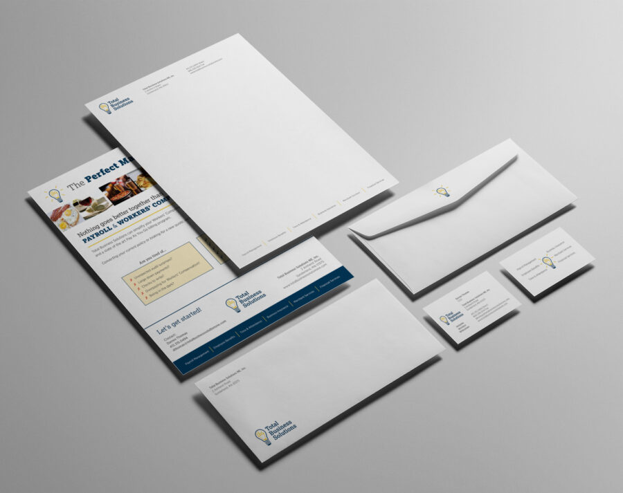
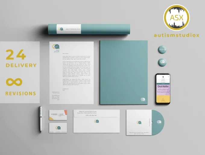
Brand or collateral materials are creative assets associated with your brand. Many of these brand materials will showcase your brand’s logo. These can include brochures, envelopes, letterheads, business cards, flyers, etc.
Jumping Off the Deep End
As mentioned in my previous post, finding inspiration and narrowing down the vibe for your organization is a vital part of creating collateral material for your business and should be your first stop when starting your design process.
Understanding your brand’s tone or mood allows you to translate it to your audience. This may seem easy at first. However, translating it to correspond with fonts, colors, and other design elements isn’t as straightforward as it may seem. Find fonts and color palettes that convey the key message that you want your audience to gather from your design.
I suggest utilizing mood boards and finding inspiration on platforms like Pinterest, and I Heart It. These platforms allow you to visualize the design by putting all of your essential elements in one area.

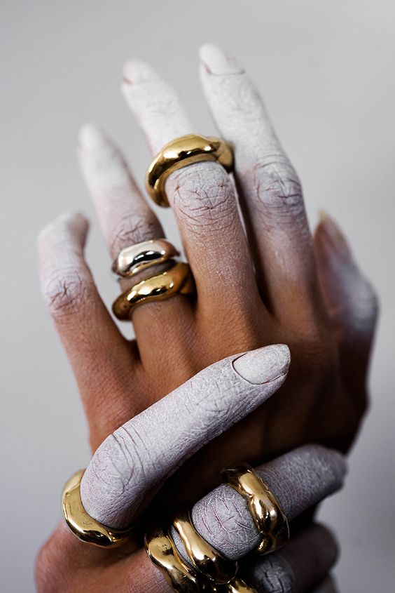
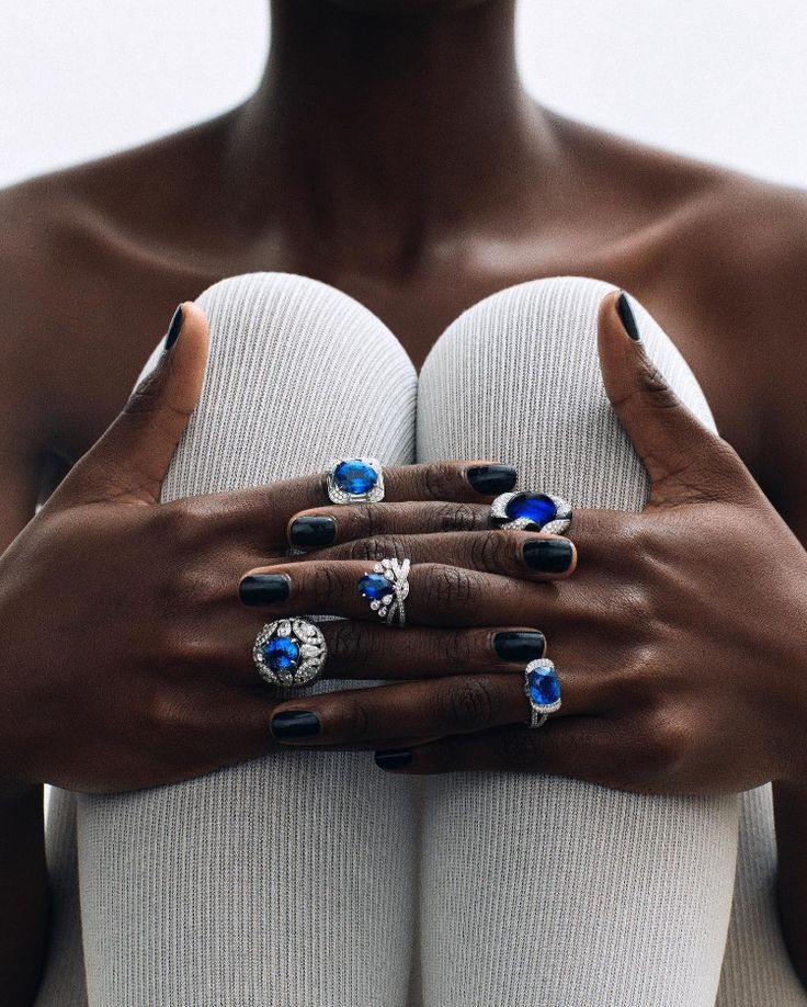
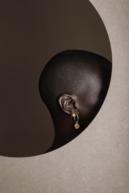
When creating the brand materials, I knew I wanted to go for a chic and simplistic vibe to my work. I wanted to represent Mejuri’s classic tone and showcase their contemporary take on familiar favorites. I thought utilizing colors and elements I saw repetitively in my inspiration boards and translating those into my design process would help me articulate these tones into my design.
Here are a few other pointers and guidelines I used to create brand materials!
Are We in Uniform?
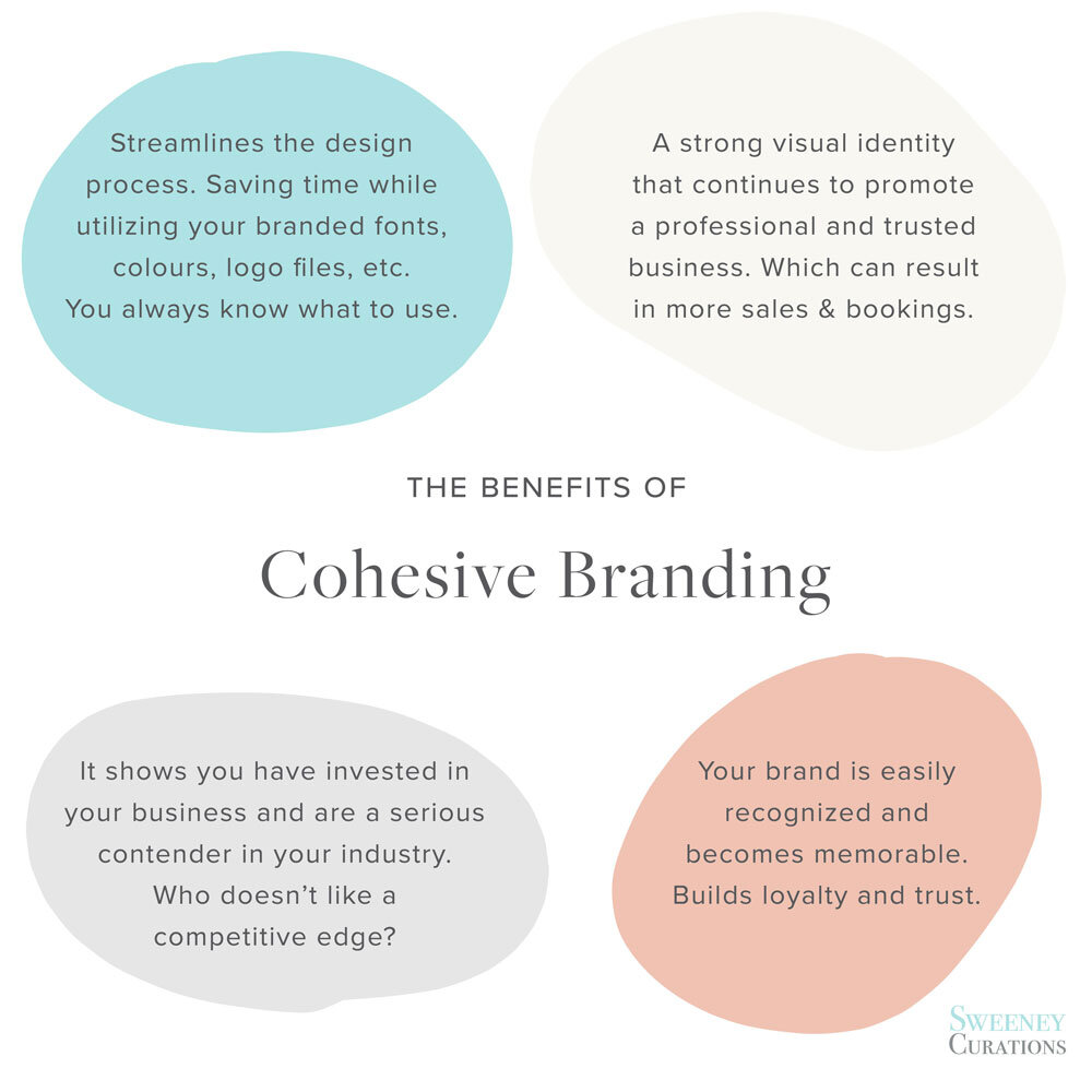
Having uniformity in brand messaging across all channels, including collateral material, is essential for brand recognition. Ensuring your design will translate well across a business card, letterhead, and envelope is necessary when creating brand collateral material. Seeing a brand’s logo repetitively allows for faster brand recognition and a sense of cohesiveness.
Cohesive Designs
Having harmony within your design allows for the product to be aesthetically pleasing and easy on the viewer’s eyes. The goal is to stay consistent with all the content you implement into your brand.
Another example that is a factor of a cohesive design is the integration of the idea of scale and proportion. I’ve discussed these in depth in previous posts. However, to recall, scale and proportion are essential to design because different sizes can draw attention to specific elements. For example, having a design where the scaling of elements draws your eye around the whole page can display your message more effectively to your reader.
Consistency in your Logos and Design
I decided that presenting the logo consistently throughout my messaging was essential for my design. I made the logo the biggest part of the design to draw the viewer’s eyes there. I repeated this logo throughout to once again improve brand recognition.
Consistency is all about showing up day in and day out with the same message, the same visuals, and the same tone of voice. It’s about being reliable and trustworthy, and showing your audience that you mean business.
BrennanBrand.com
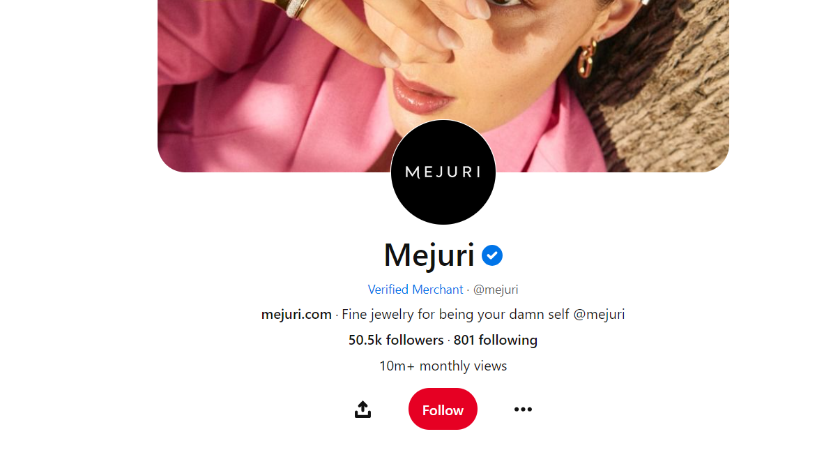
Mejuri Branded Collateral Material
For my business card, letterhead, and envelope, I wanted to display a sense of elegance, simplicity and the idea of being a new version of the classic jewelry brands!
I achieved this by creating a simple logo and layout but still using concepts like the scale to draw the viewer’s eyes to the essential information: the logo, the company name, the company mission and Mejuris contact information.
I chose classic colors for my business card, letterhead and envelope: black, brown and white. This is due to Mejuri’s consistent element in their brand of neutrals being the primary colorway. As a brand, I wanted to showcase that Mejuri still provides comfort and reliability as classic brands. However, the blank spacing and boldness of the logo add a contemporary feel to the collateral materials.