Tag: communcations

Studying Social Media

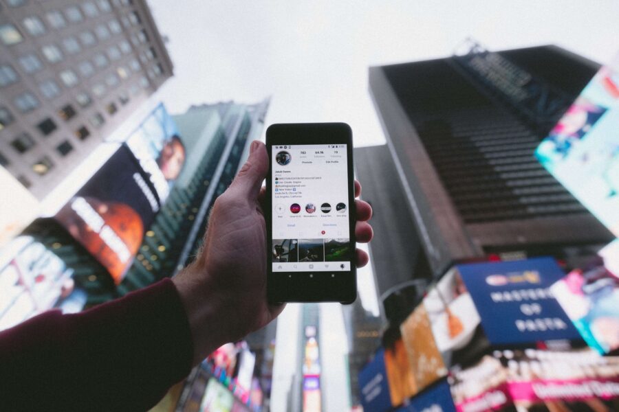
Throughout my professional and academic career, I recognized how critical social media is in public relations. From news to entertainment, social media is a massive part of our lives now. PR professionals must use this tool to connect with audiences and promote our organization!


Having Social Media as a Tool in your PR Kit

You can use social media as a tool rather than just a platform in several ways. Many social media platforms have built-in analytic monitoring services, allowing organizations to track their engagement and impressions. This can be helpful to gauge how specific promotions and campaigns are working with your audience.

Social media also offers a two-way communication channel with your stakeholders and target audiences. Allowing for post feedback lets your audience feel connected to the brand or organization, keeping that relationship.

Creativity is a big part of social media that traditional news, press releases, and other forms of media do not offer. With social media, there are creative ways to connect to your audience. You can do this via polls, comments, taking on social media trends, and commenting on influencers’ posts.

Creating a Social Media Campaign for Mejuri

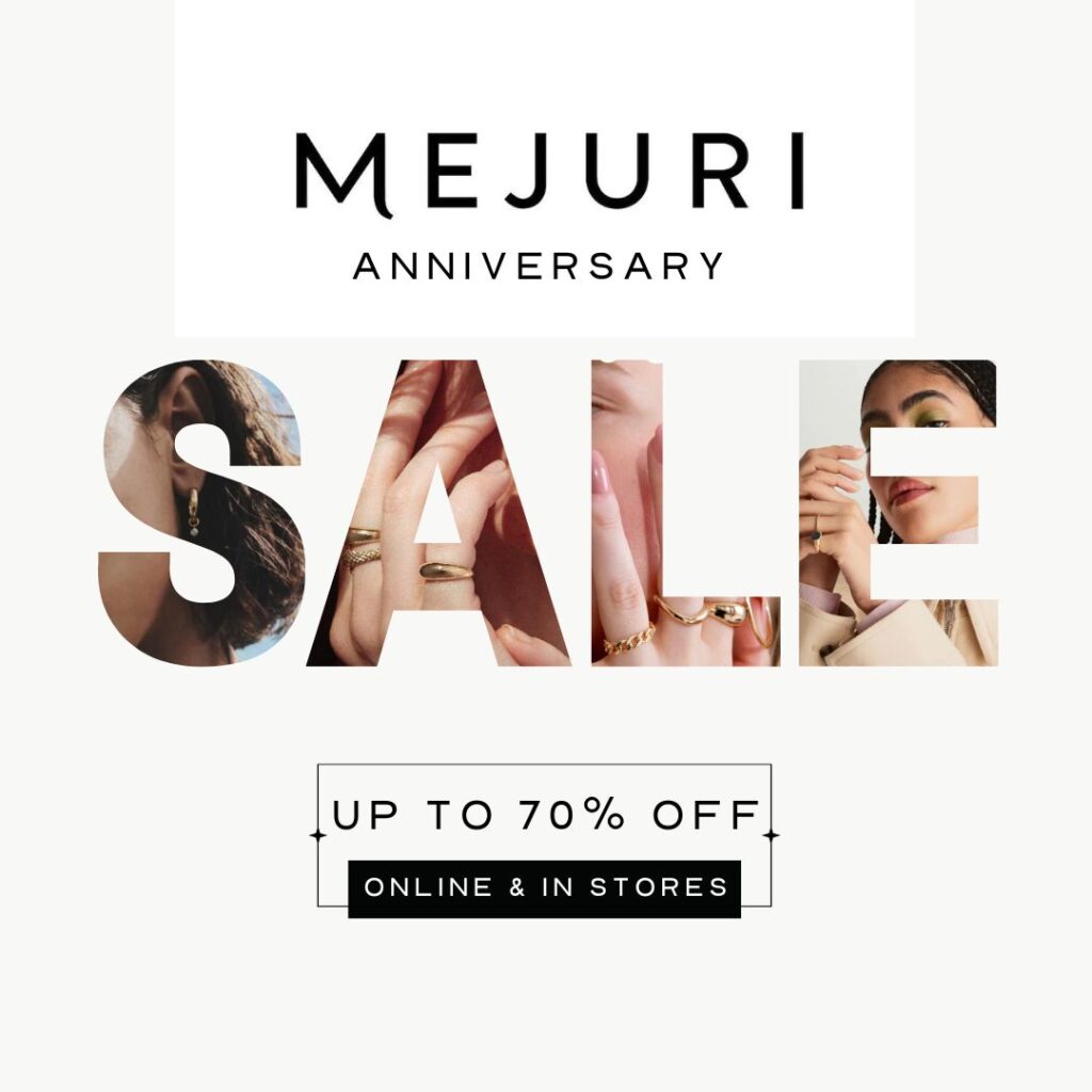
To polish my social media skills, I created a social media campaign for the brand I have worked with for the past couple of weeks, Mejuri. ( Check out my previous posts on Mejuri brand collateral for context!) For this campaign, I relied on consistency and adjusting the post to the platform. For example, this campaign was centered around the Mejuri anniversary sale and was an Instagram and Facebook post exclusive as that’s where our major audiences are.

Mejuri Anniversary Campaign: Instagram Post
Anniversary Sale: Facebook Post
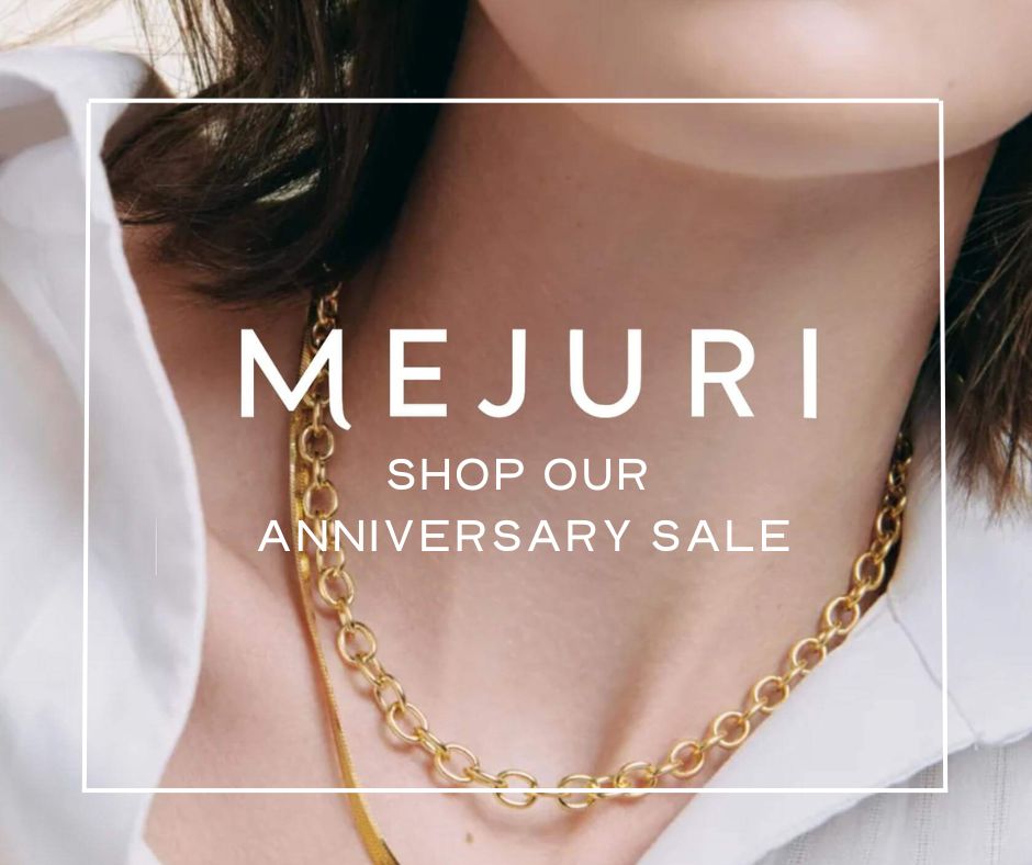
Utilizing consistency in the Mejuri logo allows for brand recognition. Repeated promotion of “Shop our anniversary sale.”

I wanted to utilize these posts to be the main element of promotion. I followed through with Mejuris’ editorial picture feel and blended this into the anniversary campaign. Using high-contrast images and them becoming the catching eye point of the posts.

Facebook Cover
Twitter Header

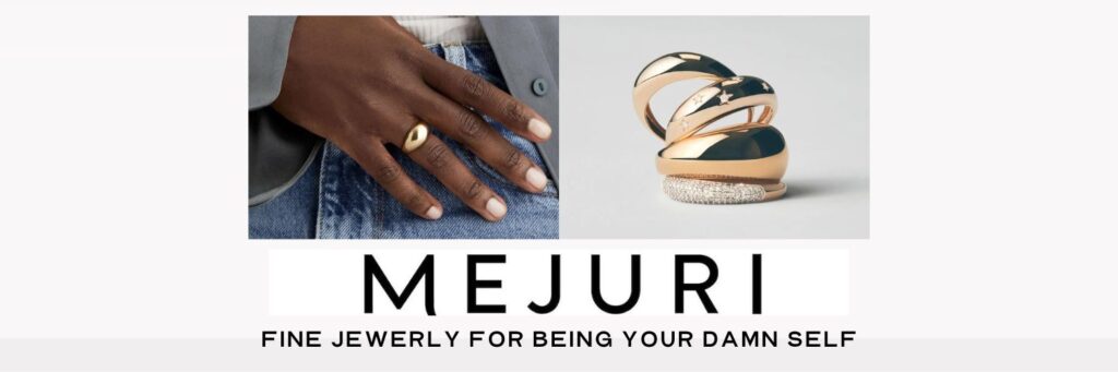
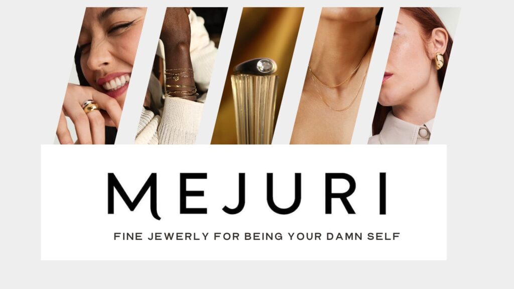
I wanted a consistent header/cover for the Facebook and Twitter headers that would stay on these platforms for multiple campaigns and seasons. One element of Mejrui is their catchphrase, “fine jewelry for being your damn self.” I utilized light gray, cream and dark exposure images that match Mejuri’s clean and crisp tone.


When Creating Social Media Content, Keep in Mind…

Brand voice, culture and tone are key to staying connected with your pre-established audiences.

For Mejuri, aligning with their classy, editorial, and clean vibe was important. They have consistently used product images focusing on the “people” aspect. It is important to keep these elements. That way there is greater brand recognition, so it feels genuine to the audience.


Platforms for Social Media Campaigns

Platforms like Canva are user-friendly, free and expansive. Canva has several elements that you can add to your posts. Canva also offers templates that can provide a jumping-off point for your creations. Templates are great when you need to see examples and ideas to generate your own creativity and ideas.

There is also a new feature that can help in idea generation. Canva has an AI helper called “Magic Tool,” which allows you to input ideas and design elements.

Canva is a great accessible platform for social media creation and is easier than its predecessors, InDesign and Photoshop.

Canva offers many tutorials, and you can even utilize the AI helper to guide you through your designs.


Here are several more articles and resources on how social media can be one of the best tools in your PR Toolkit.

Keep Your Eye Out for Design!

Elements of Design we can see out and about!

Typography

Typography (as referenced in my last post) studies letters and words to make them visually appealing to the reader’s eye. So with that, obviously, that is a HUGE part of design. We want our readers to be captivated by our messaging or to understand the tone of our message. That starts with the first glance, which emphasizes ensuring the font fits the style we are trying to achieve!

While doing my morning journaling, I noticed that my journal had a captivating aspect for a few different reasons.

First, the typography for this journal just hits the message on the head. The font feels very academic and whimsical. This font allows me to correlate that I can write freely throughout this journal because of the literary feel. I also enjoyed how the bottom “subheading” is in all caps, drawing attention to the area even though the text is smaller.

Lines

Secondly, the use of lines in this photo was also exciting. The line between the dark blue journal in contrast to the light blue journal behind. The vinyl cover follows the same angles as the journal when they are apart while having its design covered with lines. Then, lastly, seeing the roundness of the glass with a straight line from the straw draws attention back to the journals. Lines allow my eyes to follow the angles, almost guiding the eyes to every individual element of this photo.


Dominance

The element of dominance in design can allow our eyes as viewers to see an intended message very quickly. In this bathroom at a furniture store in Norman, it was amazing to see how, despite a busy background, the “LOVE” stands out due to its simplicity and asserts dominance over the floral design. Utilizing distinction is an easy way to grab attention quickly, and I love how this design was put together.


Proportion

Though not the most artsy photo, this picture taken on the University of Oklahoma’s campus captures the idea of proportion so well. I took this photo and got closer to the ground to make the clock tower seem even more significant than the man. The willow trees standing taller than him give us an idea of how big the clock tower is and allow us to fully understand the different sizes of things in the world.


Balance

This photo may seem very busy at first, but as my eyes follow the elements of the picture I notice that every area has its unique feature and is balanced to the other. For example, the bottom is significantly busier than the top. Therefore, we can notice the bright white ceilings to balance this photo. Secondly, something is happening in every aspect of this photo—the ceilings with lights and the “STASH” sign. The bottom has an assortment of pots and pants. The right and left sides match each other perfectly while allowing room at the top to create balance within the photo. This photo also leans into another design aspect, which is UNITY.

Unity

Each element of this photo feels that it complements another. The bright white walls, mixed with the lush green plants. Specks of muted browns for the furniture that mesh well with the natural colors of the plants. Every aspect of this photo seems to link together well to create an aesthetic scene for me!


Color & Rythm

Within this image, there is a sense of color that is very repetitive and rhythmic. Rythme with color is very important, depending on which message you’d like to portray. When I came home and saw my two cats, I first noticed how not one color felt that loud or aggressive. Every color felt intentional and peaceful. The repetitive nature of the colors felt very calming. For example, my orange cat’s hair matches the color of some of the lighter bricks and is almost similar to my gray cat’s eyes. The gray cat’s coat is the same as the curtain color in the back, longing for a repetitive aspect to the color palette. This is highly appealing to the eyes because everything in this photo has a place and a complementary element with the same color. The receptive nature amplifies the message that these two pairs of cats are partners and one of the other’s better half.


Symbols & Minamlism

When I came to Gaylord for the first day of the semester bright and early at 7 a.m., I noticed the minimalism of this message. The bright JMC, compared to the dull, minimalistic background, seemed like a metaphor to me. Something similar to how JMC courses outshine and seem so much more intense next to other classes. However, this metaphor wasn’t implied in any way. It is interesting how minimalism, compared to the bold JMC logo, can allow viewers like myself to ponder a deeper meaning behind the image!

Combining these elements

Having these elements be what you base your ideas on is a great way to ensure that your design aligns with the messaging you want for your target audience. Knowing how aspects that may seem small, like lines and rhyme, can entirely change the messaging!

Make sure to keep your eye out for design to gather inspiration in your daily lives, too!

Powered by WordPress & Theme by Anders Norén