Tag: communications

Mejuri and the Magic of Messaging

Sticky post

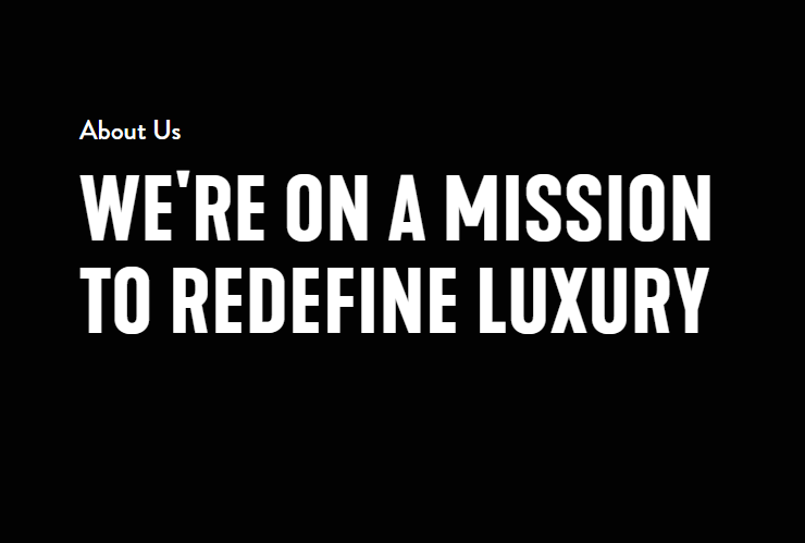
Mejuri, a Canadian-based fine jewelry brand, is based on its mission:
The brand’s focus on simplistic, sustainable and timeless pieces is a crucial difference from its competitors. Mejuri understands that fine jewelry is an investment, and they opt to create designs that will always be trendy.

Based on their classic appearance, they also highlight the youthfulness of their pieces by promoting dainty, gold and delicate looks.

While I create a new campaign for Mejuri, come along with me as I show you how I narrowed down my choice of language, images and overall vibe for this project.

Utilzing Visual Langauge

One thing that first caught my eye with the brand is the usage of precise language that focuses on their drive to contribute to sustainability. The brand has a very empowering undertone without the fluff of overly positive messaging.
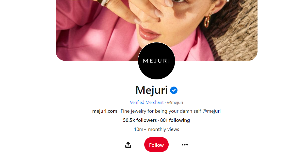
Mejuris Pintrest Account 2023.

For example, this is their Pintrest account. The phrase “Fine jewelry for being your damn self” showcases the brand’s philosophy of changing the behavior around fine jewelry and creating an equitable environment for all consumers.

I want to continue this element of authenticity, short and precise language. I think another element of Mejuri is that they let the products speak for themselves by having these short captions, which I want to incorporate into this new campaign.

For the messaging, I want to implement their font that is very bold but not detailed:
This font also supports the idea that the brand doesn’t need the extra fluff, and the central concept is simplicity.

Choosing Images for Visuals

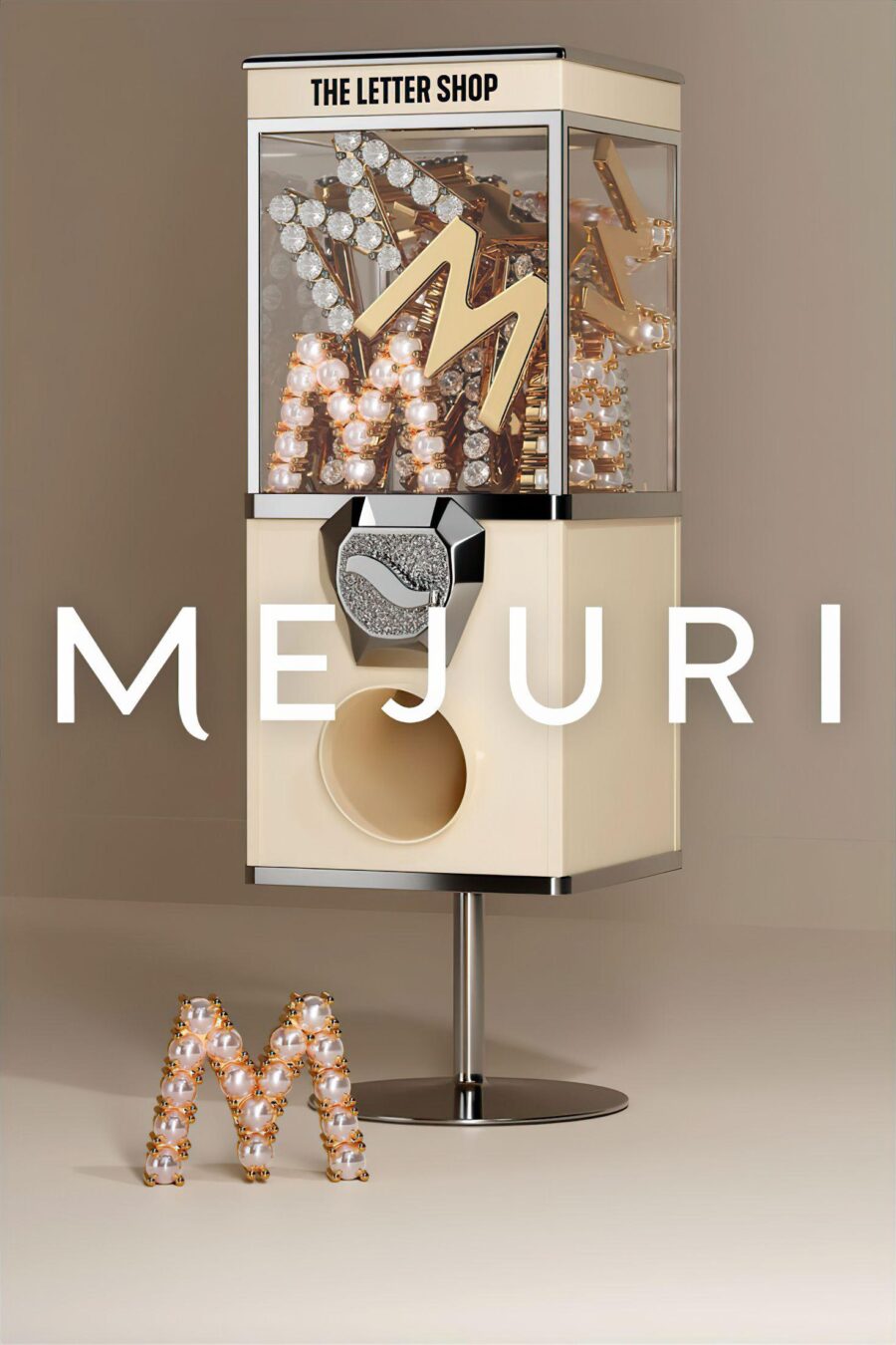
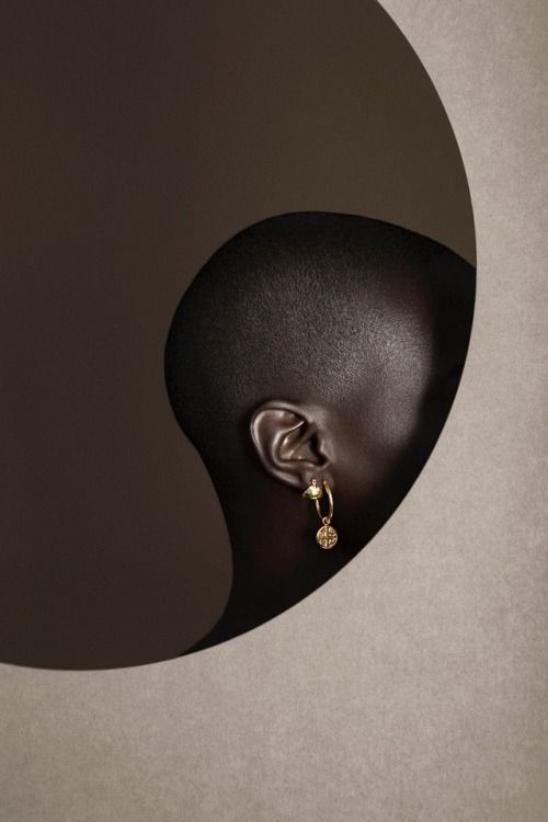
Mejuris most recent campaign, I feel, fits the brand the best. Their recent campaign gave an editorial style and implemented it with a clean, high-contrast look. I plan to incorporate this element.

I want to present my visuals as more image-based to further the idea that Mejuri products speak for themselves and don’t need a long explanation.

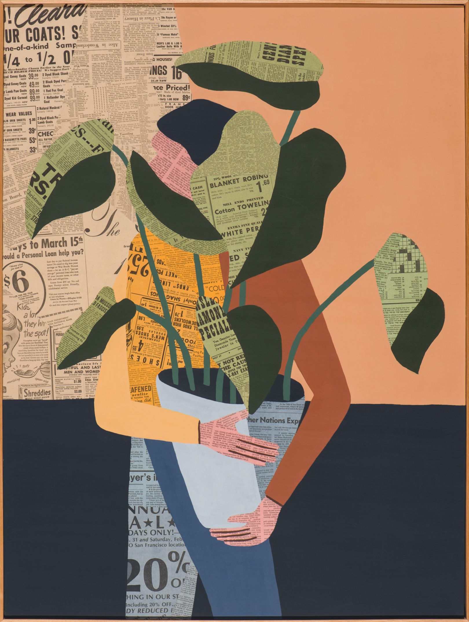
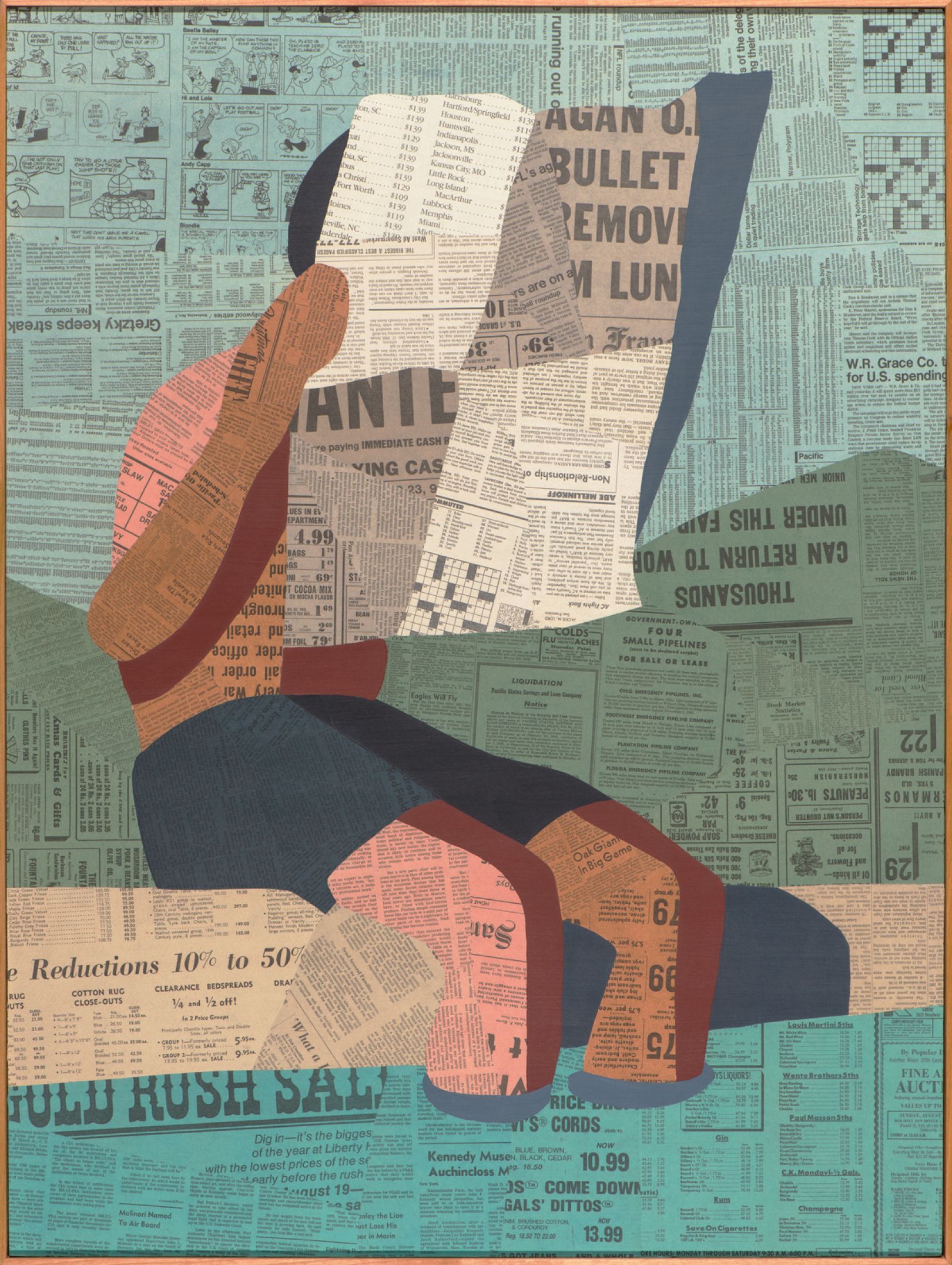
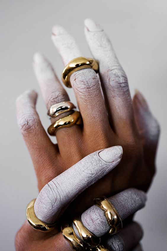
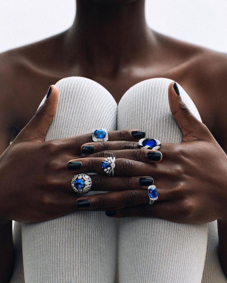
In my inspiration board for the images for the campaign, I focused mainly on highlighting their products rather than just being an element of the picture. Some examples of this are:

Connecting Typography & Imagery

For this campaign, I want to utilize these high-contrast images with a focus on the jewelry to allow Mejuris’ core values and ideologies to be expressed. I plan to use a straightforward font with an image that is the main focal point of the visual. I want to make up for the lack of words with how I position my few words. I think wrapping the words around some aspects of the images would be a great way to make this simplistic editorial campaign look a bit more creative and intriguing.

The goal is to highlight the quality, simplicity and luxurious feel of Mejuri products. Making these visuals too busy would take away from that key message.

The Goal, Inspiration, and Vibe of Mejuri’s New Campaign

MEJURI

We are on a mission to redefine luxury.

As I’ve touched on several times, the elements presented before all contribute to enhancing the core ideas of Mejuri. Overall, we want to return to that mission: “We are on a mission to redefine luxury.”

Mejuris products are pieces of fine jewelry for everyday use. So, for my inspiration, I drew from a set of images that I feel represent all stages of life but still have a trendy, editorial and simple appeal.
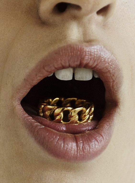

We want to highlight visual elements: clean lines and textures, high contrast, negative spaces and pops of color.

To see more inspiration I drew for this campaign, visit my Pinterest board for this project!
What’s your Type? Choosing the Right Font for Your Next Design.

Typography is a make or break in the way we design, communicate, and share our ideas with others.

© Patrick Nelson

What is typography, and how do you incorporate it into design?

Typography is the way in which we arrange letters and words to create an aesthetic and legible copy. Typography is the basis of design because there are many ways that the font we chose pushes a certain story or can be associated with certain things. So, how are ways we can break down typography to understand how it can completely change the ways of the story we want to portray?

Fonts and their Impact on Image

Typography is the way you want your reader to view your message. The choice of font can change the entirety of your messaging. A font that might be considered “loud or aggressive” should be chosen for a specific audience. On the other hand, fonts are seen as dainty or quiet and could be utilized in a calmer, more serene environment! Typography is one of the shakers and movers in design and public relations because the appearance of your messaging can be as harmful and helpful as the words you say!

Differentiating between different styles of fonts

Besides just basically studying a list of fonts and brushing up on your memorization skills, there are a couple of options to use while studying typography.

My favorite way to study typography was to play Type War. This game focused on choosing between options of font when displaying a letter. The two options might be “is this Verenda or Times New Roman?” and you choose between the two options. With enough repetition, I felt an actual difference in my ability to differentiate fonts. Some of them look very similar, so this one can be tricky!

Another great game I played was KernType. Now, while I liked this game… this one felt a lot more difficult for my learning style. With KernType, you adjust the space between letters to match the font they give you. The layout of this game was really interesting, and I got to learn a new term in the world of typography: Kern. Kern is the spacing of letters like so:

Photo: Adobe Creative Cloud, Discovering Kerning.
Ways choosing the wrong font can ruin the legitimacy of your brand
Photo: Metaweb / CC-BY

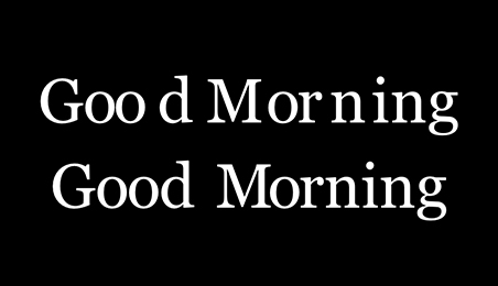
Having errors like these in logo designs can tarnish the hard work you have done for your brand and leave that idea in your audience’s head instead of your intended message. Several instances have been far worse than this, where it has been a scandal instead of just being a funny moment.

To see more typography fails that can inspire you before “choosing your type,” click here!

So… before you choose a font, make sure it is the best way to convey appropriate messages to your audiences!

Professional Portrait

Sticky post

Hi there! I am Zoe Taylor.

I am a public relations professional that believes in a heavy emphasis on learning, growing, and adapting as a professional.

I utilize the skills I gained at the University of Texas and the University of Oklahoma to create a public relations toolkit focusing on creativity, collaboration, and strengthening bonds between organizations and their audiences.

Why I Enjoy Practicing Public Relations

Public relations opened up a world that combined my two favorite things: helping others and using my words to do so. I love the idea that creativity is combined with a strategy to help clients connect with their audience in a way they haven’t been able to before. Not everyone is as skilled in communication, and that is where PR practitioners step in. We want to help our clients build those strong relationships and help them succeed as an organization!

I started studying public relations because of my intimal overall interest in communications and the urge to help others around me. I started off college as a political science major, wanting to make a change in our world. Soon I realized that being a political science major wasn’t going to allow me the face-to-face time with the public that I appreciate. Shortly after my first semester of college, I became interested in journalism. I loved connecting with people but wanted to be a little bit more geared toward creative design and big-picture ideas. I then landed on public relations and fell in love. I took my first public relations course at the University of Texas and never looked back. It was amazing to take the elements from both political science and journalism.


My Motivation regarding PR

Public relations is one of those fields that is ever-changing. In just a few days, something can drop in the media that completely reimagine what you had laid out for the week. It is the fact that no matter how long you’ve been in practice, you learn something new every day as there is an ever-changing environment around you. It is exciting to feel that even after you graduate with your degree, that you will be a student every day.


getting involved in extracurriculars

Student organizations such as the University of Oklahoma’s PRSSA chapter are incredibly helpful. Finding a community within the university adds another layer to campus life and creates incredible relationships among your peers. I plan to join the PRSSA this semester, as I was a member at the University of Texas and thoroughly enjoyed it.

In my community, I love to participate in volunteering for festivals. Helping set up and seeing events behind the scenes in an area I am very interested in. Helping your community feel supported when they express creativity is a great way to connect. One of my favorite festivals I have helped volunteer for is the Art. Music. Power. (AMP) Festival! This festival focused on creative works from women artists in my community!

Powered by WordPress & Theme by Anders Norén