Tag: digital marketing

Mejuri and the Magic of Messaging

Sticky post

Mejuri, a Canadian-based fine jewelry brand, is based on its mission:

The brand’s focus on simplistic, sustainable and timeless pieces is a crucial difference from its competitors. Mejuri understands that fine jewelry is an investment, and they opt to create designs that will always be trendy.

Based on their classic appearance, they also highlight the youthfulness of their pieces by promoting dainty, gold and delicate looks.

While I create a new campaign for Mejuri, come along with me as I show you how I narrowed down my choice of language, images and overall vibe for this project.

Utilzing Visual Langauge

One thing that first caught my eye with the brand is the usage of precise language that focuses on their drive to contribute to sustainability. The brand has a very empowering undertone without the fluff of overly positive messaging.

Mejuris Pintrest Account 2023.

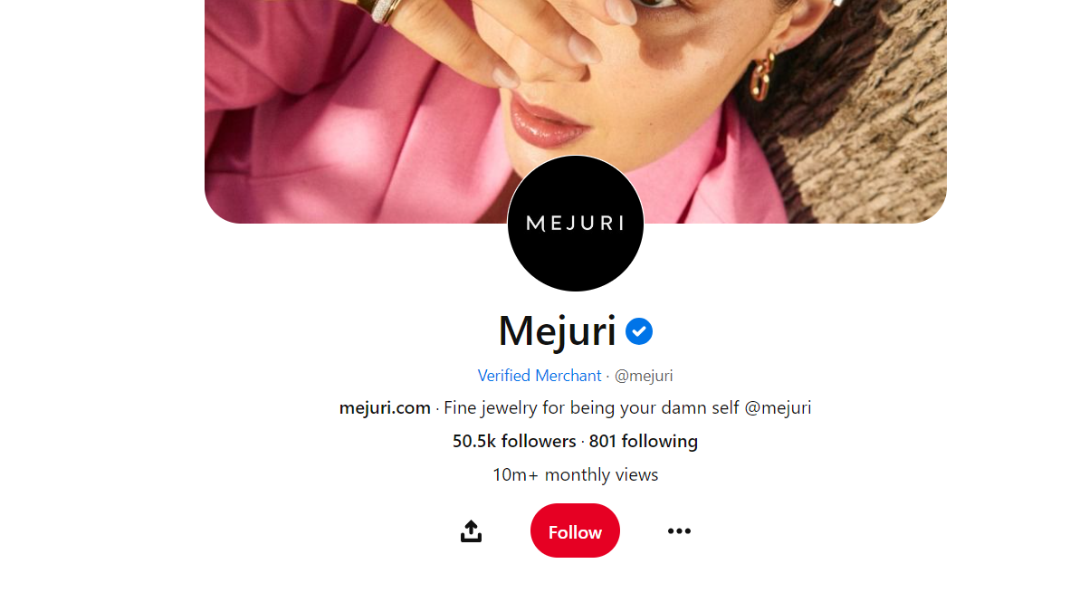
For example, this is their Pintrest account. The phrase “Fine jewelry for being your damn self” showcases the brand’s philosophy of changing the behavior around fine jewelry and creating an equitable environment for all consumers.

I want to continue this element of authenticity, short and precise language. I think another element of Mejuri is that they let the products speak for themselves by having these short captions, which I want to incorporate into this new campaign.

For the messaging, I want to implement their font that is very bold but not detailed:

This font also supports the idea that the brand doesn’t need the extra fluff, and the central concept is simplicity.

Choosing Images for Visuals

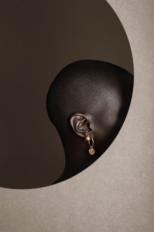
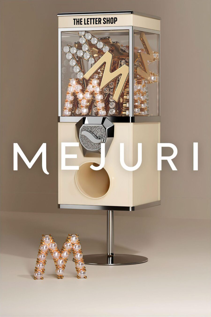
Mejuris most recent campaign, I feel, fits the brand the best. Their recent campaign gave an editorial style and implemented it with a clean, high-contrast look. I plan to incorporate this element.

I want to present my visuals as more image-based to further the idea that Mejuri products speak for themselves and don’t need a long explanation.

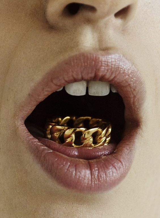
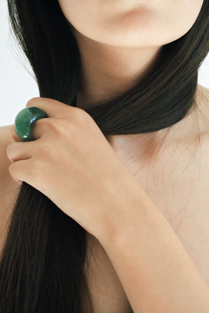
In my inspiration board for the images for the campaign, I focused mainly on highlighting their products rather than just being an element of the picture. Some examples of this are:


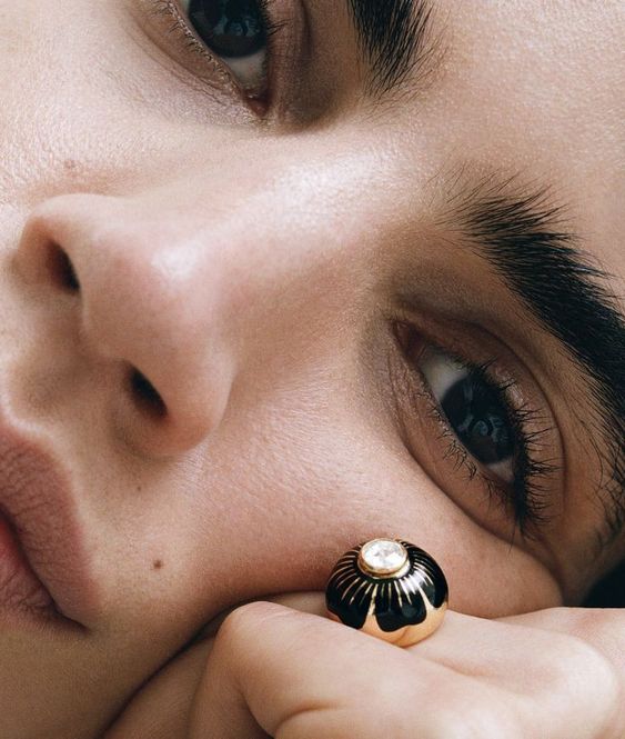
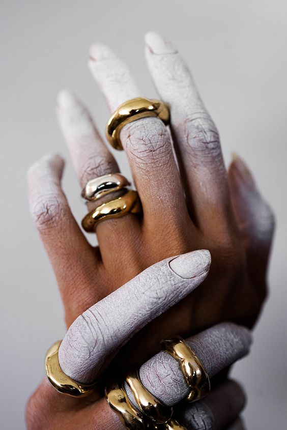
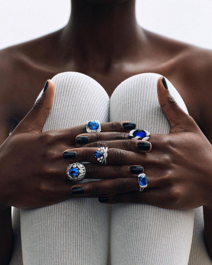
Connecting Typography & Imagery

For this campaign, I want to utilize these high-contrast images with a focus on the jewelry to allow Mejuris’ core values and ideologies to be expressed. I plan to use a straightforward font with an image that is the main focal point of the visual. I want to make up for the lack of words with how I position my few words. I think wrapping the words around some aspects of the images would be a great way to make this simplistic editorial campaign look a bit more creative and intriguing.

The goal is to highlight the quality, simplicity and luxurious feel of Mejuri products. Making these visuals too busy would take away from that key message.

The Goal, Inspiration, and Vibe of Mejuri’s New Campaign
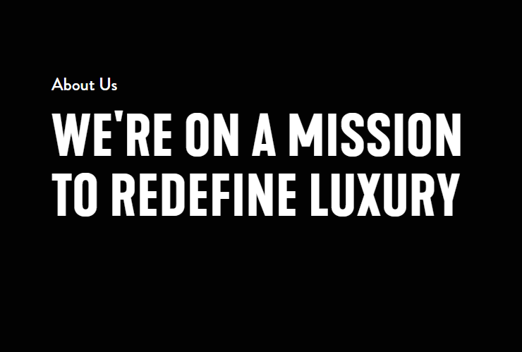
MEJURI

We are on a mission to redefine luxury.

As I’ve touched on several times, the elements presented before all contribute to enhancing the core ideas of Mejuri. Overall, we want to return to that mission: “We are on a mission to redefine luxury.”

Mejuris products are pieces of fine jewelry for everyday use. So, for my inspiration, I drew from a set of images that I feel represent all stages of life but still have a trendy, editorial and simple appeal.

We want to highlight visual elements: clean lines and textures, high contrast, negative spaces and pops of color.

To see more inspiration I drew for this campaign, visit my Pinterest board for this project!

Two Apps You Must Have in Your PR Toolkit!

Design can be a very daunting topic, especially for artistically challenged people like most of us. However, with programs like Adobe Indesign and Photoshop, you’ll never have to wonder if your design must rely on your sketching skills!

Adobe Photoshop

Adobe Indesign


Adobe Indesign: A brief overview

Adobe Indesign allows users to create documents across various platforms. Its primary focus is on page layout and, of course, design! I can create several documents with InDesign to fit my clients’ needs. Just to name a few, Indesign allows its users to make brochures, magazines, flyers, and many more. Another great feature I love with InDesign is the ability to size the document to my needs. When you open Indesign, there are a few different options on how you want your page to be set.

This option allows us to choose the best document option based on where we plan to utilize the project. This is a fantastic feature for me because I go between work from my iPad to my laptop, and they have different screen dimensions. I think this feature with Indesign is very adapted to our world, where work is not solely performed on a desktop anymore, and most organizations are cross-platform!

Along with the amazing page setup options, Indesign offers many design tools that can be unnerving initially. However, after the brief learning curve, I felt like any idea I had for my designs was feasible.

Here is just a brief look at how InDesign functions. That toolbar on the left has many options and could be overwhelming, but Adobe can provide significant resources to its users to aid in any technical difficulties! Once I learned the app’s mechanics, I now utilize almost every tool along the toolbar.

Needing help with Indesign? No problem.

Indesign through the application offers tutorials under the label “Learn.” Although most software provides this, I haven’t seen an application that promotes the idea of learning consistently with their program. I think that having the “learn” tab be a prominent feature of the home screen helps me, as a customer and user, feel that I have support and that it is normal not to be an Indesign pro on the first day! This is a unique aspect of any design software because it can quickly feel lost with all of the settings.

Becoming familiar with Adobe Photoshop

PHOTO PROVIDED BY JONTORRES.COM

While Adobe has shined with Indesign, they offer another application that is just as valuable to PR, if not more. Think of PR campaigns, how polished everything looks, how there aren’t any shadows, and how the photos’ lack of business allows brands to focus on their messages. You can thank Photoshop for that! Photoshop allows users to eliminate any distractions in pictures, clean up edits, and ensure our designs and photographs align with the vision imagined for our campaigns and organizations.

Adobe Photoshop offers many settings and tools, such as cut, blur, a spot selection tool, and much more. Combined with a photograph or design, these tools are a way to clean up an image or transform it into something very powerful in displaying a desired message.

“Graphic design can be an integral part of public relations, from designing websites to social media graphics. Chances are Adobe Creative Cloud has an app to help you create content.”

Jenna LaBorde, “Utilzing Adobe Creative Cloud”

What makes Adobe Photoshop and Indesign unique?

As we briefly touched on before, Adobe generally offers excellent user support. They acknowledge that these programs can be challenging to learn by providing step-by-step tutorials for almost everything. Both applications have a “learn” option, where users can have an interactive experience when asking questions about the Adobe applications.

Another critical aspect is the community of Adobe users. Throughout my time using these applications, I have found a TON of information through YouTube videos, Linked In learning, Reddit, and other resources. This sense of community and helping each other perfect our skills is another thing that truly sets Indesign and Photoshop apart from other applications.

We’ve got the tools; now, how do we use them?

A great application is just the beginning of becoming a great designer. Designing takes planning and lots and lots of trial and error. Design is not a situation where you can get the best design your first go around. For a great design, the designer must utilize elements such as proportion, coloring, and dominance. Combining knowledge of design and programs is essential to using design in PR and ensuring your design is the best for your organization!

Good luck using these tools to create your designs and graphics. Check out my other posts for tips on perfecting them with typography and other design elements!

Powered by WordPress & Theme by Anders Norén