

Designing Direct-Mail with Photoshop
My client, the University of Oklahoma Recruitment and Admission Offices, needs to reach several target audiences. A classic way to reach out to stakeholders is through direct mail-ins. My first step in designing these mail-ins was brushing up on my Photoshop skills.
My Experience with Photoshop
Photoshop had a learning curve for me. I found the platform pretty difficult to use at first compared to Adobe Indesign. Especially in terms of creating a design and layout, I had to watch many YouTube tutorials explaining the basics to help me get started. A great one I watched explained the platform in under 20 minutes.
After reviewing these tutorials, I learned the basics and shortcuts to improve my Photoshop experience.
One piece of advice I have is do not give up! I closed my laptop several times in frustration, but after practice and understanding that “Ctrl + Z” made anything go back, I was flying!
The Importance of Knowing Your Audience and Stakeholders
For this assignment, I really needed to research my stakeholders and make our mail-in stick out more than other competing colleges. As noted in my last post, I am working with two main stakeholders: transfer students and Promising high school seniors.
As we discussed before, it was important for my promising high school senior stakeholder to focus on the unique education the University of Oklahoma offers. I wanted to advertise this on the mail-in and focus on academia.
I chose to go with an angle that would resonate well with parents as well, considering this high-school senior still lives with her parent.
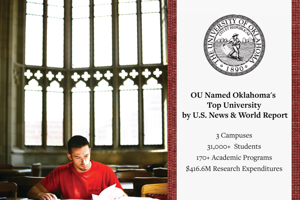
Paige Turner: High School Senior with above-average grades.
The back of the mail-in:
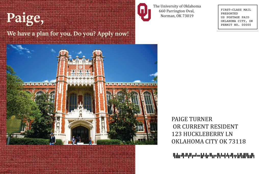
The front of the mail-in:
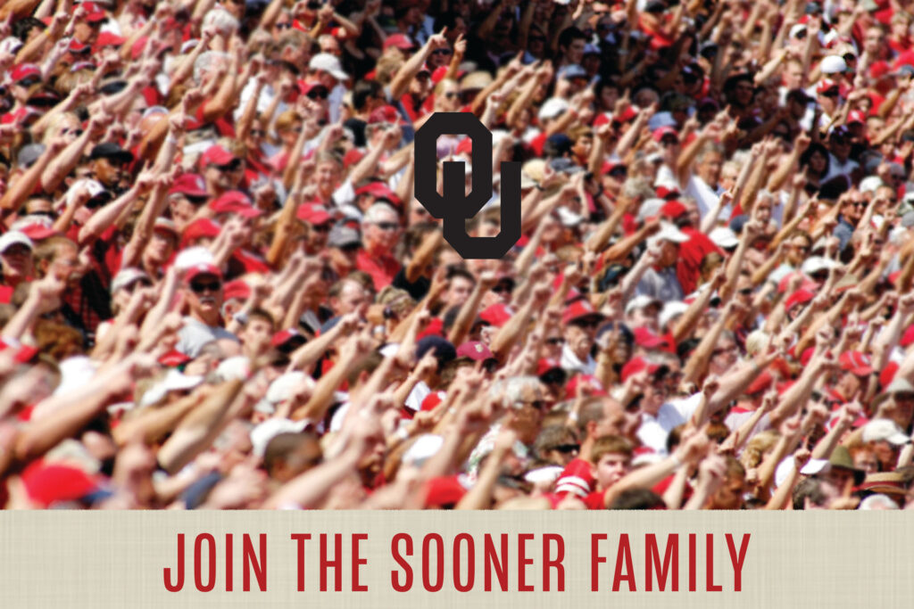
Justin Case: Contemplating Transfer Student
For the transfer student, this stakeholder wants a sense of community and networking in his new university. As privy to my research, it is important for transfer students to feel interconnected with their new university and feel that the benefits outweigh the risk of transferring.
I wanted to showcase OU’s wonderful community, school spirit, and overall vibe. I used empowering language, urging this stakeholder to apply to OU.
The back of the mail-in:
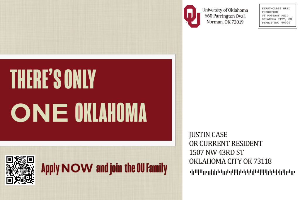
The front of the mail in:
Fluidity of the Design Process
My design for these mail-ins is my final draft. As I experimented with Photoshop, I knew these would change as I gained skills and a vision for these designs.
Designs are bound to change based on your comfort level with the platform and as your idea for the project becomes more concise.
I first started with something overly basic, as I felt none of my designs could mesh. After utilizing the layers feature and becoming more comfortable- I felt a shift in how I approached them.
I tried new things, incorporated ideas I liked, and washed ones I didn’t.
I also utilized feedback to be able to round out my ideas and make sure they translate well for a mail-in.
A design needs to remain fluid to improve each time you work on it!