
First Impressions Count: Why Your Stationery Matters
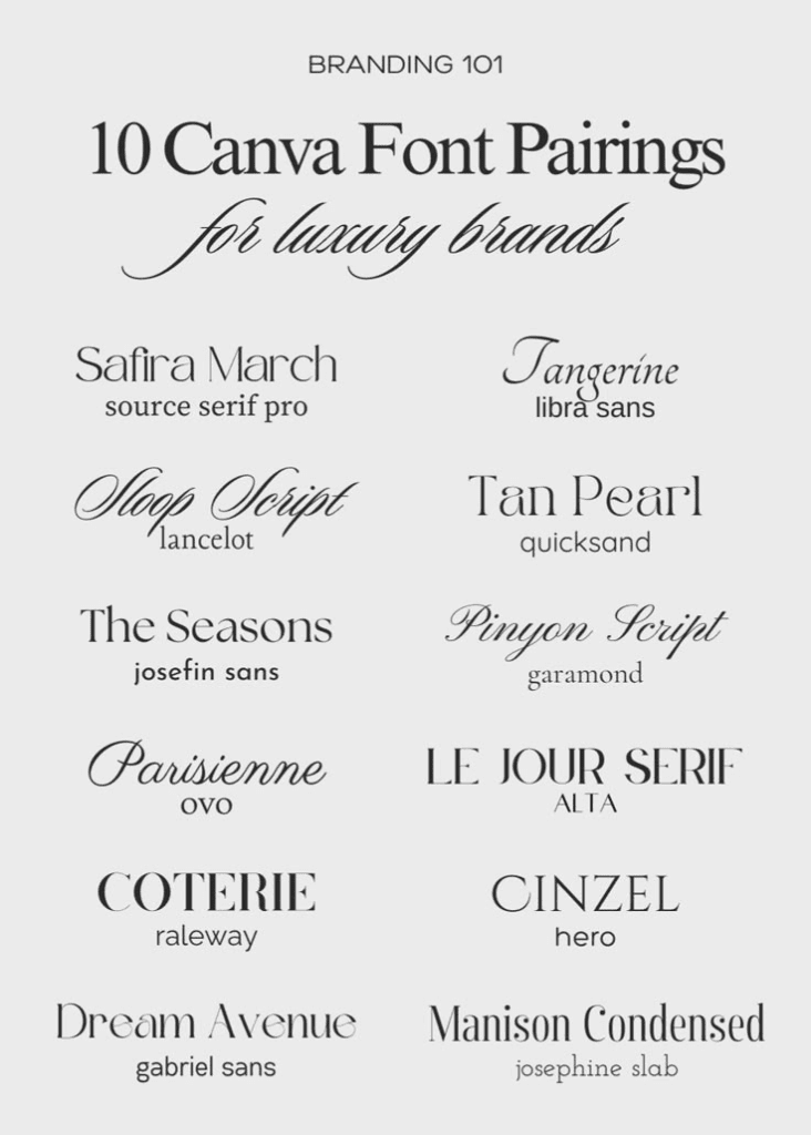
First impressions are super important in the world of PR. Crafting an image that accurately portrays your brand and who you are is vital to your career and future success! Your stationery can speak louder volumes than most PR professionals realize when they’re just starting their careers. Crafting a well-designed business card, letterhead and envelope can create a lasting impact that captures the essence of your brand. Knowing how to design stationery effectively and efficiently is the first step to creating something perfect for your brand! Using the right fonts, colors, harmony, typography and images are only a few of the crucial factors that play a part in crafting stationery that’s an accurate representation of you.
The Main Event: Your Business Card
Your business card is argueably the most important part of your stationery. It is important to include your necessary information and make it represent you and your brand. It’s important to not make it too cluttered and disorganized. You want it to be unique to you and not a copy of someone elses that doesn’t accurately capture you. After making sure I knew what I wanted my brand to value and what I wanted my image to be, I used that information as well as information from my competitive analysis and started designing. I played around a lot on Canva to experiment with designing logos, and I ultimately created my final designs using Adobe InDesign. I wanted to go simple, elegant and sleek. I used a very legible, simple clean font that I felt resonated with my brand. I created many different options and experimented over and over until I finally designed what I thought fit me best.
Next Up: Your Letterhead
Personally, I struggled with the design of my letterhead. I even scrapped my original logo and made a new one because designing my letterhead made me realize I wanted something different. As I said before, I valued a sleek, clean look. A lot of examples and inspiration I looked at were a little more complex than what I originally designed, but even though mine may have felt TOO simple, it was exactly what I wanted and captured my brand essence well. Making sure that you’re testing multiple designs is crucial. I tested multiple fonts, colors, locations of texts and more.
Finally: Your Envelope
My envelope was honestly the easiest thing for me to design. Once I had finished my business card and letterhead, I felt like I knew exactly how I wanted my envelope to look. I wanted to stick to the simplicity of my other designs, and I put the necessary information with my core color. I used the same font on all of my text to make sure there was a sense of unity. You want your designs to look like they belong together and make sense next to each other. It took me a long time to design my business card and letterhead but that made it easier and more clear when it came to what I wanted my envelope to look like.
What To Takeaway: The Essentials
One of the main things I learned in my designing process is that it is NOT a quick process. Designing can feel tedious or discouraging when you keep having to change things or edit fonts and text sizes over and over again, but it made my designs look 10x better than they would have if I would’ve stuck with my first design idea. The main thing I want PR professionals to take away from my experience is that experimentation is key. It will take a lot of trial and error to finally find something that fits your brand, but it is worth it in the long run. Don’t just settle for the first design because it’s quick and easy, take the extra design steps and it will 100% pay off!