Designing to Connect: What I Learned About PR Design

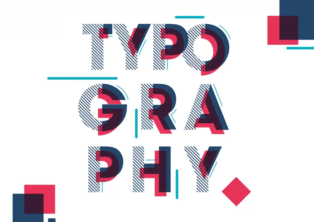
What Is PR Design and Why It Matters

PR design is all about making sure your message isn’t just heard, but actually seen and felt. It’s not about creating the most perfect, polished visual; it’s about making visuals work for the message you’re trying to communicate. Whether it’s a flyer, a newsletter, or a social media post, design is how you take your ideas and communicate them in a way that grabs attention and gets results.

Some of the tools I found super helpful this semester included:

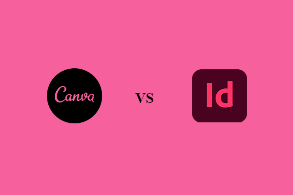
  • Adobe InDesign – for making fancy, professional layouts
  • Canva – my go-to for quick, clean designs when I need something fast.
  • Photoshop – for when I wanted to get a little more creative with images.

These tools helped me really pull things together and made the whole design process smoother.

Design Hacks That Made My Life Easier

Here are a few hacks that helped me work faster (and smarter):

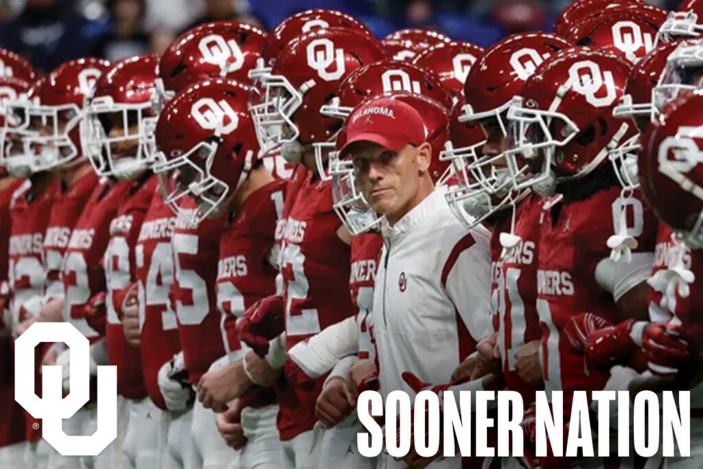
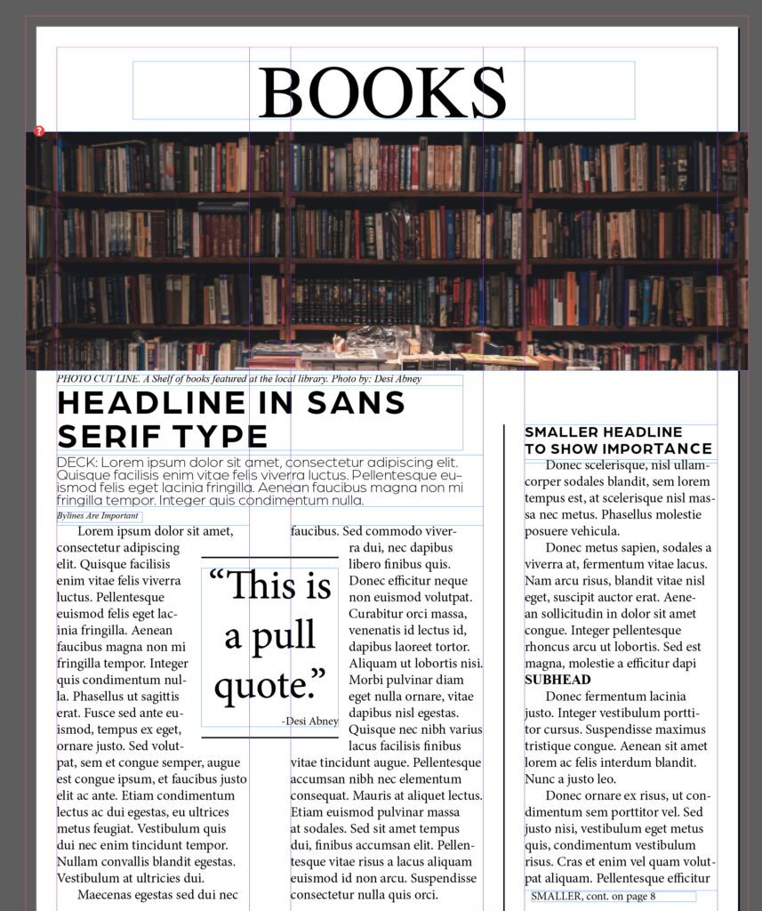
Grids Are Your Friend: It might sound simple, but aligning everything just right really makes a difference in how professional your work looks. This was super helpful when I was creating my NFL newsletter.

Organize Layers and Groups: Label layers and group similar items together in programs like InDesign and Canva. It’ll help keep your workspace tidy and save time when you need to make edits.

Use Styles for Easy Text Management: InDesign’s paragraph and character styles let you quickly adjust fonts, sizes, kerning, and leading across your whole document. It’s especially helpful when working with large multi-page documents like newsletters.

Use Templates for Quick Design: Canva has tons of pre-made templates that can save you time, especially if you’re working on social media graphics, flyers, or simple presentations. Just adjust the text and images to match your content.

Why Designing For Your Audience Matters

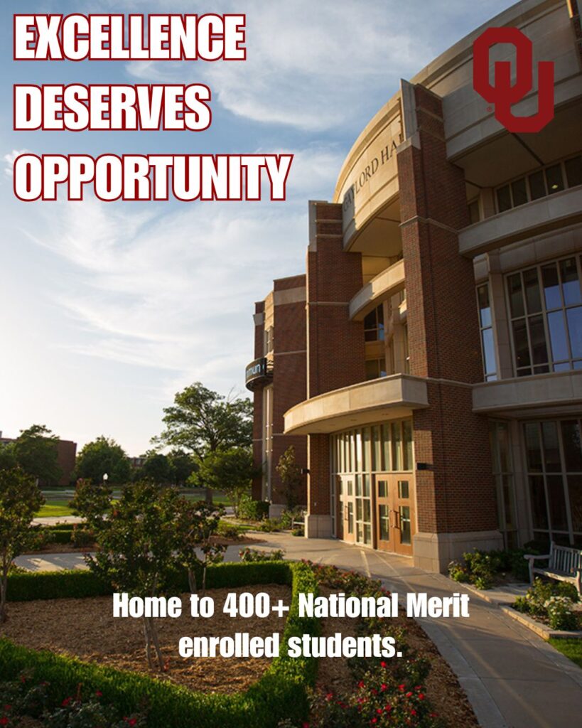
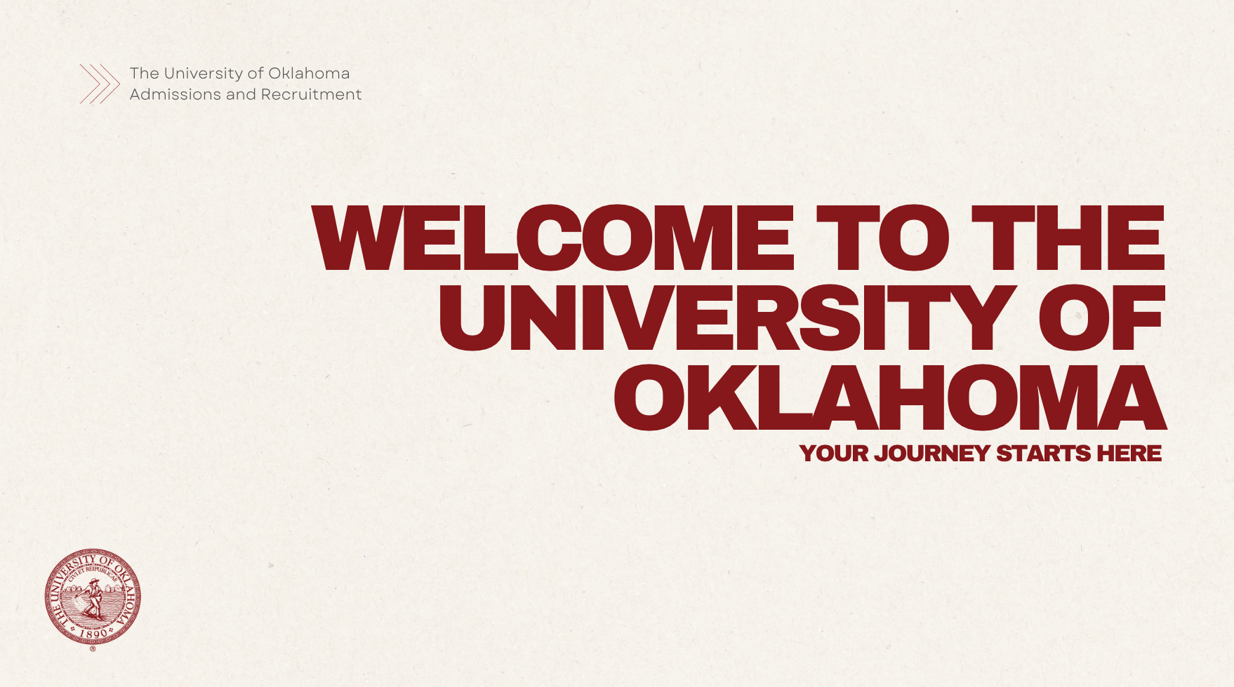
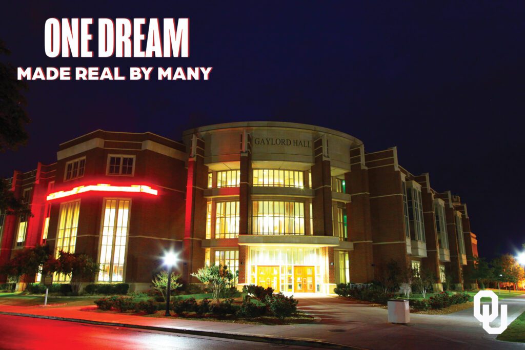
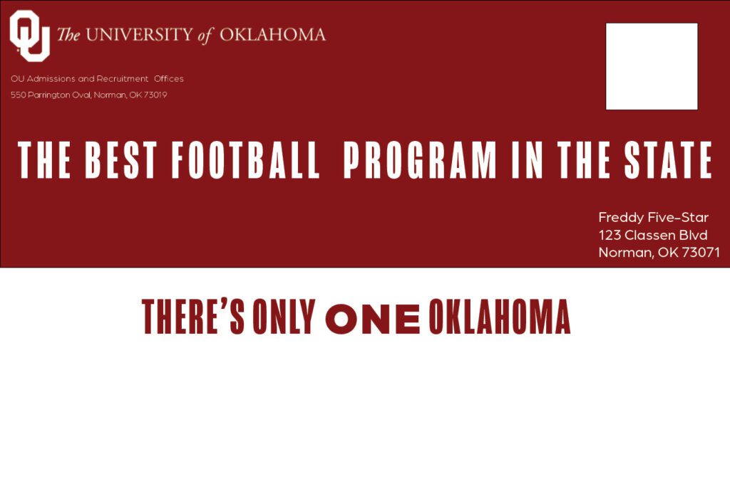
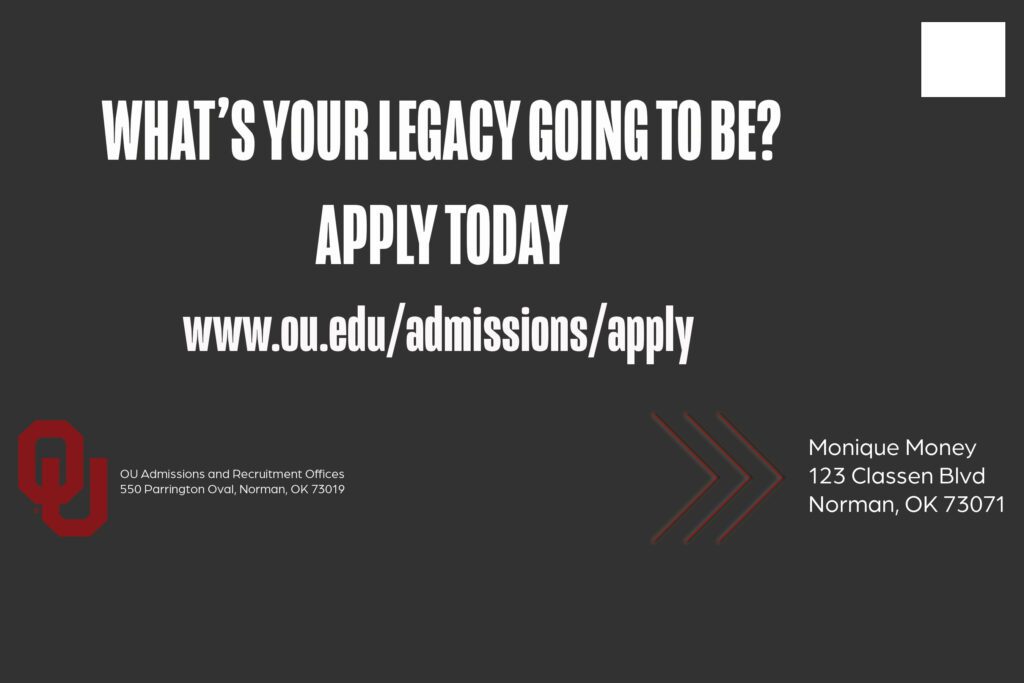
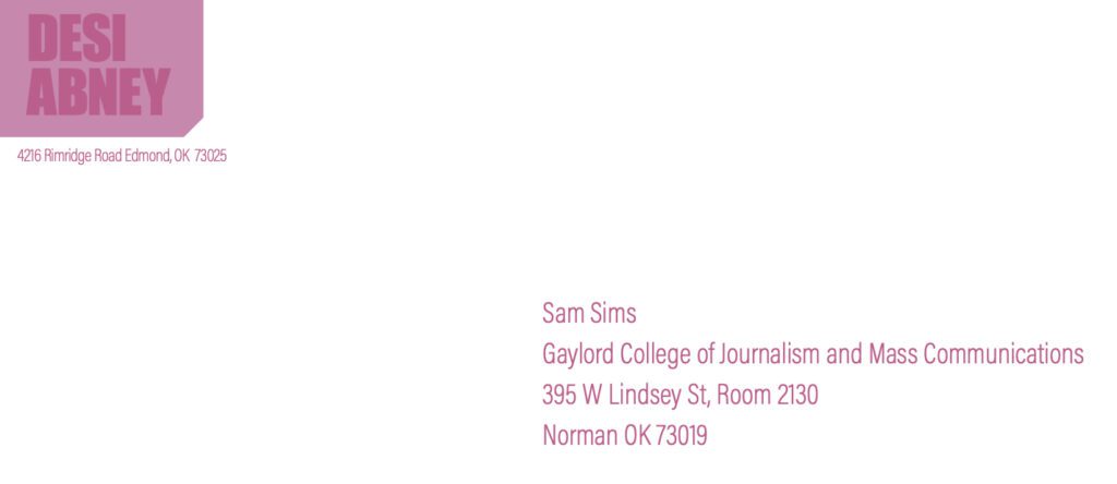
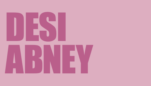
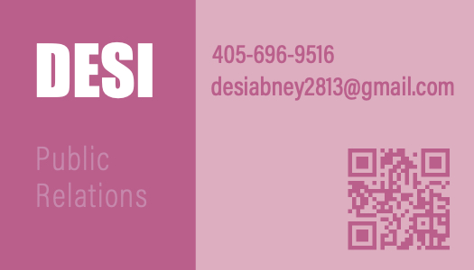
Honestly, the biggest thing I took away from this course was how important it is to know your audience when designing. You can have the best-looking newsletter for example, but if it doesn’t speak to the people you’re trying to reach, it won’t matter. Whether I was working on my business card for branding myself, the NFL newsletter, or creating for OU Admissions & Recruitment, it was so clear that each design needed to fit the target audience’s vibe. The tone, colors, and layout all had to match up with what the consumers cared about.

Final Thoughts on the Semester

Looking back, this class taught me how to think visually and how to make my ideas pop. I came in with writing and research skills, but now I feel way more confident putting together designs that help tell those stories. It’s cool to see how everything connects, writing, designing, communicating, and now I’m ready to tackle the real world with both writing and design skills under my belt. I am very thankful to my professor, Sam Sims, for his patience and for truly helping me learn and get better. I created things I never thought I could thanks to him. If you’re taking this class next, I definitely recommend enrolling with Professor Sims.

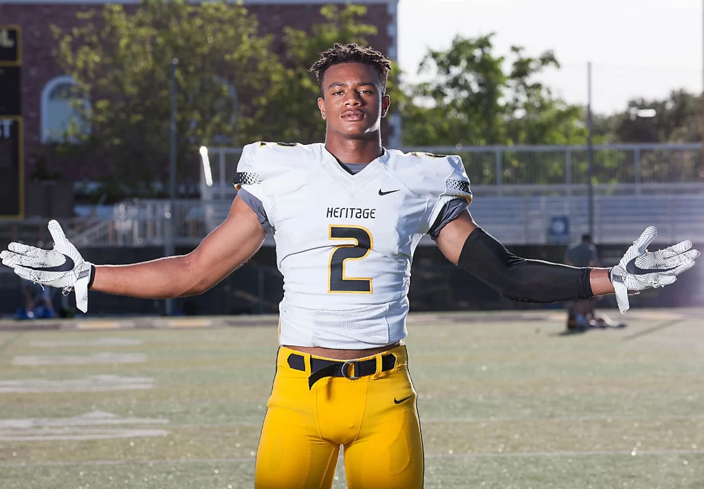
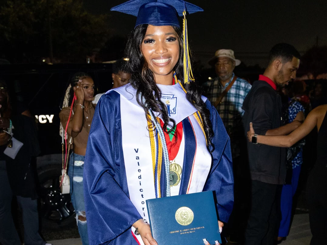
Extra Feature Images From My Work

Screenshot

Designing for Digital

Designing for digital is a whole different ball game compared to print, and I’ve learned a lot while creating social media posts, email campaigns, and presentation templates for my client, OU Admissions and Recruitment. The key to digital design is understanding the unique characteristics of digital spaces, what engages your audience, and how tools like Canva and MailChimp can either elevate or limit your designs. Here’s a reflection on my experiences with these digital projects and some advice for creating successful digital collateral.

Targeting My Audience

When I was working on these digital pieces, my target personas were two very distinct groups: the five-star football athlete and the National Merit Scholarship student. These personas shaped everything from the tone of the messaging to the visual style. For the football athlete, I knew the design needed to feel bold, dynamic, and high-energy to appeal to their competitive spirit. Meanwhile, for the National Merit Scholarship student, I focused on a more refined, academic aesthetic—clean lines, professional typography, and a more polished feel.

In terms of stakeholders, my client (OU Admissions and Recruitment) was the primary stakeholder, but I also kept the students themselves in mind. Their needs and expectations were central to every design decision. Whether they were scrolling through Instagram or opening an email, the designs had to speak to their values and interests while clearly communicating OU’s brand.

The Evolution of My Designs

Designs evolve a lot during the process, and this became especially clear when I created drafts, received feedback, and made adjustments. Early drafts tend to focus more on the big picture—layout, visuals, and general messaging. As I moved through the review stages, I’d refine these elements based on feedback from peers and Professor Sims. Sometimes, the feedback would be about adjusting the tone or balancing the visuals better with the text, while other times, I’d have to scale things down to make sure the design didn’t feel too cluttered.

What influences these changes? Honestly, it’s a combination of client preferences, user experience considerations, and staying true to the campaign message. It’s all about making sure the design is functional and appealing, while also being responsive across devices, especially with email campaigns, where people might be viewing them on a phone instead of a computer.

Tips for Working in Digital Tools

Now, let’s talk tools. I used Canva for designing the social media posts and presentation templates, and MailChimp for email campaigns. These tools are great, but they come with their own sets of pros and cons.

Canva: Canva is my go-to tool for creating quick, eye-catching designs. It’s intuitive, and it offers a ton of templates that make the design process faster. However, it can sometimes feel limiting when you’re aiming for a custom design or want more control over typography and layout. My advice: Make sure to customize templates to fit your brand’s unique voice, and don’t just settle for the default style.

MailChimp: MailChimp was key for creating the email campaigns. The drag-and-drop functionality is super helpful, especially when you need to quickly put together a clean design. The challenge, though, is ensuring your email is mobile-optimized. A lot of users check emails on their phones, so keeping the design simple, with short copy and clear CTAs, is crucial. My tip: Always preview your email on multiple devices before hitting send to ensure everything looks great.

Presentation Templates: For the presentation slides, I used Canva as well. The templates here are awesome for getting started, but there’s always room for improvement. Keep in mind that presentations aren’t just about looking good, but they’re about communicating ideas clearly. I made sure to leave enough white space to keep things visually appealing but not overwhelming.

Advice for Creating Digital Collateral

One of the most important things I’ve learned is that when you design for digital, you must think beyond the visuals. Yes, aesthetics matter, but the user experience is what makes or breaks your design. Is your message easy to read on a phone? Does your design scale well across devices? Does your campaign fit within the context of your audience’s needs? Always keep these questions in mind.

Wrapping Up

Throughout this whole process, I’ve learned how crucial it is to keep stakeholders in the loop. They’re the ones who shape the direction of the design, so doing your research is key to ensuring the final product aligns with the goals of the campaign. It’s all about balancing your creative vision with the client’s needs, and making sure the final design resonates with the target audience.

So whether you’re designing for social media, emails, or presentations, remember that digital design requires flexibility, attention to detail, and an understanding of your audience. Keep your design simple, intentional, and responsive, and you’ll be set up for success!


Learning Photoshop

When I first opened Photoshop, I honestly had no clue what I was doing. There were so many tools, panels, layers, and buttons that I didn’t understand. It felt like staring at spaceship controls or something. But with the help of Professor Sims, I created two very different handouts, and I can say I’ve learned way more than just where things are on the screen. I’ve further learned how to design with a purpose and to think about who my messages are made for.

Who Are You Designing For?

So for my first handout, I was targeting a 5-star high school football player who I want to come play at OU. While we may not always walk away with a dub, OU does have a super great football program regardless. After looking at OU Recruitment’s website, I understood that everything in my design needed to be bold, strong, and exciting. For the front I used a shot of the team with Coach Brent Venables in the middle. I used big fonts, OU’s classic logo, and “SOONER NATION” to really hype it up. My role with this handout was as a recruiter — someone who needed to sell the program.

For my second handout, the audience completely changed. This one was for a National Merit Scholar high school senior who is super smart, cares about academics, and is thinking about scholarships. They’re also planning on being a Gaylord College of Journalism student, which is also where I study. So this time, I had to think about what would appeal to that kind of student. I went with a clean design, persuasive commentary, and a more academic look. The tone was totally different. That switch in audience helped me realize that who you’re designing for should guide literally everything you do in Photoshop.

From First Draft to Final

When I first started my drafts, I thought they looked decent. But after getting feedback and really taking time to step back and review my choices, I realized that I didn’t really feel like it was my best work, and I saw a lot of room to grow. At first, I was just placing stuff to get something on my pages, but when I went back into Photoshop, I was being more purposeful and strategic. I realized design should be more intentional.

For example, I went back and adjusted spacing, made text more readable, and even changed the placement of some sections so they made more sense. What helped most? Feedback from my classmates and Professor Sims. This class has made me realize that having others critique my work seriously makes it better. Also, looking at other examples for inspo helped spark new ideas.

My Honest Advice:

  • Don’t rush it. You’re not gonna master Photoshop in a day. Start slow and don’t be afraid to Google stuff if you have an unanswered question.
  • Use your layers wisely. Name them. Organize them. It makes life so much easier as you complete your projects.
  • Take breaks. If you stare at your design too long, everything starts to look wrong. Walk away and come back with fresh eyes.
  • Ask for help. Whether it’s a friend or a teacher, getting a second pair of eyes on your work really helps.
  • Design with intention. Think about your audience. Are they hype football recruits or serious scholars? That matters.

Photoshop Made Me a Better Communicator

This class is really teaching me that design is about telling a story. Using Photoshop for this project further proved this point. Whether you’re trying to hype up a football program or convince scholars that OU is their next home, every color, font, and photo you use says something. Photoshop gave me a way to say exactly what I needed to in order to get my messages across.

So if you’re just getting started, don’t stress. You’ll mess up. You’ll forget to save your project (been there). But you’ll get more comfortable and grow, which is honestly the best part.

Finding the Right Fit: Understanding OU’s Target Stakeholders in Recruitment

When it comes to college recruitment, it’s not just about reaching students—it’s about reaching the right students with the right message. OU Recruitment Services has one main goal: to connect with prospective students in a way that speaks to their goals, interests, and concerns. But to do that effectively, we have to get specific. Who exactly are these students? What influences their decisions? And how can we make sure OU stands out as the perfect fit for them?

Who Are Our Key Stakeholders?

At first glance, it might seem like our main stakeholder is just “prospective students,” but that’s way too broad. Different students have different priorities, and the way we communicate with them has to reflect that. For this project, we’ve identified two key groups we want to focus on:

1. The Five-Star Prospect

Who they are: High school football recruits from Texas (ages 17–19) with elite talent and multiple Division I offers. They’re looking for a powerhouse program that will not only develop their skills on the field but also set them up for future success in the NFL and beyond.

What matters to them:

  • Playing in the SEC, the most competitive conference in college football
  • NIL (Name, Image, Likeness) opportunities and personal brand growth
  • Top-tier facilities, game-day atmosphere, and a strong fan base
  • Coaching staff and player development programs
  • Academic support to balance football and school

2. The Academic Achiever

Who they are: High-achieving students (ages 17–18) who are National Merit Scholars and want to study at OU’s Gaylord College. They’re academically driven and looking for a school that will set them up for career success in media.

What matters to them:

  • Strong academic programs and hands-on experience
  • Financial aid and scholarship opportunities
  • Internship and networking possibilities
  • Personalized career mentorship
  • A diverse, engaged campus community

Why It’s Important to Identify Stakeholders

If OU Recruitment Services tried to reach both of these students with the same message, it wouldn’t work. A five-star athlete isn’t going to care about research opportunities as much as a National Merit Scholar, and a Gaylord student isn’t picking a school based on its athletic facilities. That’s why understanding stakeholders is key—it helps us craft messages that actually resonate with the people we’re trying to reach.

For example, when recruiting a five-star prospect, OU’s messaging might highlight:

  • SEC competition and national exposure
  • The university’s strong NIL program and brand-building support
  • Success stories of OU players who went to the NFL

But when talking to an academic achiever, OU’s messaging would look totally different, focusing on:

  • The prestige of Gaylord College and its industry connections
  • Scholarship opportunities to minimize student debt
  • Real-world experiences like internships and study abroad programs

Tailoring the Message

The key takeaway? One-size-fits-all messaging doesn’t work in recruitment. By identifying key stakeholders and understanding what matters to them, OU Recruitment Services can create personalized outreach that speaks to what students actually care about. Whether it’s a football player dreaming of the SEC or a Gaylord student eager to land their first internship, OU has to show them that this is the place where they’ll thrive.

At the end of the day, college recruitment isn’t just about selling a school—it’s about helping students find the place that feels like home. And by understanding who they are and what they need, we can make sure OU is at the top of their list.

Collateral Design 101: The Best Practices for PR Students

Designing collateral materials—like business cards, letterheads, and envelopes—might sound like a simple task, but there’s way more that goes into it than just throwing your logo on a page. As PR students (and future professionals), we’re responsible for creating materials that speak to our brand, and trust me, it’s important to get it right. After playing around with different designs, here are a few things I’ve learned that’ll make your designs pop and stand out for all the right reasons.

Balance and Harmony: Find Your Flow

When designing, balance is everything. It’s like making a playlist—too much of one thing (like text or images) can make it feel chaotic, but the right mix makes everything flow perfectly.

  • Symmetry looks super organized and professional, while asymmetry can give your design a fresh, modern vibe. Think of it as finding the right balance between your visual elements—nothing should overpower the rest.
  • Don’t forget about harmony. Everything on your design should complement each other. For example, if you have a bold logo, balance it with a simple font so it doesn’t look too busy.

Color: The Secret to Your Design’s Personality

Color is such a big deal. The right colors can say a lot about a brand, so it’s important to pick ones that match the vibe you’re going for.

  • Stick to two or three main colors for a clean, professional look. Too many colors? It might get a little out of control.
  • Choose colors that align with the brand’s values. For my work, I used different shades of pink which symbolizes sweetness and is also my favorite color.
  • Pay attention to contrast—you want your text to pop, so make sure it’s easy to read against the background. If your logo’s dark, try a light-colored background, or vice versa.

Fonts: More Than Just Pretty Letters

Fonts matter a lot. They help set the tone of your design and make it easier for people to read.

  • Use sans-serif fonts for a modern and clean feel, or serif fonts for something more traditional and authoritative.
  • Keep it simple. Limit yourself to two or three fonts so your design doesn’t get too cluttered.
  • Use font hierarchy to make sure people know what’s most important—headlines should stand out more than body text, and your contact info should be easy to find.

Quality Images: No Pixelated Pics!

It might seem obvious, but don’t use low-res or blurry images. A fuzzy logo or bad picture can make your design look amateur, and no brand wants that.

  • Use vector images for logos because they can be resized without losing quality. I used a vector image for my QR code, as you can see above.
  • For photos, go for high-res JPG or PNG files. And trust me, a pixelated image can be a dealbreaker.
  • Don’t go crazy with too many pictures. A simple, clean design with one or two well-chosen images works way better than overcrowding your space.

Embrace White Space: It’s Not Empty, It’s Essential

White space, or negative space, is basically the room around your design elements. It might sound boring, but it’s actually super important. It gives your design a clean, sleek look and makes it easier to read. White space also helps highlight important elements. If your business card is packed with text and logos, it’s hard to know what to focus on—so make sure there’s enough space to draw attention to key info.

Consistency Across the Board

Consistency is one of the most important things in PR design. Whether it’s your business card, letterhead, or social media, all of your materials should feel like they’re from the same brand.

  • Keep your fonts, colors, and logos consistent across all your designs. This builds brand recognition and keeps things looking polished.
  • The tone of your design should reflect the brand’s personality. If it’s a super formal brand, don’t use funky fonts. If it’s a more laid-back brand, feel free to get creative!

Wrapping It Up: Keep It Simple, Keep It Stylish

Designing collateral materials is a great chance to get creative while also keeping things professional. By focusing on balance, choosing the right colors and fonts, using quality images, and staying consistent, you’ll create designs that are both functional and memorable. And remember—these materials represent the brand, so you want them to make the right impression from the start!

Crafting My Communications Strategy

In PR, standing out isn’t just about making noise—it’s about making an impact. With so many talented professionals in the industry, I know I need to build a brand that’s not only memorable but also meaningful. My strategy? Authentic storytelling, genuine connections, and a strong sense of purpose. Here’s how I’m bringing my brand to life while staying true to me.

Key Message: Telling Stories That Matter

At the core of my brand is a simple but powerful idea: I want to tell stories that matter while staying true to who I am. It’s not just about being seen—it’s about creating something real that resonates and drives action. In PR, perception is everything, but I want my work to go beyond that. I’m here to craft narratives that reflect authenticity, diversity, and purpose, helping to build connections that last longer than just one campaign or headline.

Visual Language: Connecting Through Imagery

We all know visuals play a huge role in how messages are received. To connect with a broad and diverse audience, my brand’s visual language will be rich, inclusive, and relatable. I want my imagery to speak to people from all backgrounds, especially underrepresented ones, and make them feel seen and understood.

Image-Driven Approach with Thoughtful Typography

A picture is worth a thousand words, and in PR, powerful visuals can tell a story as effectively as words can. My approach will be primarily image-driven—immersing viewers in the heart of the story while encouraging them to think critically about what they’re seeing.

Typography will also play a key role in my brand’s identity. Clean, bold fonts will communicate confidence, while dynamic text placement will bring creativity and movement. Many brands use this type of strategy in order to stand out in industries. My ultimate goal is for my words to not just be read, but felt.

The Meaning Behind My Visual Choices

Every visual element I use will have deeper connotations that align with my values:

  • Diversity: Representing a range of perspectives and experiences, ensuring people from all backgrounds feel included.
  • Equity: Highlighting fairness and equal opportunities, driving conversations about inclusivity.
  • Uniqueness: Emphasizing individuality and authenticity, reinforcing that every story deserves to be told in its own way.

These elements will work together to shape a brand that is visually compelling, meaningful, and true to my mission.

How Competitive Analysis Shapes My Strategy

Looking at the competition has helped me refine my own approach. The PR industry is filled with incredibly talented individuals, many of whom have similar goals and ambitions. Through my research, I’ve identified the qualities that set me apart: my experiences, my perseverance, and my commitment to empowering others. While many focus purely on crafting the perfect public image, I want to focus on real, meaningful storytelling. That’s what will make my brand stand out.

Final Thoughts: Owning My Space

At the end of the day, my communications strategy is about more than just personal success—it’s about impact, connection, and amplifying important voices. I’ve learned to take up space with confidence, knowing that there’s room for all of us at the table. By embracing authenticity and intentional storytelling, I’ll not only build a strong brand for myself but also inspire others to do the same.

Building My Brand: Standing Out with Purpose

Creating a Brand That’s True to Me

In a world where everyone is trying to be unique in some type of way, personal branding is essential. Especially as a PR practitioner, where connections and perception matter, how I present myself can profoundly shape the opportunities I get and the impact I make. But instead of just building a brand for the sake of it, I want mine to be real, meaningful, and true to who I am.

My Mission: More Than Just PR

Let’s be real—public relations is competitive. Everyone wants to make an impact, land the best opportunities, and build a name for themselves. But for me, PR isn’t just about crafting the perfect pitch or managing images. It’s about telling stories that matter, making connections that last, and staying true to who I am while doing it.

As a young Black woman stepping into this industry, my mission is simple: navigate PR with authenticity, build a career that reflects my values, and uplift others along the way. I don’t just want to be good at this—I want to make a difference.

The Competition: Who Am I Up Against?

The biggest competition? My peers. I’m surrounded by smart, ambitious, and driven PR students who are all working just as hard as I am. We’re all fighting for the same internships, networking opportunities, and eventually, jobs. But here’s the thing—I don’t see competition as a bad thing. If anything, it pushes me to be better.

What sets me apart isn’t just my work ethic or my skills (though those are important, too). It’s my perspective, my experiences, and my commitment to staying true to myself in an industry that can sometimes feel all about perception. I’m not here to just blend in—I’m here to stand out in my own way.

Building My Brand Foundation

Every strong brand has a foundation, and mine is built on three key pillars:

  • Perseverance: I know I’ll face obstacles, but I also know I have the strength to push through. Whether it’s proving myself in a competitive industry or overcoming setbacks, I won’t let challenges define me—I’ll let them refine me.
  • Authenticity: In PR, so much of the job is about crafting a message, but I never want to lose sight of who I am. My personal brand is about being real, being honest, and aligning myself with opportunities and people that reflect my values.
  • Empowerment: Success isn’t just personal—it’s collective. I want to uplift and inspire others, especially young Black women who might not always see themselves represented in PR. If I can open doors for others while walking through my own, I know I’m doing something right.

Looking to the Future

Right now, I’m laying the groundwork—studying, searching for internships, networking, and sharpening my skills. But where do I see my brand going?

I want to work in PR in a way that aligns with my values, whether that’s in sports, entertainment, or brand management. I see myself working with organizations and individuals who have powerful stories to tell and helping shape narratives that truly make an impact. Long-term, I want to be able to mentor and support other young women in PR, creating a space where we can all thrive together.

At the end of the day, my brand is me. And I’m building something that’s not just about getting ahead but about making space for others, telling meaningful stories, and staying true to who I am every step of the way. I have had to learn not to be afraid to take up space. There’s room for all of us at the table—we just have to be bold enough to claim our seats.

Creating PR Designs with Adobe InDesign and Canva: What I Learned

As a PR pro, getting your message out with eye-catching publications is key. For my Typesetting Assignment, I dove into Adobe InDesign. I am used to using the design tool, Canva, for all my designs, but through this assignment I learned a lot about the different utilizations for each when it comes to creating awesome PR. Here’s a quick look at what I discovered!

Adobe InDesign: Professional-Level Design

First up, we have Adobe InDesign. This software is a powerhouse for creating digital publications. It’s packed with tools for layout design, typography, and image handling, so it’s perfect for high-end PR materials like magazines and brochures. The cool thing about InDesign is its advanced typography and layout controls. You can customize it to create exactly what you need. If you’re looking for professional-quality work, InDesign is the way to go. That said, it’s not the easiest tool to learn. I got a little overwhelmed with all the options and buttons, but once I started experimenting, I got the hang of it.

Canva: Simple and Speedy

Now, let’s talk about Canva. If you’re looking for something quick and easy, Canva is your friend. It’s an online tool that lets you create anything from social media posts to flyers. The best part? It’s super user-friendly. You don’t need to be a graphic designer to make something that looks great. Canva has tons of pre-made templates, so you can create designs in no time, which is perfect if you need to get stuff done fast. It’s not as customizable as InDesign, but it’s definitely easier to use.

What Makes Them Unique?

InDesign: It’s all about precision and customization. You have full control over the layout and typography, so you can create high-quality, professional publications.

Canva: The simplicity is what makes it stand out. It’s fast, intuitive, and perfect for PR folks who need to create content without spending hours on design.

Learning These Programs

If you’re looking to get started with either of these, there are plenty of resources out there:

For Adobe InDesign:
  • Adobe Tutorials: They’ve got everything from beginner to advanced, so you can learn at your own pace.
  • YouTube: There are tons of tutorials from real-life PR pros sharing their tips on using InDesign.
  • Practice: The best way to get better is to just dive in and start creating!
For Canva:
  • Canva Design School: A free resource that teaches you how to use the platform step-by-step.
  • Canva’s Blog: Keep up with tips and trends to get the most out of the program.
  • Templates: Canva’s template library is perfect for experimenting and finding your style.

Good Design: It’s More Than the Program

Even though tools like InDesign and Canva are powerful, good design is all about creating something that’s clear and effective. A few things I learned that make design work:

  • Clarity: Make sure your message is easy to understand.
  • Balance: Keep things organized and avoid clutter.
  • Consistency: Stick to a color scheme and font style to keep it looking professional.
  • Simplicity: Less is often more. Focus on what really matters.
  • Call to Action: Make it clear what you want your audience to do.

What I Liked and What I Didn’t

I actually really enjoyed using InDesign for the first time. I’m not the most creative person, but it was fun to experiment with different designs and make the project my own. The tricky part? InDesign’s complexity. There are so many buttons and options, it can get overwhelming! But once I stuck with it, I started getting the hang of it.

Final Thoughts

InDesign and Canva are both great tools for PR publications, each with its own vibe. InDesign is perfect for professional, high-end work, while Canva is great for fast, easy designs. Whether you’re tackling complex projects or need something quick, learning these programs will help you step up your PR game.

Typography: Why Fonts Are More Than Just Pretty Letters

Let’s talk about typography—the unsung hero of design! You might think it’s just about picking a cool font, but it’s so much more than that. Typography is basically the secret sauce behind how we read, feel, and connect with written words. Every letter, every space, and even how text is arranged can totally change the way we interpret a message. Whether you’re reading a website, a magazine, or a billboard on the highway, typography is shaping your experience—whether you realize it or not.

Typography: Why Fonts Are More Than Just Pretty Letters

So… What Even Is Typography?

In simple terms, typography is “the art and technique of arranging type to make written language legible, readable, and appealing when displayed” (Sims, 2025). But let’s be real—it’s also an entire vibe.

It’s about more than just picking a nice-looking font. It involves everything from letter spacing and text size to alignment and how words interact with a design. The goal? To make text not only look great but also work effectively. Good typography finds that perfect balance between beauty and function. It’s like choosing the right outfit—not just for style points, but also to make sure you’re dressed for the occasion.

The Power of Typography: How It Shapes Our Experience

Typography isn’t just about aesthetics—it actually affects how we feel when we read something. Think about it:

  • A sleek, modern sans-serif font? Feels professional and efficient.
  • A fancy, decorative script? Gives off luxury and elegance.
  • Bold, capital letters? Can scream excitement! or urgency!
  • A cluttered, messy font? Might just make you want to give up reading altogether.

Beyond just vibes, typography also impacts accessibility. The wrong font choice or spacing can make content harder to read, especially for people with visual impairments. Designers have to think beyond style and consider inclusivity—because what’s the point of a beautiful design if some people can’t even read it?

Why Typography Can Make or Break a Design

Typography isn’t just a design element—it’s a power move. The fonts a brand chooses can literally shape its identity. Think about how different you feel when you see Nike’s bold, strong type versus the elegant, timeless lettering of Tiffany & Co.

On the flip side, bad typography can totally ruin a message. Ever seen a sign with weirdly spaced letters that made you do a double take? (Like when “Super Bowl” turns into “SuperB Owl” because someone didn’t space it right?) Cramped text, awkward line breaks, or inconsistent styles can confuse readers and even send the wrong message.

The Bottom Line

Typography isn’t just about making words look pretty—it’s about making them work. When done right, it enhances readability, strengthens a brand’s voice, and creates an emotional connection with the audience. Mastering typography means mastering the art of storytelling through design.

So next time you’re picking a font, remember: it’s not just a font. It’s a whole mood.

In a Crisis, Apologize First and Then Take Action

In crisis communication, the principle of apologizing first and then taking action emphasizes the importance of immediately acknowledging mistakes and expressing genuine remorse before taking corrective steps. A PR Week article states, “in a crisis situation, companies should try to act like human beings, especially when it comes down to addressing the human needs of their stakeholders. …addressing [stakeholders’] fear, outrage, and concern is fundamental. … Often, a simple ‘we’re sorry’ goes a long way” (“Is it always”).
This approach is critical for rebuilding trust, minimizing reputational damage, and demonstrating true accountability. An authentic and timely apology shows empathy and a willingness to take responsibility, which is often the first step in repairing the relationship between an organization and its consumers. Following the apology, there should be concrete actions, known as rectifying behavior, to prove to the public that the organization is not merely offering empty words but is actively working to rectify the issue and prevent any future occurrences from taking place (Moore, 2024, “Managing issues and crises”).

A sign at a US gas station during the oil crisis of 1973-74(Photo by H. Armstrong Roberts/ClassicStock/Getty Images)

The Importance of Prioritizing an Apology

This strategy’s importance lies in its ability to humanize organizations. Stakeholders, including customers, employees, and the public, are more likely to forgive an organization that acknowledges its mistakes and provides a roadmap for improvement. A PR Daily article states that an apology, “shows [that organizations] care about their stakeholders… They are taking responsibility. They know what’s important, they’re going to fix it” (Carter, 2023). Failing to apologize or delaying that initial action can make the crisis worse, leading to public outrage, loss of customer loyalty, or even legal repercussions. One source writes, “keep in mind that over the long term, the fact the crisis occurred is far less damaging to a company’s reputation, brand equity, or shareholder value than the perception of how your company responded to the situation” (“Is it always”). An apology without follow-up actions can also backfire, as stakeholders may perceive it as insincere. Therefore, combining both of these steps effectively is the key to restoring confidence and moderating long-term impacts.  

Starbucks’ Apology and Meaningful Action

One organization that exemplified this approach is Starbucks during the 2018 racial bias incident at one of its Philadelphia locations. In this incident, two Black men were arrested for trespassing after they sat in a Starbucks store waiting for a friend without making a purchase (Avila et al., 2019). The incident, caught on video, sparked nationwide outrage and calls for boycotts.  

FEBRUARY 21, 2017: A Starbucks Coffee shop in Santa Fe, New Mexico (Photo by Robert Alexander/Getty Images)

Starbucks’ CEO Kevin Johnson issued a prompt, heartfelt apology, stating,

“the video shot by customers is very hard to watch and the actions in it are not representative of our Starbucks mission and values”

(Avila et al., 2019).

Johnson personally met with the two men to apologize and took full responsibility for the situation, emphasizing that Starbucks would do better.  

Following their apology, Starbucks implemented meaningful actions. The company closed 8,000 U.S. stores for a day to conduct racial bias training for nearly 175,000 employees (Avila et al., 2019). Additionally, Starbucks revised its store policies, making it clear that anyone could use their spaces, even without a purchase. These efforts showcased the company’s commitment to change and accountability.  

Conclusion

In conclusion, it is clear that Starbucks’ ability to blend an apology with decisive action helped them to navigate the crisis effectively. While it faced criticism, the company’s proactive steps reinforced its dedication to inclusivity and served as a blueprint for other organizations. This example highlights the enduring importance of saying “we’re sorry” first and ensuring that actions follow words whenever crises occur.

Key Words/Tags

Crisis Communication, Accountability, Public Relations, Crisis Management

References

  • Avila, M., Galoostian, S., Parkin, H. (2019). $16.7 Million To Save One Reputation: How Starbucks Responded Amidst a Racial Sensitivity Crisis. Pepperdine Journal of Communication Research. https://digitalcommons.pepperdine.edu/cgi/viewcontent.cgi?article=1108&context=pjcr
  • Carter, A. (2023, October 31). Saying sorry: The risks of apologizing after a statement goes wrong. PR Daily. https://www.prdaily.com/saying-sorry-the-risks-of-apologizing-after-a-statement-goes-wrong/
  • Is it always necessary for companies to apologize following a comms crisis? (2012, January 1). PR Week. https://www.prweek.com/article/1280549/always-necessary-companies-apologize-following-comms-crisis
  • Moore, J. (Ed.) (2024). Managing issues and crises. Public Relations: Principles, Origins, and Practice. Cognella Academic Publishing. https://canvas.ou.edu/courses/355766/files/112062231?module_item_id=6982831