Let’s talk about typography—the unsung hero of design! You might think it’s just about picking a cool font, but it’s so much more than that. Typography is basically the secret sauce behind how we read, feel, and connect with written words. Every letter, every space, and even how text is arranged can totally change the way we interpret a message. Whether you’re reading a website, a magazine, or a billboard on the highway, typography is shaping your experience—whether you realize it or not.
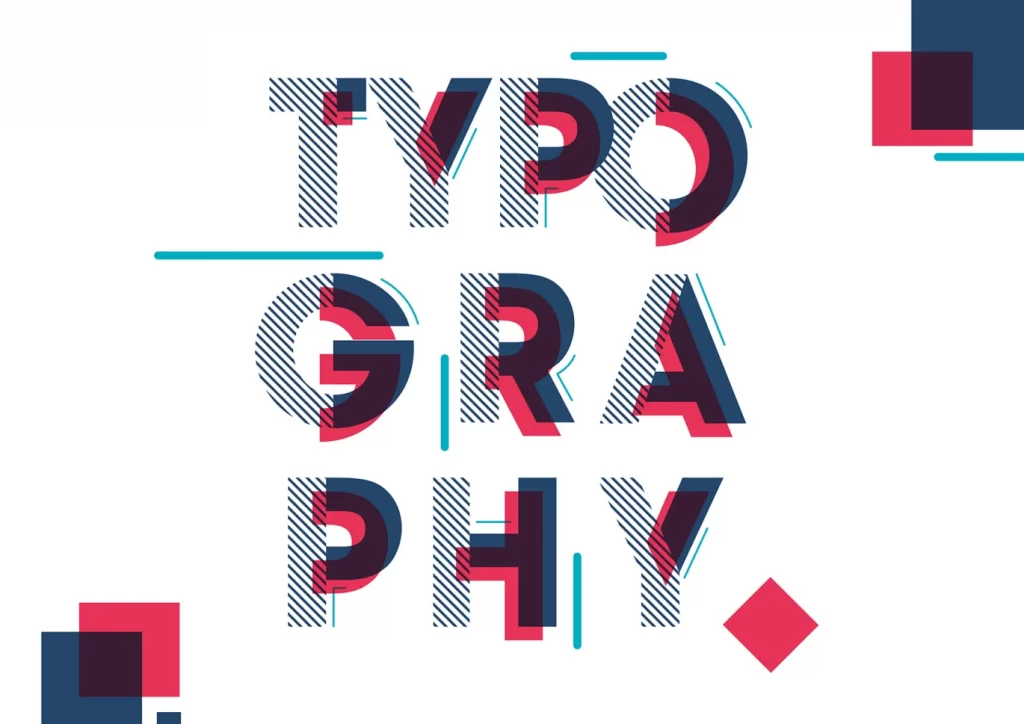
Typography: Why Fonts Are More Than Just Pretty Letters
So… What Even Is Typography?
In simple terms, typography is “the art and technique of arranging type to make written language legible, readable, and appealing when displayed” (Sims, 2025). But let’s be real—it’s also an entire vibe.
It’s about more than just picking a nice-looking font. It involves everything from letter spacing and text size to alignment and how words interact with a design. The goal? To make text not only look great but also work effectively. Good typography finds that perfect balance between beauty and function. It’s like choosing the right outfit—not just for style points, but also to make sure you’re dressed for the occasion.
The Power of Typography: How It Shapes Our Experience
Typography isn’t just about aesthetics—it actually affects how we feel when we read something. Think about it:
- A sleek, modern sans-serif font? Feels professional and efficient.
- A fancy, decorative script? Gives off luxury and elegance.
- Bold, capital letters? Can scream excitement! or urgency!
- A cluttered, messy font? Might just make you want to give up reading altogether.
Beyond just vibes, typography also impacts accessibility. The wrong font choice or spacing can make content harder to read, especially for people with visual impairments. Designers have to think beyond style and consider inclusivity—because what’s the point of a beautiful design if some people can’t even read it?
Why Typography Can Make or Break a Design
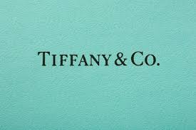
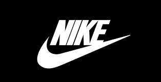
Typography isn’t just a design element—it’s a power move. The fonts a brand chooses can literally shape its identity. Think about how different you feel when you see Nike’s bold, strong type versus the elegant, timeless lettering of Tiffany & Co.
On the flip side, bad typography can totally ruin a message. Ever seen a sign with weirdly spaced letters that made you do a double take? (Like when “Super Bowl” turns into “SuperB Owl” because someone didn’t space it right?) Cramped text, awkward line breaks, or inconsistent styles can confuse readers and even send the wrong message.
The Bottom Line
Typography isn’t just about making words look pretty—it’s about making them work. When done right, it enhances readability, strengthens a brand’s voice, and creates an emotional connection with the audience. Mastering typography means mastering the art of storytelling through design.
So next time you’re picking a font, remember: it’s not just a font. It’s a whole mood.