Designing collateral materials—like business cards, letterheads, and envelopes—might sound like a simple task, but there’s way more that goes into it than just throwing your logo on a page. As PR students (and future professionals), we’re responsible for creating materials that speak to our brand, and trust me, it’s important to get it right. After playing around with different designs, here are a few things I’ve learned that’ll make your designs pop and stand out for all the right reasons.
Balance and Harmony: Find Your Flow
When designing, balance is everything. It’s like making a playlist—too much of one thing (like text or images) can make it feel chaotic, but the right mix makes everything flow perfectly.
- Symmetry looks super organized and professional, while asymmetry can give your design a fresh, modern vibe. Think of it as finding the right balance between your visual elements—nothing should overpower the rest.
- Don’t forget about harmony. Everything on your design should complement each other. For example, if you have a bold logo, balance it with a simple font so it doesn’t look too busy.
Color: The Secret to Your Design’s Personality
Color is such a big deal. The right colors can say a lot about a brand, so it’s important to pick ones that match the vibe you’re going for.

- Stick to two or three main colors for a clean, professional look. Too many colors? It might get a little out of control.
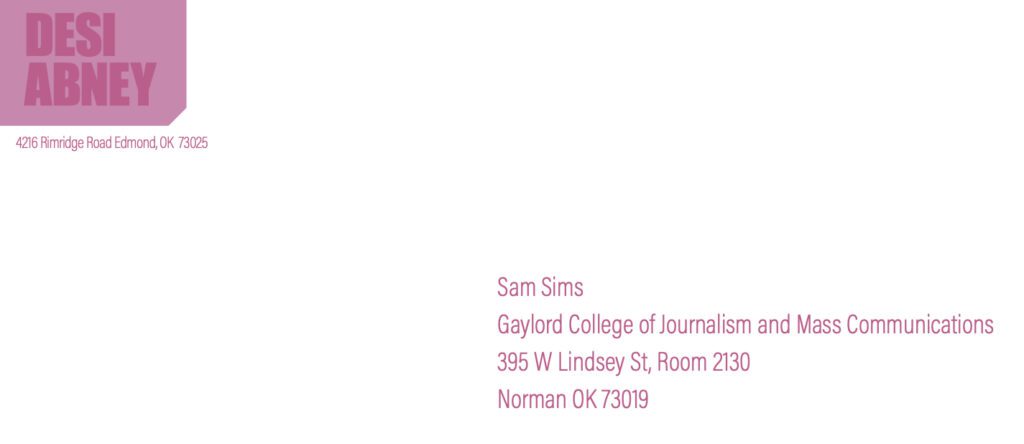
- Choose colors that align with the brand’s values. For my work, I used different shades of pink which symbolizes sweetness and is also my favorite color.
- Pay attention to contrast—you want your text to pop, so make sure it’s easy to read against the background. If your logo’s dark, try a light-colored background, or vice versa.
Fonts: More Than Just Pretty Letters
Fonts matter a lot. They help set the tone of your design and make it easier for people to read.
- Use sans-serif fonts for a modern and clean feel, or serif fonts for something more traditional and authoritative.
- Keep it simple. Limit yourself to two or three fonts so your design doesn’t get too cluttered.
- Use font hierarchy to make sure people know what’s most important—headlines should stand out more than body text, and your contact info should be easy to find.
Quality Images: No Pixelated Pics!
It might seem obvious, but don’t use low-res or blurry images. A fuzzy logo or bad picture can make your design look amateur, and no brand wants that.
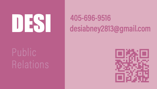
- Use vector images for logos because they can be resized without losing quality. I used a vector image for my QR code, as you can see above.
- For photos, go for high-res JPG or PNG files. And trust me, a pixelated image can be a dealbreaker.
- Don’t go crazy with too many pictures. A simple, clean design with one or two well-chosen images works way better than overcrowding your space.
Embrace White Space: It’s Not Empty, It’s Essential
White space, or negative space, is basically the room around your design elements. It might sound boring, but it’s actually super important. It gives your design a clean, sleek look and makes it easier to read. White space also helps highlight important elements. If your business card is packed with text and logos, it’s hard to know what to focus on—so make sure there’s enough space to draw attention to key info.
Consistency Across the Board
Consistency is one of the most important things in PR design. Whether it’s your business card, letterhead, or social media, all of your materials should feel like they’re from the same brand.
- Keep your fonts, colors, and logos consistent across all your designs. This builds brand recognition and keeps things looking polished.
- The tone of your design should reflect the brand’s personality. If it’s a super formal brand, don’t use funky fonts. If it’s a more laid-back brand, feel free to get creative!
Wrapping It Up: Keep It Simple, Keep It Stylish
Designing collateral materials is a great chance to get creative while also keeping things professional. By focusing on balance, choosing the right colors and fonts, using quality images, and staying consistent, you’ll create designs that are both functional and memorable. And remember—these materials represent the brand, so you want them to make the right impression from the start!