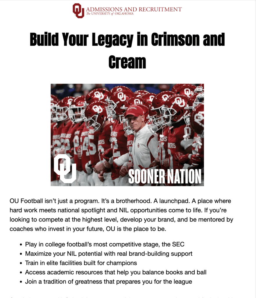
Designing for digital is a whole different ball game compared to print, and I’ve learned a lot while creating social media posts, email campaigns, and presentation templates for my client, OU Admissions and Recruitment. The key to digital design is understanding the unique characteristics of digital spaces, what engages your audience, and how tools like Canva and MailChimp can either elevate or limit your designs. Here’s a reflection on my experiences with these digital projects and some advice for creating successful digital collateral.

Targeting My Audience
When I was working on these digital pieces, my target personas were two very distinct groups: the five-star football athlete and the National Merit Scholarship student. These personas shaped everything from the tone of the messaging to the visual style. For the football athlete, I knew the design needed to feel bold, dynamic, and high-energy to appeal to their competitive spirit. Meanwhile, for the National Merit Scholarship student, I focused on a more refined, academic aesthetic—clean lines, professional typography, and a more polished feel.

In terms of stakeholders, my client (OU Admissions and Recruitment) was the primary stakeholder, but I also kept the students themselves in mind. Their needs and expectations were central to every design decision. Whether they were scrolling through Instagram or opening an email, the designs had to speak to their values and interests while clearly communicating OU’s brand.
The Evolution of My Designs
Designs evolve a lot during the process, and this became especially clear when I created drafts, received feedback, and made adjustments. Early drafts tend to focus more on the big picture—layout, visuals, and general messaging. As I moved through the review stages, I’d refine these elements based on feedback from peers and Professor Sims. Sometimes, the feedback would be about adjusting the tone or balancing the visuals better with the text, while other times, I’d have to scale things down to make sure the design didn’t feel too cluttered.
What influences these changes? Honestly, it’s a combination of client preferences, user experience considerations, and staying true to the campaign message. It’s all about making sure the design is functional and appealing, while also being responsive across devices, especially with email campaigns, where people might be viewing them on a phone instead of a computer.
Tips for Working in Digital Tools
Now, let’s talk tools. I used Canva for designing the social media posts and presentation templates, and MailChimp for email campaigns. These tools are great, but they come with their own sets of pros and cons.
Canva: Canva is my go-to tool for creating quick, eye-catching designs. It’s intuitive, and it offers a ton of templates that make the design process faster. However, it can sometimes feel limiting when you’re aiming for a custom design or want more control over typography and layout. My advice: Make sure to customize templates to fit your brand’s unique voice, and don’t just settle for the default style.

MailChimp: MailChimp was key for creating the email campaigns. The drag-and-drop functionality is super helpful, especially when you need to quickly put together a clean design. The challenge, though, is ensuring your email is mobile-optimized. A lot of users check emails on their phones, so keeping the design simple, with short copy and clear CTAs, is crucial. My tip: Always preview your email on multiple devices before hitting send to ensure everything looks great.

Presentation Templates: For the presentation slides, I used Canva as well. The templates here are awesome for getting started, but there’s always room for improvement. Keep in mind that presentations aren’t just about looking good, but they’re about communicating ideas clearly. I made sure to leave enough white space to keep things visually appealing but not overwhelming.

Advice for Creating Digital Collateral
One of the most important things I’ve learned is that when you design for digital, you must think beyond the visuals. Yes, aesthetics matter, but the user experience is what makes or breaks your design. Is your message easy to read on a phone? Does your design scale well across devices? Does your campaign fit within the context of your audience’s needs? Always keep these questions in mind.
Wrapping Up
Throughout this whole process, I’ve learned how crucial it is to keep stakeholders in the loop. They’re the ones who shape the direction of the design, so doing your research is key to ensuring the final product aligns with the goals of the campaign. It’s all about balancing your creative vision with the client’s needs, and making sure the final design resonates with the target audience.
So whether you’re designing for social media, emails, or presentations, remember that digital design requires flexibility, attention to detail, and an understanding of your audience. Keep your design simple, intentional, and responsive, and you’ll be set up for success!