
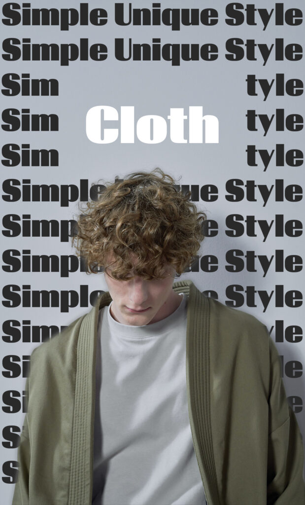
How do you create not only a brochure but a brand from a set of basic and simple stock photos? The first thing I set about doing was figuring out a voice for the whole company. I personally believed a modern almost minimalistic vibe was the right way to take this because it really matched the clothing design of being blank and kind of simple. Next, I decided to take the main features of the brand and incorporate them into the overall design the three things that came to mind for me were Simple, Unique, and Recyclable. I took each of these key concepts and divided them into their own unique pages and tried to match the trend of each word set for the page. Like making the funky page with circular text boxes, the recycling-focused page was with the whole brochure done on a recycled paper background. Lastly simple was just that simple clean lines and boxes nothing super fancy. All of these really helped create the theme of the whole brochure and allowed me to incorporate that into the graphic design for the whole page graphics. In the end, I created a really unique and cool-looking brochure that I was really happy with and reflected my personal taste in clothing onto a basic set of stock photos.