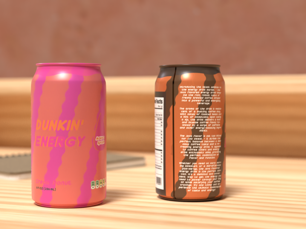
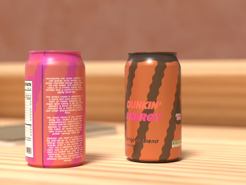
Yes, that’s as crazy as it sounds but nonetheless it’s part of two new flavors I created for this design mockup. Now Cream donut energy drink to me sounds absolutely horrendous and a stomach ache waiting to happen, but at least the can looks good, right? Speaking of the looks what was the motivation behind my design on these bright colours and squiggly lines? The first thing that was important was fitting into the design parameter set by Dunkin Donut making sure to use the right colours and following along the general guidelines. This gave me my pink and orange on the can, fitting for a donut. But I don’t know how much that screams coffee flavor to me so I made the second can brown for some starch contrast and an easy way to identify the cans apart. Which brings me to why the cans are squiggly and bright it’s simple, to look different and stand out. I know every product tries to do that nowadays but Dunkin is already such a bold and creative brand I thought the can designs would really help them stand out from other generic energy drinks yet still scream the Dunkin we all love and know. Overall I really had fun creating such a unique pattern with complete creative freedom and getting to see a virtual mock-up was just the glazing on the donut.