The Home Stretch to PR Design

Mastering PR Design: Tools, Tips, and Reflections from the Field

In the fast-paced world of public relations, design isn’t just about making something look good, it’s about making sure your message lands. PR design is the strategic use of visual elements to enhance communication, build a brand’s identity, and connect with the right audience. Whether you’re creating a press release, social media graphic, or event flyer, design plays a crucial role in how the message is received and remembered.

What is PR Design?

PR design refers to the visual components of public relations materials, everything from color schemes and typography to layout and imagery. These design choices support the messaging and brand image of an organization. Effective PR design helps a company look professional, polished, and consistent across all platforms.

Tools to Promote an Organization

In today’s digital world, there’s no shortage of design tools to help promote an organization. Some of the most effective ones include

  • Canva—Perfect for beginners, Canva offers pre-made templates for flyers, social posts, and press kits.
  • Adobe Creative Suite—Tools like InDesign, Illustrator, and Photoshop give professionals full creative control.
  • Mailchimp – A helpful platform for designing and sending email newsletters.

Design Hacks and Tips

Throughout my PR design projects, I picked up a couple of helpful hacks to speed up the creative process:

  • Template Libraries Are Gold: For me, starting from scratch takes time. Saving templates for social media posts, press releases, and newsletters can cut your workflow time in half.
  • Smart Use of Grids and White Space: Clean, balanced designs look more professional and are easier to read, especially in media kits or pitch decks.

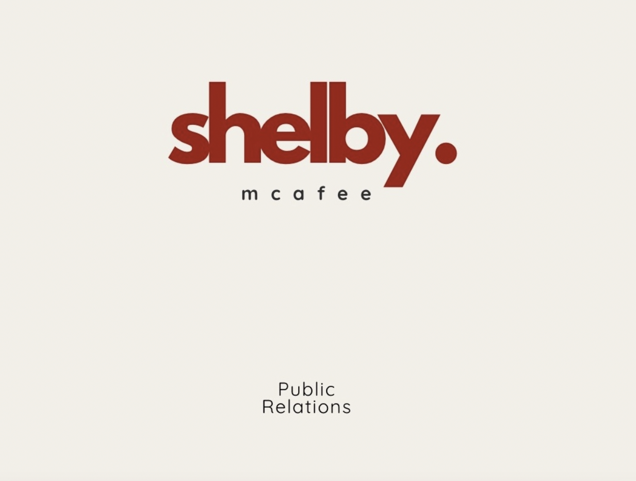
My brand logo, which I thought was different, also explained my personality. Simple yet bold.

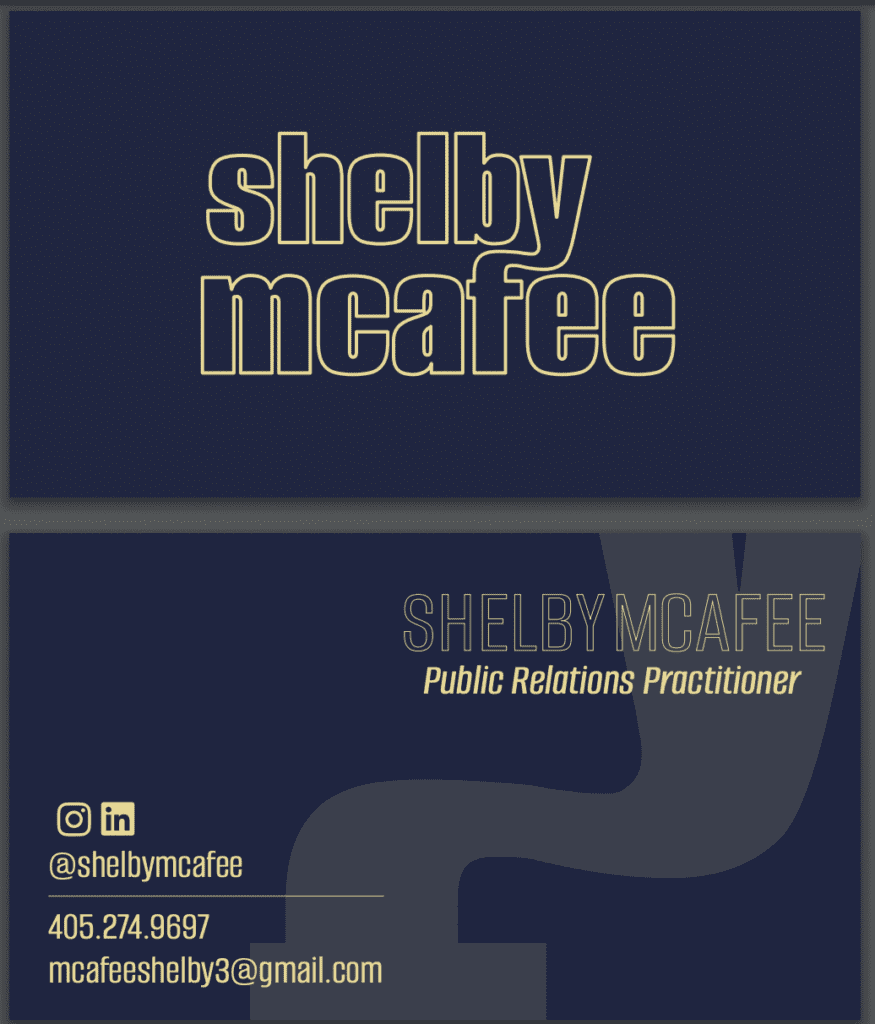
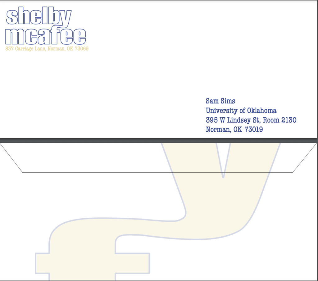
This was my favorite project I worked on: my business card. The time and the effort I put into this are why it is my all-time favorite.

Final Reflections

One of the most important takeaways from this course is that knowing your audience is everything. A beautifully designed publication is useless if it doesn’t speak to the people you’re trying to reach. That means tailoring not just your message but your entire visual approach, from the colors you choose to the platforms you use, to fit your audience’s expectations, and I also gained a new appreciation for the core elements of design: contrast, alignment, repetition, and proximity. These principles aren’t just textbook theory; they’re essential guidelines for creating content that is both attractive and functional.

Whether it’s through social graphics, press materials, or product packaging, PR design is an essential skill that bridges strategy and creativity. With the right tools and mindset, creating standout publications becomes less about stress and more about impact.

Designing for Digital: What I Learned About Reaching Real Students

When designing digital content, it’s important to consider who you’re talking to. For this project, I focused on two key students in my community: Emma, a 21-year-old transfer student majoring in biology, and Alexis, an 18-year-old first-generation college student. Both have different needs and goals, and that shaped how I designed every piece.

 Social Media Post

Social media is fast-paced. You have about one second to grab attention.

For Alexis, I kept the design friendly, bold, and easy to understand. I used strong visuals, short phrases, and a message that felt motivational without being cheesy. Emma needed something more informative, so I included a quick tip or stat she could take with her.

The goal: make them stop scrolling and feel seen.

 Email Campaign

Email gave me space to explain more. I organized the layout with short paragraphs, headers, and buttons to make things easy to click through.

Emma’s section focused on academic resources and tips for transfer students. For Alexis, I added a short message of encouragement and a link to student support programs made for first-gen students. I made sure the tone felt supportive and helpful, not overwhelming.

Presentation Template

This was made for advisors or student leaders to share with groups like Emma and Alexis. I designed the slides to be clean and professional but still welcoming.

I included simple graphics and clear space for people to add local resources. The message was all about empowerment—helping students know what’s available and how they can succeed.

What I Learned

Throughout this process, I realized how important it is to know your audience. Feedback helped me simplify my designs and stay focused on what students need.

Tools like Canva and Adobe made designing easier, but it was the personal connection to my audience that made the final work meaningful.

Final Thoughts

Designing for digital means thinking beyond just “looking good.” It’s about making students feel supported, understood, and ready to take action. When we keep our audience in mind, our work becomes more than content, it becomes a connection.

My Take on Adobe Photoshop

When I first started learning Adobe Photoshop tools, I was taken aback by how many tools, layers, and shortcuts there were to add to a design element. I have since learned how to use Photoshop and now know how important it is to understand all of its features. 

Why It Matters

In any project, stakeholders are the people who will interact with your design or benefit from the end result. Two major stakeholders shaped my design: Alexis Alvarez, a first-generation college student from Orange Cove, California, and Emma Brooks, a transfer student at Oklahoma City Community College studying biology.

For Alexis, who values family and hard work, it was important that the design was both clear and practical. She’s focused on proving herself through education, so my design had to communicate in a way that made sense and didn’t distract her from her busy schedule. She interacts with her community often, so visuals had to feel passionate and inviting.

Alexis’ direct mail mock-up.

Emma, on the other hand, is driven by her aspirations in healthcare and education. She’s motivated by career goals and is deeply involved in community volunteering. Emma’s design preferences leaned more towards thriving in her dream life. She needs to absorb information quickly, so I wanted her design to be bold.

Emma’s direct mail mock-up.

The influence of these two stakeholders guided my approach to the design, and I realized that understanding their needs and experiences was critical to crafting a project that could resonate with both.


Advice for Photoshop Beginners

  1. Use Layers Wisely.  Name and organize your layers to avoid chaos in complex designs. Layers are key to maintaining a clean file structure.
  2. Be Open to Feedback. Outside input is invaluable, whether you’re designing for a class or project or just seeking advice. Diego’s and Emma’s perspectives helped shape my final product.
  3. Start with a Clear Plan.  Having a rough idea about your project before you dive into Adobe can save you time and help you stay focused.
  4. Think About Your Audience—Whether your stakeholder is someone like Alexis, who balances family and school, or Emma, who values professionalism in her healthcare journey, your designs should always cater to their needs.

Photoshop isn’t just about creating pretty designs; it’s a tool for communication. When you use it with purpose and keep your stakeholders in mind, your work becomes more than just a visual project—a solution serving real people. Through my designs for Alexis and Emma, I learned how critical it is to balance creativity with clarity and to think about the users who will engage with the design.

Finding the Right Students: Diego and Emma’s Stories

Finding the Right Students: Diego and Emma’s Stories

When bringing new students to a college, we must know who we’re trying to reach. Not every student is the same; different people need different things from a school. That’s why I created two student personas to help us figure out who we’re talking to and how to talk to them in a way that makes sense for their lives.

Let me introduce you to Diego and Emma. They’re examples of students a university should consider when recruiting.


Meet Diego Alvarez – First-Generation Student

Diego is 18 years old and comes from Orange Cove, California. His parents moved here from Mexico, and he’s the first person in his family to go to college. That’s a huge deal! Diego is majoring in the arts but is also super into business and wants to start his own company one day. He works part-time and greatly helps his family, balancing many things simultaneously.

Who Diego Is:

First-generation Latino students, around 18 years old, from low- to middle-income families, are interested in the arts and entrepreneurship and want to find a welcoming and supportive college.

If we’re trying to reach students like Diego, we must show him first-gen student programs, scholarships, mentorships, and clubs that help him meet people like him. He wants to know that there’s a place for him on campus.


Meet Emma Brooks – Transfer Student

Emma is 21 and from Moore, Oklahoma. She attended Oklahoma City Community College and earned her associate’s degree in biology. Now, she’s ready to transfer to a four-year school to finish her degree. In her free time, she works as a medical assistant and volunteers at a free clinic. Emma’s big dream is to become a physical therapist and open her practice someday. She’s serious about her future and wants a school to help her achieve it.

Who Emma Is:

Emma is a female transfer student, age 21, from Oklahoma City Community College with an associate’s degree in biology. She’s working part-time in healthcare and looking for a school that makes it easy to transfer credits and prepare for graduate school.

For students like Emma, we need to discuss how easy it is to transfer, what help is available for transfer students, and programs that help her gain experience in the health field.


Why This Matters

Knowing who we’re talking to helps us say the right things. Diego and Emma need different kinds of support, and our messages should show them how we can help. Whether it’s making them feel welcome, offering financial aid, or helping them plan their future careers, it all starts with understanding who they are.

BTS of Building My Brand

Creating Effective Collateral Material: My Guide to PR Design

In public relations, crafting compelling collateral materials is essential in building my brand identity. Whether it’s a business card or an envelope design these pieces communicate my message, values, and professionalism. Through my experience, I’ve learned some of the best practices for design and layout, and I want to share what has worked for me so that future PR professionals can create materials that look great and serve their purpose.

The Fundamentals of Great Collateral Design

Effective collateral material isn’t just about aesthetics—it must be well-structured, easy to read, and aligned with a brand’s identity. Here are the key principles I follow:

1. Balance and Harmony

I always ensure my designs are well-balanced, so no single element overpowers the layout. I also maintain harmony across all my collateral materials, ensuring my business card and envelope share a similar design language.

2. Color Psychology and Branding

Colors evoke emotions and play a huge role in brand recognition. When designing my business card, I carefully selected a modern and professional color palette, a navy blue and lighter yellow, to enhance readability while reinforcing my brand identity. I’ve learned that limiting a color scheme prevents visual clutter and keeps things looking polished.

3. Font Selection and Readability

Typography can make or break a design. I stick to one or three complementary fonts—one for headings, one for body text, and sometimes a third for emphasis. Readability is key, so I ensure a strong contrast between the text and the background. My business card design, for instance, features a bold and modern font for my name (Alumni Sans) to enhance visibility and brand recognition.


Essential Collateral Pieces

Business Card

My business card is often the first impression people have of my brand, so I made sure it reflects my professionalism. A great business card should include:

  • My name and title
  • My personal logo and tagline
  • Contact information (phone, email, LinkedIn, social media)
  • A clean, uncluttered layout

I kept my final business card design sleek and minimalistic, ensuring clear contact details and strong branding.

Envelope Design

Custom envelopes add professionalism to any correspondence and reinforce my brand. When designing mine, I focused on:

  • Proper placement of sender and recipient addresses
  • Including my logo while keeping the design clean
  • Making sure the layout looked polished yet distinctive

My envelope design follows these principles, balancing branding and function.


Final Thoughts

As I continue to grow as a PR professional, I’ve realized how vital it is to master the art of collateral design. Prioritizing clarity, consistency, and strategy has helped me create materials that don’t just look good but also effectively communicate my brand. I hope that by sharing what I’ve learned, I can help other aspiring PR professionals craft their standout collateral materials.

A Communications Strategy You Want

My brand is built on authenticity and determination, setting me apart in a competitive PR landscape. I am not just selling myself—I am positioning myself to outshine my peers through ambition and a relentless drive for success.

Photo: Pintrest

Visually, I embody a polished, modern aesthetic with a bold yet refined touch. My visual language reflects clean typography, striking yet sophisticated colors, and unique layouts that reinforce confidence, professionalism, and innovation.

A balance of typography and imagery is crucial to my brand. My typography displays clarity, modernity, and strength, while my imagery conveys collaboration, strategic thinking, and attention to detail. Every element is carefully designed to showcase my personality and expertise.

I aim to include trust, credibility, and forward-thinking strategy, ensuring that hiring managers see me as a PR professional who delivers results while staying true to my authentic self.

With my competitors being fellow PR students, I differentiate myself by taking a strategic and intentional approach. I don’t just follow industry trends—I analyze what others are doing and identify the gaps they overlook. By filling these gaps, I position myself as a unique and indispensable asset in the PR industry.

Photo: Pintrest

Through my competitive analysis of my classmates, I’ve noticed that some are bold risk-takers, others emphasize diversity and inclusivity, and many have more experience than I do. While I admire their strengths, I know I can fill the gaps they leave behind.

I’m not just a risk-taker—I’m a strategic one. I carefully analyze situations, ensuring that every move I make leads to real, measurable results. I don’t just acknowledge diversity—I create it into meaningful, inclusive storytelling that connects brands with a wider audience in an authentic way. And while some may have more experience, that doesn’t count me out. Experience can sometimes mean being stuck in traditional ways, while I bring a fresh, adaptable approach that keeps brands ahead of the curve.

I am your next hire.

In the fast-paced world of Public Relations, standing out is not just an advantage—it’s a necessity. As I step into this competitive industry, I am not just another candidate; I am a brand, a force of determination, and a storyteller with a mission.

My Mission: Making an Impact with Authenticity

My mission is simple yet powerful—to communicate with authenticity, build meaningful connections, and create strategic narratives that leave a lasting impact. I strive to bring fresh perspectives to PR campaigns, ensuring that every story told resonates with its audience in a way that is both engaging and genuine. Through my work, I aim to elevate brands, foster trust, and drive success in an ever-evolving digital landscape.

My Competitors: The Rising PR Talent

In this journey, my main competitors are my fellow classmates—ambitious, talented, and equally determined to secure a spot in the industry. However, competition is not just about standing apart; it’s about learning, growing, and continuously refining my skills to bring something unique to the table. What sets me apart is my relentless drive, strategic mindset, and ability to turn challenges into opportunities.

Photo edit by Shelby McAfee

My Core Values: The Foundation of My Brand

At the heart of my personal brand are two key values: respect and honesty. These principles guide every interaction, campaign, and decision I make. I believe that trust is the foundation of any successful PR strategy, and by upholding integrity in my work, I ensure that my clients, colleagues, and audiences always receive transparent and ethical communication.

Looking Ahead

As I continue to build my career in PR, I am committed to evolving, adapting, and pushing boundaries. I understand that success in this industry is not just about creativity; it’s about strategy, persistence, and the ability to navigate the ever-changing media landscape.

I am ready to bring my passion for storytelling, my unwavering determination, and my core values into the professional world. With a strong personal brand and a clear mission, I am prepared to make my mark in Public Relations.

Which PR Tool Best Fits You?

According to Google, PR professionals rely on two powerful tools: Prowly and BuzzStream. While I’m familiar with BuzzStream, this is my first time learning about Prowly. After exploring both, I’ve identified some key differences between the two platforms. Here’s how they compare.

Prowly is an all-in-one PR software focused on media relations management. It offers features such as:

  • Media Database: Access to a large database of journalists and media contacts.
  • Press Release Creation & Distribution: Tools for crafting, organizing, and sending press releases.
  • PR CRM: Helps track communication history with journalists.
  • Media Monitoring: Tracks media coverage and brand mentions.
  • Online Newsrooms: Allows users to create branded newsrooms to showcase press releases and media assets.

Best for: PR teams looking for a comprehensive, journalist-focused media outreach platform.

Image provided by Prowly

BuzzStream is a relationship management and outreach tool primarily used for link-building, influencer marketing, and digital PR. Key features include:

  • Contact & Relationship Management: Keeps track of conversations and follow-ups.
  • Email Outreach & Follow-Ups: Automates personalized email campaigns.
  • Link Building Management: Ideal for SEO-focused PR campaigns.
  • Team Collaboration: Allows teams to manage outreach efforts efficiently.

Best for: PR professionals and marketers focusing on influencer outreach, link building, and digital PR campaigns.

Image provided by BuzzStream

What you can learn.

PR professionals can learn from Prowly by mastering media database management, optimizing press releases, and building strong brand visibility through online newsrooms and media monitoring. From BuzzStream, they can adopt strategic outreach techniques, personalize pitches, and leverage digital PR for link-building and influencer collaborations. Both platforms emphasize the importance of relationship management, automation, and data-driven insights, helping PR teams enhance media engagement and campaign success.

How these platfroms make a good design.

A good design in PR platforms like Prowly and BuzzStream should balance usability, functionality, and efficiency to help PR professionals streamline their work. Key design principles include:

  • Storytelling
  • Data Visualisation
  • Design Relevance
  • Design Consistency
  • Image Sourcing

Personal Thoughts.

I enjoyed how the process highlighted the strengths of both Prowly and BuzzStream, showing how they complement each other in PR strategy. It was nice to break down complex features into clear, actionable insights that PR professionals can apply. However, condensing detailed comparisons into a concise format was slightly frustrating without losing key points. However, the overall summary made the process more effective and digestible.

The Visual Language of Words

What is Typography? 

Whether you are reading an article on your phone, skimming a book, or scrolling through a website, you are constantly digesting words. 

Typography is all around you.

It involves all types of font styles, structure, and appearance. Typography is the art and technology of arranging fonts in a way that makes written language not only legible but enjoyable to read.

Types of Fonts. 

I’m sure we’ve all written an email, an essay, or sent a text at some point. But have you ever stopped to notice the font you’re using? Two fonts that pop up almost everywhere in everyday text are serif and sans serif.

When you hear the word “serif,” does your mind immediately picture a sheriff? Mine does! It’s the perfect way to introduce the difference between serif and sans-serif fonts in a fun, creative way. Think of serif font as the “sheriff” of the typography world—it’s bold, used in a body of text, authoritative, and stands out with its little embellishments at the ends of each letter. On the other hand, sans serif is like the sheriff’s trusty deputy. It may not have the extra flourishes, but it’s sleek, modern, used for headlines, and makes the sheriff’s job easier by enhancing readability. Together, they create the perfect team. 

Why is Typography important?

Typography is important because it affects how people perceive and interact with written content. “It has two main purposes. The first is to promote legibility, and the second is to help communicate the messaging, tone, and sentiment of a design piece” (Corrigan)

Typography plays a crucial role in how we consume written content every day. From emails to books to websites, the choice of fonts impacts readability, aesthetics, and overall communication. Serif fonts, like the “sheriff” of typography, provide authority and structure, while sans-serif fonts offer a sleek and modern touch for easy readability. Ultimately, typography enhances both function and design, making written language not just legible but also engaging and effective. 

Promoting Fun with Airbnb’s “Live There” Campaign

Travel is about more than just seeing new places—it’s about experiencing life from a new perspective. In today’s world, where every trip can be captured and shared instantly on social media, travelers are increasingly looking for experiences that are authentic and engaging. Airbnb’s “Live There” campaign, which focuses on promoting a deeper connection to destinations, does just that. It encourages travelers to “[be inspired by other] travelers to reimagine what it is to travel, showcasing the experiences only made possible through Airbnb and its community” (Dexigner).

Words That Connect

Airbnb’s “Live There” campaign is grounded in the idea that travel should be more than just visiting famous landmarks. The campaign’s messaging focuses on words like “live,” “belong,” and “local experience”. The slogan “Live there” invites travelers to imagine what it would be like to stay in someone’s home rather than a hotel, to feel connected to a city beyond its touristy hotspots. “Belong anywhere,” another tagline, reassures customers that no matter where they go, Airbnb offers an opportunity to feel at home in a new place. Airbnb’s objective is to promote the idea of living authentically (Graetzelkaiser). This messaging reflects the core idea that travel is about connection—both with the destination and with the people who live there. These carefully chosen words evoke feelings of belonging and adventure, making the experience feel personal and fun.

Imagery That Captures the Spirit of Travel

The visuals used in the “Live There” campaign are vibrant and relatable. They depict real-life moments that showcase travelers enjoying fun, immersive experiences. Rather than relying on stock photos of perfect beaches or crowded tourist attractions, Airbnb uses images and videos of people interacting with locals, enjoying off-the-beaten-path experiences, and engaging with their surroundings in meaningful ways. Whether it’s a group of friends enjoying dinner in a cozy apartment, a family exploring a quiet street, or a solo traveler finding a hidden café, these images capture the joy of discovering a new place from a local perspective. The visual style is designed to evoke the feeling that travelers are part of a community, not just visitors passing through.

“Live There” Airbnb Campaign

Communication Tactics That Drive Engagement

Airbnb’s communication strategy is as dynamic as the experiences it offers. One of the key tactics is its use of social media, particularly Instagram, where users can share their own experiences under hashtags like #LiveThere. This user-generated content creates a sense of authenticity and community, allowing future travelers to see real-life examples of Airbnb stays. In addition, influencer partnerships amplify the message, with influencers sharing their Airbnb experiences and reaching a broad audience.

Another key tactic is video storytelling. Short, engaging videos tell personal stories of travelers experiencing the world like locals—whether they’re meeting new people, sampling local foods, or uncovering hidden gems. These videos highlight the fun and excitement of being fully immersed in a new culture, making travel feel more accessible and enjoyable.

A Public Relations Tactic to Promote Airbnb

If I were to create a public relations tactic to promote Airbnb’s “Live There” campaign, I would host a “Pop-Up Local Experience” event in a major city. This event would feature different themed rooms, each representing a unique Airbnb destination. It would encourage visitors to share their experiences on social media using a branded hashtag like #LiveTheAirbnbWay. By participating, they could win a free stay in one of the featured Airbnb homes.

Keywords: live there, destination, visitors, local

References

Airbnb launches live there campaign. Dexigner. (n.d.). https://www.dexigner.com/news/28795

Energizer, G.-Y. G. (2023, November 22). Case study: Airbnb’s #LiveThere campaign. Medium. https://graetzelkaiser.medium.com/case-study-airbnbs-livethere-campaign-c5e31c17455f

YouTube. (n.d.). Airbnb『Live There』. https://www.youtube.com/watch?v=ddRBr2It00k