Mastering PR Design: Tools, Tips, and Reflections from the Field
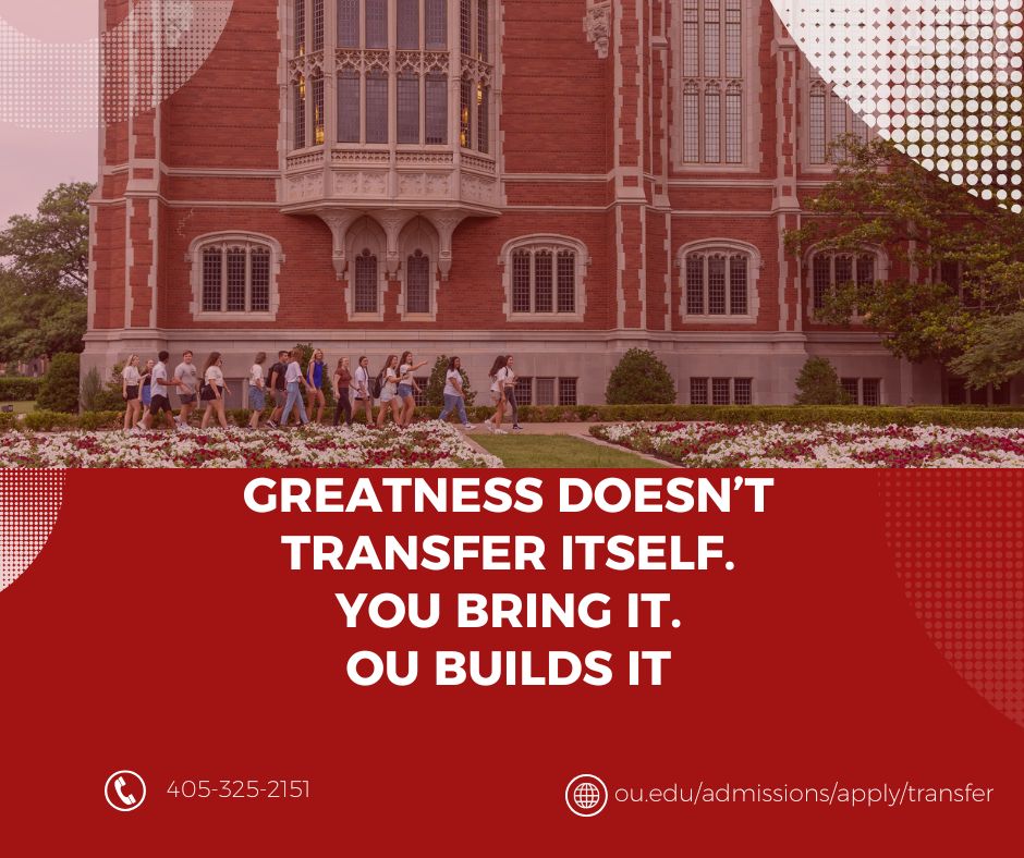
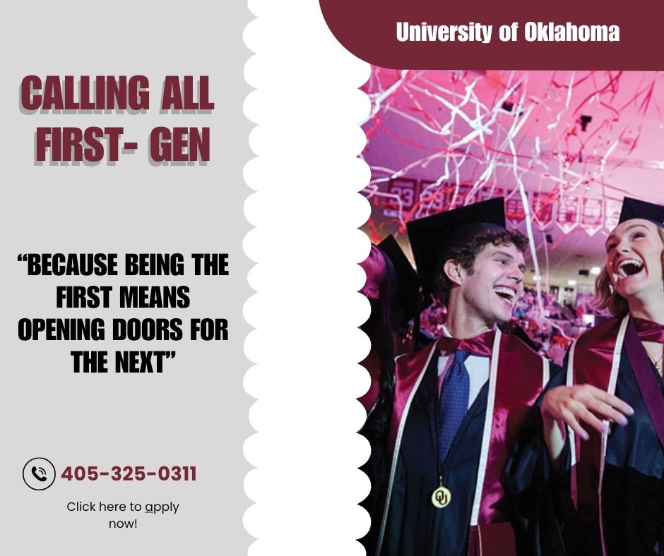
In the fast-paced world of public relations, design isn’t just about making something look good, it’s about making sure your message lands. PR design is the strategic use of visual elements to enhance communication, build a brand’s identity, and connect with the right audience. Whether you’re creating a press release, social media graphic, or event flyer, design plays a crucial role in how the message is received and remembered.
What is PR Design?
PR design refers to the visual components of public relations materials, everything from color schemes and typography to layout and imagery. These design choices support the messaging and brand image of an organization. Effective PR design helps a company look professional, polished, and consistent across all platforms.
Tools to Promote an Organization
In today’s digital world, there’s no shortage of design tools to help promote an organization. Some of the most effective ones include
- Canva—Perfect for beginners, Canva offers pre-made templates for flyers, social posts, and press kits.
- Adobe Creative Suite—Tools like InDesign, Illustrator, and Photoshop give professionals full creative control.
- Mailchimp – A helpful platform for designing and sending email newsletters.
Design Hacks and Tips
Throughout my PR design projects, I picked up a couple of helpful hacks to speed up the creative process:
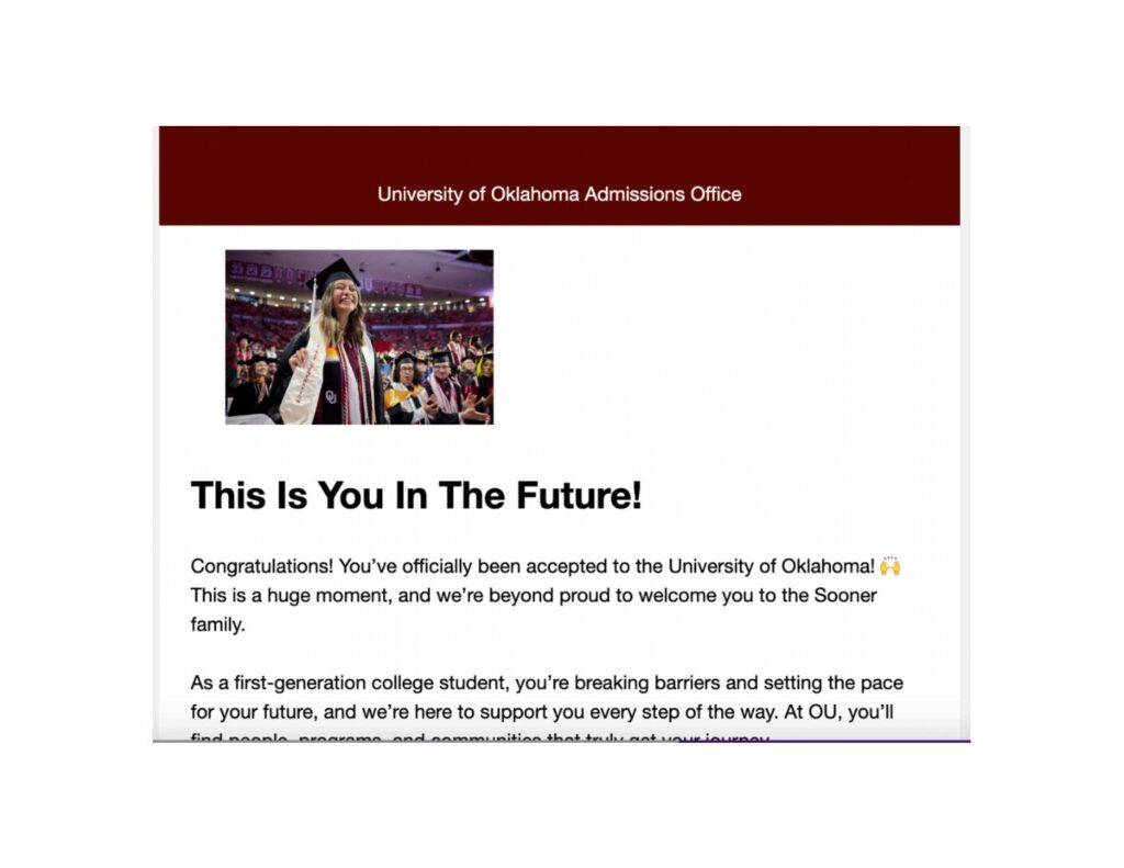
- Template Libraries Are Gold: For me, starting from scratch takes time. Saving templates for social media posts, press releases, and newsletters can cut your workflow time in half.
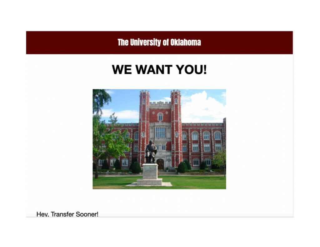
- Smart Use of Grids and White Space: Clean, balanced designs look more professional and are easier to read, especially in media kits or pitch decks.
My brand logo, which I thought was different, also explained my personality. Simple yet bold.
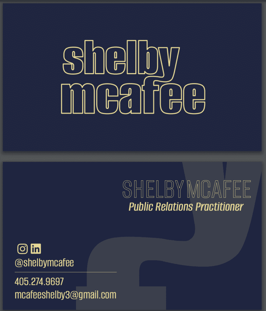
This was my favorite project I worked on: my business card. The time and the effort I put into this are why it is my all-time favorite.
Final Reflections
One of the most important takeaways from this course is that knowing your audience is everything. A beautifully designed publication is useless if it doesn’t speak to the people you’re trying to reach. That means tailoring not just your message but your entire visual approach, from the colors you choose to the platforms you use, to fit your audience’s expectations, and I also gained a new appreciation for the core elements of design: contrast, alignment, repetition, and proximity. These principles aren’t just textbook theory; they’re essential guidelines for creating content that is both attractive and functional.
Whether it’s through social graphics, press materials, or product packaging, PR design is an essential skill that bridges strategy and creativity. With the right tools and mindset, creating standout publications becomes less about stress and more about impact.

