

Throughout my time studying public relations design, I feel I have become an expert in many elements of design. Utilizing Indesign, Canva, Photoshop, and MailChimp I am confident that I can design engaging material on any platform.
I enjoy creating content and taking the time and effort to think extensively about each design element I incorporate.
Below is some of the work I have completed over the Fall 2023 semester. Each attachment links to the full version of the project.
Creating Brand Collateral: Stationary
Reflection
Creating a business card was my first introduction to utilizing InDesign for brand collateral. For this major project, I chose a fine jewelry brand; Mejuri. Mejuris’s audience is younger women and men who have an interest in timeless, simplistic, and chic accessories. The objective of this project was to build brand recognition and to be a one-stop shop for information for Mejuri contact info. Before designing the business card, I had to fully analyze the brand’s vibe, messaging, and how they have previously showcased these elements. Alongside the business cards, I designed matching stationary; a letterhead, and an envelope. The main thing that was of the utmost importance was consistency. Having consistency allows for better recognition and brand recall.
Business Card

September 19, 2023
Reflection
Creating a business card was a bit challenging due to the size of a business card. I created this business card for my client Mejuri as a way to promote their business and gather contact information all in one place. It was essential to narrow my goal for this business card because since I was working with a smaller size design, I had to be very intuitional and simplistic in my design. I learned that although we want to be able to present the most information we can to our audiences, it is extremely important to narrow that messaging down to only provide key facts.
Social Media Campaign

October 12th, 2023
Reflection
Social media is a major factor in Public Relations, as it allows a channel for two-way communication with our audiences. For this reason, it is extremely important to make sure your messaging and design align with your brand and target audience. For this social media campaign, I created a Pinterest mood board that allowed me to pull out the main factors in Mejuris’ vibe and overall tone. I then needed to practice consistency in these posts and continue to use several of the same elements for better recall. I enjoyed creating a social media campaign and felt I thrived on this project.
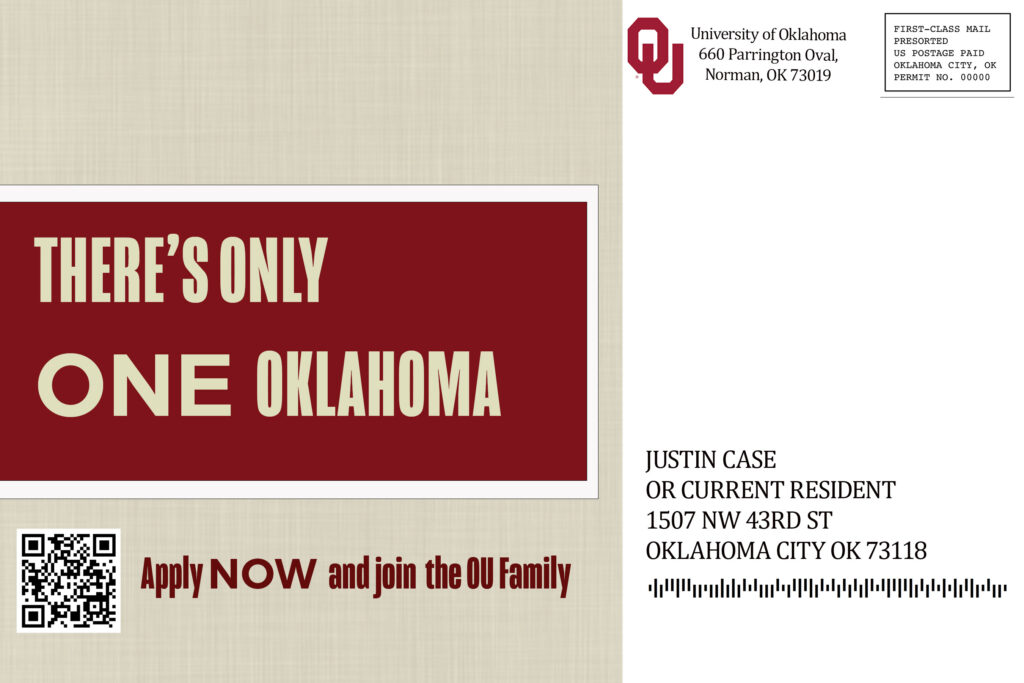
Creating HandOuts with Adobe Photoshop
October 5, 2023
Reflection
The direct mail-in/ handout assignment was completed on October 3rd. This project goal was to position the University of Oklahoma as a top university for high school seniors and transfer students. This project required a lot more intentional design elements. I chose to sketch my project out and found that is an amazing tool when preparing for a big project. I utilize the OU brand font, color, and logos. I also utilized the media assets provided by Professor Kast and incorporated these to fit the audiences.
Creating a Corporate Newsletter

October 31, 2023
Reflection
The Newsletter was one of the most intense projects I completed this semester. With several different pages, it was essential to utilize many design elements to create a newsletter that catered specifically to our stakeholders. I created a newsletter for Target Inc. The goal was to reach out to customers, new and returning, and to spread information quickly to media and employees of Target Inc. The first thing designing a newsletter taught me was how to adhere to columns strictly. I had to use copy to portray information but had to be very adamant about making sure each column, image, and other graphic element lined up. I learned how to incorporate bylines, headings, and subheadings. It is important to be able to break up copy and draw the reader’s eye throughout the newsletter.
Building a Brochure

November 16th, 2023
Reflection
Creating a brochure was a very tedious, and engaging product that built my critical thinking skills. There are many elements to a piece of printable material like a brochure that I didn’t realize at first, such as folding calculations. To combat this, I used a folding calculator and calculated where each of my margins needed to be placed in InDesign. After utilizing these margins, I was able to construct a tri-fold brochure, for the University of Oklahoma Recruitment. I wanted to capture the University of Oklahoma’s excitement for new students, so I picked images that radiate enthusiasm. I utilized several University of Oklahoma-approved logos and went to their brand asset, which featured logos, fonts, and messaging. I incorporated this as I had consistent fonts throughout my brochure, and repeated several of the same types of messaging. I enjoyed this project, and had to play around with this one the most to ensure everything lined up!
PowerPoint

November 25, 2023
REFLECTION
During the creation of my PowerPoint presentation, I was learning to format my design to be optimal for presenting. Several design elements had to be changed to fit a presentation format better, such as less copy and utilizing notes instead of copy in my presentation. I also wanted to utilize icons, and other graphic elements to break up the PowerPoint. I needed to utilize bigger and clearer fonts, to make sure my presentation would be visible. I enjoyed doing this because it allowed me to practice how I would present a design tips presentation.
E-Newsletter

November 30, 2023
Reflection
Creating an e-newsletter was an amazing start to establishing my brand: Taylor Communications. I utilized Canva to create my logo and header. I then went into Mailchimp and took inspiration from a template that I felt lined up with my vision for Taylor Communications. I felt the e-newsletter was a new realm, writing copy to promote my blog was a new experience that required skill. I needed to tighten my copy and be summative in my small description for the promotion of each blog post. My biggest struggle was finding a balance between simplicity and catching attention and drawing it to my blog posts. I enjoyed writing a boilerplate, it was great to figure out the core values and initiatives of Taylor Communications and portray them.